Top Paint Color Trends 2026: The Great Shift to Warmth for Timeless, Cozy Homes
The landscape of Paint Color Trends 2026 is here, and if we could sum it up in one word, it would be warmth. After a hectic few years, it appears we’re collectively yearning for our homes to feel like a big, cozy blanket, providing restoration, comfort, and calm. Designers and paint experts agree: 2026 will be dominated by richer, nature-inspired hues, suggesting a decisive shift away from cooler colors.
We’re diving deep into the year’s most influential announcements, exploring everything from the universally safe neutrals to the surprisingly bold, deep jewel tones. Consider this post your friendly guide, ready to give you a head start on planning your next home painting project.
Key Takeaways for Paint Color Trends 2026
If you don’t have time to read every single word (but we hope you do!), here are the major trends and insights defining the year ahead:
- Warmth is Everything: The primary driver for nearly all selections is the need for warmth, resulting in the widespread selection of cozy, earth-inspired palettes.
- Universal Khaki is the Anchor: The selection of Universal Khaki by HGTV Home and Sherwin-Williams signals that sophisticated, Timeless Neutral shades are dominating the market.
- The Depth Endures: The “moody moment” isn’t over. Brands like Behr and Benjamin Moore are still embracing Deep Saturated Color, but focusing on sophisticated, grounded versions.
- Focus on Finishing Touches: The rise of wood stains (Special Walnut) and specialized spray paints (Matte Coffee Bean) shows consumers are paying as much attention to architectural details and refurbished furniture as they are to walls.
- Nature Connection: Nearly every color chosen, from Warm Eucalyptus to Midnight Garden, is rooted in nature and designed to create an organic, authentic feel.
The Shift to Warmth: Why 2026 Feels So Cozy
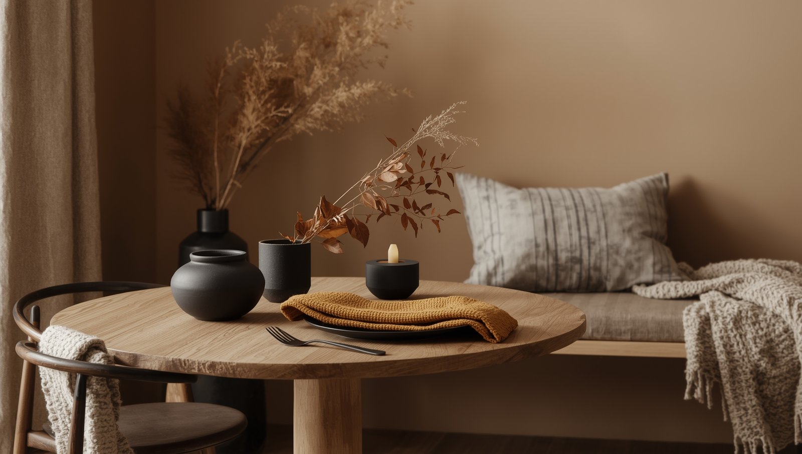
The trend forecasts for 2026 are practically screaming “snuggle up!” The overriding theme is a return to warmth, which means a departure from the sleek, cool grays and blues that have defined interiors for the past decade. Designers predict we’ll see fewer cool tones and more richer, nature-inspired hues that bring calm, organic comfort.
This collective desire is fueled by the simple fact that in our fast-paced society, we need spaces that offer restoration, comfort, and calm. Color selections are being revitalized with a renewed respect for nature, ecological wisdom, and historical practices. The result? Every color, whether it’s a deep red or a creamy beige, is designed to feel grounded.
Understanding the Psychological Pull
Brands like Dutch Boy Paints selected their Color of the Year based on key social influences, including nostalgia, off-grid romance, and mindful consumption. This selection process reflects a commitment to colors that signify comfort, timelessness, and community. Valspar’s choice of Warm Eucalyptus, for example, is a direct response to consumers’ desire for nostalgia and comfort, intended to create a haven for renewal.
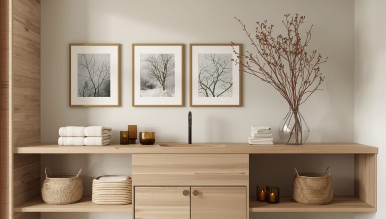
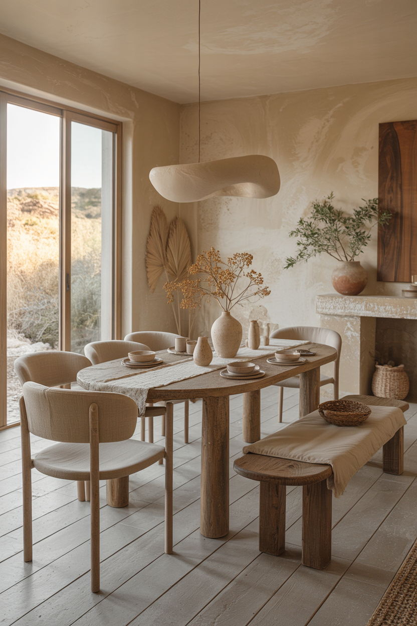
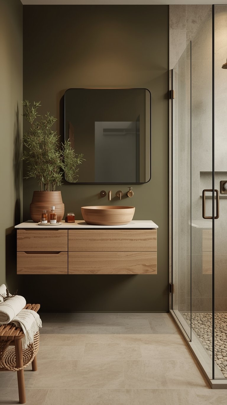
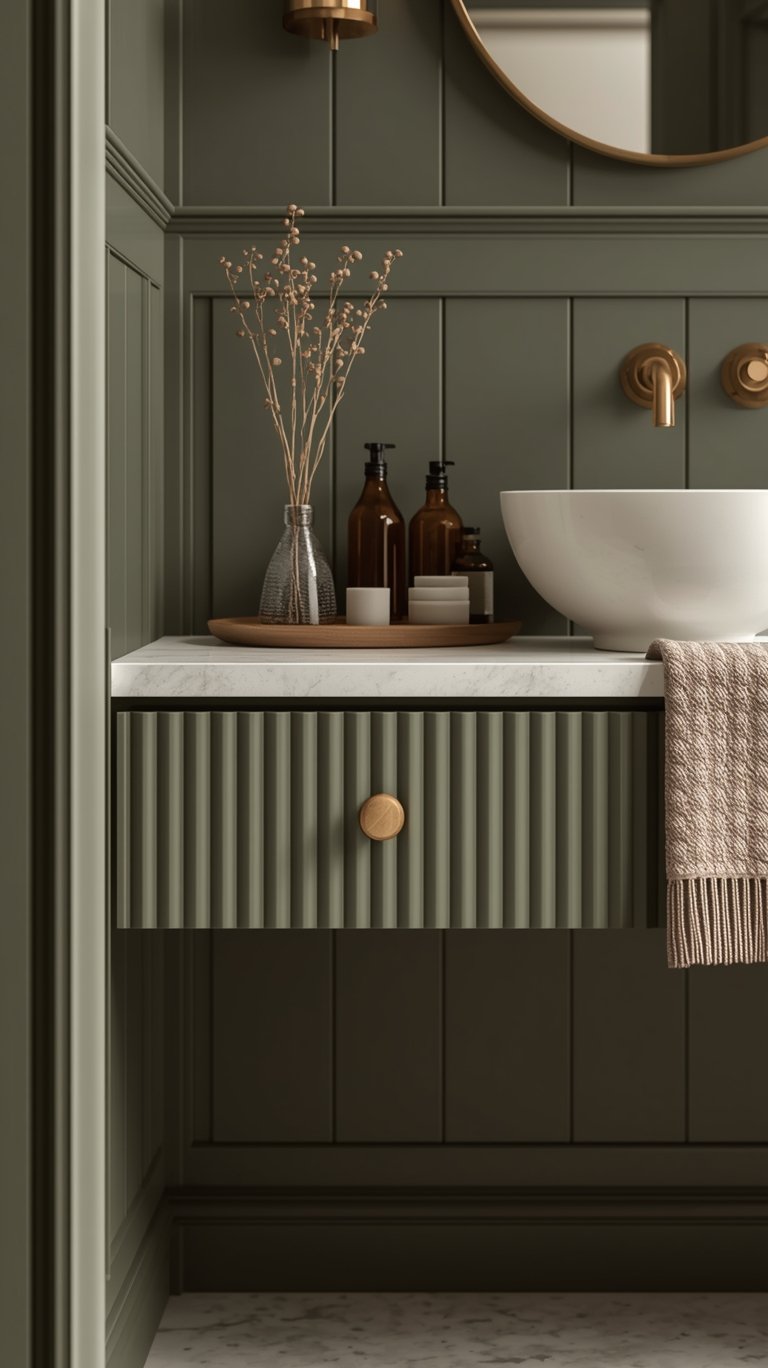
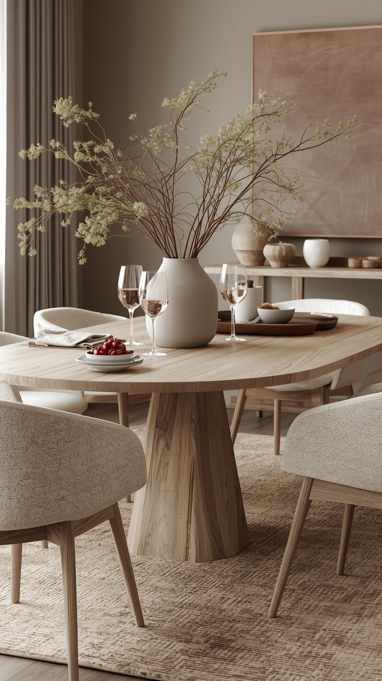
The Reign of the Timeless Neutral: Khaki, Ivory, and Beige
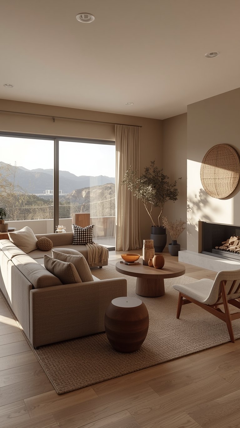
The biggest story of 2026 might be the overwhelming embrace of warm, sophisticated neutrals, marking them as the ideal choice for creating a timeless design.
Universal Khaki: The Versatile Anchor
The combined effort of Sherwin-Williams and HGTV Home introduced Universal Khaki (Shop || Sample) as their Color of the Year, signaling that neutrals are shifting to sandy shades.
- This hue is described as a warm, grounded neutral that captures the essence of life’s bare essentials, offering understated elegance and everyday versatility.
- The brand chose it because it’s a timeless, go-anywhere shade that works with a wide range of colors, creating a rich, inviting backdrop.
- Practicality: Universal Khaki is an easy choice for utilitarian spaces like laundry rooms and mudrooms, but also provides an inviting aesthetic in formal dining rooms or cozy living spaces. It’s flexible enough to be the anchor of a home’s color palette.
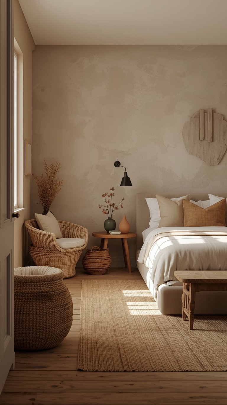
Soft Creamy Shades and Designer Go-To’s
Beyond khaki, lighter, softer neutrals are gaining traction for their comforting simplicity:
- Melodious Ivory (Dutch Boy Paints) is a soft, creamy beige selected for its nostalgic, elevated vibe. It perfectly supports the rise of slow living and nostalgia-inspired aesthetics.
- Epernay (C2 Paint) is a sophisticated soft ochre that conveys warmth and comfort. It’s an earthy ochre inspired by European influences, reminding us to appreciate the personal touches that make a home uniquely ours.
- Designers predict Sandstone Cliff (Behr // Shop || Sample) will be the go-to neutral shade. It provides warmth without heaviness, making it an ideal backdrop that allows bold accents to pop without drawing too much attention itself.
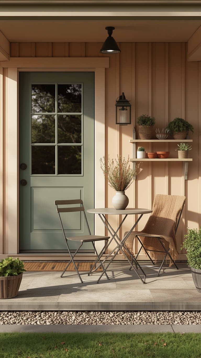
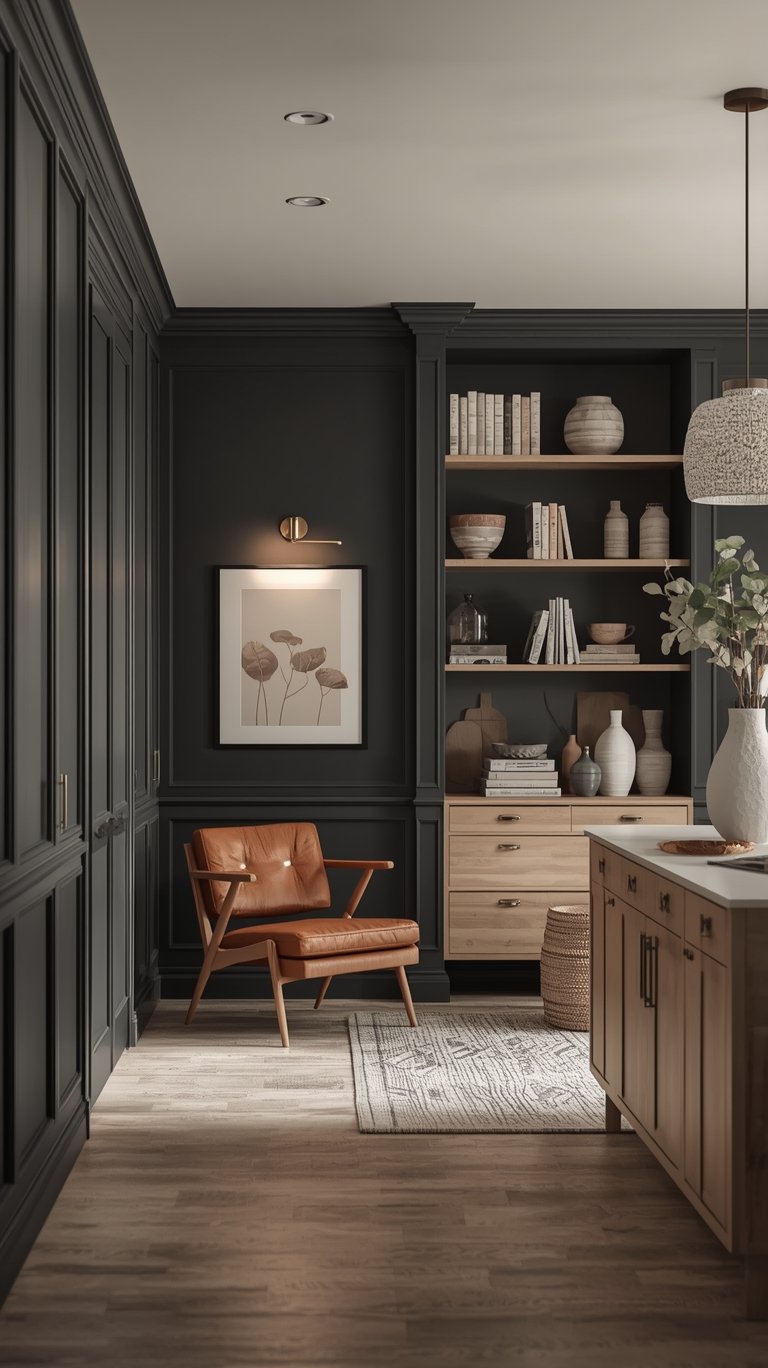
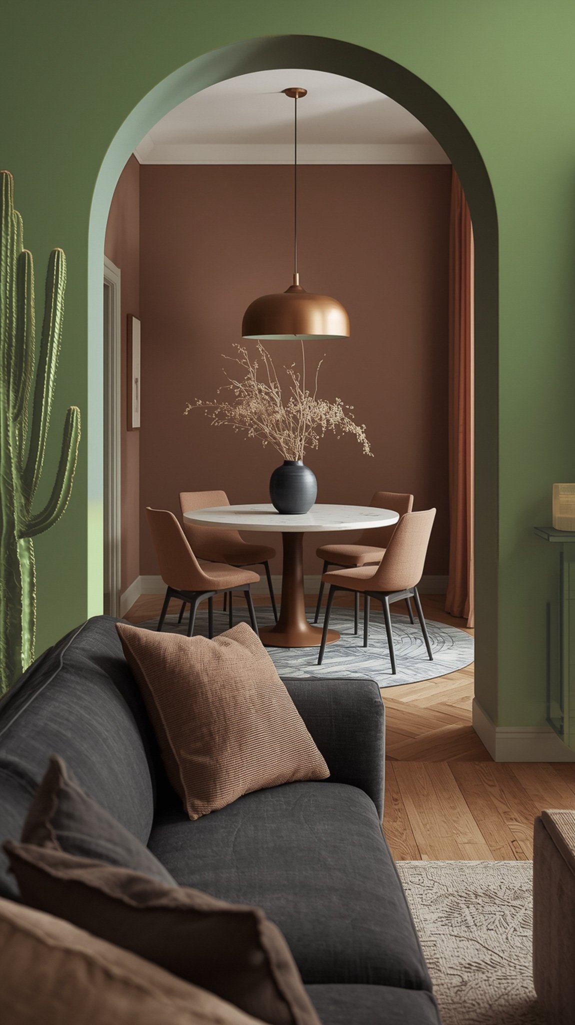
The Moody Moment Continues: Deep Tones and Saturated Jewel Hues
While neutrals are taking the foundation, several major brands affirmed that color confidence is back, doubling down on rich, deep, and Deep Saturated Color.
Hidden Gem and the Layering Strategy
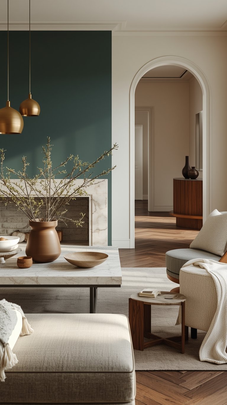
Behr kicked off the announcement season with Hidden Gem (Behr // Shop || Sample), a smoky jade—a deep, complex blend of blue and green.
- This jewel tone is both energizing and grounded.
- The Bold Move: Behr is embracing deep, emotional colors for the second consecutive year. They aren’t erasing the past; instead, they are building continuity by including past moody colors like Cracked Pepper (Behr // Shop || Sample)and Rumors in their 2026 palette, showing how everything fits together.
- Application Confidence: Hidden Gem is versatile enough to color-drench a powder room or act as a subtle accent color.
Deep Browns and Teals
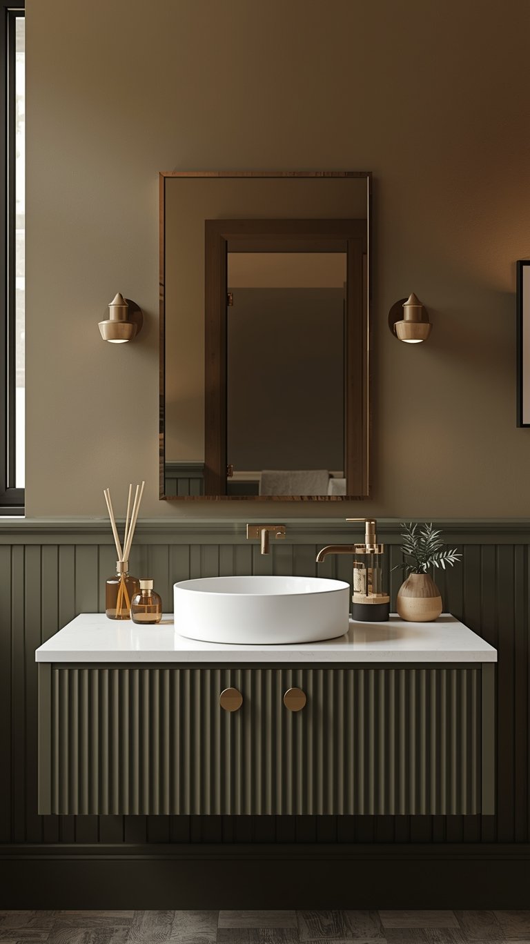
The brown color family, in particular, is having a major moment:
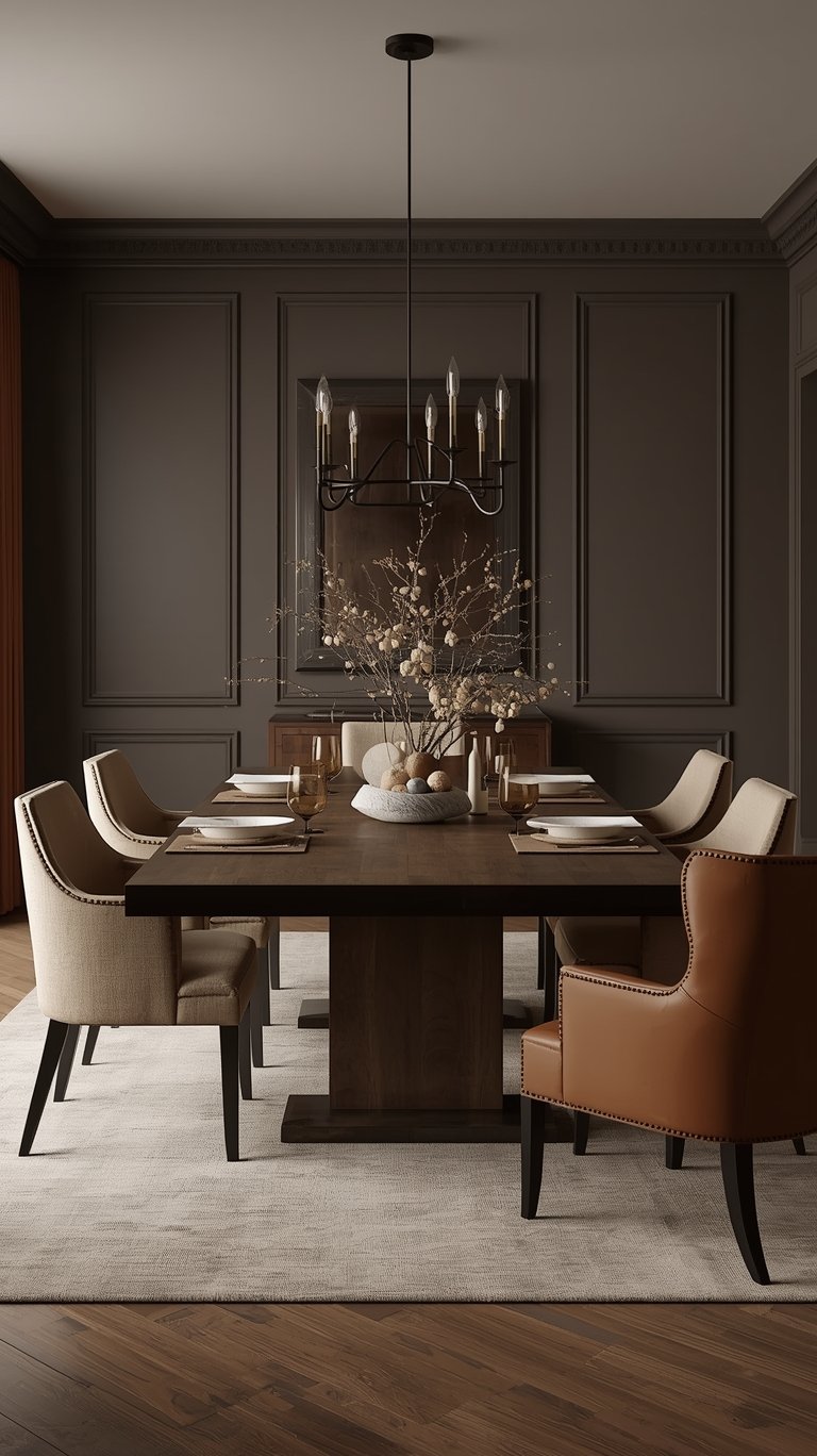
- Silhouette (Benjamin Moore // Shop || Sample) is a chocolatey espresso hue with moody charcoal undertones. It was inspired by the feeling of a perfectly tailored suit, embodying a growing appreciation for the brown color family and the resurgence of timeless pieces. We expect to see this hue in plenty of formal dining rooms, cozy bedrooms, and statement-making bathrooms.
- Midnight Teal (Valspar) is predicted to replace lighter blues, offering a rich blue with green undertones that is dramatic yet soothing. It has enough depth to anchor a space without overwhelming it.
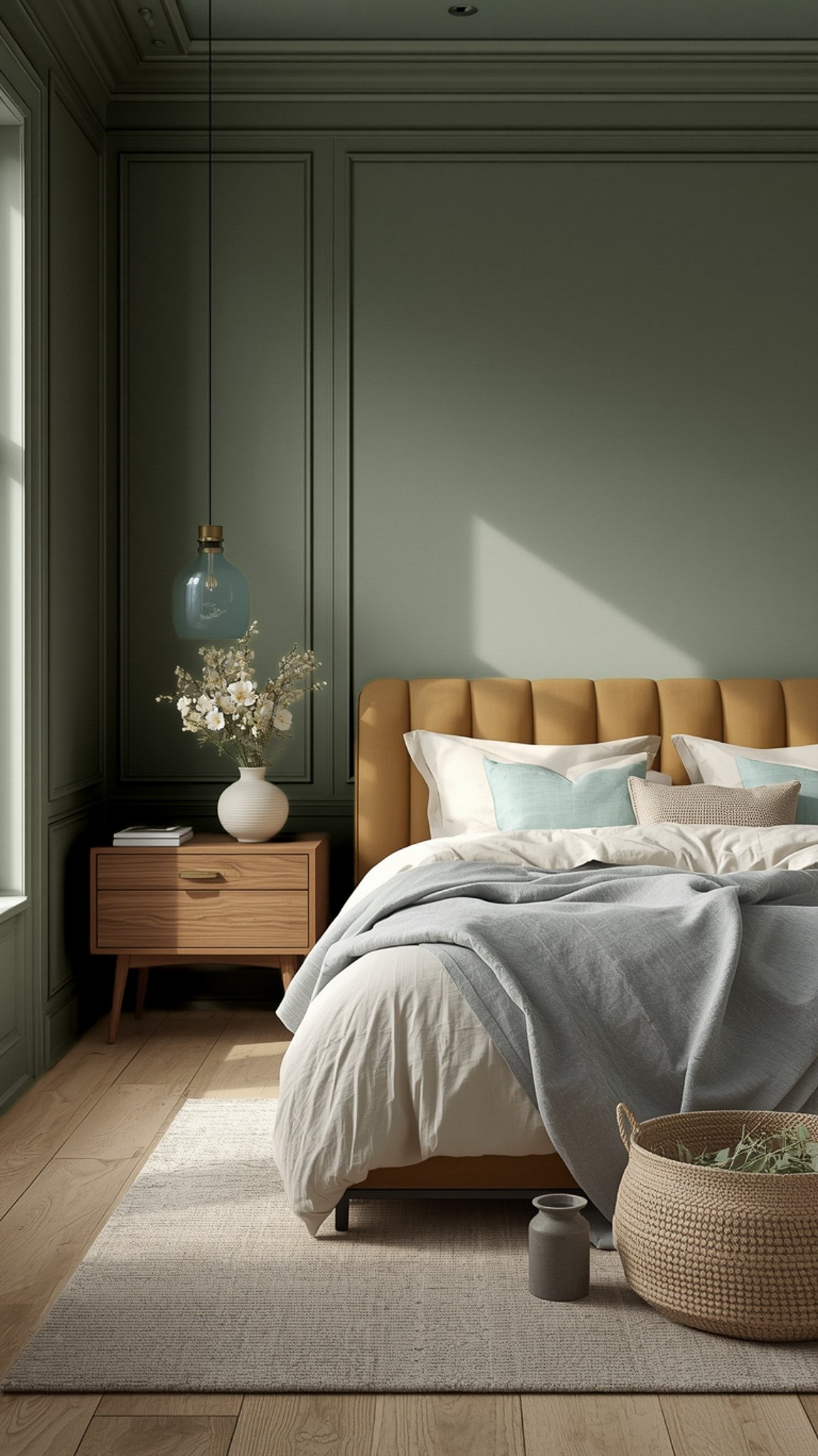
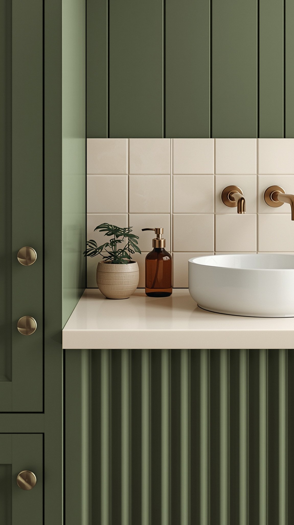
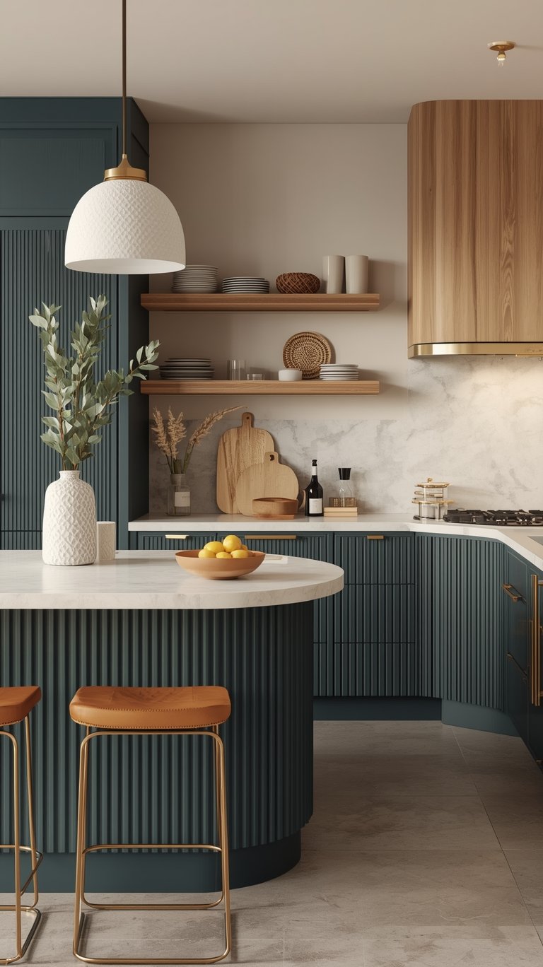
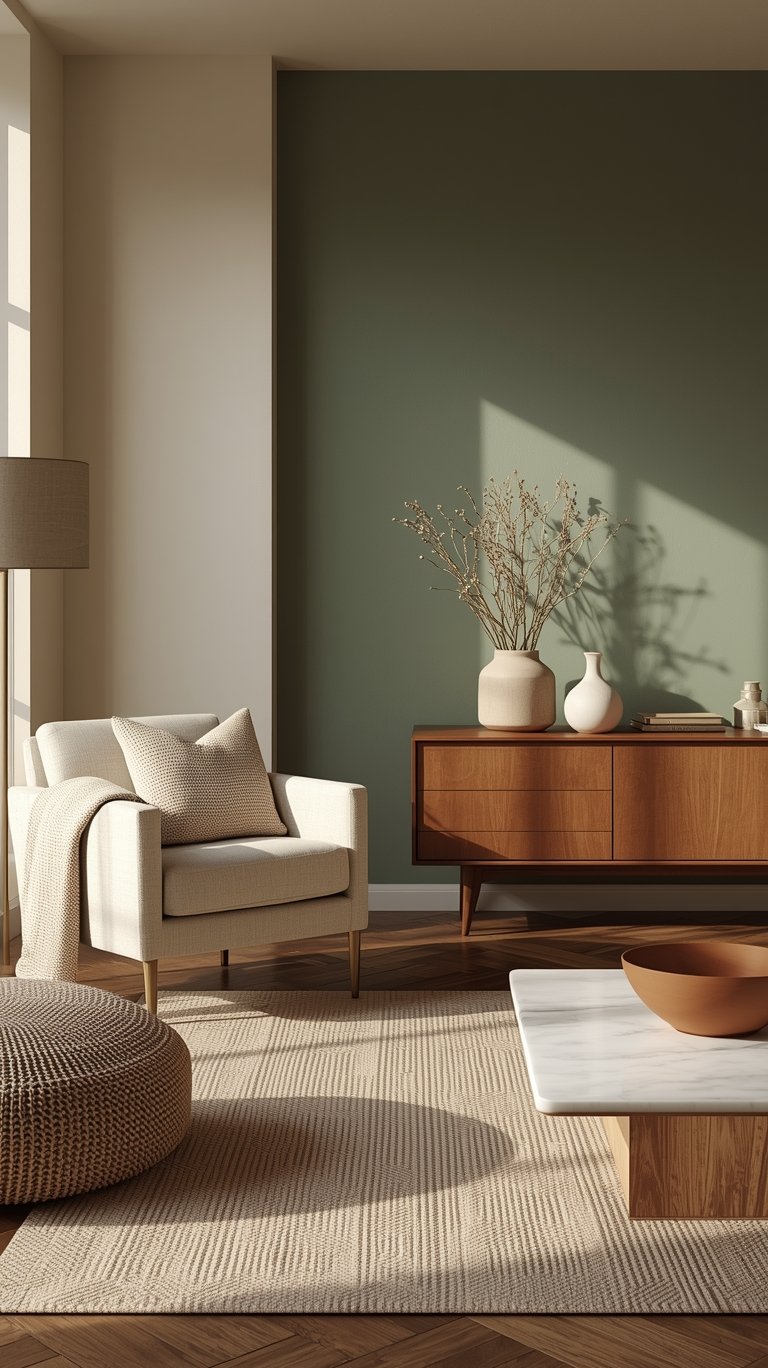
- Midnight Garden (Dunn-Edwards) is a deep, muted green that also serves as a dark hue, reminiscent of moss. Due to its muted nature, Dunn-Edwards notes it can act as a neutral in many spaces, similar to gray or beige.
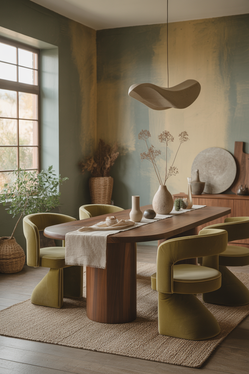
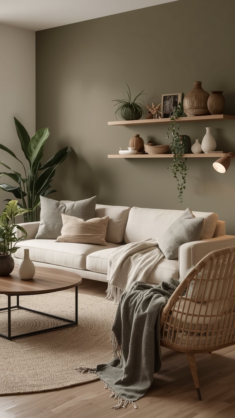
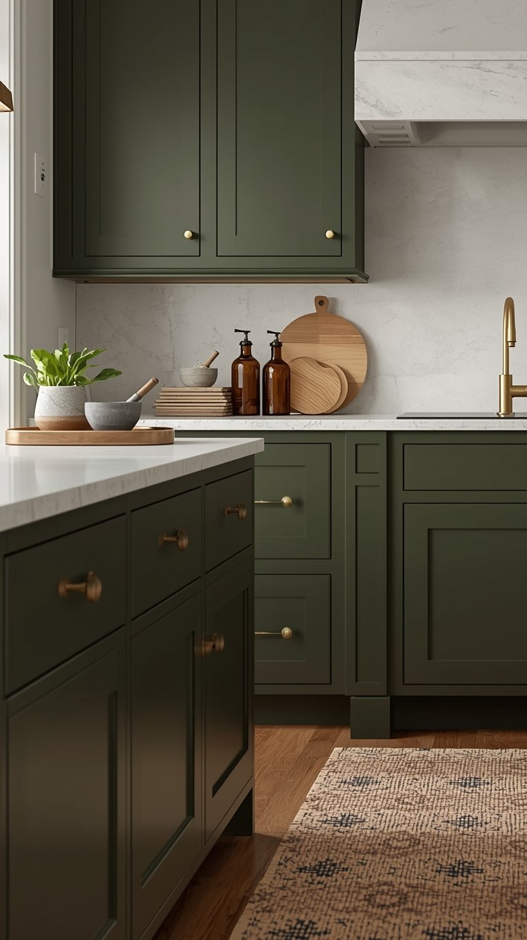
Grounded and Restorative: The Many Shades of Green
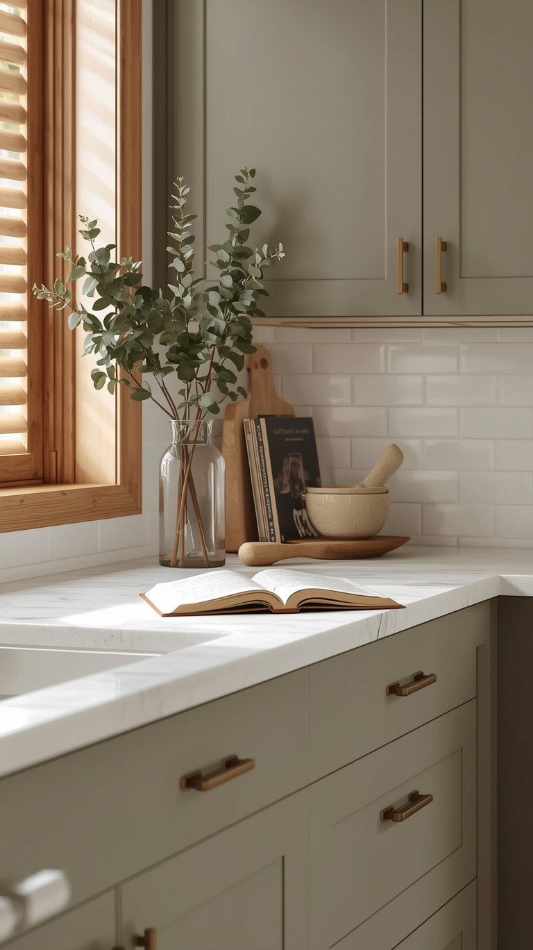
Green is a crucial component of the Paint Color Trends 2026 because it directly fulfills the desire to connect with nature inside our homes.
Warm Eucalyptus and Calm Sage
The emphasis is placed firmly on the warmer, softer end of the green spectrum:
- Warm Eucalyptus (Valspar) is a vintage-inspired variation of sage green. It is designed to be a calming and serene hue with warm undertones that create a grounded, welcoming mood.
- Warm Sage (Sherwin Williams // Shop || Sample) is predicted by designers to have a big moment. It inspires balance and an organic sense of ease, which is especially relevant as people look to make their homes more restorative.
- Olive Green (Benjamin Moore || Shop || Sample) is ideal for those who love their neutrals but want a touch of color. It’s timeless, elegant, and perfect for the softer, more relaxed mood people are leaning toward.
Earthy Greens and Muted Moss
Other nature-inspired greens solidify the trend towards earthy tones:
- Midnight Garden (Dunn-Edwards) is a deep, muted green that features calming earth tones. Its selection reflects a long-term trend in color and design.
- Cactus Valley (California Paints) is a medium earthy green selected to evoke calm and connection, bringing a sense of balance to every space.
- Secret Garden (Sharwin Williams // Shop || Sample) is a rich hue that expresses the Conscious Color trend as an organic shade within the Honest Essentials collection.
Beyond the Walls: Wood Stains and Spray Paint Focus on Details
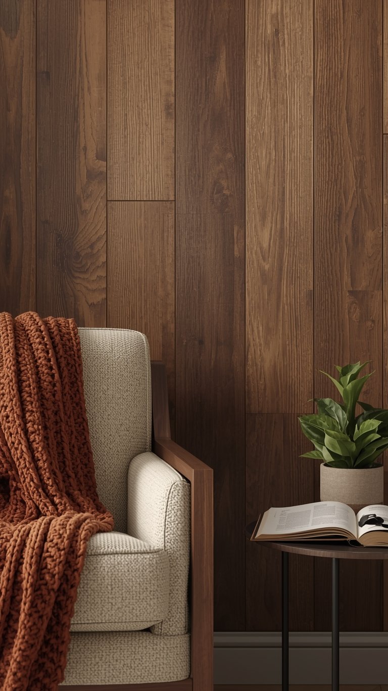
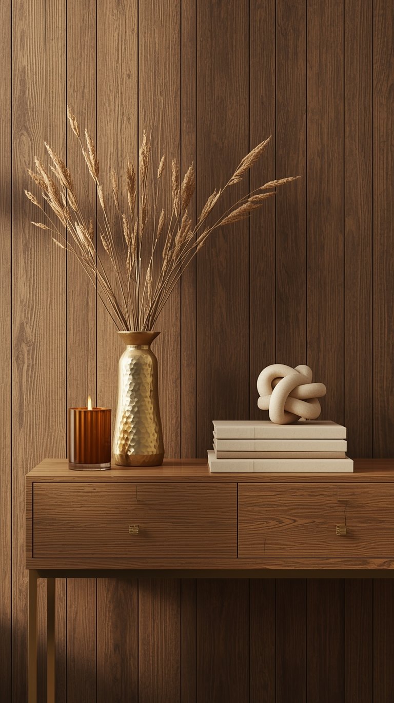
The Paint Color Trends 2026 aren’t just about paint; they’re about the finish, the stain, and the details that bring familiar comfort and character to foundational elements.
The Refinement of Wood Drenching
Minwax declared Special Walnut (Shop), an earthy brown stain, as its Color of the Year.
- This choice reflects a shift from light wood tones toward darker, textured wood accents.
- Minwax is seeing a trend toward “wood drenching“ spaces across ceilings and walls.
- Practicality: Special Walnut delivers a classic, dimensional tone that feels both familiar and fresh, making it a favorite whether you’re restoring a vintage piece or finishing a weekend project.
Sophistication in Small Projects
Krylon, the spray paint brand, selected Matte Coffee Bean, a dark neutral.
- This selection is rooted in the concept that homeowners want to create spaces that help them slow down, recharge, and reconnect.
- Matte Coffee Bean (Krylon // Shop) is a versatile, grounded, and effortlessly sophisticated hue.
- It’s designed for DIY enthusiasts to revive furniture, decor, light fixtures, and more.
Decoding the Complementary Palettes: How to Mix and Match
To help homeowners navigate these trends, brands release curated palettes that provide specific recipes for success. These collections show how to balance neutrals and bold hues seamlessly.
HGTV Home’s Honest Essentials Approach
HGTV Home by Sherwin-Williams‘ Honest Essentials collection demonstrates how to use Universal Khaki as a foundation while introducing complementary pops of color.
- Color Contrasts: The palette encourages celebrating contrasting colors to create a look that is simultaneously creative and calming. A stunning trio is achieved using Still Water, Creamy, and Reddened Earth.
- The Sunset Effect: You can create a peaceful retreat by bringing in complementary shades in broad swaths. For instance, Cordovan (Sherwin Williams // Shop || Sample) grounds the room while the lighter Reddened Earth (Sherwin Williams // Shop || Sample) absorbs the light.
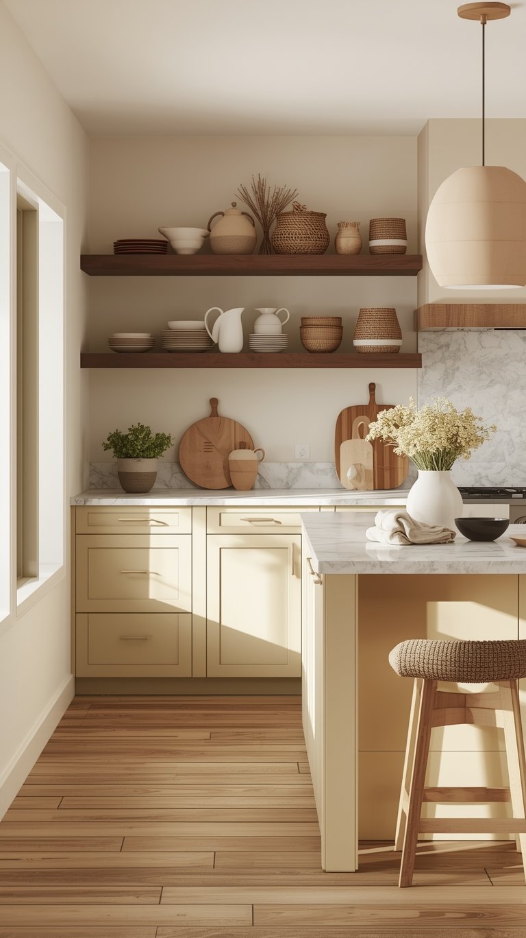
- Stepping Up Neutrals: In the kitchen, balance soft neutrals like Universal Khaki (Shop || Sample) and Creamy with an equally soft color, such as Lemon Chiffon (Sherwin Williams // Shop || Sample), for an unexpected nature-inspired backsplash.
Building Cohesion with Bold Colors
Even the deeper colors come with built-in pairing recommendations:
- Dutch Boy Paints created three curated color palettes centered around Melodious Ivory.
- Valspar suggests pairing Warm Eucalyptus with Groundbreaking (a cozy, deep brown) for comfort, or Degas Blue (a breezy light blue) for a playful touch.
- Dunn-Edwards notes that Midnight Garden pairs effortlessly with natural textures, warm neutrals, or sleek minimalism.
Using 2026 Colors in Specific Spaces
Knowing the color is one thing; knowing where to put it is the practical magic. Here’s how the experts recommend using these hues in your home:
Maximizing the Power of Dark Hues
When working with deep, Deep Saturated Color selections, strategic placement is key:
- Silhouette (Benjamin Moore // Shop || Sample) is highly recommended for formal dining rooms and cozy bedrooms.
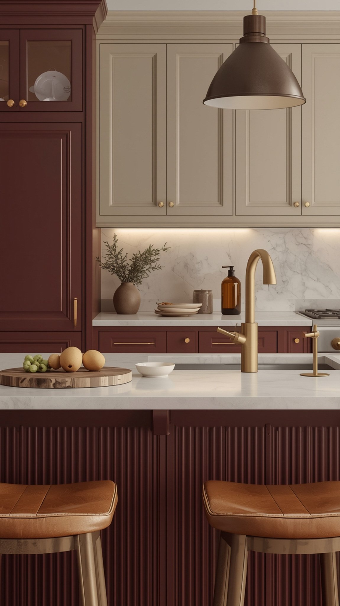
- Warm Mahogany (Glidden // Shop || Sample) is excellent for a color-drenched room (painting the trim, ceilings, and walls all the same color). Glidden experts also suggest using it on accents like moulding, ceilings, and furniture. For kitchens, try using it on an island or lower cabinets for a two-tone look that nods to nostalgic ’90s red kitchens. I bet it’d look great next to a bowl of fruit, though if I try to color-drench my pantry, I’ll probably need a map to find the snacks!
- Hidden Gem (Behr // Shop || Sample) can anchor a kitchen by painting it on the island or cabinetry.
Versatile Neutrals and Stains

The versatility of the neutrals makes application easy:
- Melodious Ivory is described as versatile enough for any space, from kitchens, exteriors, entryways, and bedrooms.
- Midnight Garden is a green that works everywhere—from cabinetry and walls to accents and exteriors.
- Special Walnut (Minwax Stain // Shop) can be used on flooring, cabinetry, architectural details, and other surfaces to add warmth and character.
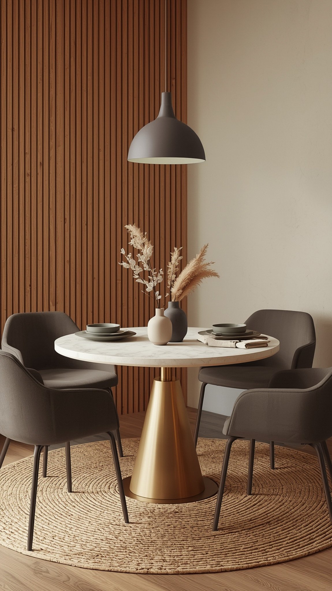
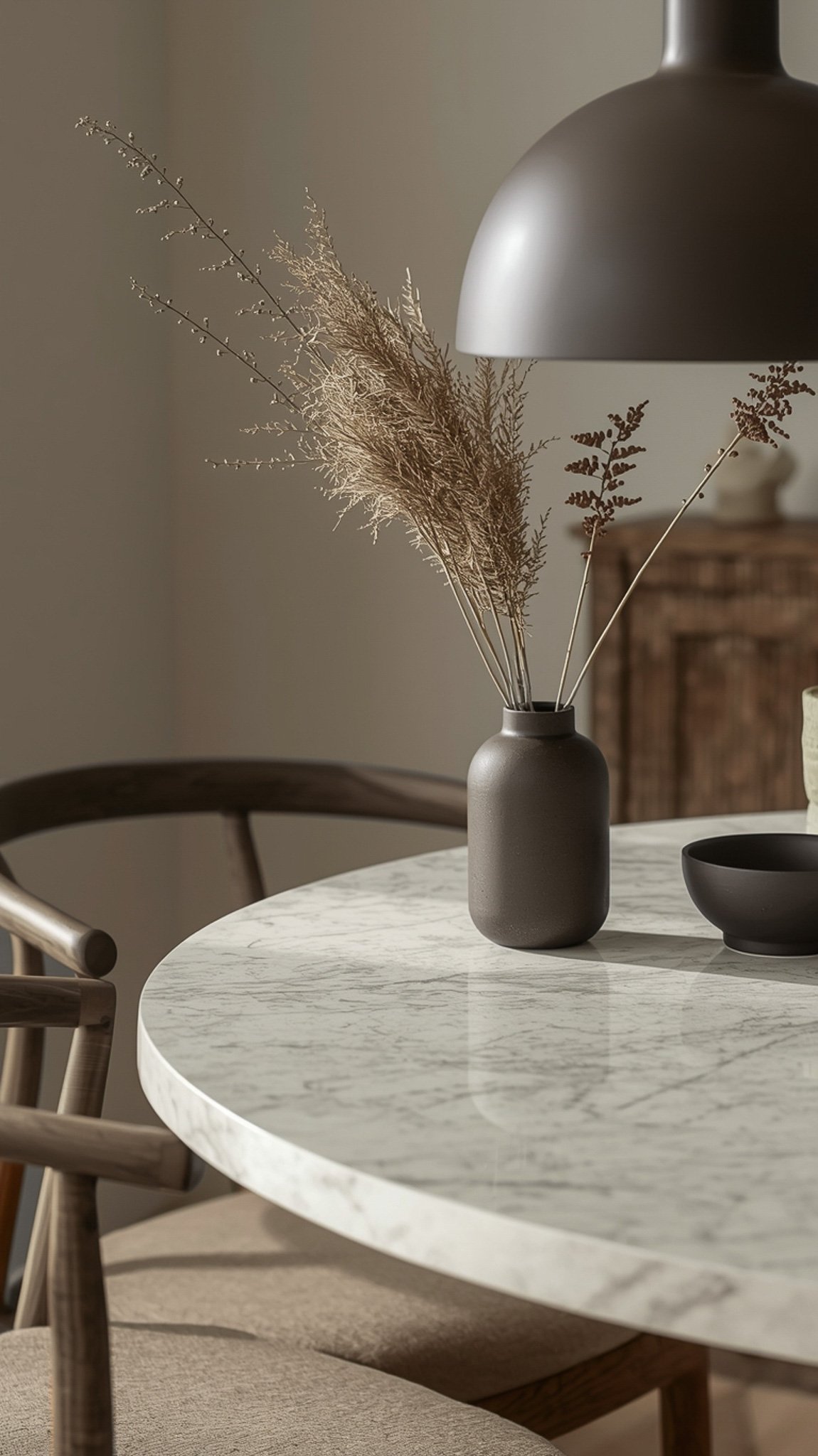
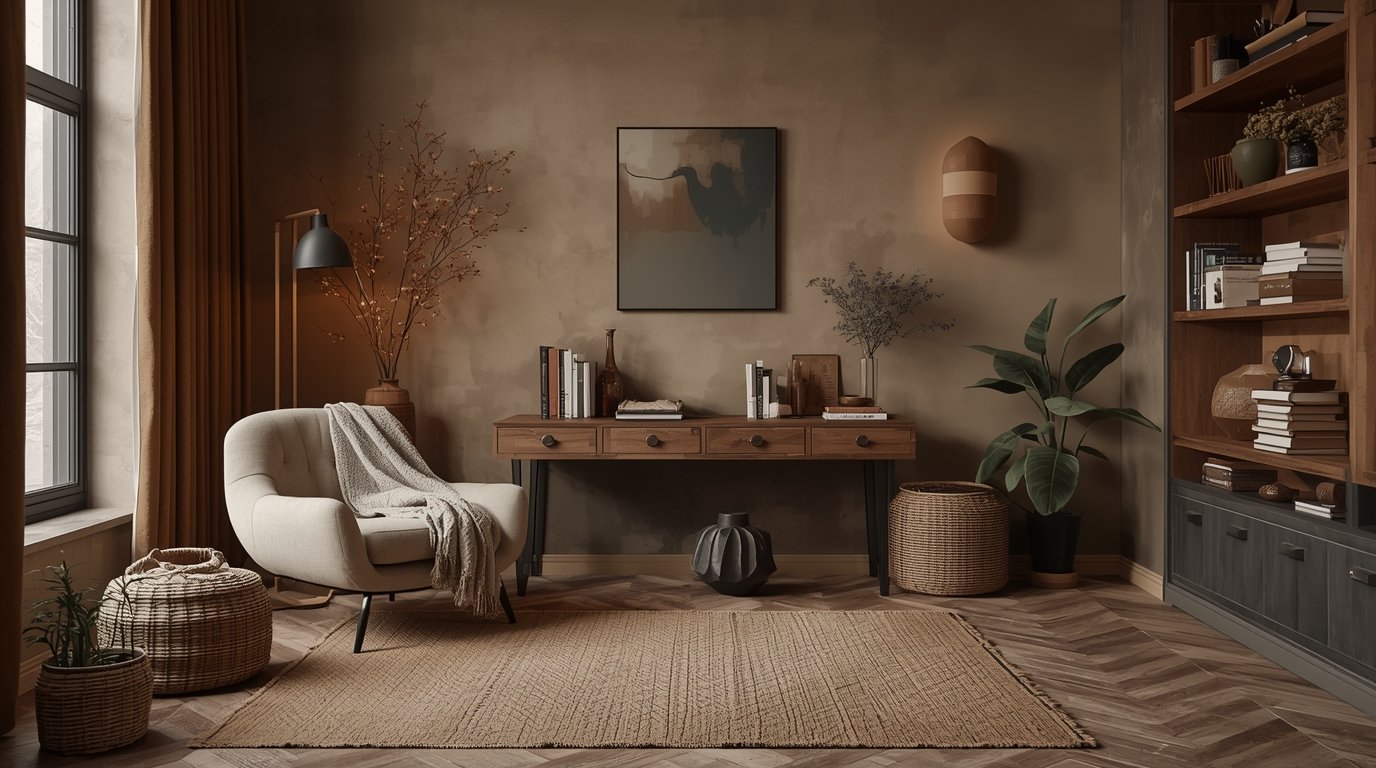
Pairing Textures: Metals, Stone, and Wood That Work Best
To achieve the “organic, elegant and authentic” environment that defines 2026, the chosen color must be complemented by the right materials and finishes.
Supporting Natural Materials
The deep connection to nature is achieved by blending these Paint Color Trends 2026 with raw elements:
- Pair Melodious Ivory with natural materials like travertine, veined marble, and dark-toned wood.
- Krylon suggests pairing Matte Coffee Bean (Krylon // Shop) with organic materials like wood, stone, and marble to encapsulate the vision of wellness and intentional living.
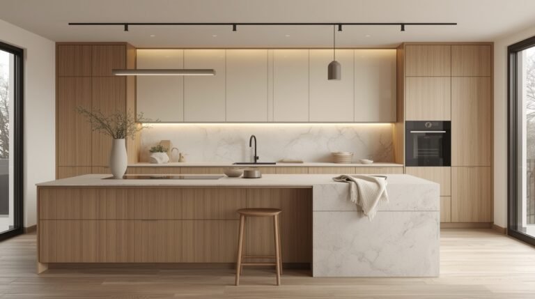
- For modern architecture featuring clean lines, use Universal Khaki (Sherwin Williams // Shop || Sample) to allow stone and wood to shine, especially when natural material is featured in sculptural moments of décor.
- Midnight Garden also pairs effortlessly with natural textures.
Accent Finishes and Metals
The hardware and metal accents should support the warm foundation:
- When using creamy neutrals like Melodious Ivory, look to warm finishes, such as brass, antique gold, and other aged metals, for complementary accents.
- When using a bold hue like Hidden Gem (Behr // Shop || Sample), pair it with warm metals, natural wood, and creamy whites to ensure it doesn’t overwhelm the space.
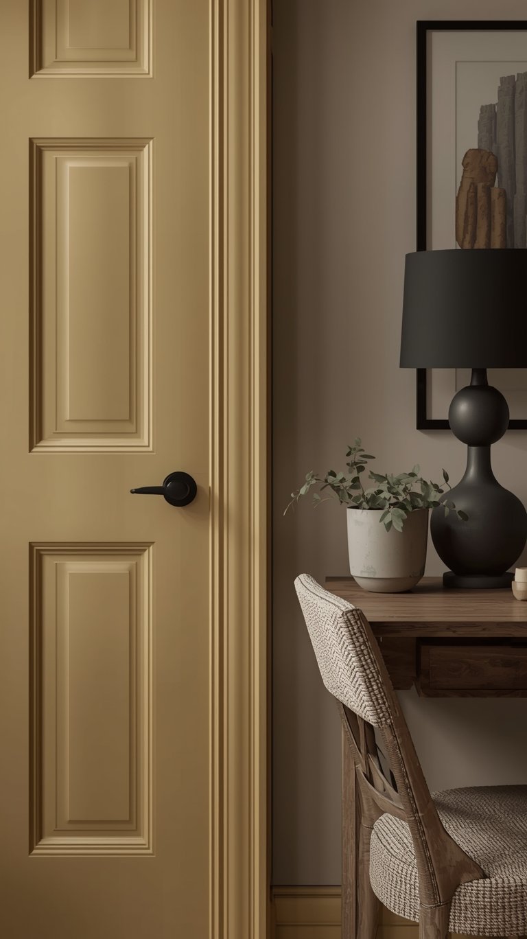
The Anti-Trend Trend: Choosing Colors Built to Last
One of the most profound aspects of the Paint Color Trends 2026 is the explicit desire for timelessness and longevity, moving away from fleeting trends. This is why many brands use words like “elegant” and “classic” in their descriptions.
Heritage and Timelessness
- Glidden’s Warm Mahogany (Glidden // Shop || Sample) is intentionally described as a “trend for anti-trend seekers”. This rich, grounded red is meant to be bold enough to grab your attention, yet reserved enough to make a truly timeless statement.
- Silhouette (Benjamin Moore // Shop || Sample) was selected due to the resurgence of timeless pieces.
- Hidden Gem (Behr // Shop || Sample) is designed to meet the desire for colors that are eternally stunning and stylish.
- Universal Khaki (Sherwin Williams // Shop || Sample) captures the desire for colors that feel natural and timeless.
Designers’ Predictions for Enduring Style
Designers reinforced the move toward lasting style by predicting specific sophisticated hues:
- Mahogany (Behr // Shop || Sample) is seen by designers as being everywhere because it’s incredibly warm and cocooning while still being refined.
- Terracotta (Sherwin Williams // Shop || Sample) is valued for being warm and soothing without being too pink or orange, offering a perfect balance of relaxed and inviting.
- Bronze Ochre (Benjamin Moore // Shop || Sample) is an adaptable color that brings a real sense of individuality. Its strength allows it to work beautifully in both north and south facing spaces.
My Favorite Shops
Discover your favorite paint colours for your next project at these premier online shops!
FAQ
Is there only one Color of the Year for 2026?
No, there isn’t one single color. Several companies—like Sherwin-Williams, Behr, and Benjamin Moore—declare their own individual Color of the Year based on their internal trend predictions and research into consumer moods.
How do I know which brand’s color to choose?
Start by looking at the core emotion or style described. If you want a Timeless Neutral foundation, look to Universal Khaki or Melodious Ivory. If you want a deep, Deep Saturated Color that brings drama, look at Hidden Gem or Warm Mahogany. The colors are meant to reflect the mood you are trying to create—whether it’s restoration or grounded elegance.
Why are so many colors dark again, following the moody trend of 2025?
While many 2025 colors were dominated by moody browns, purples, and mauves, the continued preference for deep tones shows that color confidence is back. Brands like Behr are layering these trends to show that deep colors are here to stay. Experts note that the deep tones, like Midnight Garden, can still act as a neutral in many spaces, just as gray or beige would, thanks to their muted nature.
Should I worry about painting a dark color in a small space?
You can absolutely use a deep hue, but heed the experts: test them first. Lighting and undertones can make a massive difference, especially when dealing with dark tones. Consider using a color like Hidden Gem to color-drench a powder room or anchor a kitchen island, rather than painting all four walls of a large room.
What is “wood drenching,” and how does Special Walnut relate to it?
Wood drenching is a trend that involves using a wood stain or finish across multiple surfaces in a room—sometimes ceilings and walls—to achieve a warm, continuous look. Minwax selected Special Walnut because it is a rustic, nostalgic shade that works well for this technique, adding warmth and character across flooring and cabinetry.
The Bottom Line
The Paint Color Trends 2026 point to a design year rooted in comfort, authenticity, and longevity. We’re trading out fleeting, cool trends for colors that feel deeply grounded.
Whether you choose the easy, anchoring grace of Universal Khaki, the soothing warmth of Warm Eucalyptus, or the luxurious depth of Silhouette, 2026 is the year to select a palette that supports your well-being and truly makes your space feel like home.
The materials and hues you choose should embrace the organic, elegant, and sophisticated style predicted for the year ahead. So grab your swatches, embrace the warmth, and start planning that project!
ABOUT the AUTHOR
TOKI; INTERIOR DESIGN & lifestyle CONTENT CREATOR.
Hey there! I’m Toki—the design-obsessed brain behind Dwell Studio 24. I’m a content creator passionate about interior design, photography, and creativity, living in a 77-year-old house with my husband and our awesome three kids. I write about interior design, furniture, home topics, and my lifestyle, including travel, recipes, skincare, and daily routines. I hope to inspire your next project and lifestyle!
ABOUT the AUTHOR
TOKI; INTERIOR DESIGN & lifestyle CONTENT CREATOR.
Hey there! I’m Toki—the design-obsessed brain behind Dwell Studio 24. I write about interior design, furniture, home topics, and my lifestyle, including travel, recipes, skincare, and daily routines. I hope to inspire your next project and lifestyle!