9 Ultimate Organic Modern Color Palette Ideas for a Timeless Home
Choosing the right paint colors for your space can feel incredibly overwhelming, especially when you’re trying to pin down the perfect Organic Modern Color Palette. You want a look that’s current but timeless, cozy but sophisticated, and above all, calming.
The truth is, many people get stuck trying to find that perfect balance. They worry about colors clashing, feeling too stark, or getting those sneaky undertones that pop up out of nowhere (we’ve all been there!).
But what if you had a foolproof formula? What if you knew exactly why certain colors work together and had expert tips on how to apply them the right way?
That’s what this guide is for. We’re diving deep into the core philosophy of this tranquil style, sharing the foundational colors you need, and giving you the technical insights that take the guesswork out of paint selection.
Key Takeaways
- Foundation is Neutral: The Organic Modern style relies heavily on neutrals (white, beige, taupe, brown, gray, black) to act as a canvas that creates space.
- Grounding is Essential: Use soft black or charcoal as a grounding agent or anchor to add depth and contrast, preventing the palette from feeling bland.
- Nature is Your Guide: Accent colors should be rooted in nature, such as moss green, ochre, and terracotta.
- Balance is Key: Achieving the aesthetic is “all about balance,” often meaning designers lean more heavily on modern architecture, while incorporating organic elements through smaller pieces and textures.
- Always Test: Never buy gallons until you’ve tested a physical sample on your wall—light, undertones, and even the mixing machine will impact the final color.
The Search for Sophisticated Calm
You might be wondering, what exactly is Organic Modern design? It’s a beautiful aesthetic because it finds harmony in contradiction.
What is the Meaning of Organic Modern?
Organic Modern design is a soothing combination of two opposing interior design styles: modern and organic.
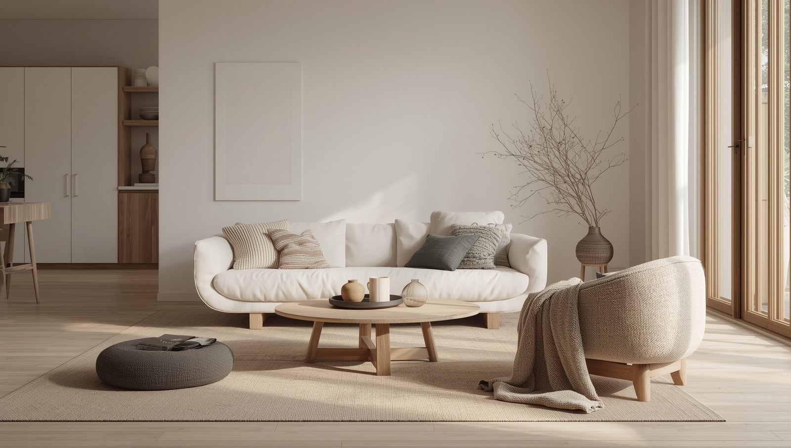
- Modern Design: This component is typically classified by clean lines, smooth textures, and often features a neutral and bright color palette. It brings sophistication and structure.
- Organic Design: This component is characterized by natural materials that originate in nature. Think rugged textures like natural stone, wood materials, leather, and natural fabrics like linen and cotton.
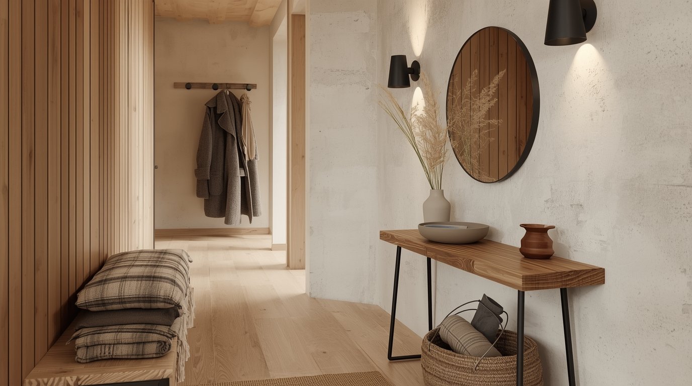
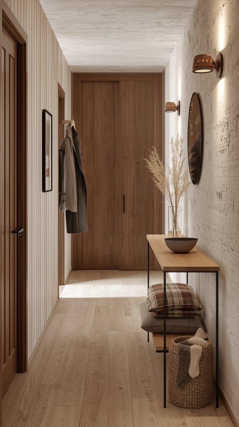
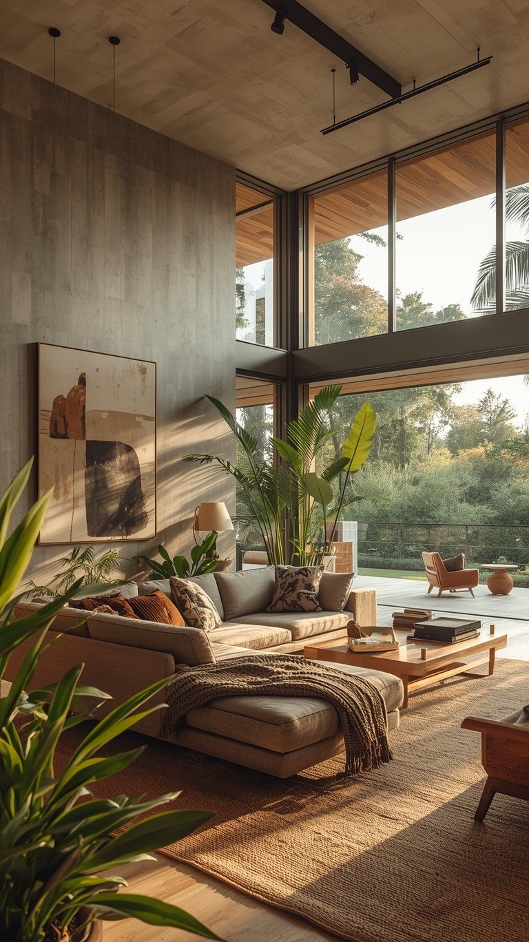
The genius of Organic Modern interior design is that it combines these two styles to create a contemporary home that feels unpretentious, laid back, and cozy. This style is specifically great for creating a calming and relaxing state. The entire goal is to feel connected to the natural beauty of the earth while still reading as sophisticated.
Is Organic Modern Style Timeless?
Absolutely, yes, this style is absolutely timeless. Because its core focus remains on warm neutrals and natural elements, it allows the design to stand the test of time. Its focus on simple, earthy hues means it can seamlessly blend and morph into other current styles—like Japandi or Warm Minimalism—with just a few small adjustments. This aesthetic is often referred to as a “Wabi Sabi palette” because of its appreciation for natural, simple beauty.
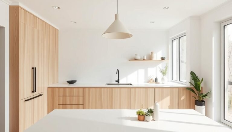
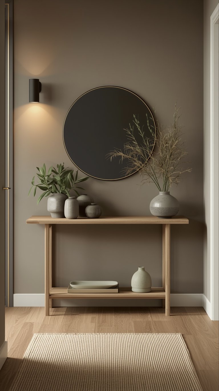
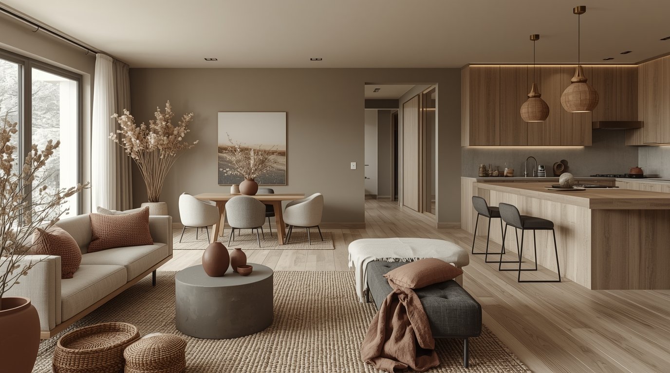
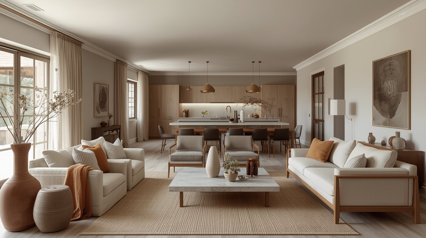
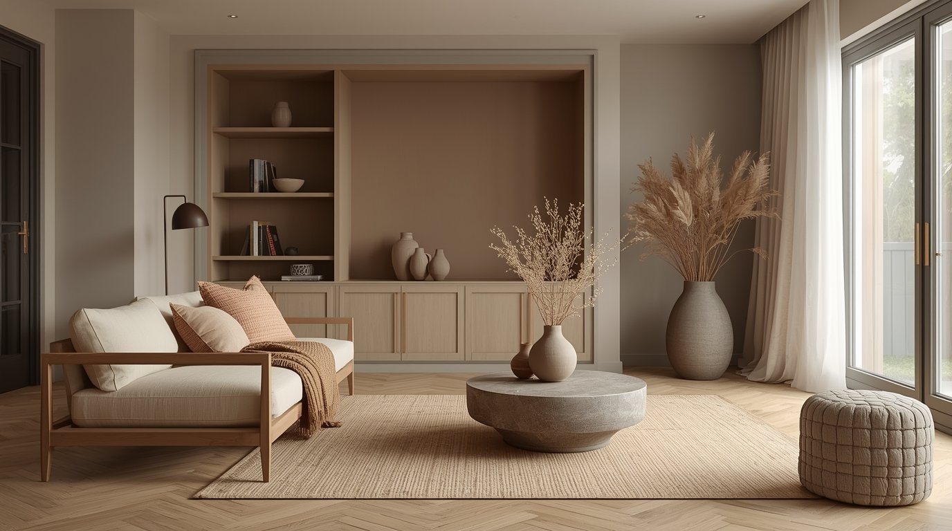
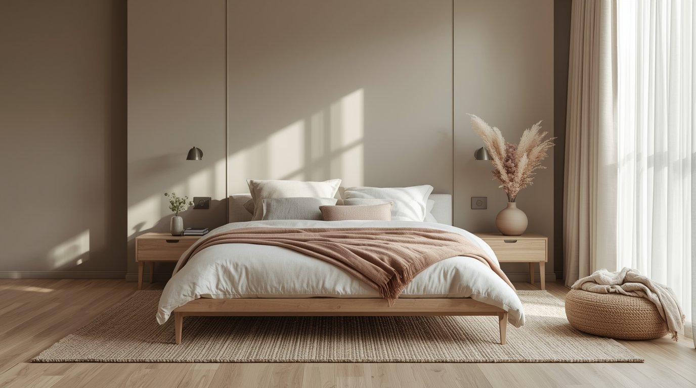
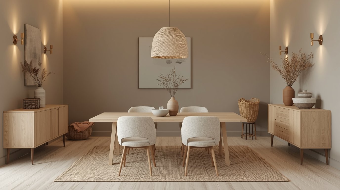
Building the Neutral Foundation
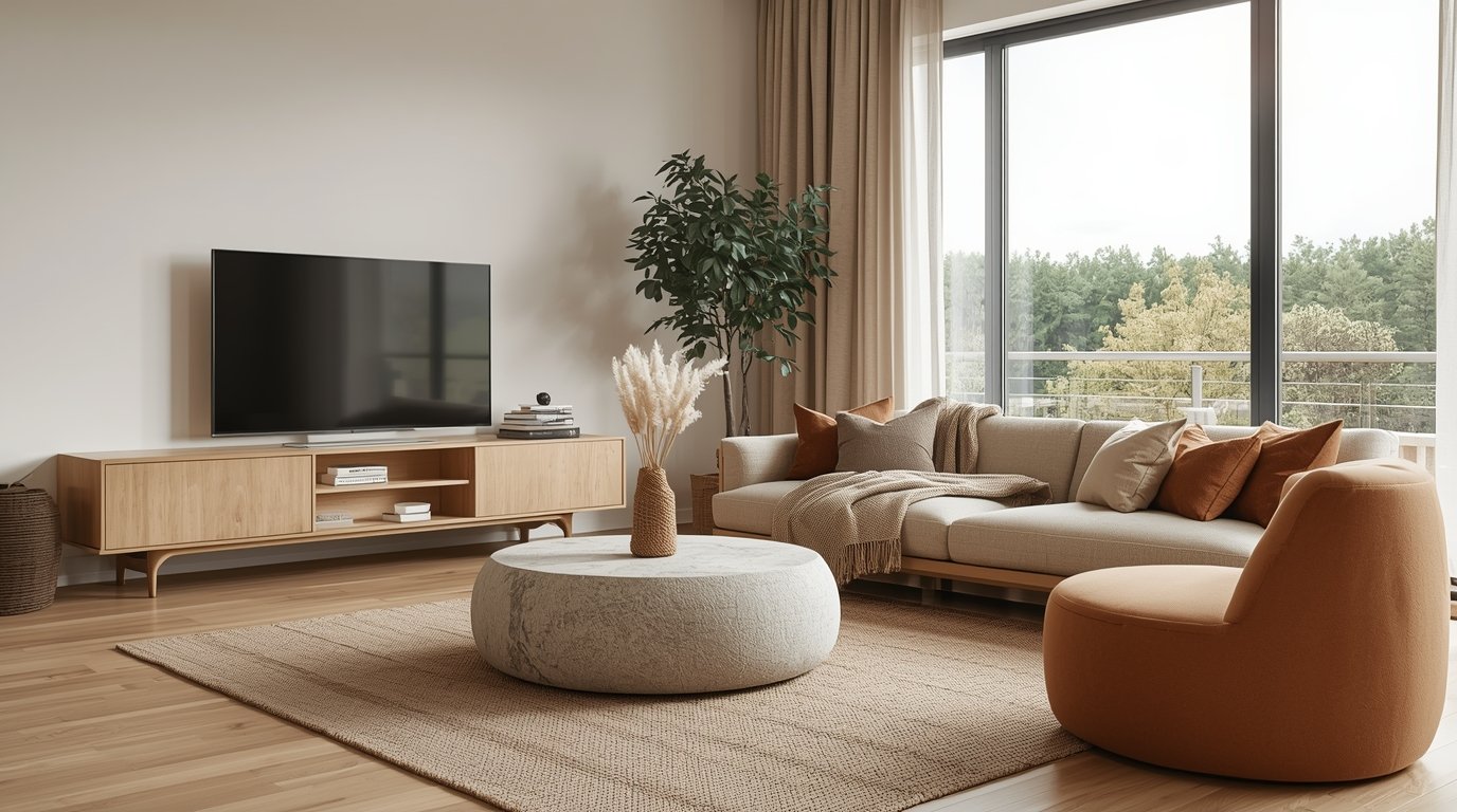
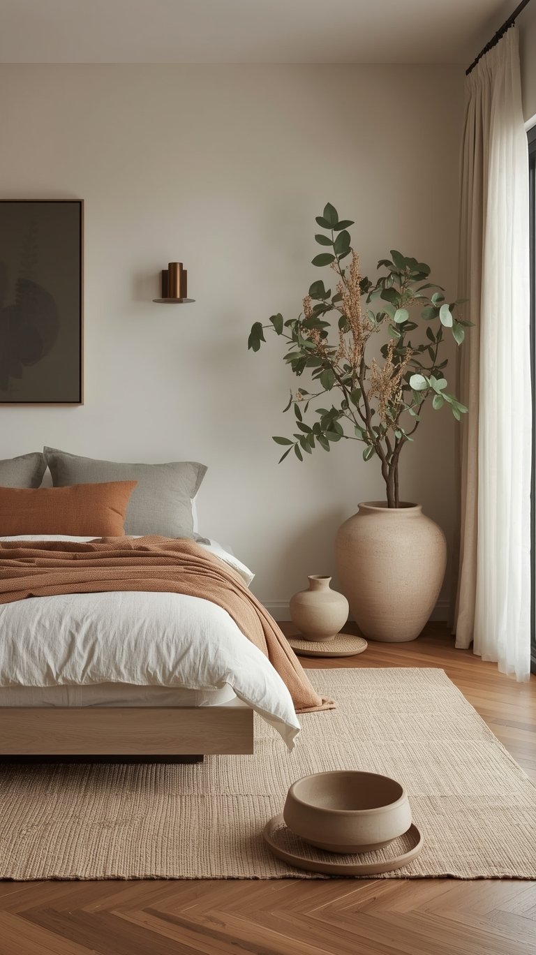
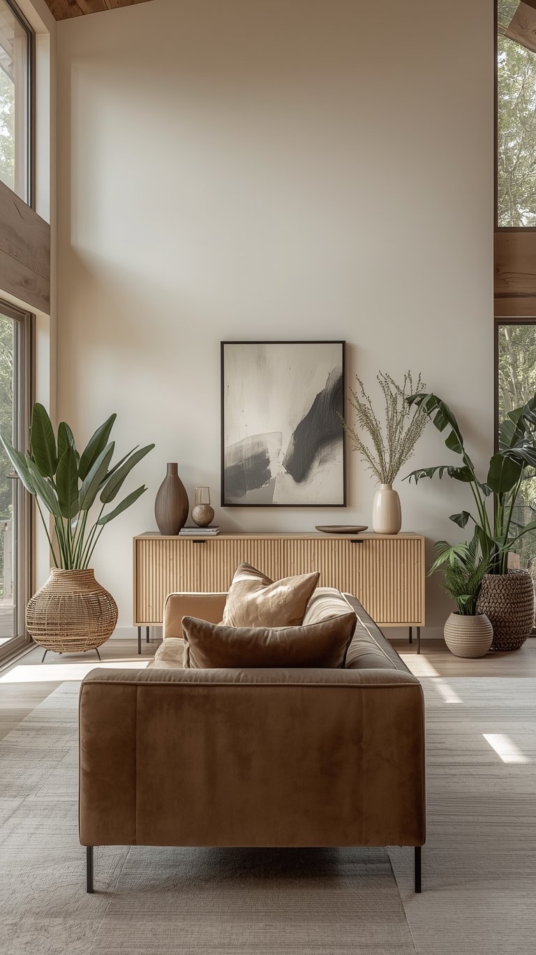
If you want to create this serene look, you have to start with the essentials. A true Organic Modern Color Palette leans heavily on neutrals as the foundation of the room. These neutrals are your canvas, allowing the other design elements to shine.
The key neutral families you need are white, cream, taupe, tan, brown, and black.
1. Choosing Creamy Off-Whites and Warm Neutrals
When selecting your base whites, skip the cold, sterile hues.
- Avoid Stark White: There’s nothing really pure, clean, sterile white in nature (other than maybe snow), so you want to reflect that natural feel with an off-white.
- Preferred Off-Whites: Colors like Benjamin Moore White Dove or Vanilla Milkshake are staple choices, often preferred for trim and cabinetry. Vanilla Milkshake, for example, is described as being a little more grayed out than a pure white, but still has a versatile touch of warmth.
- Behr’s Base: Behr suggests using its Even Better Beige on walls and Blank Canvas for cabinetry to create a seamless look by juxtaposing warm shades.
2. Anchoring with Earthy Grays and Browns
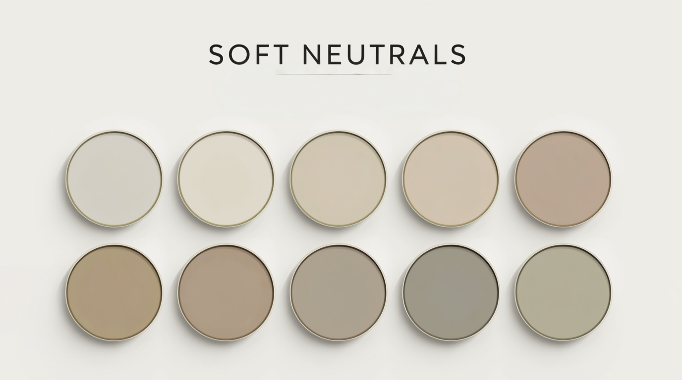
To make the space feel grounded, you need neutrals with earthy depth:
- Taupe and Tan: These are essential base colors. When you look for grays, look for those that have brown or earthy stone qualities to them.
- Complex Neutrals: Benjamin Moore Abalone is a fantastic main color, bringing an earthy Stone quality that leans towards a “grougy gray.” This color feels grounded and is a more interesting alternative to simple beige. Similarly, Metro Gray provides a “hazy gray Hue reminiscent of a foggy morning,” tying nicely to the organic feel.
- Wood Species: Brown is often integrated naturally through the use of various wood species. Urban Bronze (Sherwin Williams) can be used on interior doors to add “warm drama without being straight black or grey”. Behr Black Mocha is favored for its warm brown undertones.
3. The Role of the Grounding Agent
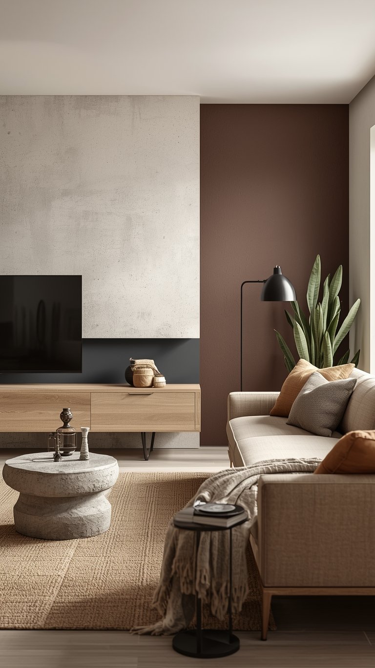
Even in a soft, cozy space, you need structure. Darker hues are used as a grounding agent to prevent the space from floating away.
- Black Accents: Soft black or charcoal tones, often applied through metal finishes, furniture, or decor, add depth and contrast.
- Black Mocha and Charcoal: Behr’s Cracked Pepper is specifically recommended because it can serve as an anchor within a space, and in combination with lighter neutrals, the darker hue is visually grounding. Benjamin Moore Silhouette is also a popular exterior and accent choice. This color was also chosen as the Color of the Year 2026!
Nature’s Essential Accents
Once your neutral foundation is established, you can layer in colors that are literally the color of nature. These accents are what transform a neutral box into a serene sanctuary.
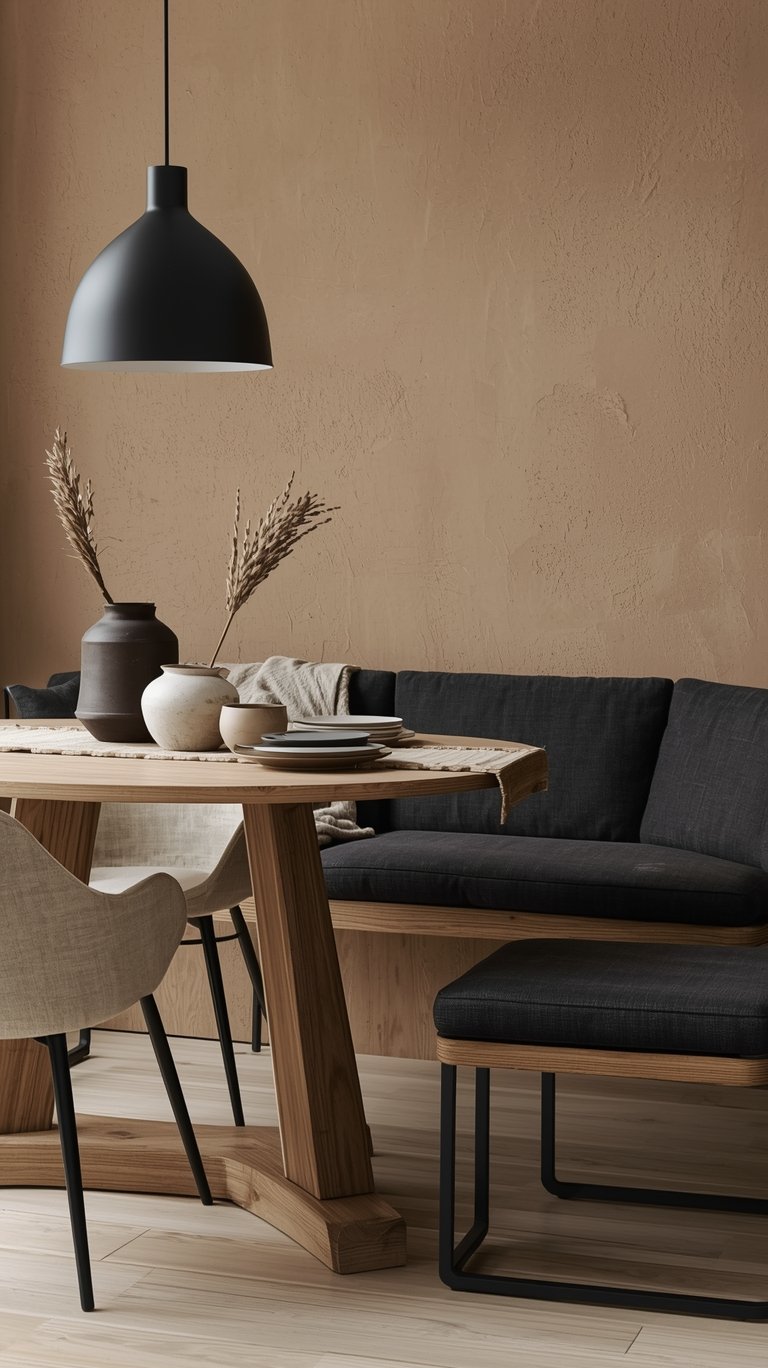
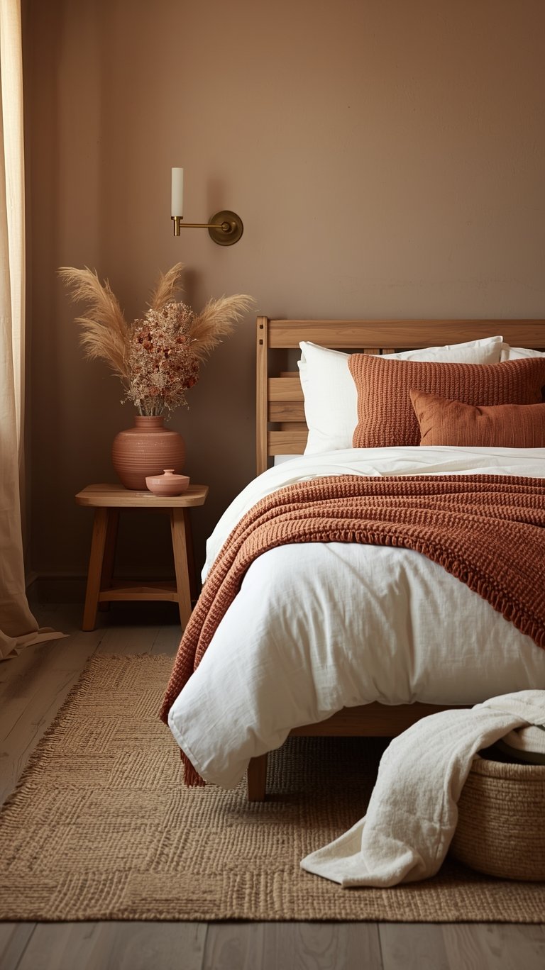
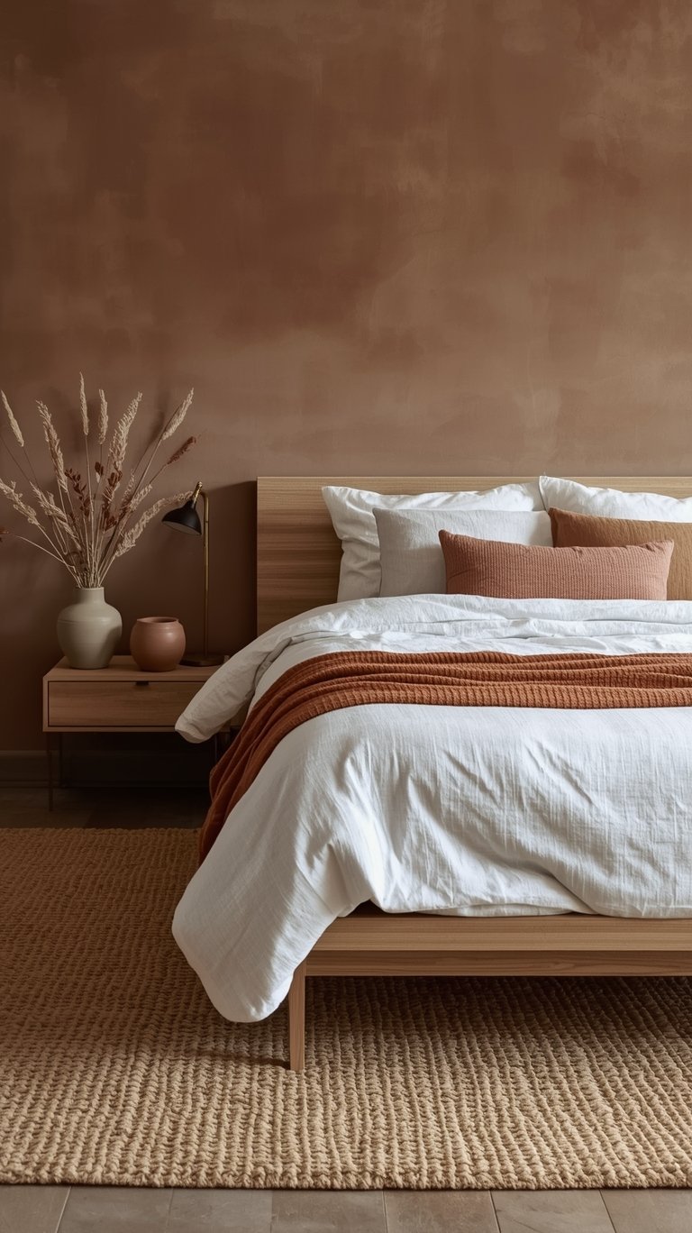
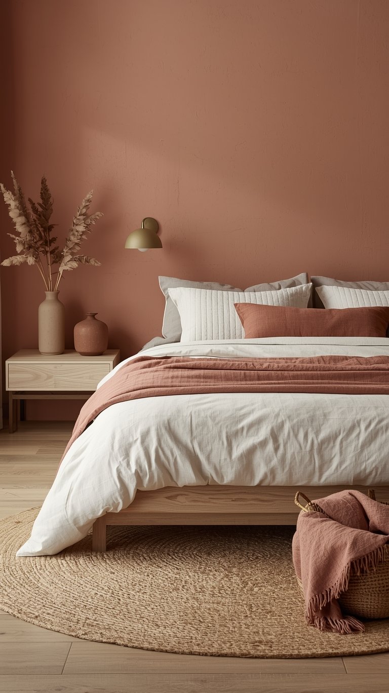
4. Infusing Warmth: Ochre and Terracotta
To prevent your neutral space from feeling boring, infuse warmth with sun-baked hues.
- Ochre: With its golden undertones, ochre brings a sense of optimism and energy. Natural ochres are particularly soothing and work well when layered with a base of neutrals.
- Terracotta: This rich, earthy red-orange adds a grounded and nurturing element. Paired with organic whites, this palette creates a warm, Mediterranean-inspired glow. You can introduce these hues through accent pieces, clay pottery, or upholstered items.
- Rust and Linen: Rust is described as that warm burnt hue that feels like late summer sunsets. When paired with natural linen, it creates a space that’s both elevated and earthy, channeling a sophisticated southwestern vibe.
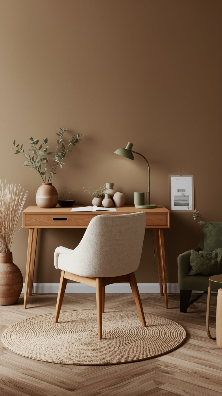
5. Introducing Greens for Botanical Calm
Green is a must-have accent because it effortlessly bridges nature and sophistication.
- Olive Green: This hue creates a serene and grounded aesthetic, working beautifully with warm neutrals like soft taupe or sandy beige.
- Moss Green: This color is deeper and moodier, creating an interior that feels like a forest retreat wrapped in modern elegance.
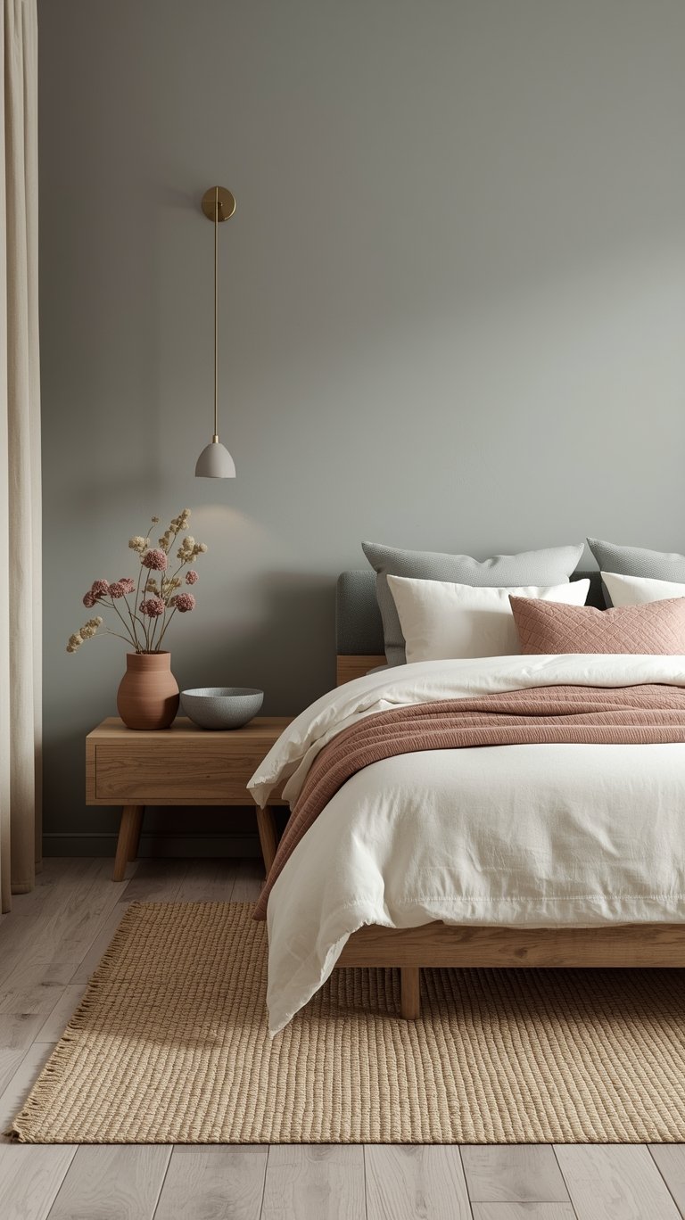
- Sage Green: A modern classic, sage is gentle, organic, and incredibly calming, perfect for creating a clean and refreshing sanctuary. Muted olive green with subtle gray undertones is recommended if you prefer earthy colors.
6. The Power of Muted and Earthy Tones
If you prefer softer drama, the focus should be on muted, ruddy natural tones.
- Nurturing Hues: Opt for soft caramel, cinnamon brown, dusty rose, and warm taupe to create a nurturing and inviting atmosphere that provides a sense of comfort and security.
- Clay Pink: This is the unsung hero, soft, romantic, and earthy. When paired with warm gray, it offers gentle color that keeps the space grounded and chic.
- Blue-Green Grays: For a cooler, yet calming palette, blue-green grays (like slate blue) are perfect, creating a serene atmosphere reminiscent of a coastal getaway while bridging the contemporary feel of gray.
The Palette Pyramid Strategy
It’s easy to throw a bunch of pretty colors together, but to create a cohesive, whole-home flow, you need a strategy. Designers often use a structured approach, like the Palette Pyramid, to ensure undertones and color families blend beautifully without guessing.
The Palette Pyramid starts at the top with your core color and works its way down to richer, more saturated accent tones.
7. The Main Color: The Default Choice
If you could only paint your entire house with one color from your palette, this would be it.
- Abalone (Benjamin Moore): This color is a perfect example of a main color in an Organic Modern Color Palette. It’s an interesting alternative to a traditional beige because it brings in that earthy stone quality and a “grougy gray” depth. With a Light Reflectance Value (LRV) of roughly 62, it’s bright enough to reflect a decent amount of light without looking washed out or boring.
8. Support Colors: Trim and Secondary Walls
Support colors are usually more neutral-leaning and are great for trim or secondary wall options.
- Vanilla Milkshake (Off-White): This is the perfect off-white companion to Abalone. It’s not your traditional clean, stark white, but rather an off-white with a touch of warmth and a more grayed-out feeling that suits the natural theme.
- Metro Gray (Secondary Wall): Sharing similarities with Abalone but leaning slightly darker (LRV 58), Metro Gray offers a more classic gray feeling. It provides that earthy, grounded feeling that ties perfectly into the overall color scheme.
9. Finishing Colors: Accent and Richness
These are your accent choices—they have a little more richness or saturation but still stay firmly within the organic theme.
- Plymouth Rock (Taupe): This color is darker than the main and support colors (LRV 42) and is a proper taupe, meaning it combines brown and gray in a balanced, substantial way.
- Stardust (Bronze/Green): This color pushes towards a dark, warm direction, sometimes featuring a bronze quality that takes it into a green direction. This subtle green undertone gives you some natural differentiation within the palette.
- Stone (Darkest Accent): This color is the darkest finishing option, yet another combination of gray and brown. Though dark, it can still be suitable for an accent wall or used as a bold finish without overwhelming the room. Remember, you don’t need to use all the finishing colors; they are usually used as a “Finishing Touch”.
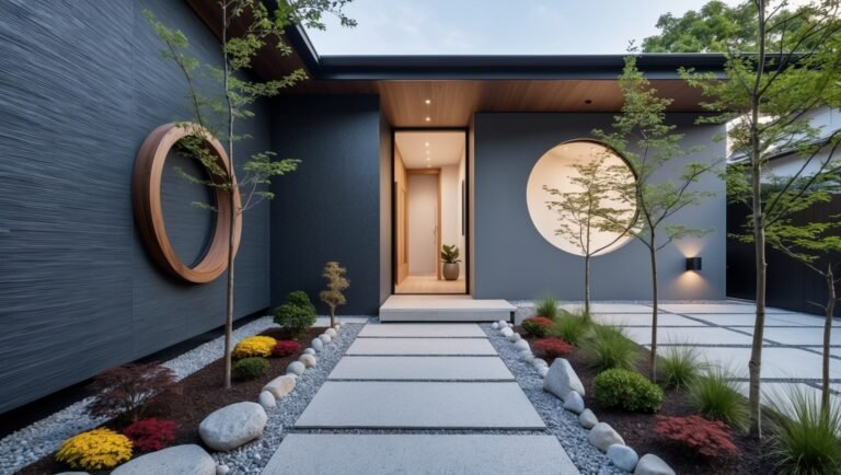
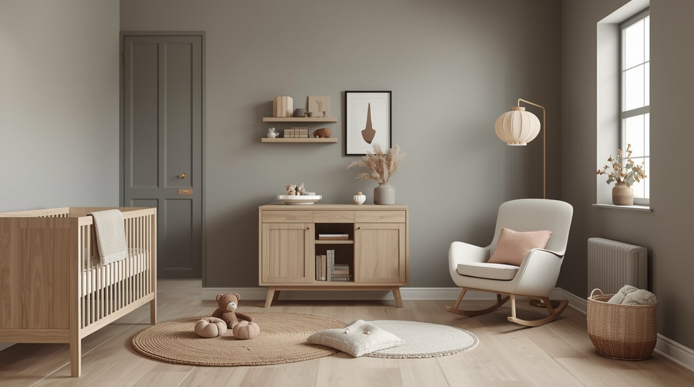
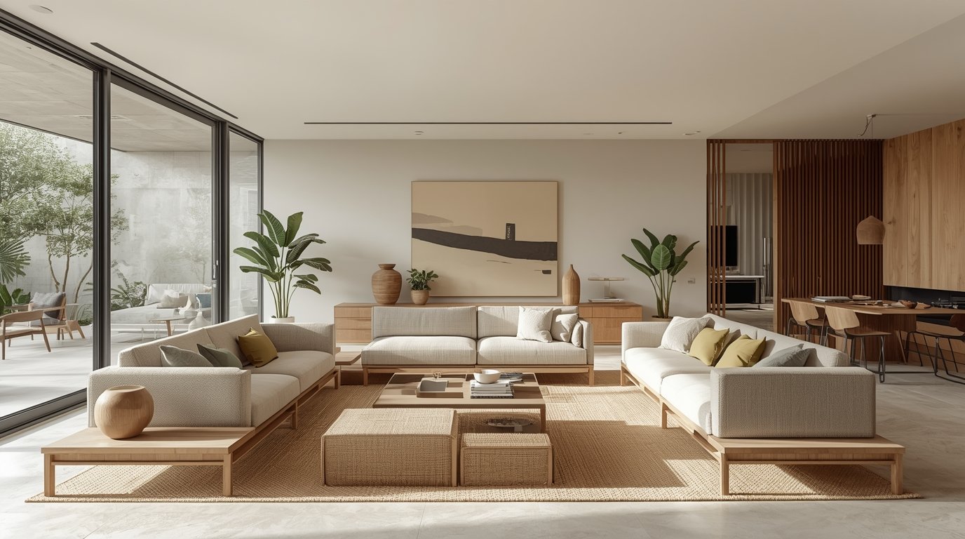
Architectural + Organic Elements
An Organic Modern Color Palette is only half the battle! The style name suggests that materials and shapes are just as critical as the paint itself.
The Architectural Anchor: Emphasizing Clean Lines
Since you’re aiming for a sophisticated, modern aesthetic, you must define the style with structure.
- Design Hierarchy: Designers typically advise that it’s best to choose a dominating style to anchor your home. Most designers lean more heavily on modern styles for architecture, and then they incorporate the organic elements through smaller, softer pieces.
- Modern Structures: This means emphasizing clean lines and smooth textures in architectural elements, furniture shapes (like a streamlined sofa), and metalwork (like matte black light fixtures).
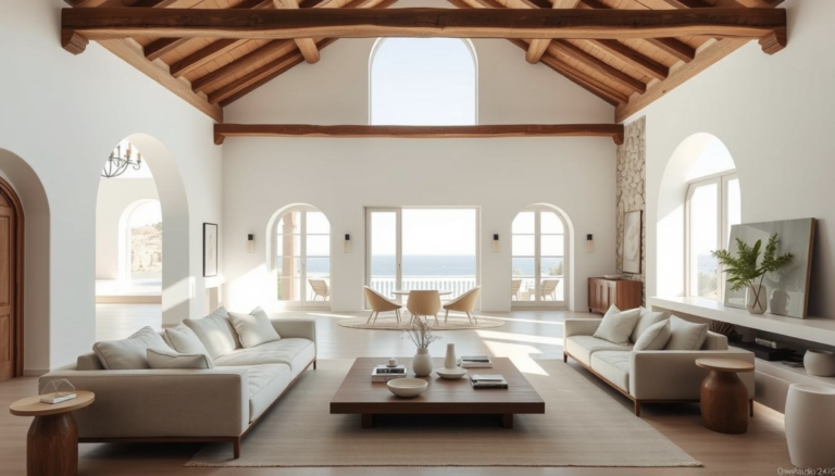
Mastering Texture Layering
Texture is often described as playing a key role in this palette. It’s what transforms a minimalist room from feeling cold into a cozy, unpretentious space.
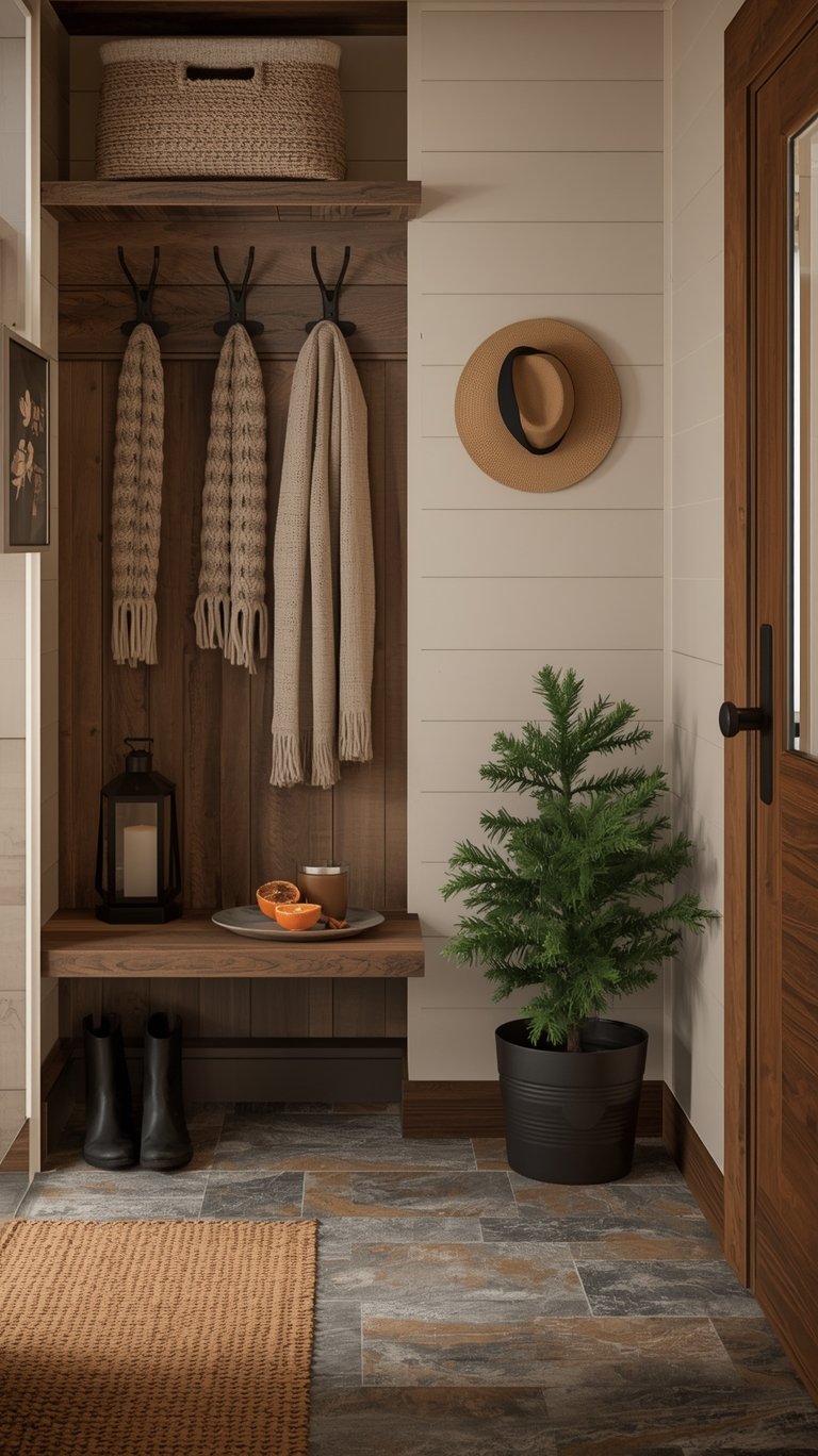
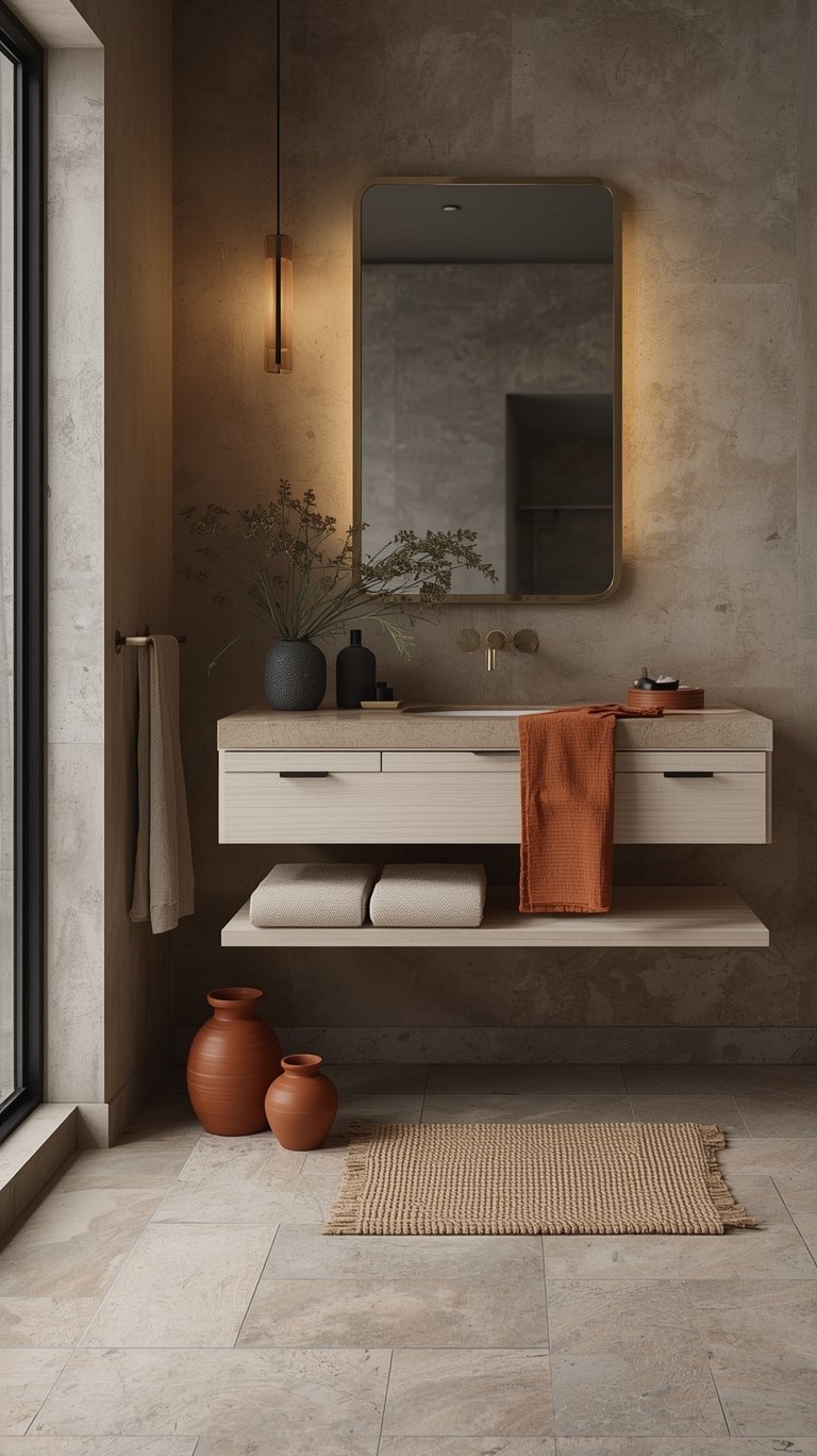
- Natural Materials: You must use materials that originate from nature. This includes wood, stone, leather, and woven elements like rattan.
- Contrasting Textures: The key to depth is juxtaposition. You want to pair the rugged (raw-edge wood, rough ceramics) with the refined (soft bouclé, plush velvet, washed linen). Layering various textures—like stonewashed linen curtains, wool throws, and woven baskets—helps form the connection to the outside world.
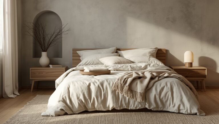
Lighting for Mood and Color Fidelity
Lighting is one of the top five factors that will dramatically impact how your chosen paint color looks. If you choose the perfect Organic Modern Color Palette but use the wrong lighting, your color will look completely different!
- Warm Glow is Crucial: Use warm-toned LED lights (or paper lanterns). This ensures that your soft beiges and creamy whites maintain a “golden hour glow,” making the space feel inviting.
- Fixture Materials: Lighting fixtures themselves should reinforce the theme. Look for natural fiber pendants or dark metal finishes, such as aged brass sconces, to add depth and contrast.
Wellness and Organic Living
The organic component of this style can extend beyond aesthetics into promoting a healthier living environment.
- Health-Conscious Choices: Designers often focus on designing with healthy habits in mind.
- Low VOC and Clay: Specific materials like low VOC paints and natural materials such as clay on the walls are suggested because they are breathable and better for your health.
Choosing Paint Colors “The Right Way”
You’ve got your beautiful Organic Modern Color Palette selected, but before you rush off to buy gallons of paint, you need to be cautioned on how to choose paint colors the right way. This advice is essential because even the best curated colors “will not look 100% identical in your home as they do online, or even in someone else’s home”.
The #1 Best Practice: Test, Test, Test
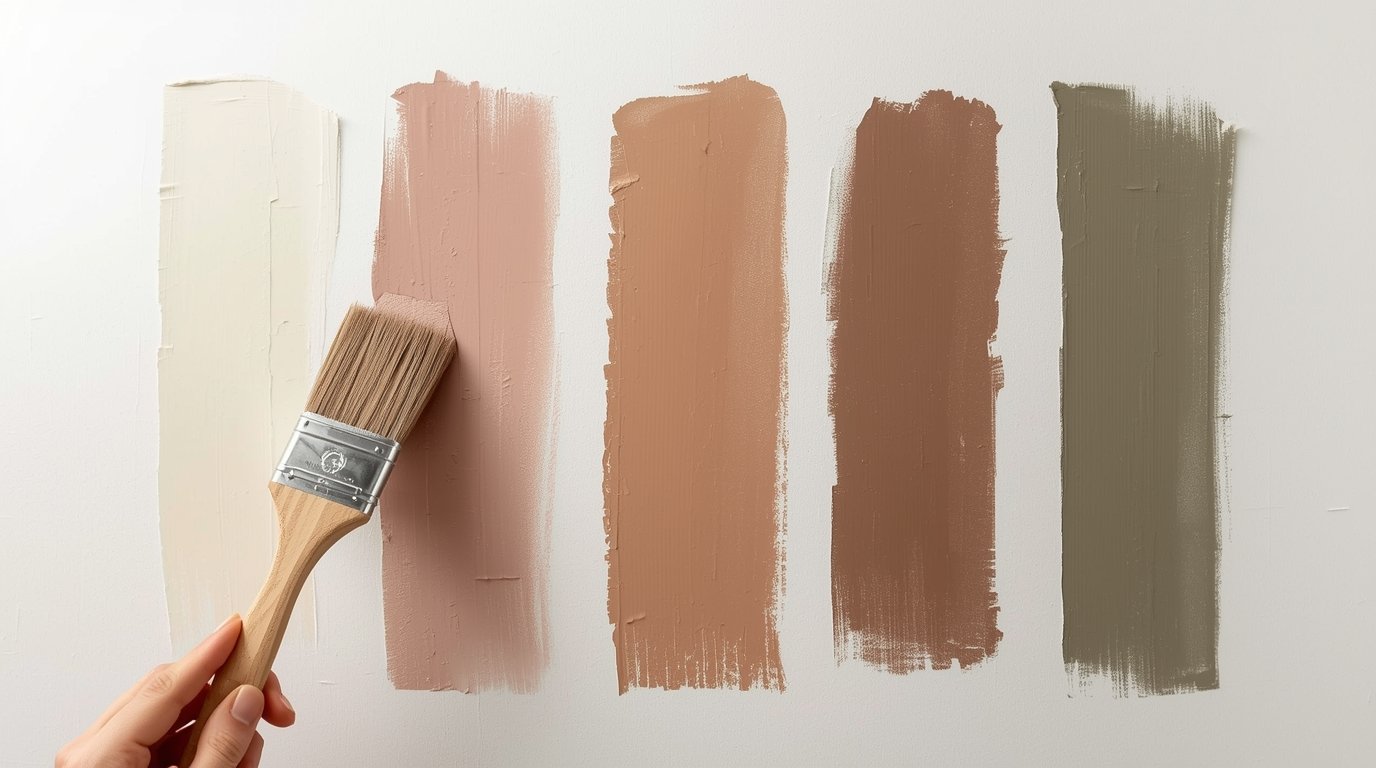
This is the most critical step, according to experts:
- Top Recommendation: Buy an actual sample from the store you will purchase from, in the brand you will purchase, and paint it on the wall. Wait to see how the light changes the color from morning to night to ensure you truly love it.
The 5 Critical Color Factors You Must Consider
There are five main factors that play into how a paint color looks in any room:
1. Lighting (Natural and Artificial)
Lighting is likely the culprit if a paint sample looks completely different at home than it did in the store. Harsh store lighting reflects differently than your home’s lighting, and the amount of natural light you have will greatly impact the final appearance of your warm neutrals.
2. Paint Undertones
Undertones play a large role, especially with light colors.
- The Trap: Whites and grays are notorious for having unexpected undertones, such as blue or purple, that you don’t anticipate.
- My Top Tip: To reveal undertones quickly, hold a sheet of white computer paper up to your sample.
3. Surrounding Colors
This is especially tricky when using light colors in an Organic Modern Color Palette.
- The Challenge: White paint is notorious for picking up the undertones of surrounding colors. If you have green furniture, your creamy white walls might reflect a subtle green tint.
4. Color Matching Inconsistencies
If you try to use a Benjamin Moore color formula in a Sherwin Williams paint base, you might run into trouble.
- The Warning: Color matching from brand to brand can lead to disaster because different parties (paint companies, independent stores) may match differently. It’s like ordering the exact same custom coffee drink at three different chains and getting three distinct outcomes; you just can’t guarantee consistency!
5. Specific Machine Calibration
Yes, the machine matters!
- Consistency is Key: Each paint mixing machine is calibrated differently. Even a slight difference in calibration can change the color outcome. To ensure consistency—especially important for touch-up paints—always choose one store to buy your paint from and keep going back to that same store.
Curated Organic Modern Color Palette Combos
While this guide focuses on the philosophy and application, the search for specific paint names is a primary driver for readers. Experts simplify the process by curating combinations from major brands, ensuring the undertones and color families blend beautifully.
Here are the brands experts frequently recommend for building your Organic Modern Color Palette:
Benjamin Moore Organic Modern Color Palette
Benjamin Moore is a fan favorite, known for beautiful neutrals. Their colors often feature the earthy, sophisticated undertones required for this style, such as the stone-like quality found in Abalone. White Dove is a specific staple often used for trim and cabinetry.
Sherwin Williams Organic Modern Color Palette
Sherwin Williams offers fantastic options for both base colors like Alabaster and accents like Iron Ore. Their modern organic palettes often include a range of 9 coordinating colors suitable for walls, trim, cabinets, and doors. Colors like Urban Bronze are highlighted for adding warm drama without resorting to straight black.
Behr Organic Modern Color Palette
Behr provides beautiful soft colors ideal for this aesthetic. Their palettes emphasize mixing light neutrals, like Even Better Beige and Blank Canvas, to create a layered look while maintaining an airy feel. The use of soft black like Cracked Pepper is recommended as a visually grounding agent.
Farrow & Ball Organic Modern Color Palette
Farrow & Ball is known for rich and saturated colors that, even when used as deep accents (like Down Pipe), maintain a luxurious, sophisticated feel perfectly suited for adding dramatic depth to a cozy neutral space.
Is Organic Modern Style Truly Timeless?
We touched on this earlier, but it’s worth dwelling on why this style has such staying power. In an era of quickly changing trends, investing time, effort, and money into a home design requires confidence that the style will endure.
Why the Focus on Nature Endures
The core reason this look is considered absolutely timeless is simple: it focuses on colors that are rooted in nature.
- Natural Connection: Because the aesthetic is deeply connected to the natural beauty of the earth—using tans, browns, white, grays, and green—these colors promote a sense of relaxation and wellbeing that transcends temporary trends.
- The Wabi Sabi Appeal: The philosophy often associated with this palette is Wabi Sabi, which cherishes things that are imperfect and simple. This mindset allows the style to embrace materials that age naturally, such as leather and wood, ensuring longevity.
- Versatility: Since the foundation is neutral, the design can seamlessly blend and morph into other styles. If you decide to introduce a completely different color trend in five years, the neutral foundation will easily support it, saving you the hassle of a total overhaul.
FAQ
To wrap up our definitive guide, let’s address some common questions about implementing the Organic Modern Color Palette.
What Defines the Modern Organic Aesthetic?
The style is defined by its balance. It fuses the clean lines and smooth sophistication of modern design with the rugged, textured, and earth-derived natural materials (like wood, stone, and rattan) of organic design. The resulting atmosphere is simultaneously sophisticated, cozy, and laid back.
Can I Use Bold Colors in an Organic Modern Home?
While a neutral foundation is key, you can certainly go bold! The rule is it is all about balance. If you choose a bold color for the walls (like a rich moss green or deep charcoal), you should tone down other elements in the room, such as the bedding or furniture, with lighter neutrals to allow the bold color to steal the show.
Why Is Texture So Important in the Organic Modern Color Palette?
Texture is critical because the colors themselves are typically muted and close in value. Using varying natural materials like linen, wood, stone, and woven elements ensures the space has interest and depth without relying on bright colors to provide the wow factor. Texture adds the coziness to the modern structure.
What Is a “Grounding Agent”?
A grounding agent is a darker color, typically black or charcoal, used strategically as an accent. When these dark tones are combined with lighter warm neutrals, they add a sense of depth and contrast that is visually grounding, keeping the room from feeling washed out or bland.
How Should I Choose Trim Color for Organic Modern Walls?
For trim, choose an off-white or a very light, creamy neutral that has a subtle warmth, like Benjamin Moore White Dove or Vanilla Milkshake. The goal is to ensure there is enough contrast between the trim and your main wall color (like Abalone or a soft beige) to look clean, but not so stark that it feels sterile and unnatural.
Do Lighting Fixtures Need to Be Natural?
Lighting fixtures should either be made of natural materials (like woven rattan or linen) or reflect the clean structure of the modern style (like matte black or raw metal finishes). Crucially, make sure you use warm-toned LED lights to maintain that inviting, golden-hour glow that makes the warm neutrals look their best.
What Are the Key Health Benefits of the Organic Modern Style?
The “organic” component encourages designing with healthy habits in mind. This includes specifying the use of low VOC paints and natural materials, such as clay on the walls, which are considered breathable and better for your health.
The Bottom Line
Creating your perfect Organic Modern Color Palette doesn’t have to be daunting. It’s all about embracing simplicity, nature, and balance.
Start with a solid neutral foundation of creamy whites and soft taupes, use earth-inspired hues like olive green or terracotta for your earthy accents, and remember to anchor the space with a grounding agent like charcoal. Most importantly? Don’t forget that critical step: test your paint on the wall, seeing how the light changes it from morning to night, to ensure you love it.
By following this philosophy and relying on these practical, expert-backed tips, you’ll stop guessing and start painting the truly tranquil, timeless home you’ve always wanted.
ABOUT the AUTHOR
TOKI; INTERIOR DESIGN & lifestyle CONTENT CREATOR.
Hey there! I’m Toki—the design-obsessed brain behind Dwell Studio 24. I’m a content creator passionate about interior design, photography, and creativity, living in a 77-year-old house with my husband and our awesome three kids. I write about interior design, furniture, home topics, and my lifestyle, including travel, recipes, skincare, and daily routines. I hope to inspire your next project and lifestyle!
ABOUT the AUTHOR
TOKI; INTERIOR DESIGN & lifestyle CONTENT CREATOR.
Hey there! I’m Toki—the design-obsessed brain behind Dwell Studio 24. I write about interior design, furniture, home topics, and my lifestyle, including travel, recipes, skincare, and daily routines. I hope to inspire your next project and lifestyle!