Cashmere Kitchens Trend: A Ultimate Guide to Timeless Warm Neutrals
Cashmere Kitchens are everywhere right now, and for good reason: your dream kitchen just got cozier. This isn’t just another passing fad; it’s a design style that takes the clean simplicity we love and wraps it in a warm, comforting hug. If you’ve been living with the sterile look of all-white or cool-gray palettes, the cashmere trend is the perfect antidote.
It brings softness and sophistication to the heart of the home, creating a space that feels luxurious but still inviting. If you’re planning a remodel or just dreaming about your next kitchen refresh, grab a cup of coffee and let’s dive into why cashmere is the smart, timeless, and oh-so-cozy choice for you.
Key Takeaways
- Cashmere is “Greige”: The color is a soft, warm neutral that successfully blends beige and gray. It’s warmer than gray, softer than taupe, and has “real nuance”.
- Undertones are Critical: The success of warm neutrals hinges entirely on choosing the correct underlying color (pink, green, or yellow beige) that harmonizes with your home’s fixed elements.
- Matte and Wood Rule: Cabinets should typically be finished in a matte lacquer for a sophisticated, velvety feel that hides fingerprints. Always layer in natural materials like oak or walnut for texture.
- The Go-To Hardware: The undisputed hardware champion is brushed gold or unlacquered brass, which is recommended to be matte, offering “whispered elegance, not Vegas showroom”.
- Lighting is Warm: Use warm-toned bulbs (2700K-3000K) in your pendants and under-cabinet lighting to make the cashmere color “glow like they’re lit by candlelight”.
Why the World Is Cozying Up to Cashmere
The Emotional Hook: Luxury Meets Comfort
The sheer appeal of the cashmere kitchen is emotional. It goes beyond mere color and aims to make your kitchen feel as cozy and luxe as an expensive sweater. This design style quite literally gets its name from neutral cabinetry that mimics the look of the luxurious cashmere fabric itself.
Designers say this hue is perfect for creating a space that feels effortlessly elegant yet still super relaxed and inviting. Instead of a cold, showy space, a cashmere kitchen is designed to be a “cocoon of comfort”. It’s more than just a creamy brown color; it emulates the softness and warmth of cashmere, making it perfect for entertaining and unwinding. It’s like the perfect cup of coffee—not too bold, not too bland.
Defining the Cashmere Hue
So, what exactly is this magical color? Cashmere falls right into the sweet spot between gray and beige, which is why it’s often called “greige”.
- It’s a best-of-all-worlds color choice—warmer than cool gray and softer than taupe, with a lovely subtle character.
- It’s a soft, warm beige-gray.
- It’s the “perfect antidote” to the stark black and white trend we’re all getting over fast.
- It functions as a neutral with “real nuance”.
The gentle neutrality of the shade makes it an easy option for those who don’t want to choose a color they may risk growing tired of.
The Promise of Timelessness
While any color can be called a trend, experts agree that the Cashmere Kitchen look is built for longevity. A major part of the appeal is its staying power.
- This style is seen as a natural step away from the sterile, all-white and cool gray palettes of the recent past.
- The color of cashmere is calming and doesn’t age—it has a classic, timeless appeal.
- Its reliance on subtle neutrals and natural materials makes it a safe choice for remodeling projects today.
- The versatility of cashmere means it can seamlessly integrate into various styles, whether you’re aiming for a rustic farmhouse feel or a modern urban aesthetic.
The Science of Warm Neutrals
The biggest challenge with Cashmere Kitchens isn’t selecting the color itself, but managing its undertone. Choosing neutral paint colors without knowing how to select the right undertone can lead to disappointment, where the random neutral you chose “doesn’t relate to anything in your home” and is “super bossy”.
Understanding the Complexity of Neutrals
Choosing the new warmer look means selecting from highly nuanced neutrals, which is more complicated than picking from a handful of popular white and off-white colors.
- Cashmere and other warm neutrals are chameleons. They shift dramatically depending on your light sources.
- The Cashmere category includes not just beige and taupe, but also the warm greys (green grey and sometimes violet grey).
- The secret to success is choosing the correct neutral undertone that relates perfectly to your home’s existing fixed elements.
The Critical Role of Undertones (Expert Tip)
The warm neutral undertone is the hidden key to making your kitchen look cohesive.
- The neutral undertone family is broken down into five categories of beige: pink beige, orange beige, yellow beige, gold beige, and green beige.
- If your countertops or backsplash aren’t white (or if you have older neutral furnishings), you need to assess their undertone first. For example, green beige relates perfectly to gold veining in marble.
- The Cohesion Rule: Once you establish a neutral undertone in the room, you must keep repeating it for all the other neutral elements (walls, sofas, etc.).
Best Practices for Color Testing
Because warm neutrals are so complicated, you can’t just cross your fingers and wing it.
- Test Large Swatches: Always paint large swatches directly on your walls and live with them for a week.
- Observe Light Shifts: Test finish samples at different times of day. What looks perfectly taupe at noon might go full pink at sunset, or look peachy in the morning light.
- Cabinet vs. Wall Contrast: To prevent the space from feeling too heavy and to ensure an “airy, sophisticated vibe,” experts recommend that you keep your walls lighter than your cashmere cabinets (using shades like whisper white or soft linen).
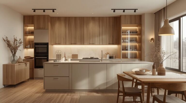
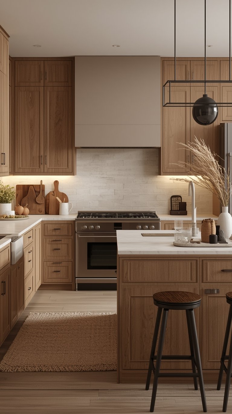
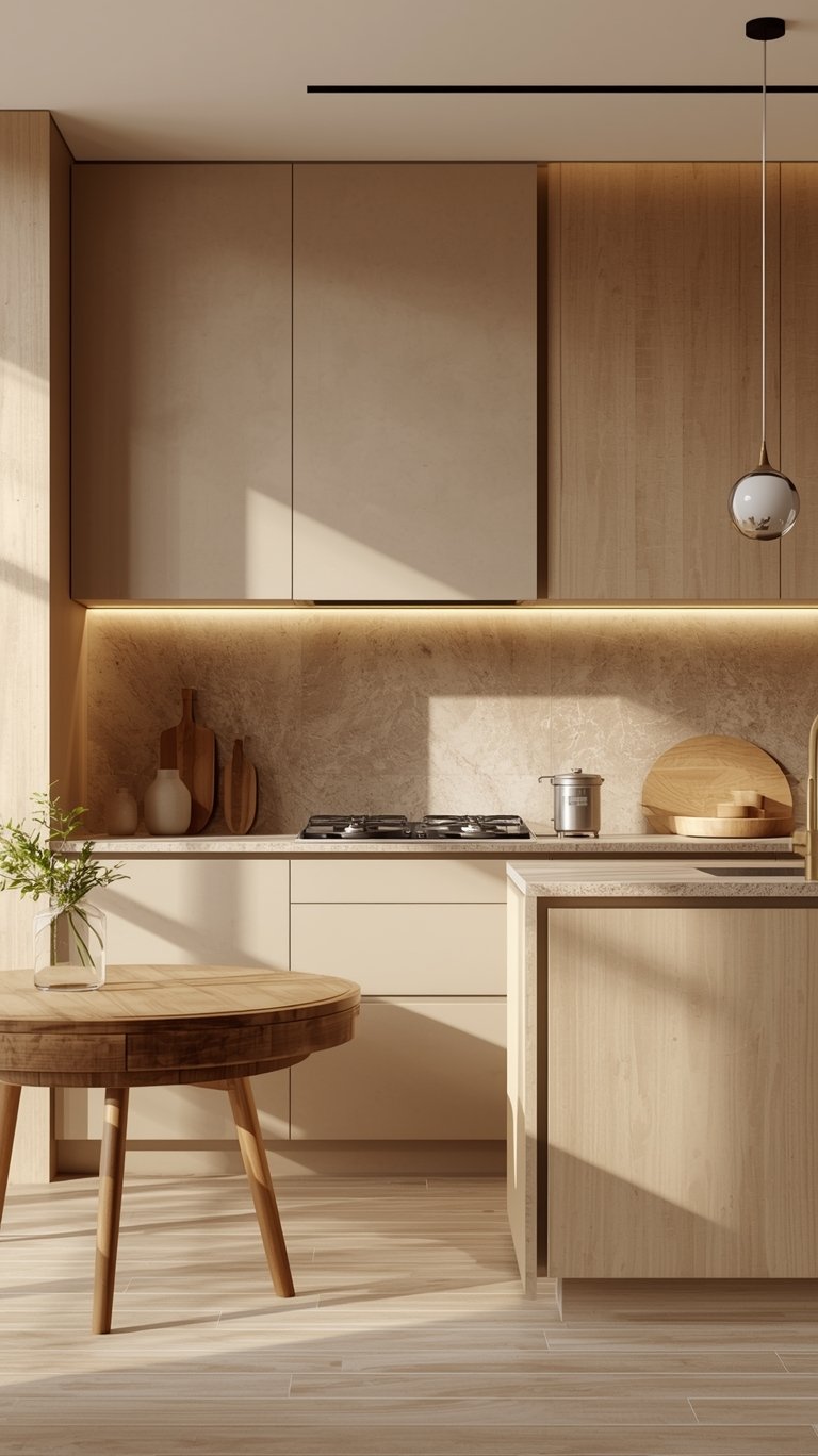
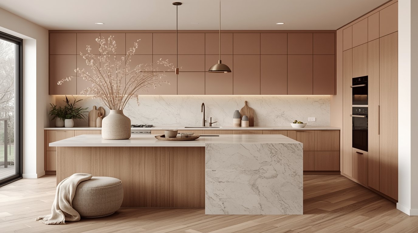
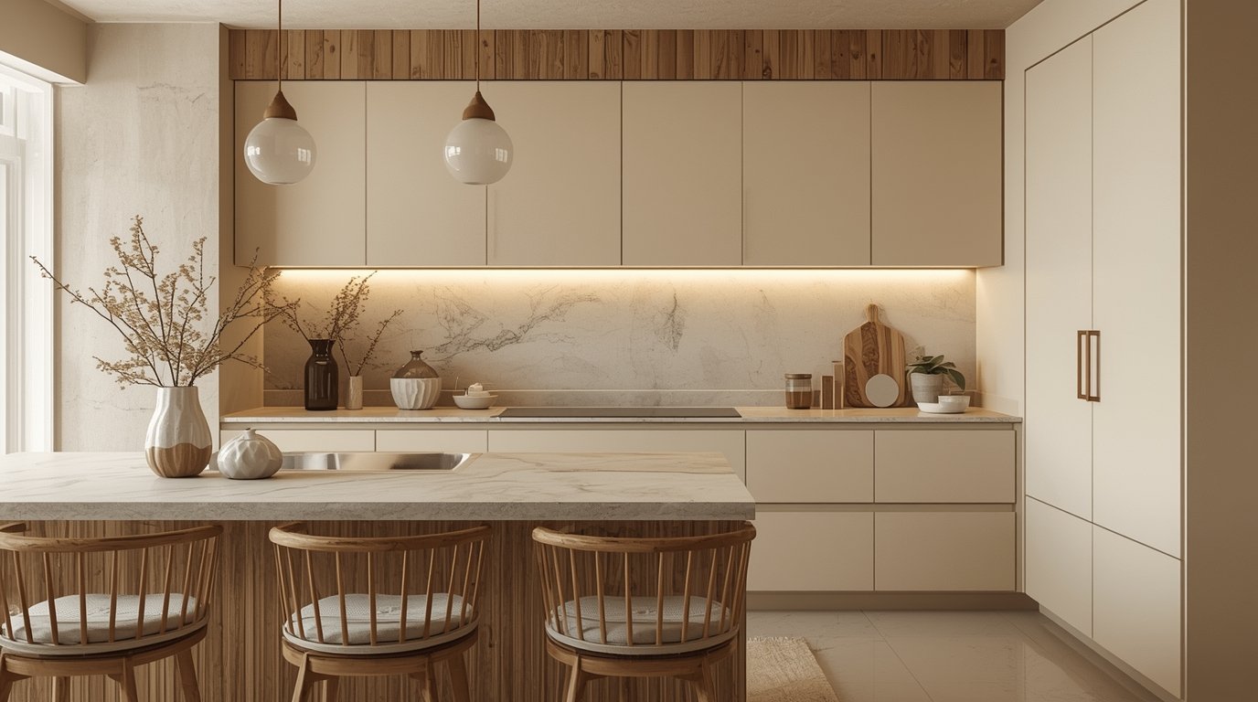
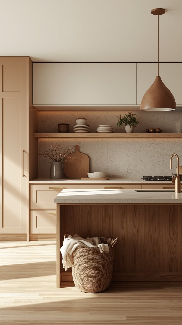
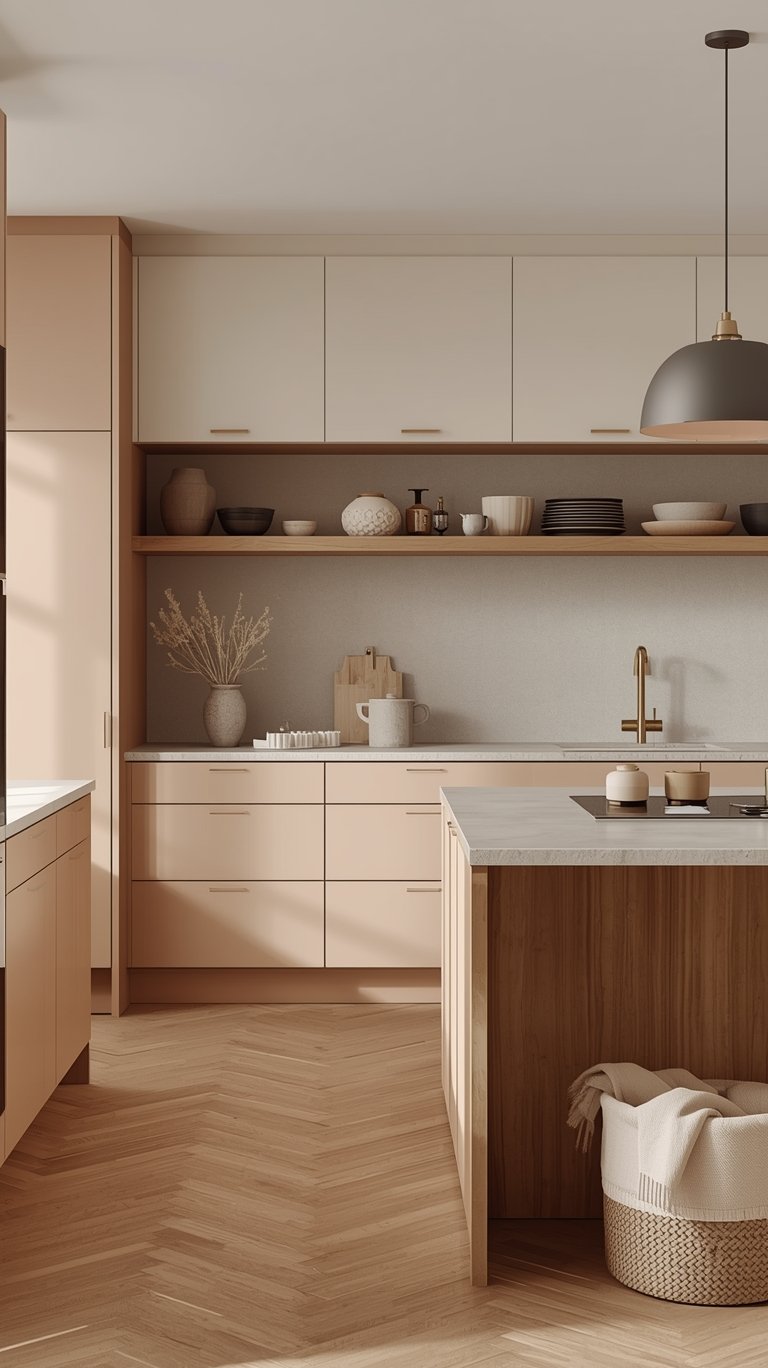
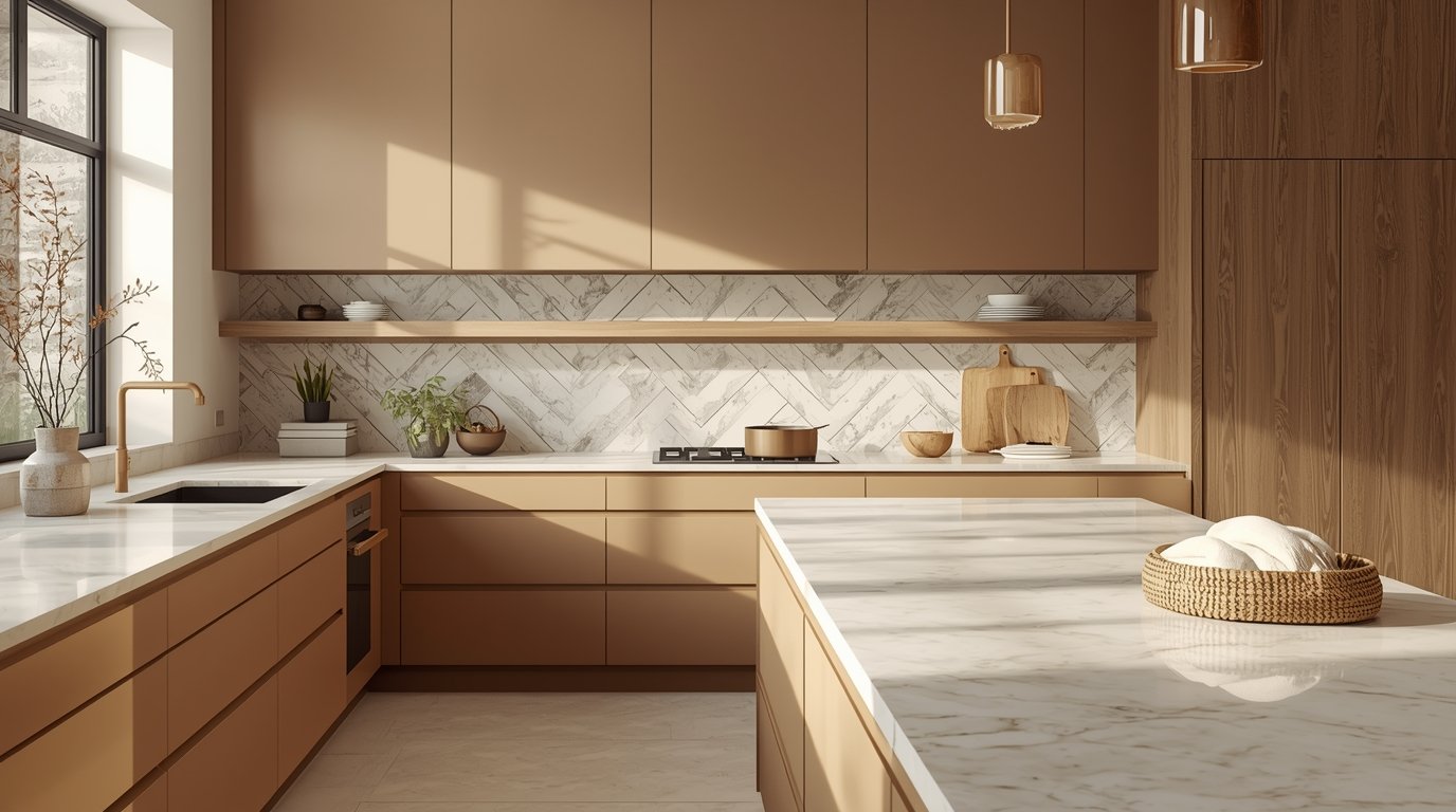
The Core of Luxury: Cashmere Cabinet Finishes and Pairings
The soft beige cabinet finishes are described as “the silk pajamas of kitchen design”, and the right finish makes a world of difference.
Choosing the Right Finish: Matte vs. Satin
The trend heavily favors a look that whispers elegance rather than shouting for attention.
- Matte Finish: You can choose matte for that chalky European vibe. Matte textures hide life’s little messes, resist fingerprints, and look effortlessly expensive. They feel velvety smooth.
- Satin Finish: Alternatively, you can go with satin for a subtle glow and gentle light reflection.
- Break the Monotony (Pro Tip): Regardless of your primary choice, you should break up all that beautiful matte monotony with one glossy element—perhaps the backsplash or hardware—to catch the light and keep things from falling flat.
Two-Tone Cabinets and Versatility
The cashmere color is so versatile that it works beautifully across various styles.
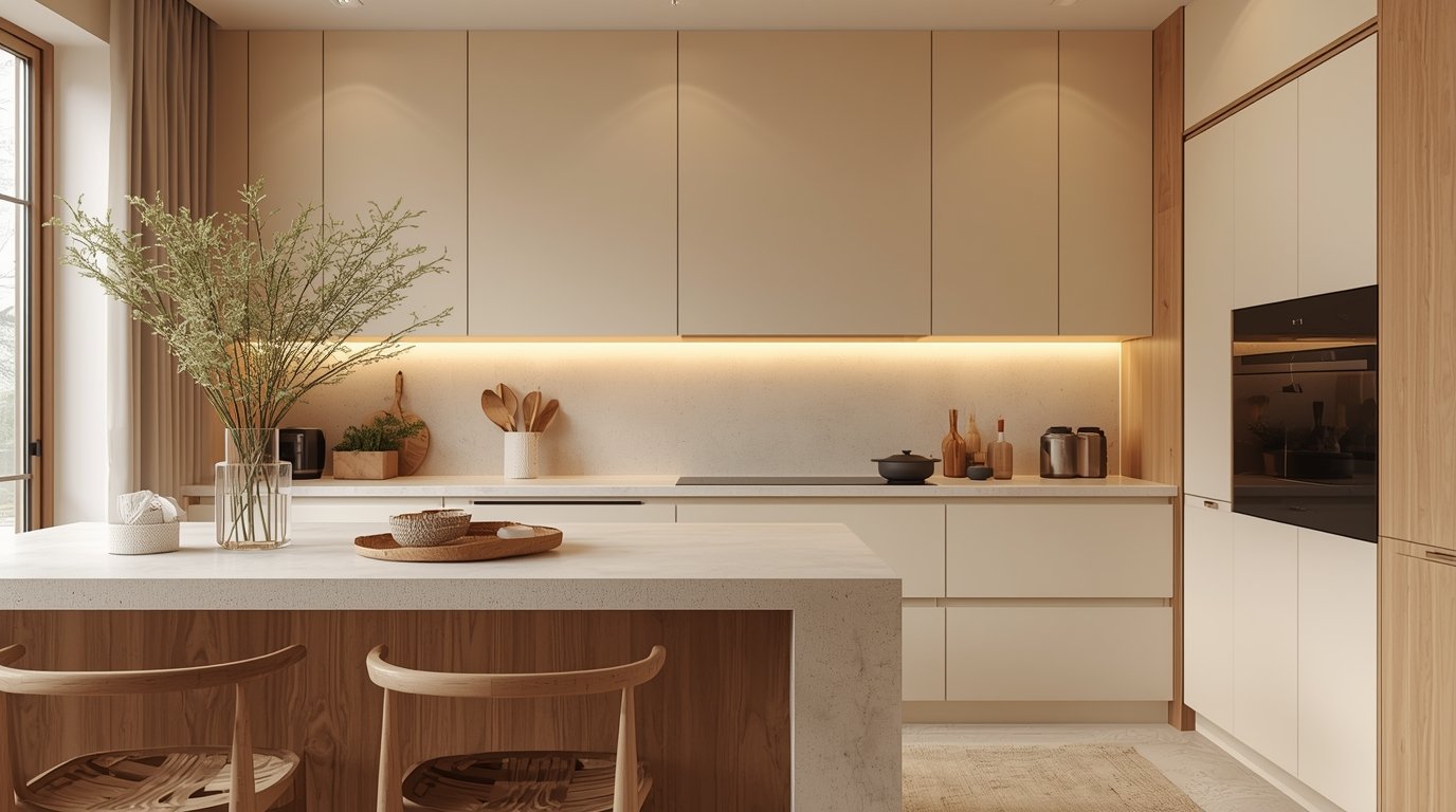
- Modern Styles: In contemporary settings, pair cashmere with flat-fronted cabinets and contrasting materials like oak or concrete for a cool, minimal look.
- Traditional Styles: Cashmere seamlessly integrates into traditional or shaker-style kitchens, adding a touch of modernity without compromising classic charm.
- Two-Tone: It’s also ideal for two-tone kitchens—try cashmere base units with white or dark upper cabinetry for balance and contrast.
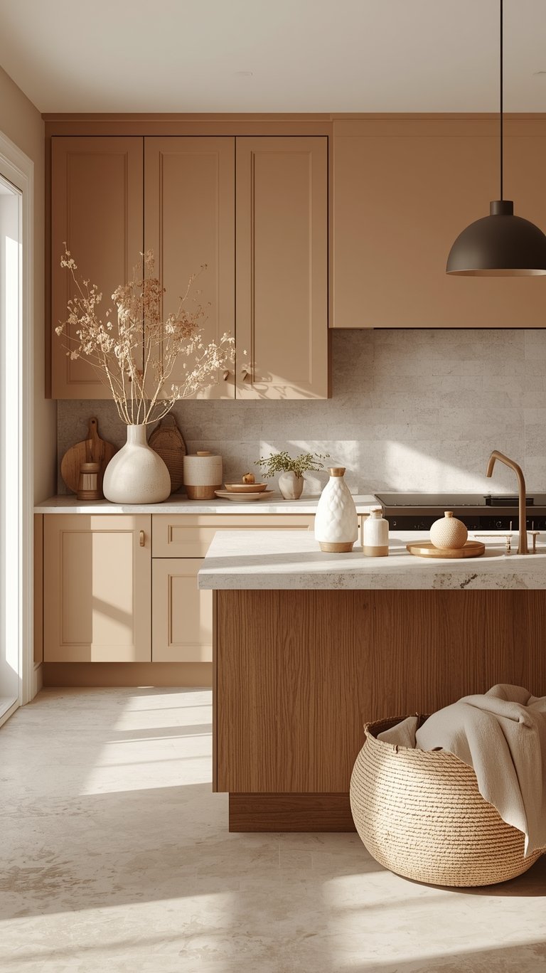
Building the Foundation with Hard Surfaces
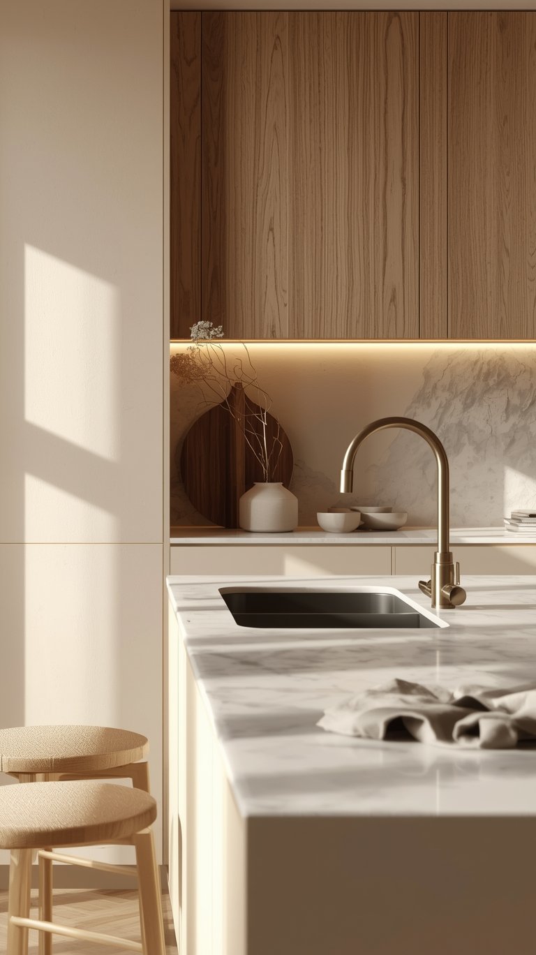
The countertops and backsplashes are crucial hard finishes that contribute to the cashmere aesthetic, and they are also key to ensuring the kitchen remains timeless.
Countertops: Soft Contrast and Durability
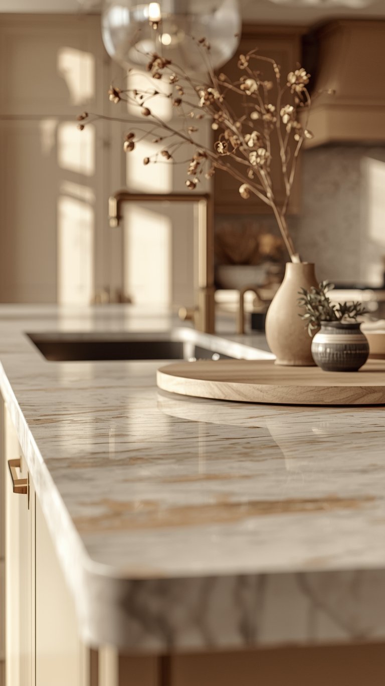
The goal for countertops is to create a soft, light contrast that keeps the space airy.
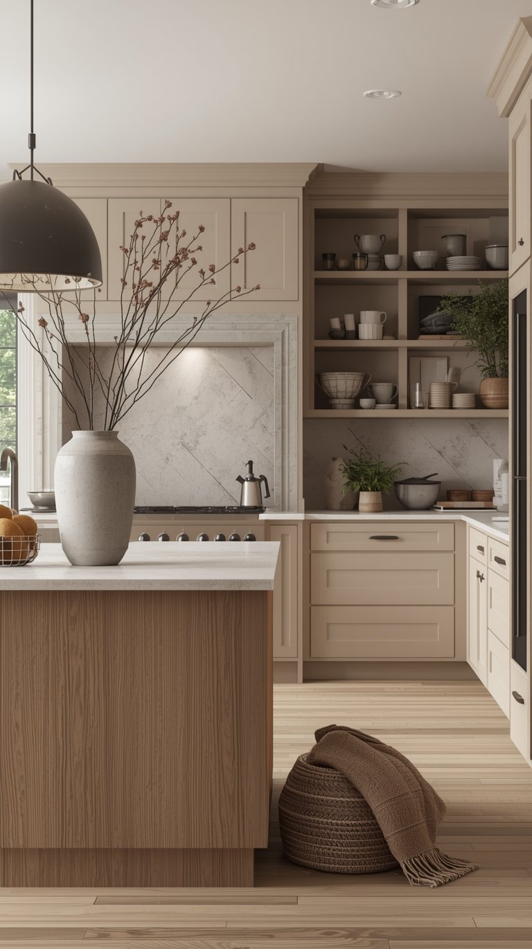
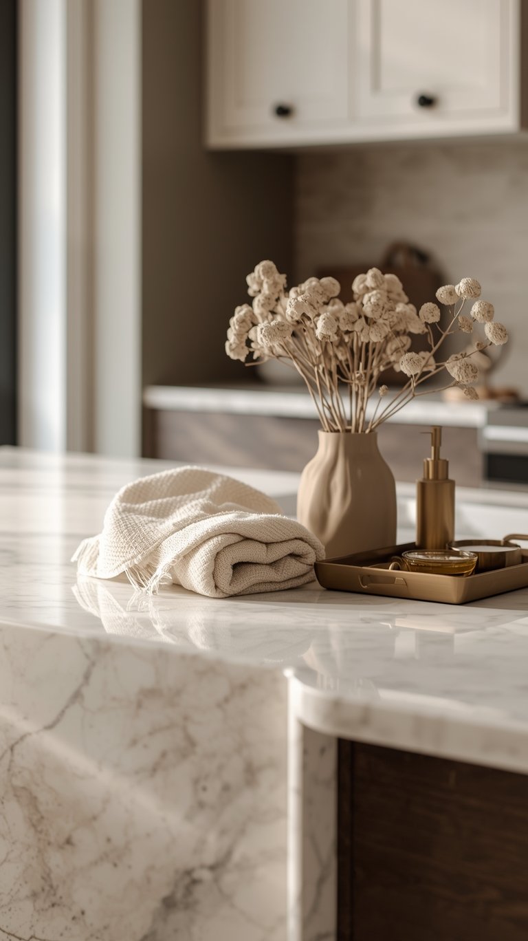
- Creamy White Canvas: Creamy white countertops are the kitchen equivalent of your favorite cashmere cardigan. These surfaces are the ultimate canvas for your culinary creativity.
- Recommended Choices: Options include white quartz with subtle veining, light marble, or porcelain slabs for durability.
- Best-in-Class Stone: Taj Mahal quartzite is highly recommended by stone experts. It brings that warm tone back, is extremely durable, is a timeless stone, and unlike marble, it doesn’t require any treatment.
My Top Tip: The Durability Test – Request samples of your top three choices and test them with red wine, coffee, and turmeric to discover the maintenance needs before installation. Creamy whites with warm undertones hide everyday wear beautifully.
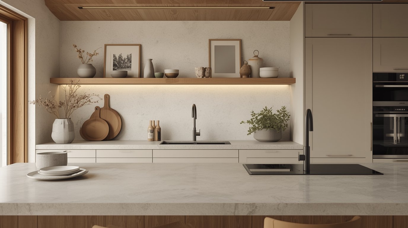
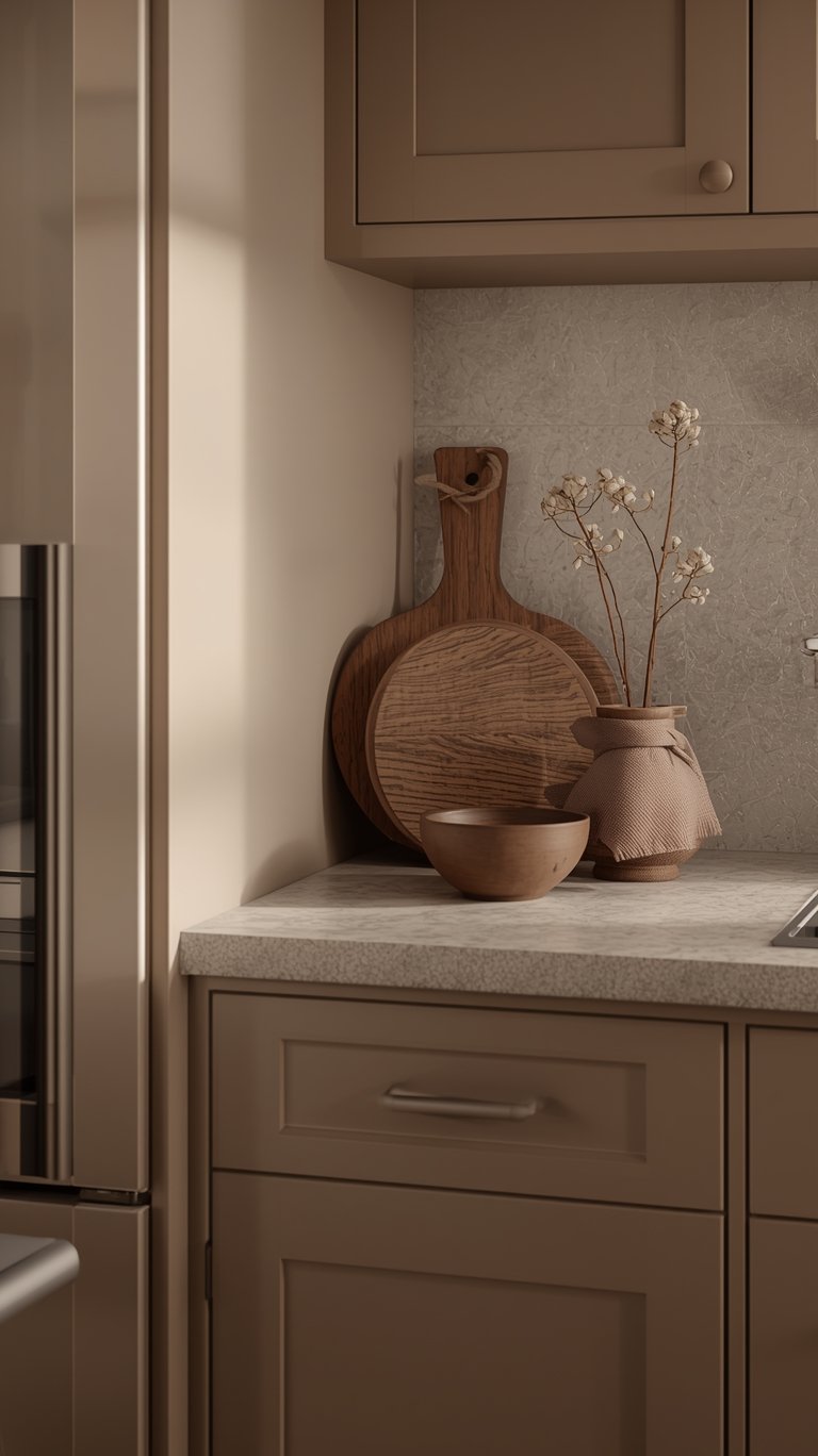
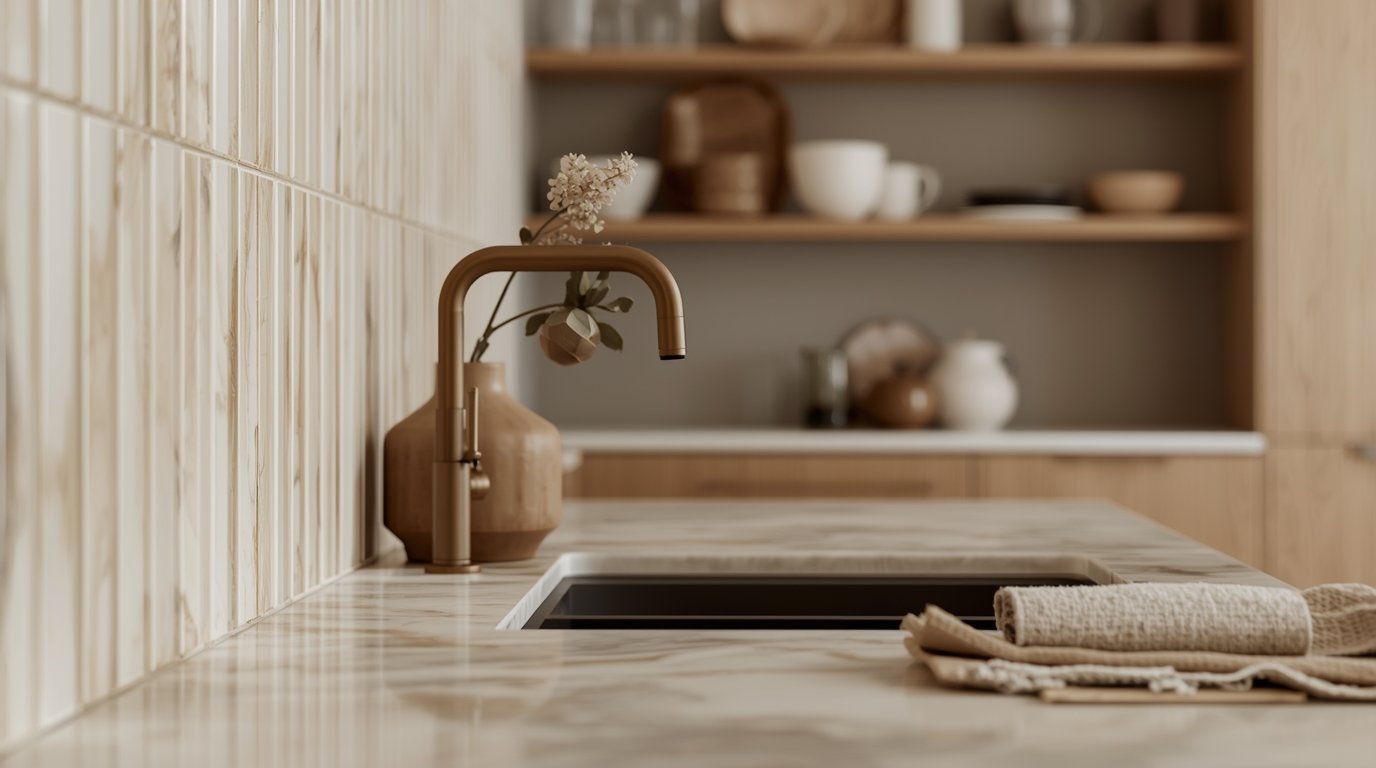
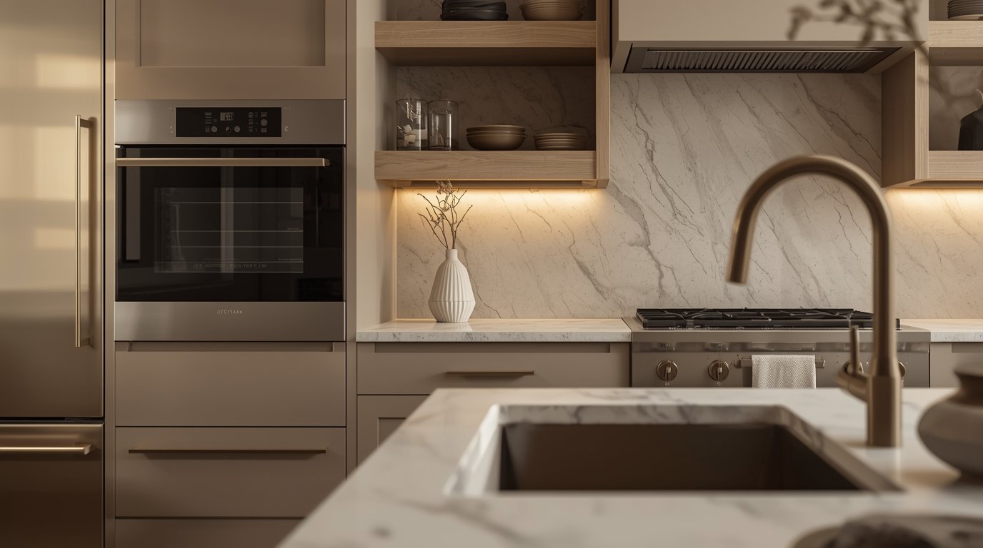
Backsplash: Veins Over Shine
The backsplash provides an opportunity to add subtle drama without overwhelming the cashmere cabinets.
- Pattern Choice: Marble backsplash tiles, acting like the “silk scarf” of your kitchen, can use patterns like herringbone, vertical stack, or hexagon honeycomb designs.
- Honed Finish (Pro Tip): Choose honed marble over polished for your backsplash. Honed surfaces hide water spots better and play beautifully with the matte finish of cashmere cabinets.
- Grout: Keep grout lines minimal and color-matched to let those gorgeous veins do all the talking.
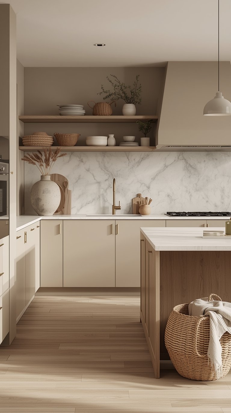
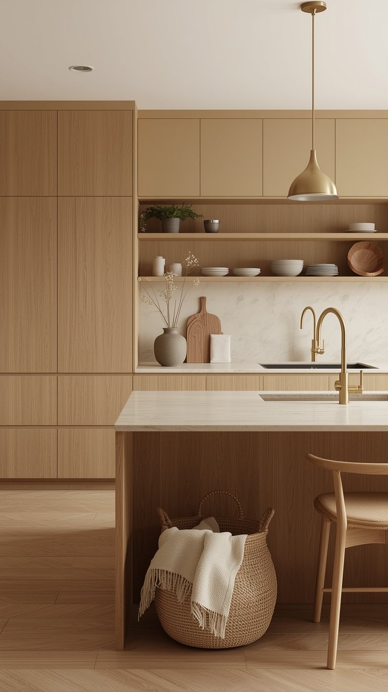
Natural Wood and Warm Metals: The Essential Accents
To prevent the neutral palette from becoming dull, designers emphasize layering natural materials and warm, rich metals.
Natural Wood Accents
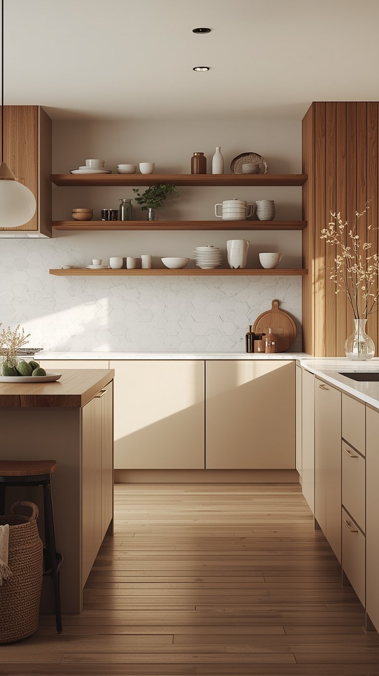
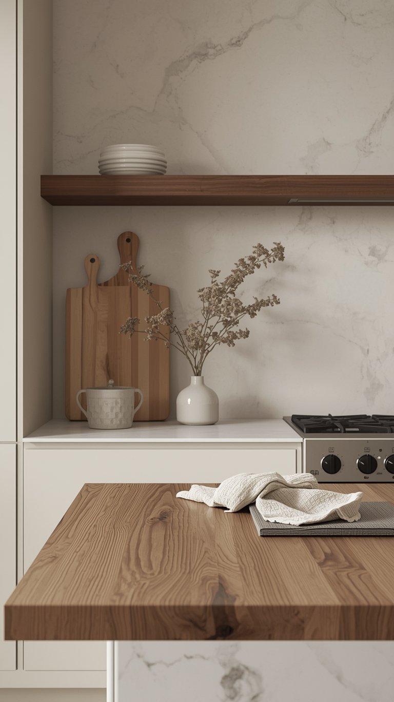
Natural wood accents are like adding a cozy cashmere throw to your kitchen’s shoulders. They add depth, organic texture, and enhance the color’s softness.
- Recommended Woods: White oak or walnut are favored.
- Integration Ideas: Float open walnut shelving displays, install white oak ceiling beams, or use wood-topped kitchen islands.
- Consistency (Pro Tip): Stick to one wood tone throughout your kitchen. Your cashmere palette generally loves blonde to medium woods best.
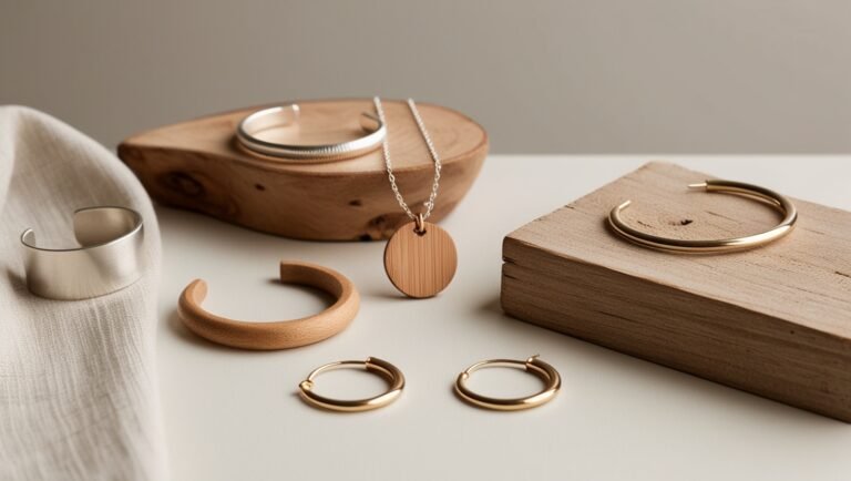
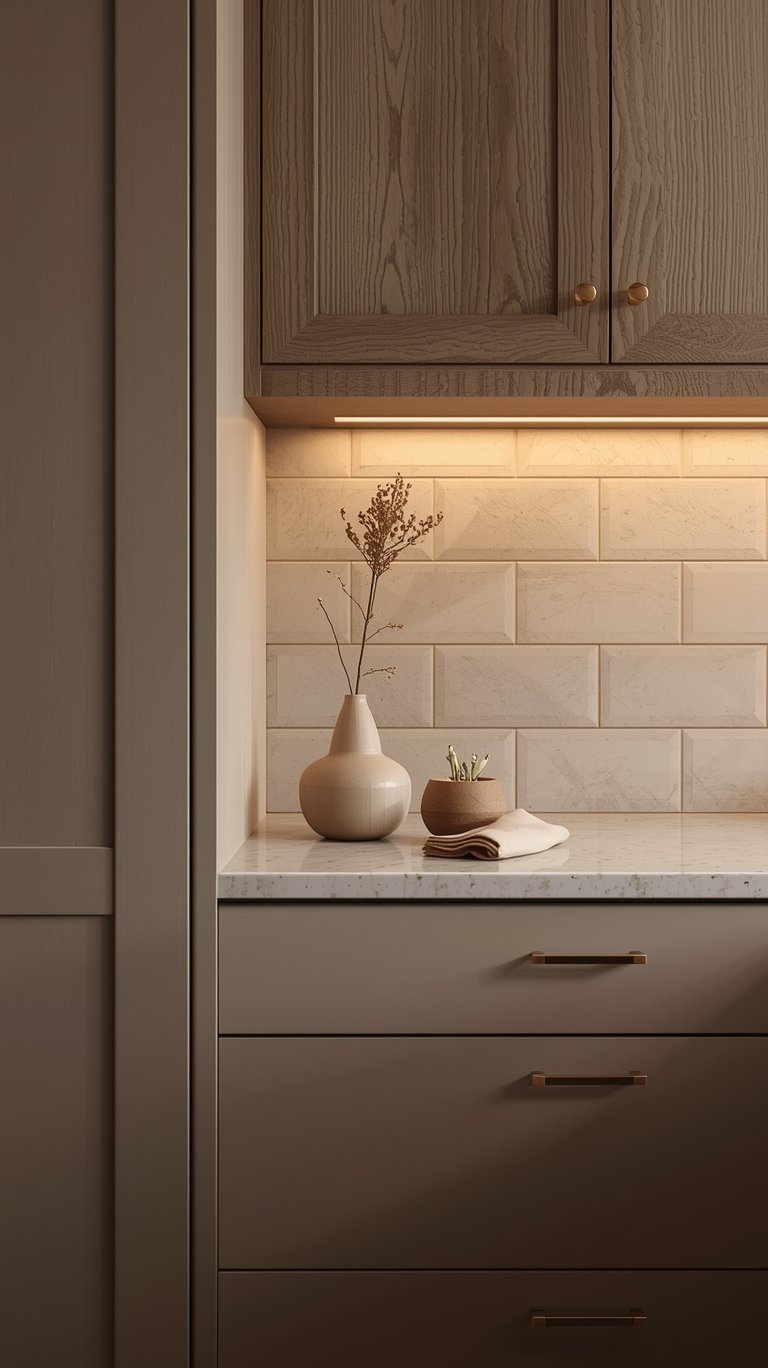
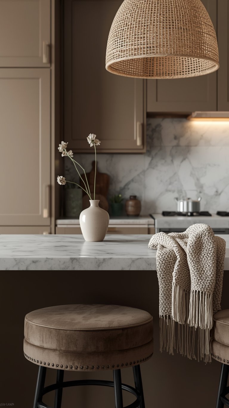
Hardware: Brushed Gold is the Jewelry
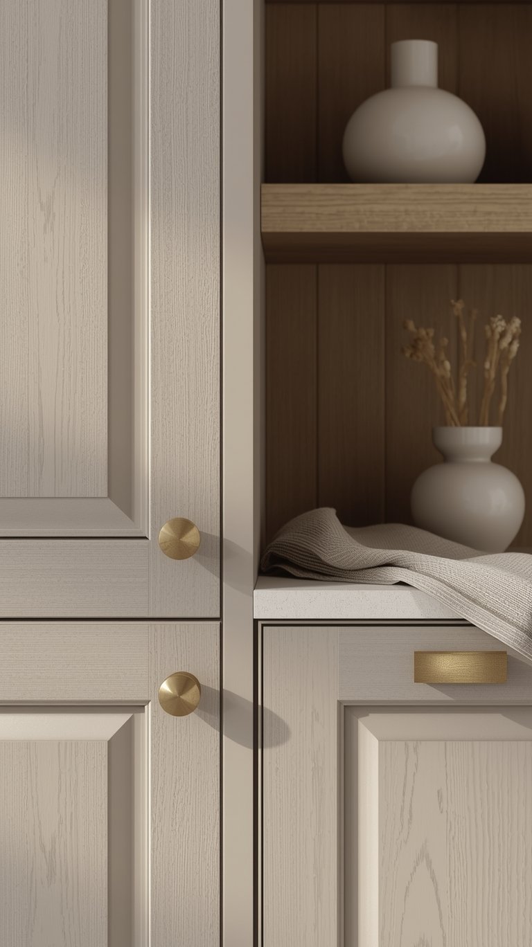
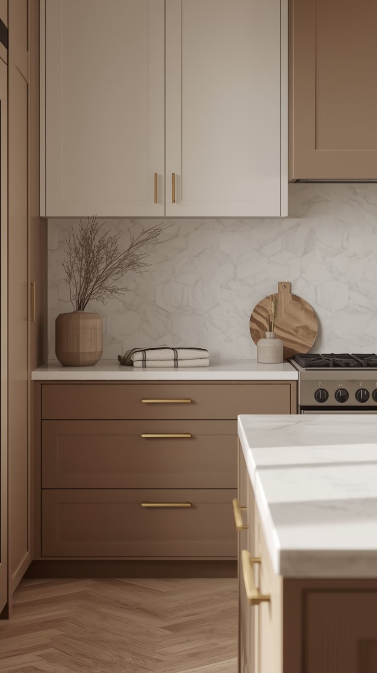
Brushed gold or brass hardware is the jewelry your cashmere kitchen’s been waiting for. It elevates every cabinet pull from functional to fabulous.
- The Finish: The preferred hardware choice is brushed gold or unlacquered brass.
- Timeless Brass: Unlacquered brass is particularly recommended because it “will get better with wear just like your favorite Kashmir sweater”.
- The Elegance Rule (Pro Tip): Keep your gold hardware matte or brushed rather than polished. You want “whispered elegance, not Vegas showroom”. Mix sizes but maintain the same finish throughout for a cohesive look.
- Integration: Brass handles and doorknobs are simple additions that elevate the whole style of the kitchen.
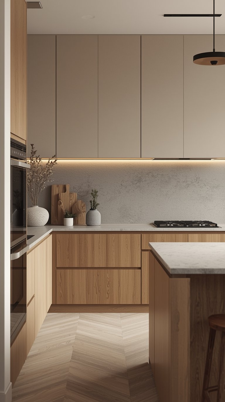
Lighting: Making Your Kitchen Glow
Lighting is not just functional; it’s a design tool that shapes the feel and color perception of your warm neutral space.
Selecting the Right Fixtures and Bulbs
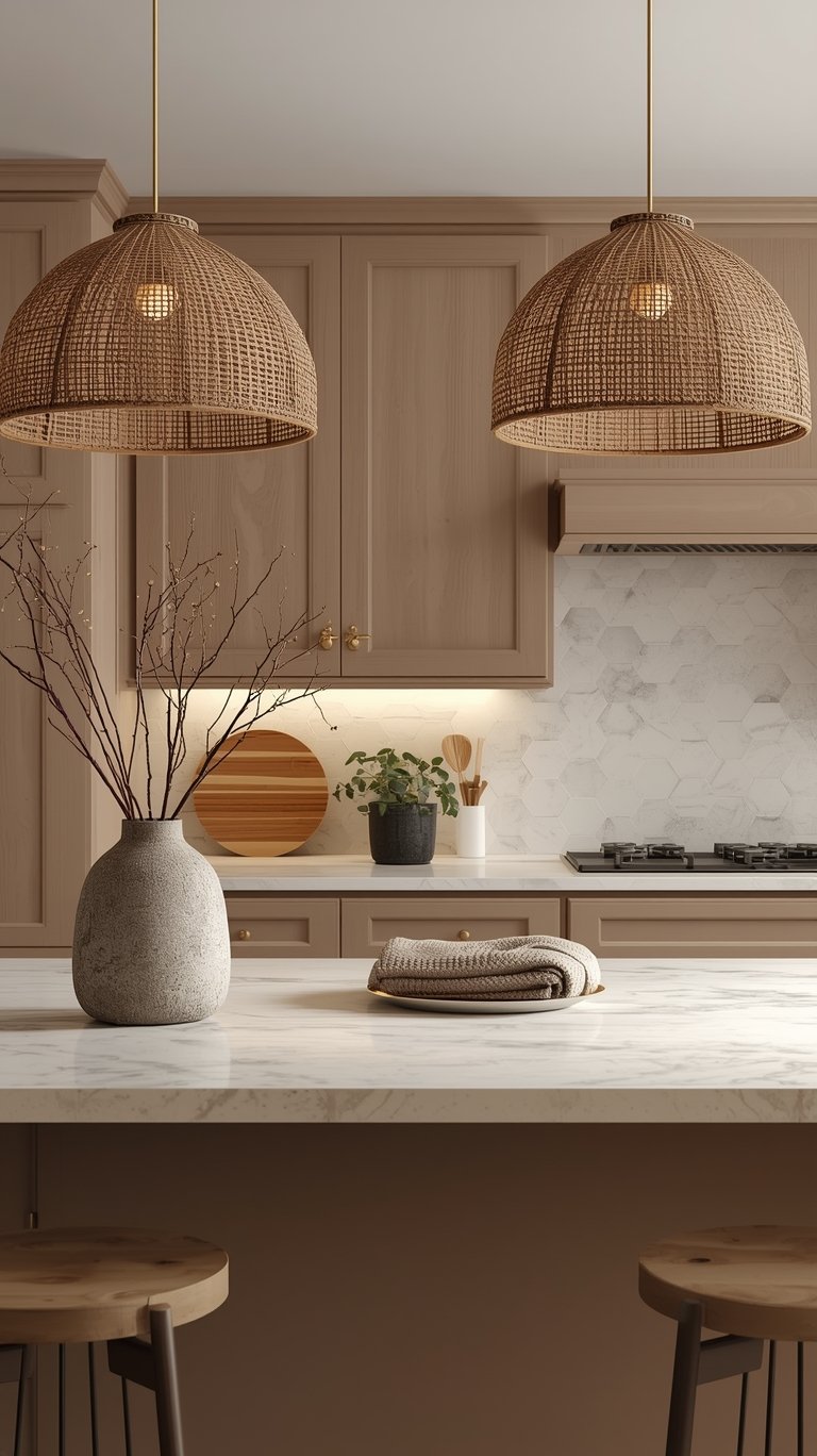
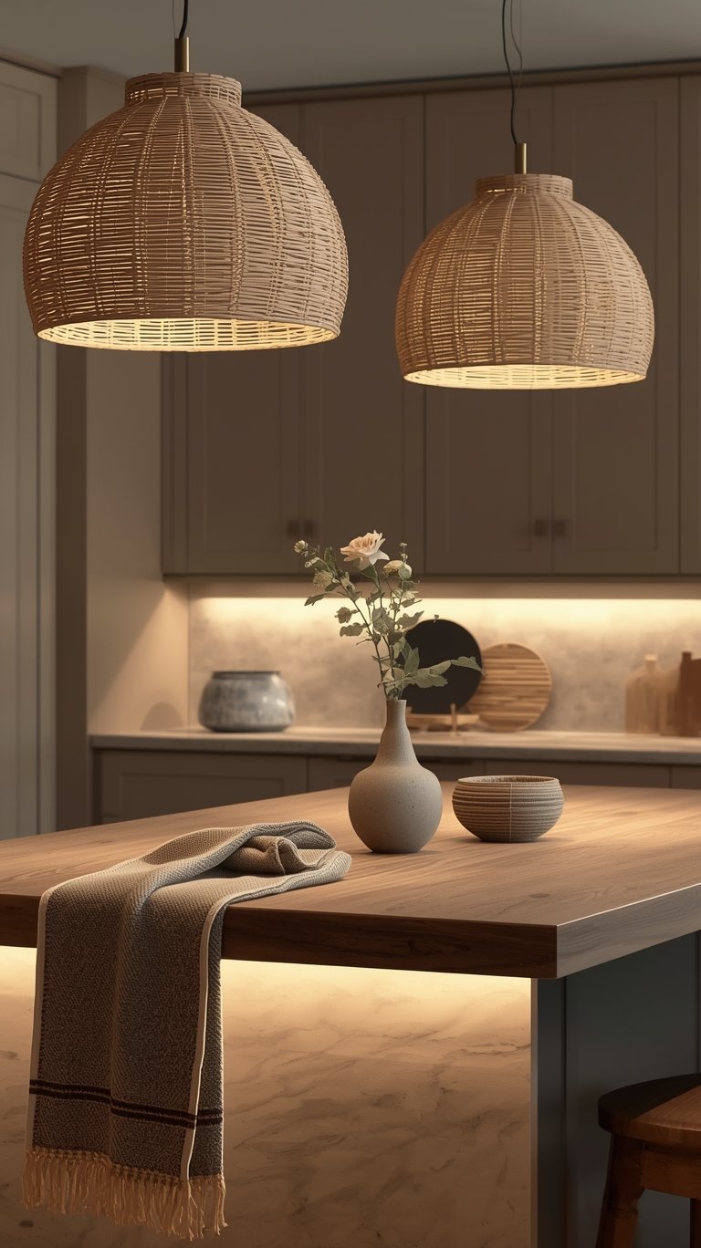
The right lighting ensures your cashmere cabinets look their absolute best.
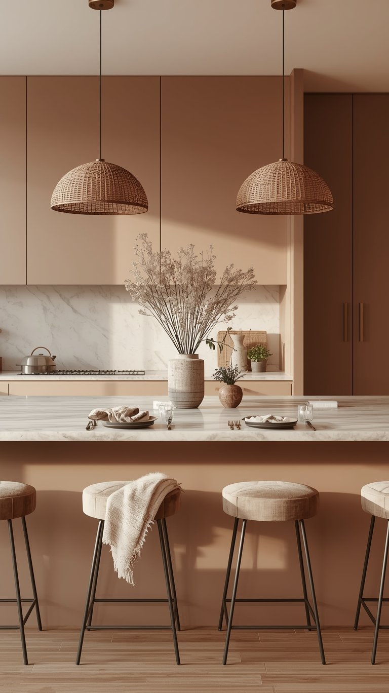
- Neutral Pendants: Neutral island pendant lighting acts like jewelry for your kitchen. Choose understated beauties like oversized glass globes or woven rattan shades.
- Intimate Light: Pendants should create intimate pools of light over the island, making it feel like the VIP section of your home.
- Warm Tones (Pro Tip): Go for warm-toned bulbs (2700K-3000K) in your pendants and under-cabinet lighting. They’ll make your cashmere cabinets glow like they’re lit by candlelight, and honestly, everyone looks better in that lighting (including your leftover pizza!).
Enhancing Space and Sophistication
Cashmere’s light-reflecting quality is one reason it’s so popular, especially in smaller spaces. Warm light further enhances this effect.
- Light Reflection: Cashmere’s ability to reflect light softly can enhance the sense of space and brightness in a kitchen.
- Sophisticated Touches: Creative light fixtures add a touch of sophistication and contribute light to warm the space.
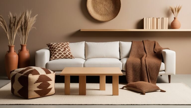
Layering Textures and Avoiding the “Beige Blob”
When you rely on subtle neutrals, you must create visual interest in other ways. This is done by layering different materials and textures.
The Importance of Layering
Layering textures prevents the easy-to-love neutral palette from veering towards an uninspiring or dull space.
- Dynamic Quality: By layering different materials—a matte wall against a polished marble countertop, or a velvet stool next to a lacquered cabinet—you add a dynamic quality that light and shadow can play off of.
- Textile Rule (Pro Tip): Follow the 60-30-10 rule with your textiles: 60% smooth surfaces (like cotton), 30% medium texture (linen or canvas), and 10% statement texture (chunky knits or velvet).
Strategic Contrast and Styling
Strategic contrast ensures your dining area or shelves stand out beautifully.
- Avoiding Monotony (Pro Tip): Your dining space needs that sweet contrast to avoid looking like one giant beige blob. Achieve this by pairing lighter cashmere chairs with a darker table (or vice versa).
- Open Shelving Rule of Thirds: If you include floating white oak shelves, follow the rule of thirds when styling them: one-third functional items, one-third decorative pieces, and one-third empty space. Your shelves need room to breathe.
Practical Tips for a Cohesive Design
Small details, from your sink choice to clutter management, complete the refined, cohesive cashmere look.
Sink and Faucet Selection
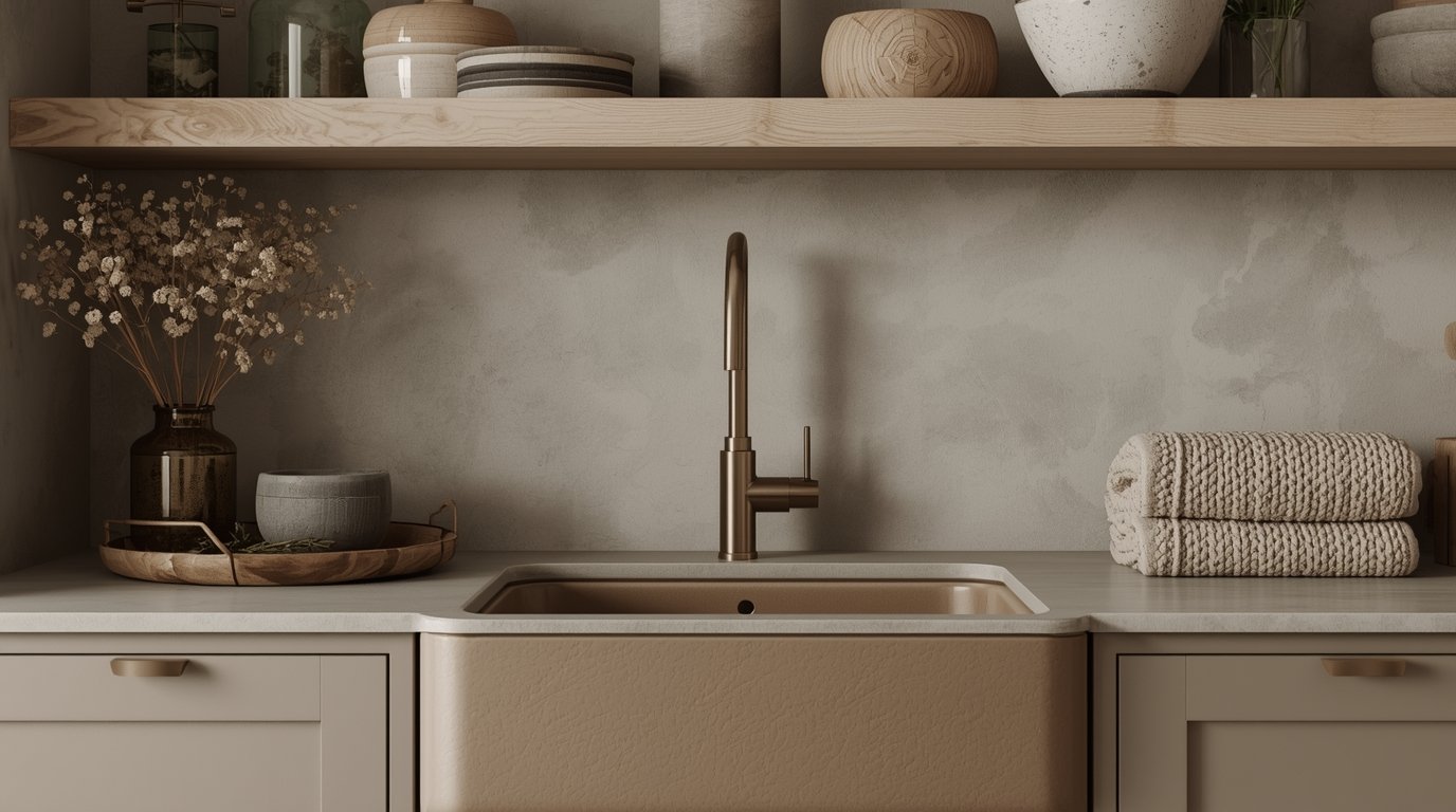
Don’t let a stark white sink clash with your beautiful warm cabinets.
- The Sink Switch (Pro Tip): Skip the stark white sink—it’ll make your cashmere cabinets look dingy. Instead, choose a cashmere ceramic sink that is either perfectly matched to your cabinets or 2-3 shades darker for a grounding effect.
- Faucets: Pair your cashmere sink with oil-rubbed bronze or brushed gold fixtures for instant elegance.
Clutter and Storage Management
Even the most sophisticated spaces need to be functional and clean.
- Clear Counters (Pro Tip): Keep your counters 80% clear by designating “homes” for everything. Display only your most beautiful everyday items (like a pretty olive oil bottle or your grandmother’s mixing bowls).
- Pantry Doors: Transform a boring pantry slab into a showstopper by matching the cashmere tone to your cabinets but going one shade lighter to create depth.
Future-Proofing Your Cashmere Kitchen
We all want a kitchen that looks great today and lasts through the next few trends. The cashmere kitchen achieves this balance through strategic choices that ensure timelessness.
Versatile Hard Finishes
The inherent safety of this design lies in its foundational materials.
- Flexibility for Repainting: While warm neutral cabinets are the hallmark of this trend, the important details and hard finishes can be completely versatile and timeless.
- The Key to Change: White countertops and tile add the soft contrast needed to keep the look clean, but more importantly, they are versatile finishes that will allow the cabinets and walls to be painted any color in the future. If in a decade or so you decide you want “sunny yellow cabinets,” you can have them.
- Balance in All-White: If you choose to paint your cabinets white down the road, it won’t automatically feel “too white” if you layer in natural wood, warm metals, or colorful textiles. Cohesion and harmony make all the difference.
Integrating Appliances
The goal is to maintain a monochromatic flow, but this can be achieved even with standard stainless steel.
- Monochromatic Flow: For the sleekest look, consider matte champagne refrigerator finishes or dishwashers with custom panel overlays.
- Balancing Cool Tones: If you have standard stainless steel appliances, ensure you use plenty of natural wood and warm-toned lighting nearby. This helps bridge the cool metal to the warmer cashmere tones.
FAQ
What Color Exactly Is Cashmere?
Cashmere is a soft, warm neutral shade that belongs to the “greige” color family. It expertly blends beige and gray tones, offering a sophisticated and inviting atmosphere. It’s essentially warmer than gray and softer than taupe.
Why are designers saying Cashmere Kitchens are timeless?
Designers agree that the cashmere trend has staying power because it relies on subtle, adaptable neutrals and natural materials. The color itself is calming and doesn’t age badly. Furthermore, the design philosophy emphasizes using versatile, white countertops and tile as fixed elements, which allows the cabinets to be easily repainted any color if the homeowner eventually tires of the neutral shade.
What is the ideal type of hardware for this trend?
The hardware of choice is typically a brushed gold or unlacquered brass. Designers stress that the hardware should be matte or brushed, not polished, to maintain “whispered elegance”. Unlacquered brass is favored because it develops a natural patina, getting “better with wear just like your favorite Kashmir sweater”.
What kind of wood pairs best with cashmere cabinetry?
Exposed timber, especially oak or limed oak, is considered one of the best pairings for cashmere cabinetry. Natural materials like oak or walnut add crucial depth and organic texture. The expert advice is to stick to one wood tone throughout the kitchen and favor blonde to medium woods.
What are the five undertones of beige I need to worry about?
When choosing the right neutral (cashmere) shade, you need to identify the correct undertone. The five undertones of beige are pink beige, orange beige, yellow beige, gold beige, and green beige. You must select the one that coordinates with your home’s existing fixed elements, like stone or tile.
Should I choose a matte or polished finish for my cabinets?
The consensus favors a matte finish for cashmere cabinets. Matte lacquer provides a “chalky European vibe,” resists fingerprints, and hides life’s little messes. While glossy finishes show every fingerprint, matte looks effortlessly expensive and feels velvety smooth.
Can I use dark countertops, like Stormy Black soapstone, with cashmere cabinets?
While light or white countertops are considered the ideal and most versatile pairing, if you choose a darker stone like Stormy Black soapstone, you must ensure that your cabinet and wall neutrals relate perfectly to the stone’s undertone. You would need to introduce additional lighter, glossy elements to counteract the visual weight of the dark stone.
What is the biggest mistake people make with warm neutrals?
The biggest mistake is choosing a warm neutral without understanding how light affects it and how undertones clash. Warm neutrals are “chameleons”. Choosing a color that doesn’t relate to anything else in the room (like stone or flooring) can lead to the color looking “dingy or out of place”. Always test large swatches in different lights.
The Bottom Line
You’ve discovered how Cashmere Kitchens aren’t just about the color—they’re a true cocoon of comfort that wraps your home in warmth. This style introduces a sophisticated new neutral that is soft, inviting, and luxurious without being cold.
By focusing on the small but vital details—choosing the right neutral undertone, insisting on matte finishes, and pairing generously with natural wood and brushed gold—you create a space that whispers rather than shouts. Your Cashmere Kitchen becomes the heart’s refuge, where morning coffee tastes richer and evening conversations flow deeper.
ABOUT the AUTHOR
TOKI; INTERIOR DESIGN & lifestyle CONTENT CREATOR.
Hey there! I’m Toki—the design-obsessed brain behind Dwell Studio 24. I’m a content creator passionate about interior design, photography, and creativity, living in a 77-year-old house with my husband and our awesome three kids. I write about interior design, furniture, home topics, and my lifestyle, including travel, recipes, skincare, and daily routines. I hope to inspire your next project and lifestyle!
ABOUT the AUTHOR
TOKI; INTERIOR DESIGN & lifestyle CONTENT CREATOR.
Hey there! I’m Toki—the design-obsessed brain behind Dwell Studio 24. I write about interior design, furniture, home topics, and my lifestyle, including travel, recipes, skincare, and daily routines. I hope to inspire your next project and lifestyle!