Paint Color Trends 2027: 6 Gorgeous, Essential Palettes for a Warmer Home
If you’ve been staring at a tired wall between school pickups and wondering what to paint next, paint color trends 2027 are good news. The shades are warm, soft, and far easier to live with than the cool grays of the last few years.
Paint brands have been revealing their 2027 Colors of the Year since late summer, and the lineup is unusually cohesive. We’re talking herbal greens, mossy olives, faded blues, clay and rosy earth, plus a few deep, moody shades for rooms that can handle some drama.
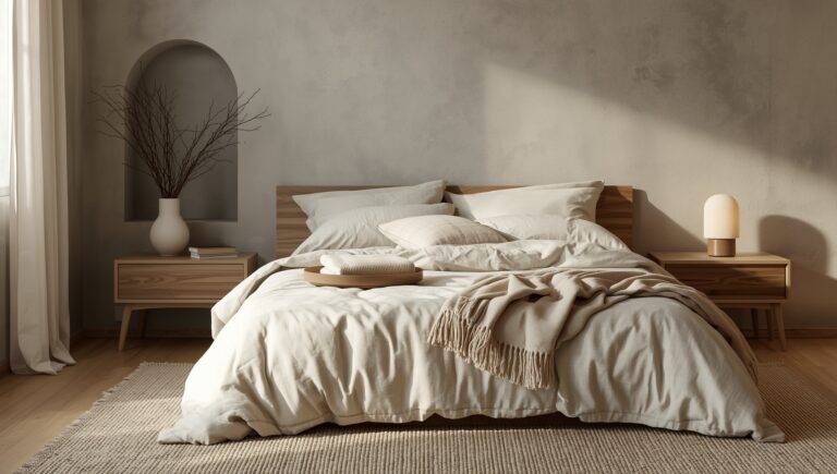
Last year’s story was warmth replacing cool gray. For paint color trends 2027, color joins the party, but gently. Nearly every shade hides a little brown, gray, or yellow inside (designers call this the undertone), so it plays nicely with wood, linen, and stone.
I’ve gathered everything in one place: the 2027 Color of the Year picks so far, six palettes worth knowing, real paint codes you can sample, and the shades I’d retire.
Feeling overwhelmed by all the shade names? Here’s your shortcut: pick one room and order one sample, either Celery for light or Grounded for cabinets. Ignore the rest for now and skim for the palette that sounds like your home. Let’s get into it!
Some of the links are affiliate links, so I may receive a small commission if you purchase through them (at no cost to you)! As an Amazon Associate I earn from qualifying purchases.
Key Takeaways
Before we dive in, here’s the quick snapshot of Paint Color Trends 2027:
- Warm beats cool: Cool grays and stark contrast are fading. The new shades carry a little brown, yellow, or gray, so they feel softer and more lived in. Of all the paint color trends 2027, this is the biggest shift.
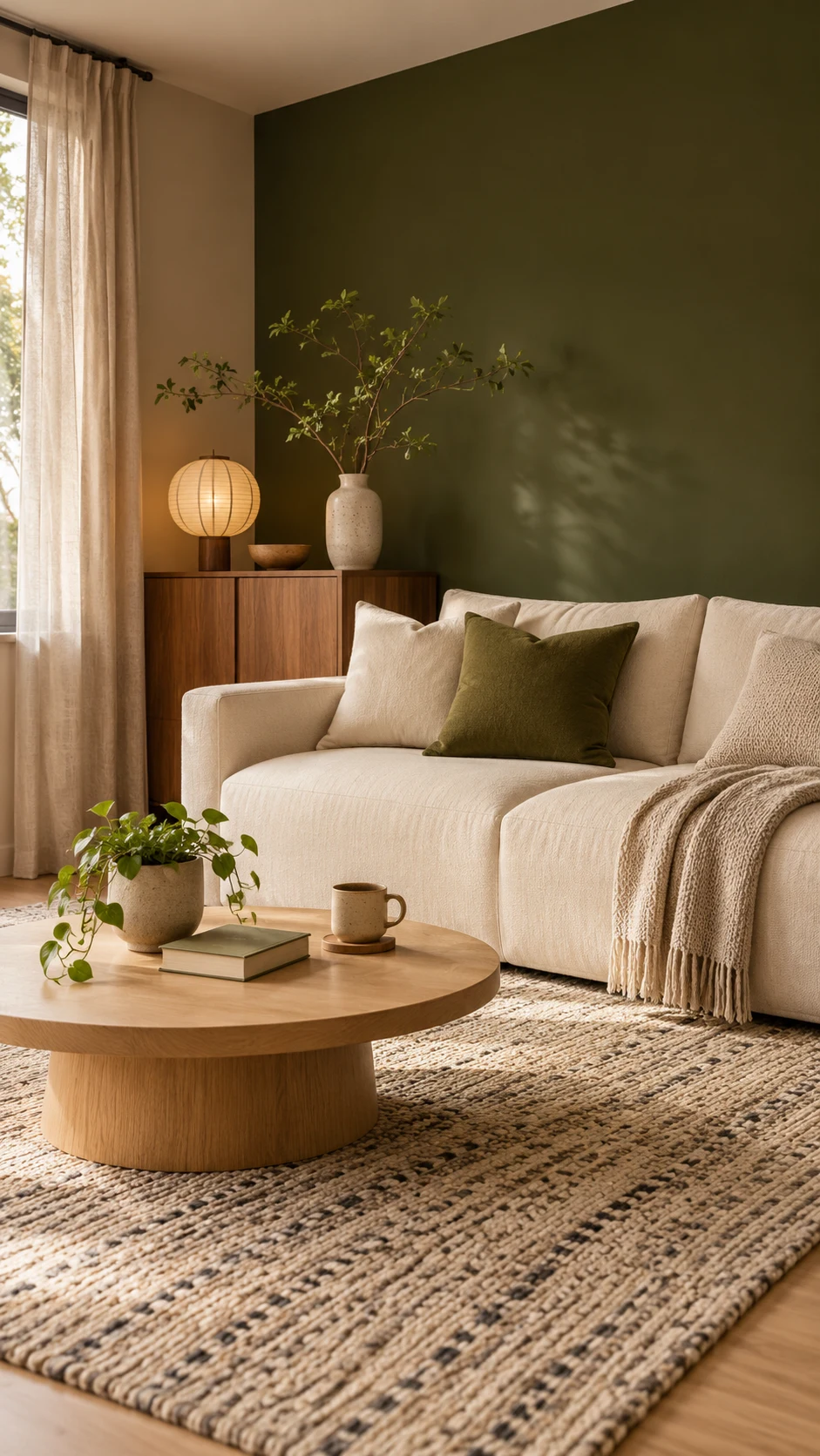
- Green is the new neutral: From airy Celery to mossy Grounded and Benjamin Moore’s Webster Green, green now works in nearly every room, and olive green paint colors are the star of paint color trends 2027.
- Blue gets calmer: Valspar’s Cottage Door and Pittsburgh Paints’ Artifact, two of the 2027 color of the year picks, are muted and a little smoky, so they feel cozy and calm, not coastal.
- Moody colors get nuance: Moody paint colors like aubergine (a deep eggplant purple), oxblood (a dark red-brown), and heritage reds (classic barn and brick reds) are showing up in dining rooms, libraries, and powder rooms.
- Paint goes beyond the walls: Trim, cabinets, ceilings, and color drenching (painting the walls, trim, and ceiling in one color) are the new ways designers are using color.
- Start small, then sample: Pick one room and one color. LRV (light reflectance value) is a 0-to-100 score for how light a color looks on the wall, so check it, then stick up a peel-and-stick sample before you buy a gallon.
Keep those six ideas in mind and the rest of this guide will feel much easier to navigate.
If you only have a few minutes, the Sherwin-Williams 2027 forecast walkthrough above is a great warm-up. Otherwise, keep scrolling, because the paint color trends 2027 breakdown starts right below.
The New Color Philosophy Behind Paint Color Trends 2027
Across every forecast I read for paint color trends 2027, one message keeps popping up: people want homes that feel lived in, not staged.
For years, the safe move was gray walls and white everything. The 2027 paint color trends break that habit.
Sherwin-Williams built its Rewild forecast around 48 colors that invite you to reconnect with nature and follow your instincts. Valspar calls its pick a colorful new neutral that layers easily into a home.
From Cool Gray to Colors With a Pulse
Cool gray was easy. It went with everything and asked for nothing. The catch is that it can feel a little flat, especially here in Southern California, where the sunlight is strong.
The colors replacing it in paint color trends 2027 aren’t loud. They just have more going on underneath:
- Warm neutrals: mushroom, putty, taupe, and creamy white.
- Greens with depth: from pale herbal to mossy olive.
- Faded blues: a little gray, a little warm, never icy.
- Earthy reds and pinks: clay, terracotta, and rosy earth.
- Dark shades with nuance: aubergine, plum, and oxblood.
That extra depth is what makes a room feel collected and a little lived in.
The Big Idea Behind Paint Color Trends 2027
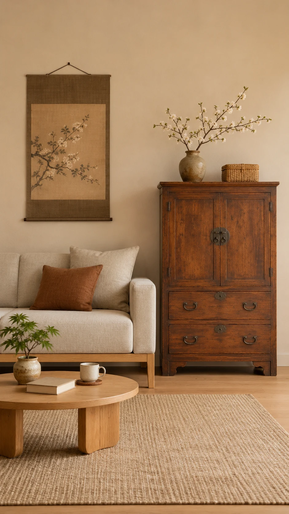
Sherwin-Williams organizes its forecast around three stories that sum up paint color trends 2027 nicely. Revive brings back heritage color and craftsmanship. Reignite plays with bold contrasts. Reconnect pulls from nature, stone, and clay.
Looking at the brands’ Color of the Year picks together, a few shared ideas stand out: nature and calm, a little wellness, and moody browns and plums replacing cool grays and flat beiges. My favorite takeaway is the easiest one to act on: judge any color next to your real materials.

My Top Tip: Before you fall for a shade online, look at it next to your wood floors, your sofa, and your countertops. Undertones show up fast next to real materials, and that one look can save you a lot of repainting.
Your own wood, sofa, and counters get the final vote, so let them weigh in.
The 2027 Colors of the Year at a Glance
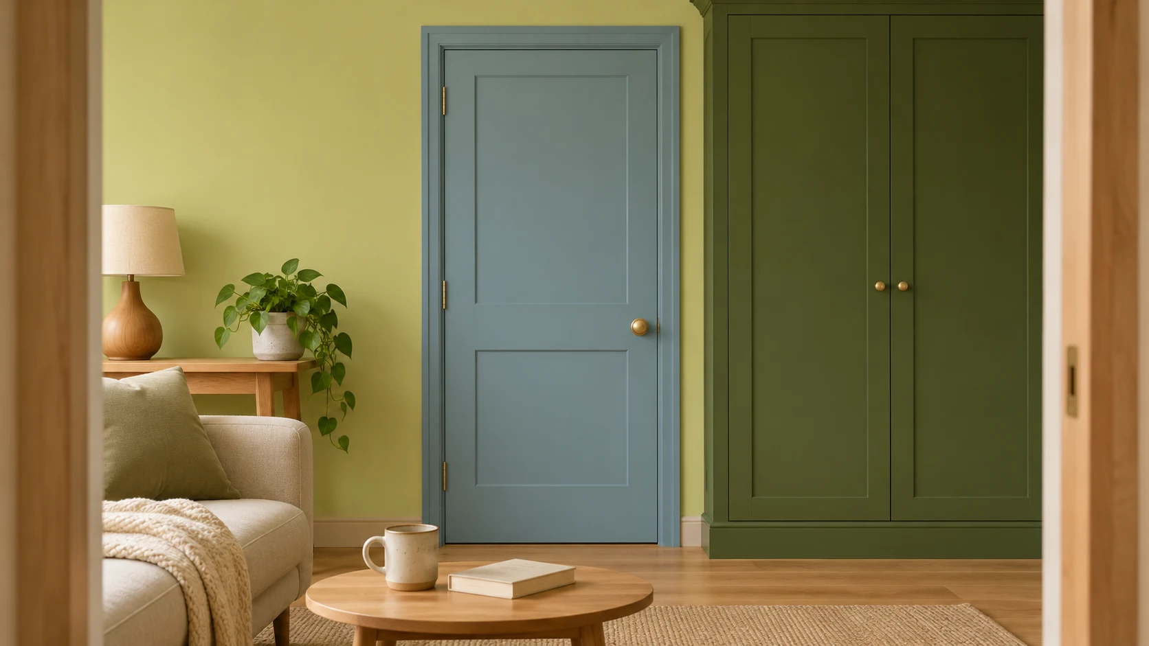
The color of the year 2027 lineup leans one way: soft, earthy greens and blues, with warm clay and deep brown as supporting players. Here are the picks that shape paint color trends 2027, what they look like in real life, and where they work best.
Sherwin-Williams Celery (SW 6421)
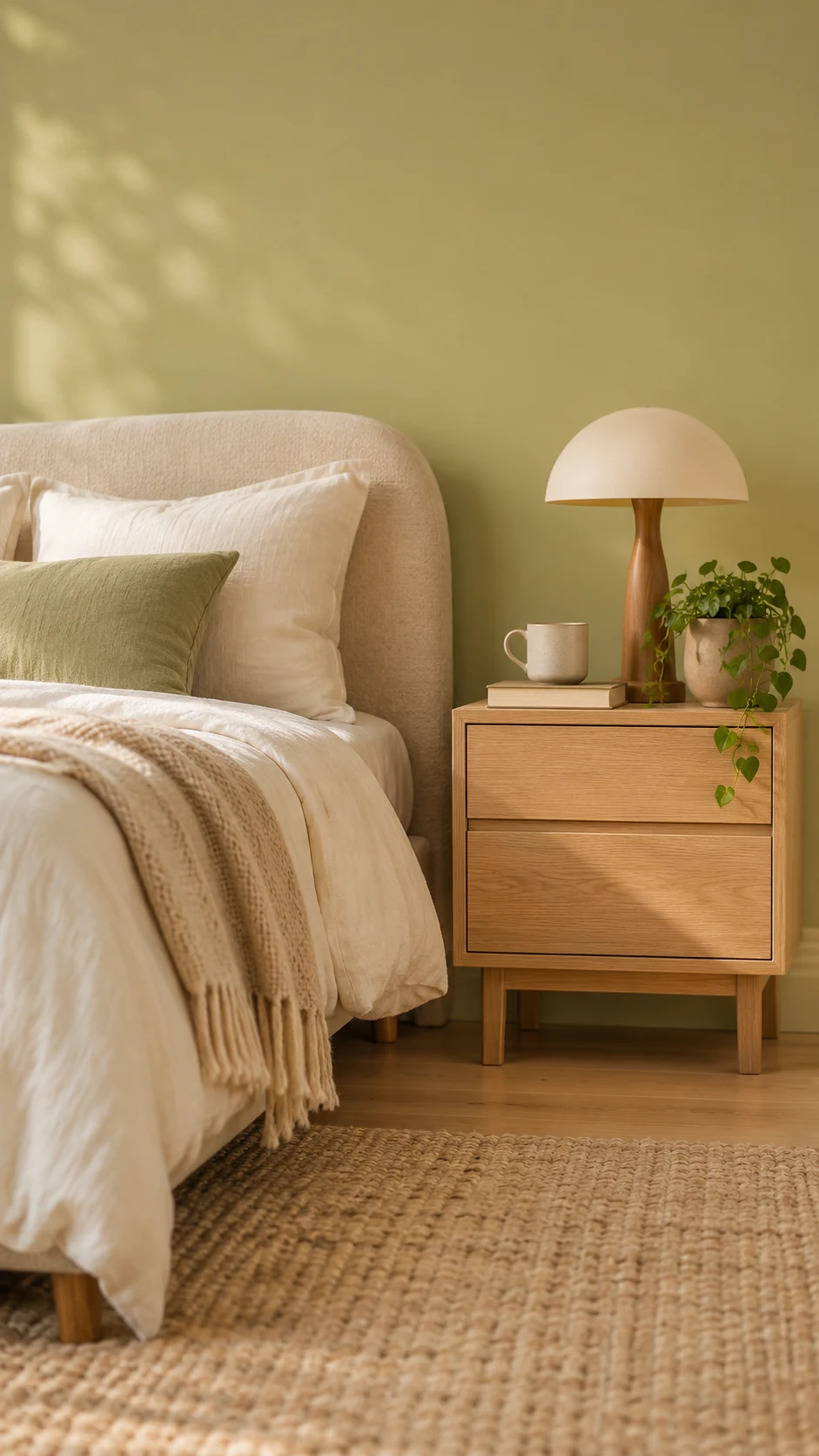
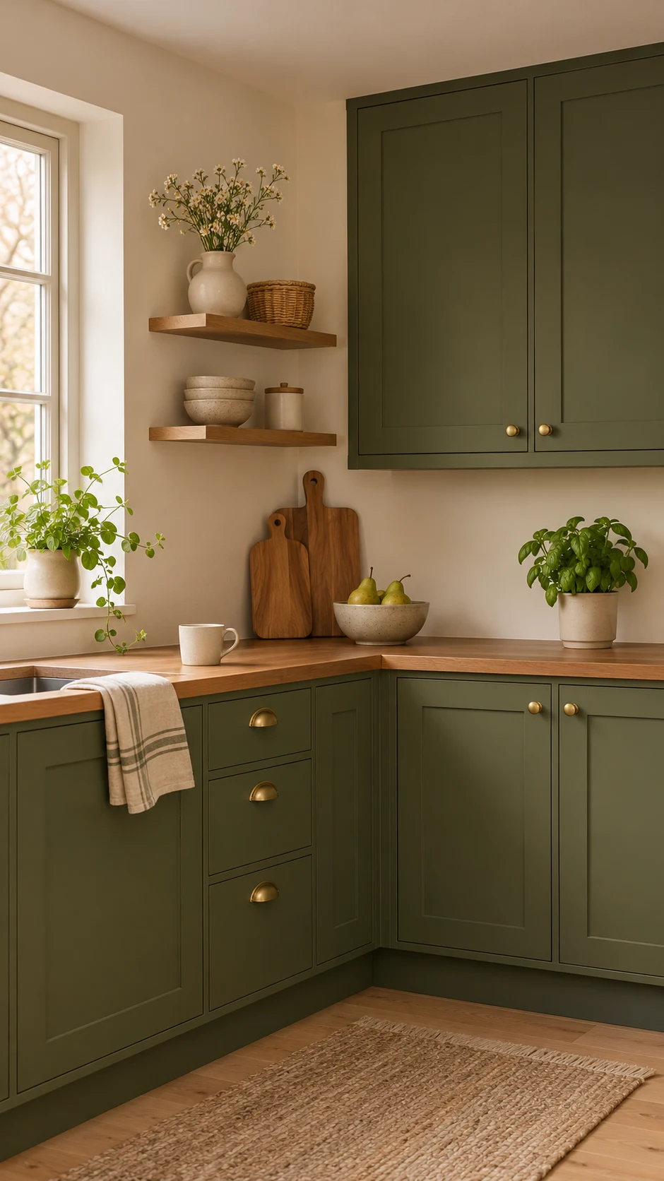
Celery is a soft herbal green with a hint of yellow, somewhere between a pastel and a grounded botanical shade. Sherwin-Williams chose it as its 2027 color of the year to reflect wellness, balance, and connection to the natural world.
With an LRV of 71, it’s light enough to brighten a bedroom, bathroom, sunroom, or reading corner without feeling icy. Pair it with warm white, light oak, woven textures, and aged brass.
Behr Grounded (T27-01)
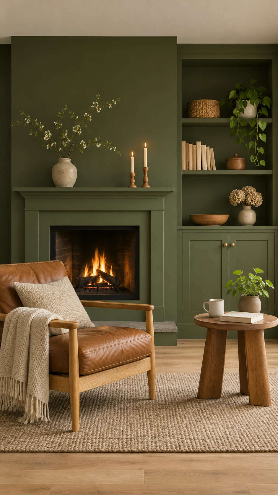
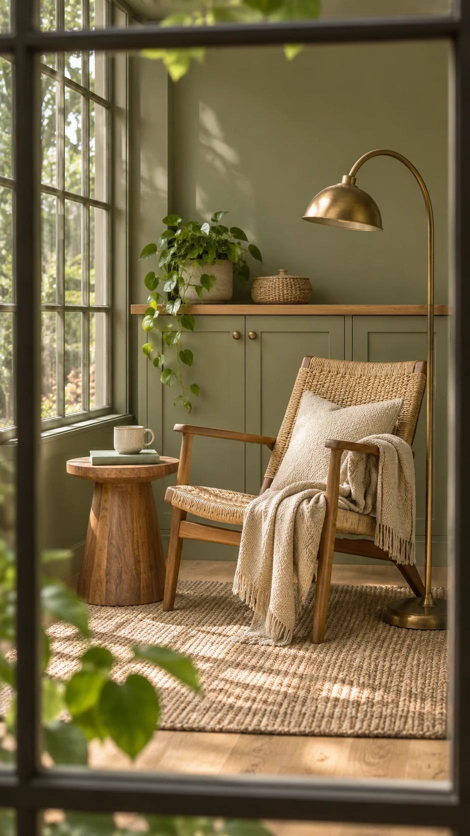
Grounded is Behr’s 2027 color of the year, a mossy olive with earthy brown undertones that Behr describes as rooted, lived in, and real. It’s also one of the darkest picks, with an LRV of just 9.
That makes it happiest on kitchen cabinets, built-ins, a bathroom vanity, or a fireplace surround, rather than on every wall. Warm white, natural wood, brass, and leather all suit it beautifully.
Here’s Behr’s own quick reveal of the color:
Valspar Cottage Door (8004-38E)


Valspar’s 2027 color of the year is a muted, mid-tone blue (not too light, not too dark). With an LRV of 26, it reads deeper in a real room than it does on a screen.
It’s a lovely fit for bedrooms, home offices, bathrooms, laundry rooms, and cabinetry. I like it with Apricot Blush (8003-8A), a creamy pink, for a warm and cool balance.
More 2027 Colors of the Year to Know
A few other brands have weighed in too, and they all fit the same story:
- Pittsburgh Paints Artifact: a smoky, muted blue with an LRV of 21.
- Dunn-Edwards French Press Coffee (DEBN07): a rich espresso brown with smoky charcoal undertones, and an LRV of just 6.
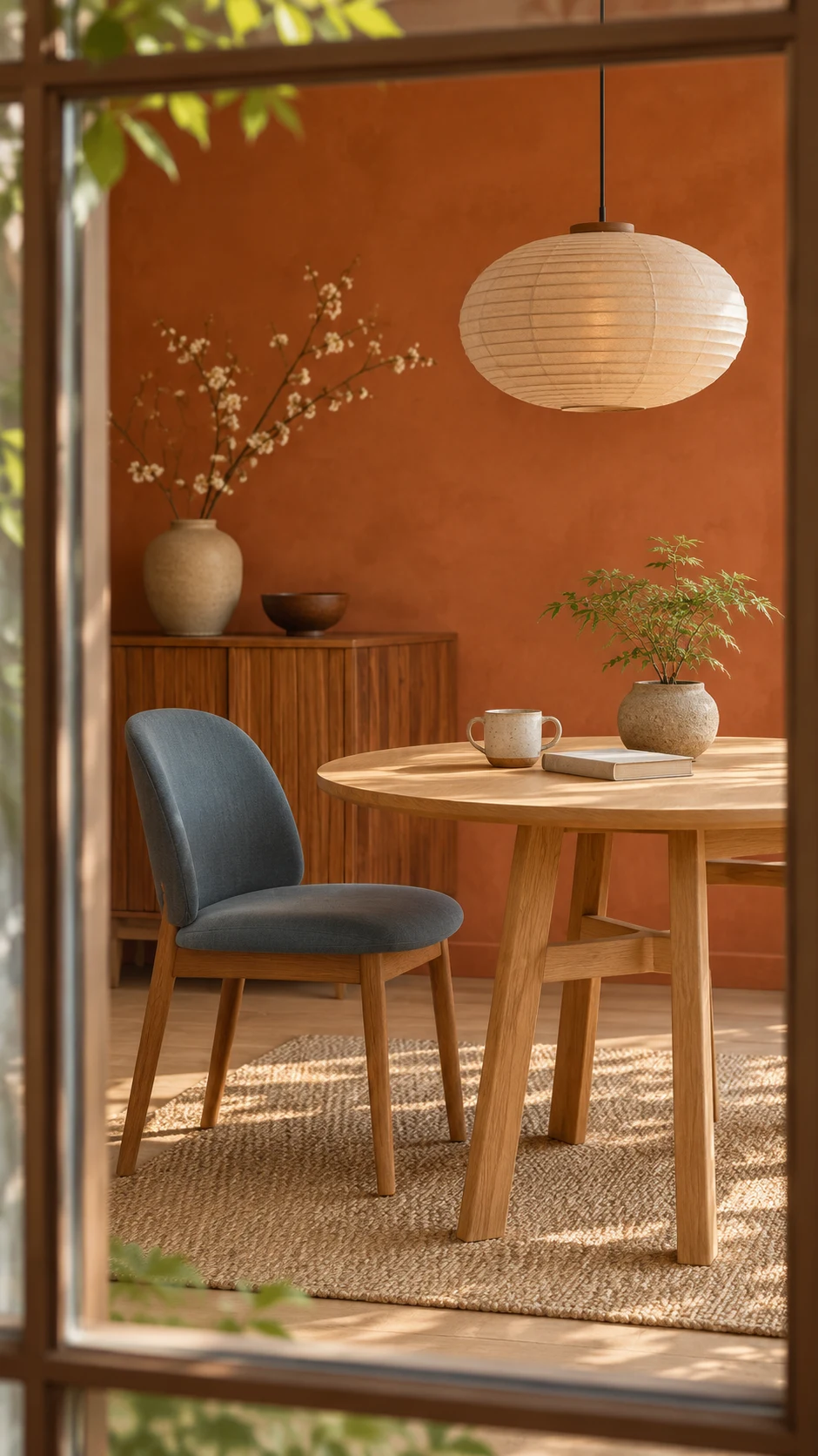
- Dutch Boy Deep Rooted (311-7DB): a rich, earthy orange that looks like a sun-warmed terracotta pot. It’s sold exclusively at Menards, and its LRV is 17.
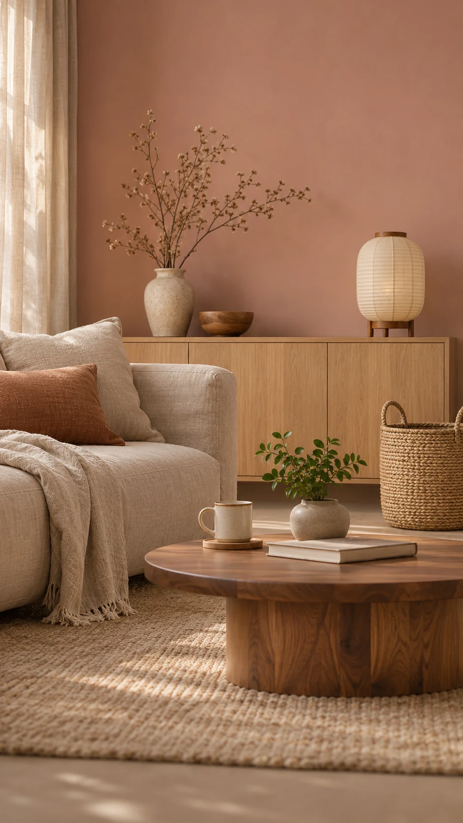
- Graham & Brown Rose Earth: a soft, warm pink with clay and brown undertones. It reads more like a warm neutral than a sweet pink.
- Dulux Soulful Sage: an airy, silvery sage green from the English paint brand Dulux, so it may be harder to find at a US paint counter.
Together, these picks show how far the 2027 lineup leans toward warm, earthy color.
What the Forecasters See
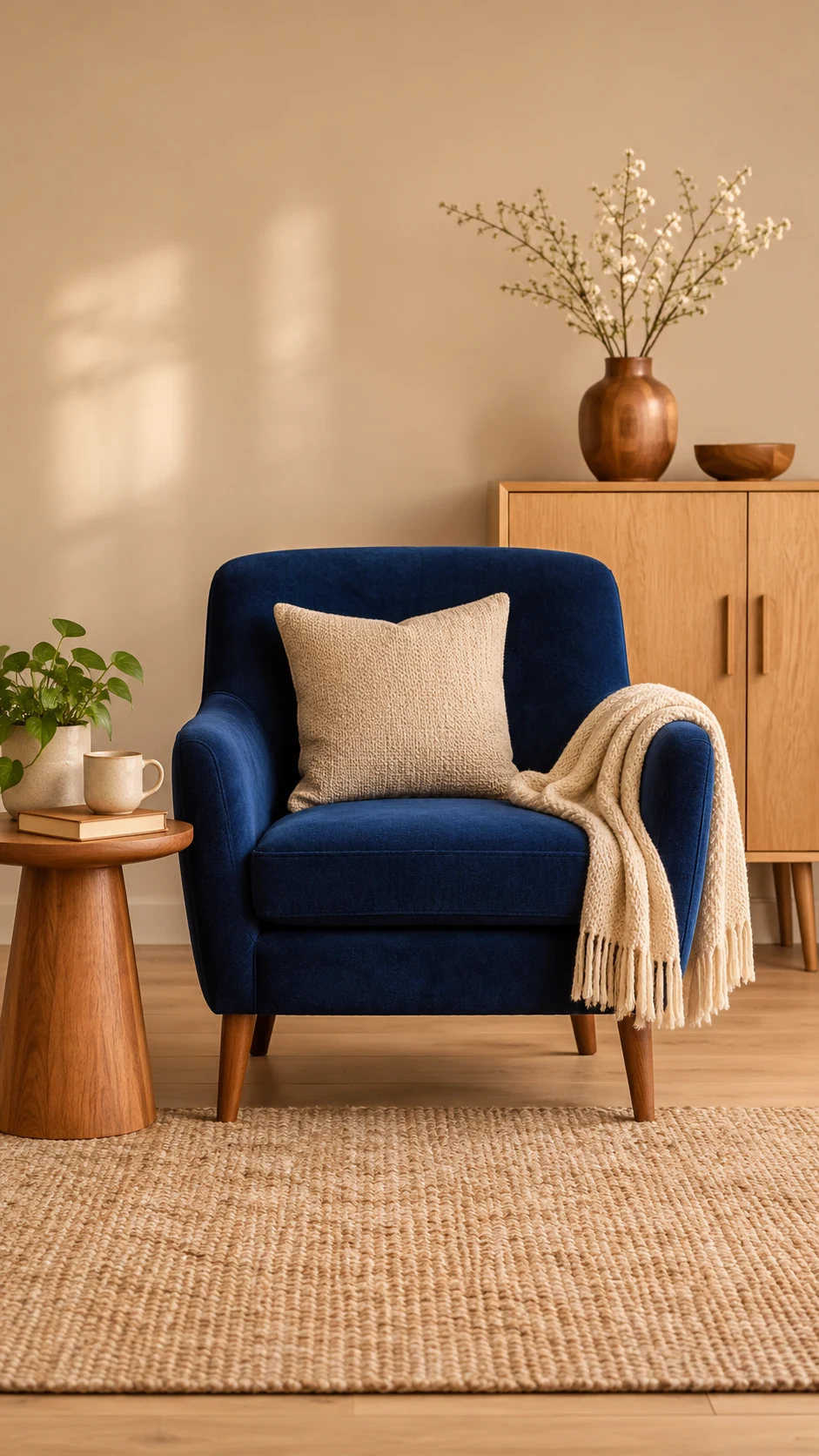
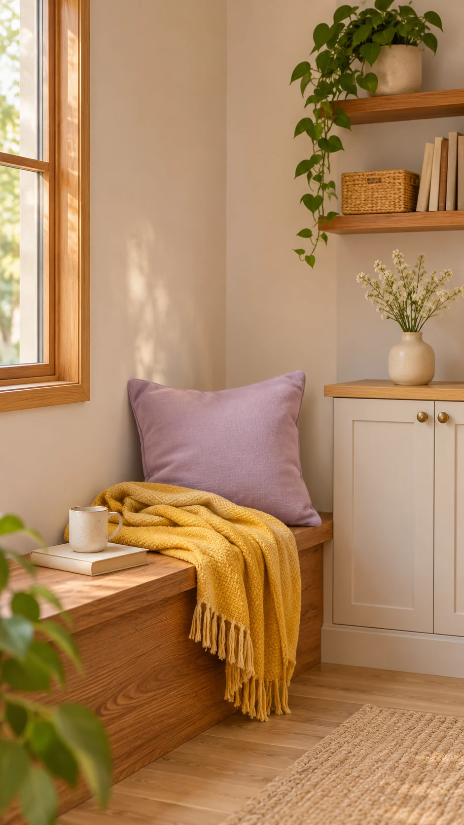
The trend forecasters at WGSN and Coloro named Luminous Blue their 2027 Color of the Year back in April 2025. The faded blues in this guide are the easier, calmer way to live with blue at home.
Fashion and home color tend to borrow from each other, so watch for more blue to sneak into paint color trends 2027 decor next.
Benjamin Moore Webster Green (HC-130) and Pantone
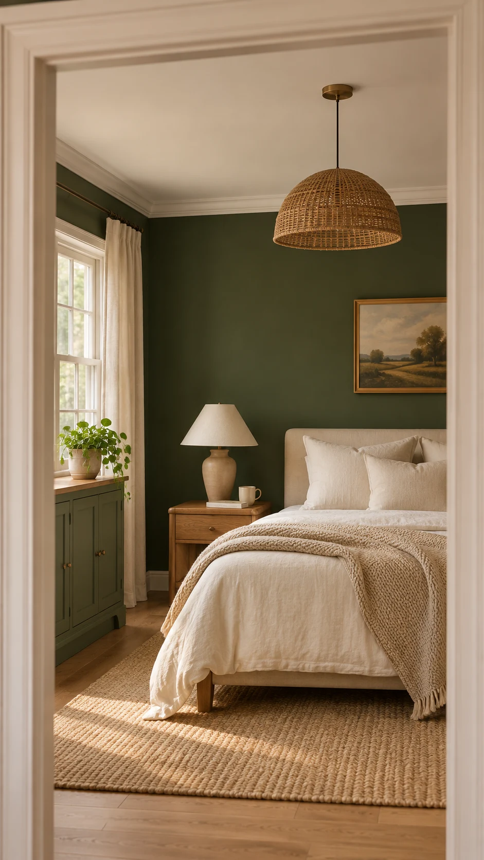
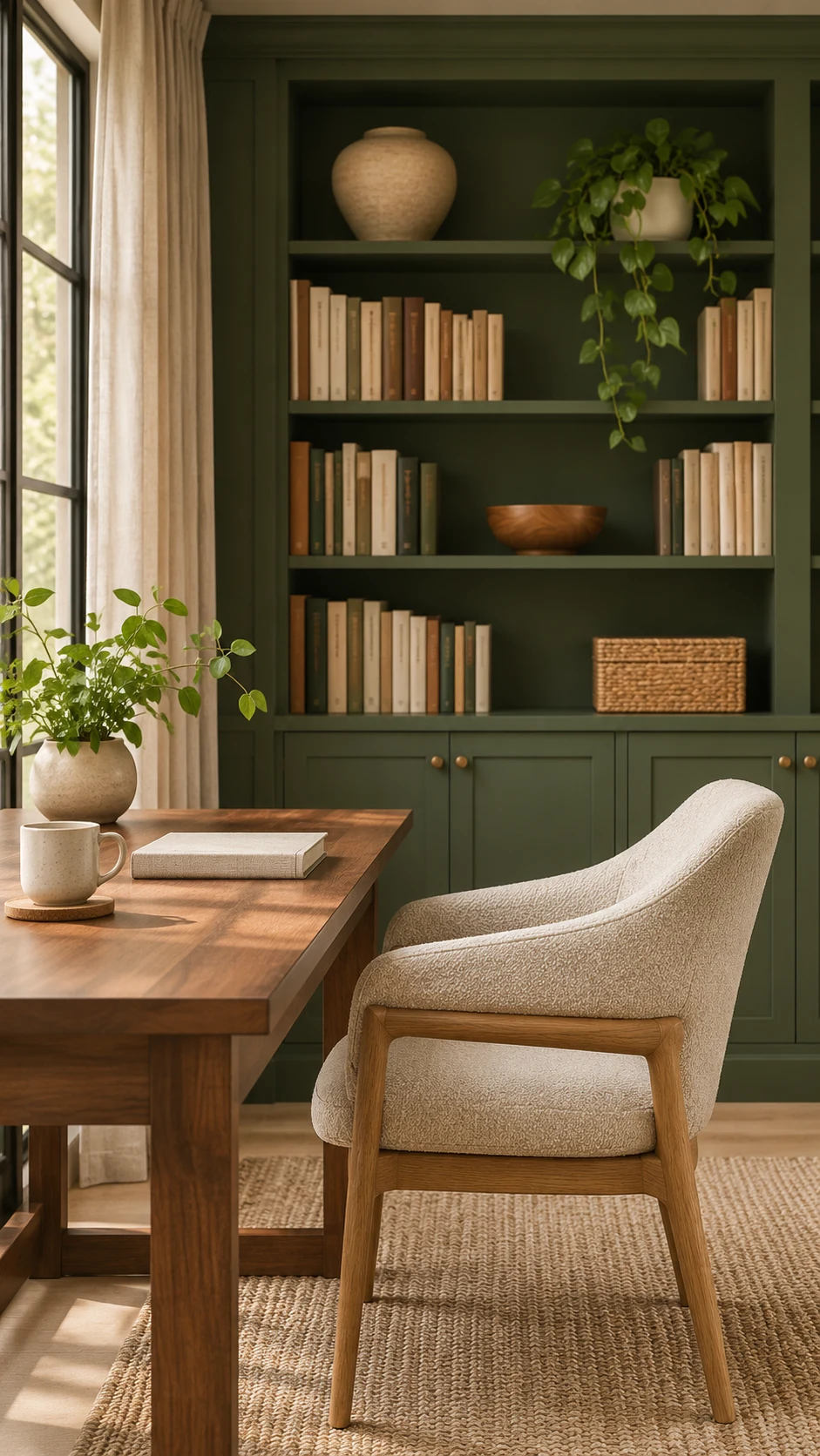
Benjamin Moore announced Webster Green (HC-130) as its 2027 Color of the Year on October 14, a classic green that balances stability with optimistic energy.
Its 2027 palette adds seven more shades: White Down, Nelson Blue, Shakespeare Tan, Antique Copper, Wild Aster, Durango, and Townsend Harbor Brown.
Pantone hasn’t announced its 2027 pick yet. It usually shares the new color between late November and early December. I’ll update this section the moment it’s official, so check back.
Only want to remember three? Celery for light, Grounded for cabinets, Cottage Door for a calm blue.
Shop These Paint Colors
Here are the closest matches I found for the shades above. A peel-and-stick sample is the easiest way to try one at home before you buy a gallon.
- Celery : SW 6421 by Sherwin-Williams || Sample
- Grounded : T27-01 by Behr || Sample
- Webster Green : HC-130 by Benjamin Moore || Sample
- Cottage Door : 8004-38E by Valspar
- Deep Rooted : 311-7DB by Dutch Boy
You don’t need all five. Pick the one closest to your home, order one sample, and save the rest for later.
The 6 Palettes That Define Paint Color Trends 2027
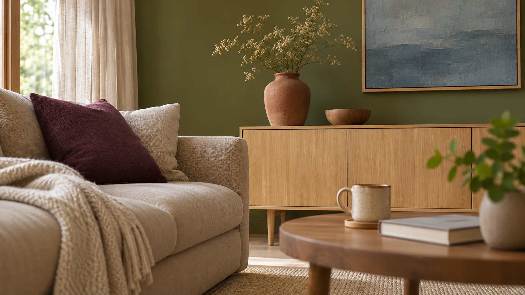
Six palettes cover nearly all of paint color trends 2027: earthy greens, faded blues, warm neutrals, clay tones, moody darks, and sun-faded pastels. You don’t need all six, so skim for the one that sounds like your home.
Earthy Greens: From Airy Celery to Deep Olive
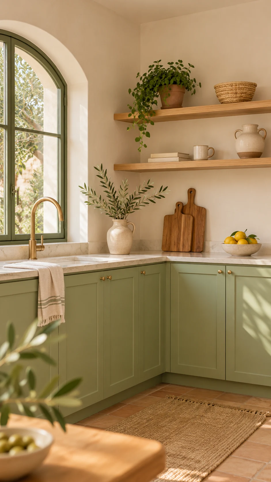
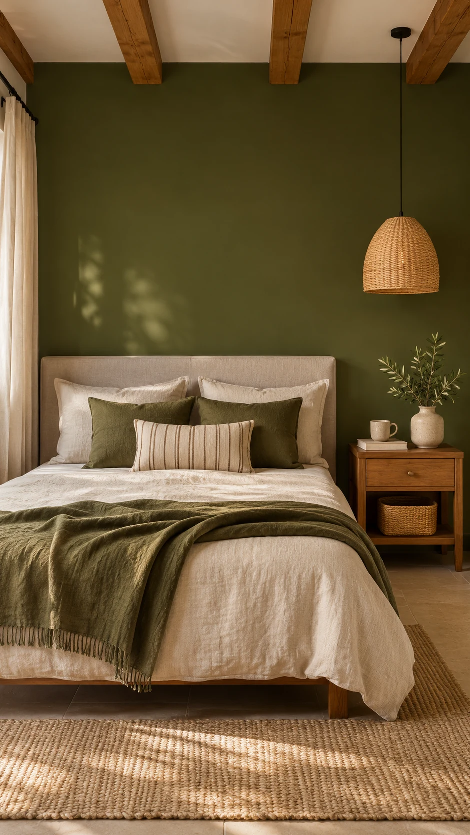
Green is behaving like a neutral now, and it’s the clearest of all the paint color trends 2027. It works with wood, white, and nearly every metal.
The range runs from pale, herbal Celery to mossy Grounded and Benjamin Moore’s Vintage Vogue, an ultra-dark, smoky green (LRV 11.85).
If you’re hunting for olive green paint colors, start with Grounded, then sample Vintage Vogue if you want something smokier. Webster Green is the classic deep green if you want something less brown.
Designers are also pointing to browner, richer greens, sometimes called safari green, for anyone who wants depth without going cold. Roycroft Bronze Green from Sherwin-Williams leans in that earthier, more olive direction.
Best for: kitchen cabinets, built-ins, bedrooms, and bathrooms. Pair with: warm white, light oak, and aged brass.
Shop These Paint Colors
Here are the greens from this palette. Order one peel-and-stick sample and hold it next to your wood floors.
- Celery : SW 6421 by Sherwin-Williams || Sample
- Grounded : T27-01 by Behr || Sample
- Webster Green : HC-130 by Benjamin Moore || Sample
- Vintage Vogue : 462 by Benjamin Moore || Sample
- Roycroft Bronze Green : SW 2846 by Sherwin-Williams
Not sure which green? Grounded is the easy first sample, and Celery is the light option.
Faded Blues: Smoky, Mid-Tone, and Never Icy
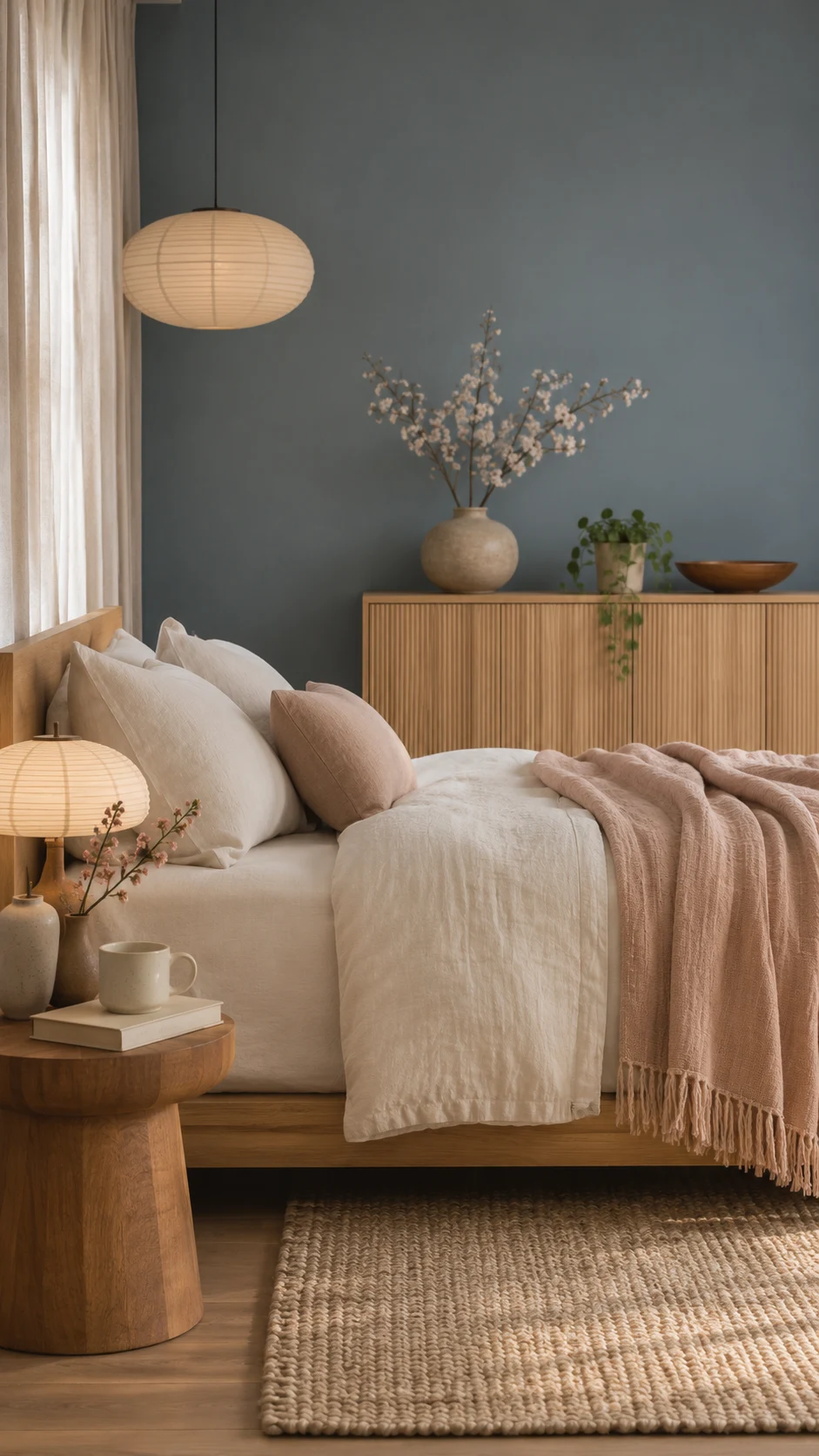
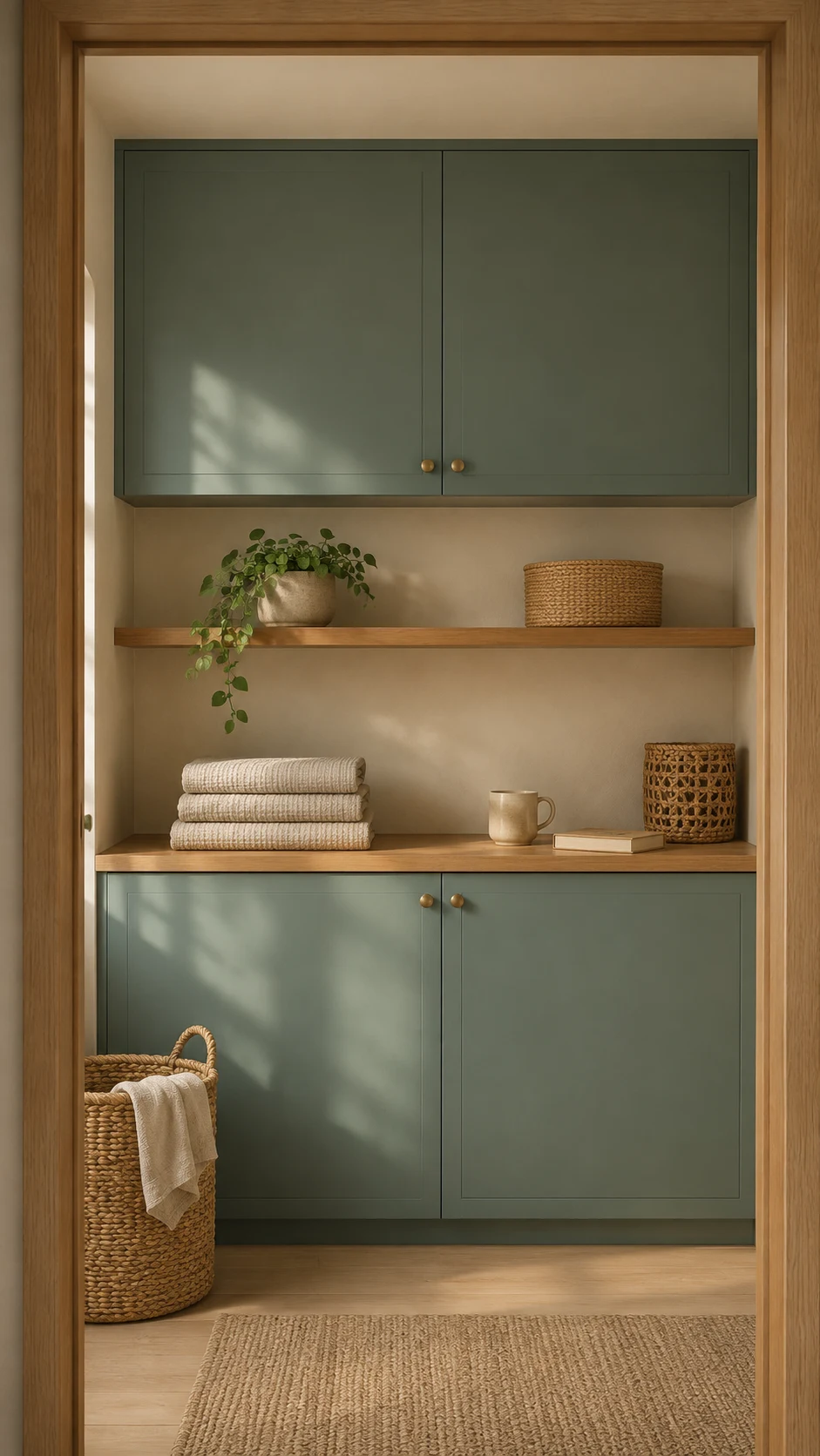
The blues in paint color trends 2027 have gray in them, and that’s the secret. They feel cozy and a little vintage, never beachy. Cottage Door and Pittsburgh Paints’ Artifact set the tone, and Sherwin-Williams’ Dutch Tile Blue adds a more complex, heritage feel.
Aegean Teal from Benjamin Moore is a muted teal that’s especially handy in laundry rooms, mudrooms, kitchen islands, and bathrooms. If you love a blue that connects warm and cool materials, this is the one to sample.
Best for: bedrooms, home offices, bathrooms, and laundry rooms. Pair with: warm ivory, light oak, soft blush, and warm metals.
Shop These Paint Colors
Here are the blues I’d sample first. A peel-and-stick sample shows how much gray you’re really getting.
- Cottage Door : 8004-38E by Valspar
- Dutch Tile Blue : SW 0031 by Sherwin-Williams || Sample
- Aegean Teal : 2136-40 by Benjamin Moore || Sample
Torn between two gray-blues? Stick Cottage Door and Dutch Tile Blue side by side and let your own light decide.
The New Neutrals: Mushroom, Putty, and Creamy White
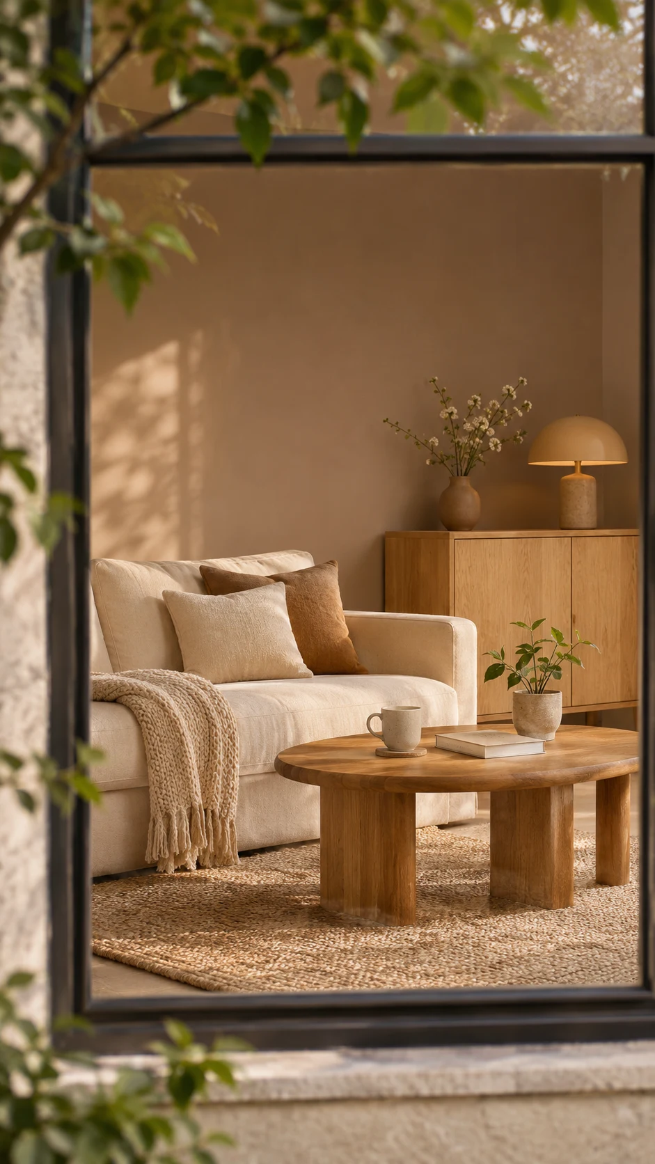
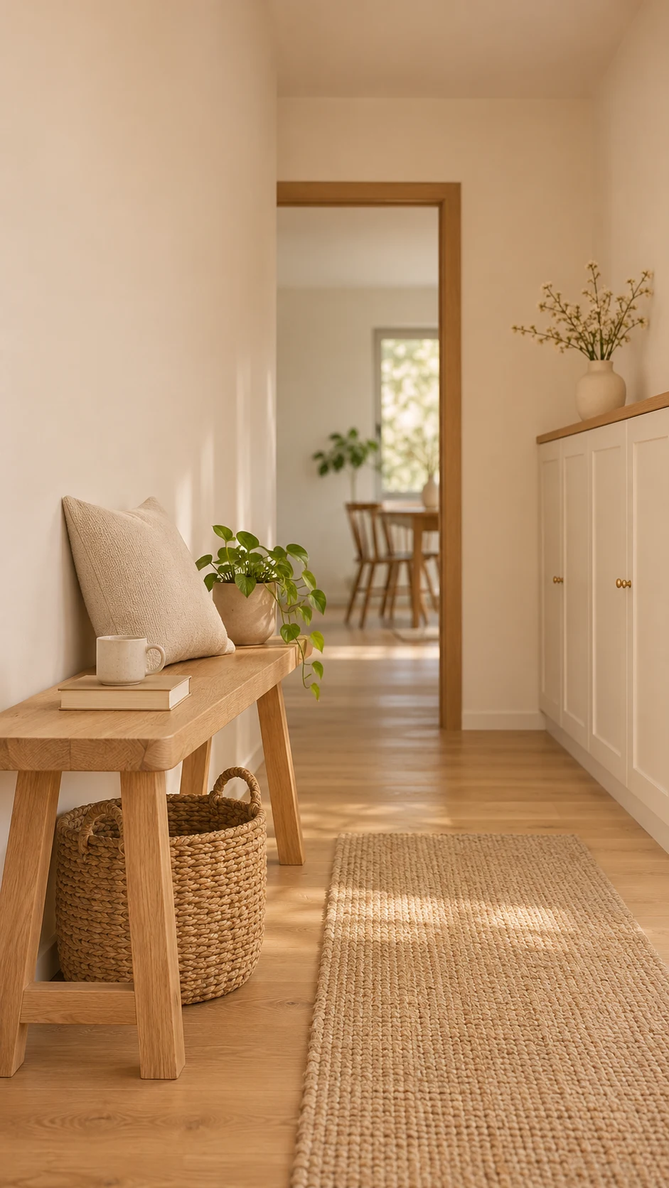
Warm neutral paint colors are still the backbone of paint color trends 2027, but they’ve gotten more interesting. Think mushroom, putty, taupe, and oatmeal instead of plain beige.
Dunn-Edwards’ Elusive Morel is a warm, mid-tone mushroom brown with an LRV of 35. Sherwin-Williams’ Backdrop is a warm, soft neutral that looks gorgeous on built-ins and accent walls. Behr’s 2027 palette adds Coastal Beige to the mix.
For creamy whites in paint color trends 2027, White Dove from Benjamin Moore plus White Duck and White Flour from Sherwin-Williams are soft whites that keep a room bright without feeling stark.
Best for: living rooms, bedrooms, hallways, and whole-home color. Pair with: olive, clay, and natural wood.
Shop These Paint Colors
Here are the warm neutrals and creamy whites worth sampling. Try them on the wall you’d actually paint.
- White Dove : OC-17 by Benjamin Moore || Sample
- White Duck : SW 7010 by Sherwin-Williams || Sample
- White Flour : SW 7102 by Sherwin-Williams || Sample
- Backdrop : SW 7025 by Sherwin-Williams || Sample
- Elusive Morel : DEBN30 by Dunn-Edwards
- Coastal Beige : PPU7-13 by Behr || Sample
Whites can fool the eye, so tape two swatches next to each other on one wall and see which feels softer.
Earth Tone Paint Colors: Clay, Terracotta, and Rosy Earth
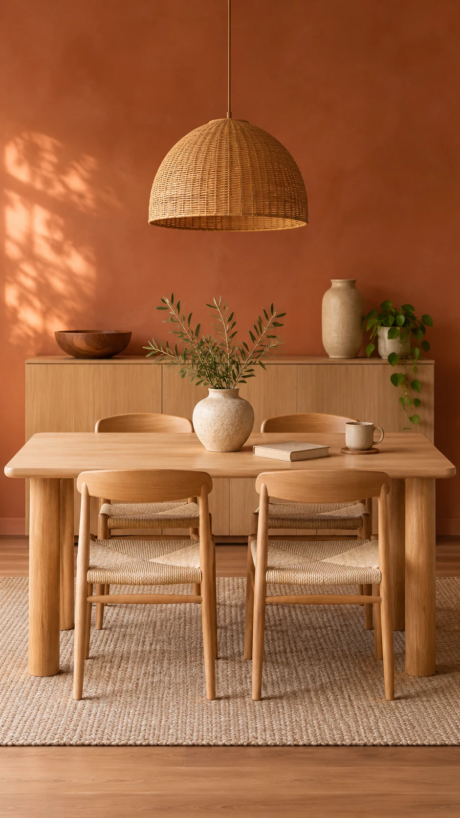
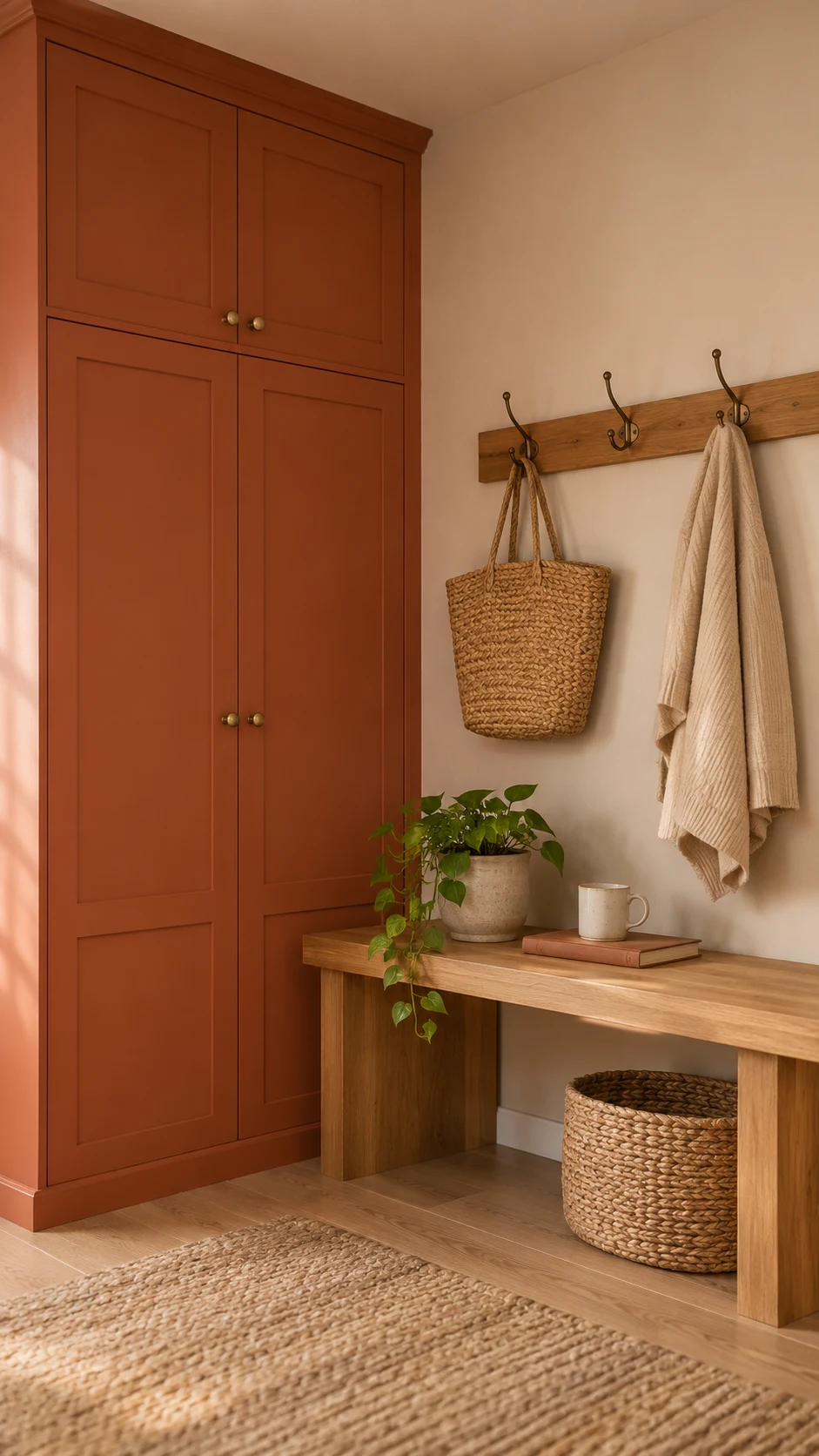
This palette of paint color trends 2027 feels like sun-baked walls and warm pottery.
If you love earth tone paint colors, this is your corner of the trend. Deep Rooted, Behr’s Tuscan Terra (an earthy red), and Sedona Pink (a peachy brown) bring it in three intensities.
Rose Earth keeps things soft.
Sherwin-Williams’ Cavern Clay, a reddish-orange mid-tone, is a great pick for mudrooms, dining rooms, and kitchen islands. Deep Rooted feels more sophisticated than the orangey Tuscan looks of the 1990s, especially next to a muted blue.
Speaking of blue, clay and faded blue make a gorgeous pair. Try Cottage Door with a touch of Apricot Blush or Deep Rooted for a warm and cool balance.
Best for: powder rooms, dining rooms, kitchen islands, mudroom cabinets, and front doors. Pair with: faded blue, warm white, and natural wood.
Shop These Paint Colors
Here are the clay, terracotta, and rosy earth shades. A peel-and-stick sample shows how much orange you’re really getting.
- Cavern Clay : SW 7701 by Sherwin-Williams || Sample
- Tuscan Terra : T27-02 by Behr || Sample
- Sedona Pink : S190-3 by Behr || Sample
- Apricot Blush : 8003-8A by Valspar
- Deep Rooted : 311-7DB by Dutch Boy
Warm on warm. Hold Cavern Clay and Deep Rooted up against your wood trim before you pick a winner.
Moody Paint Colors: Aubergine, Plum, and Heritage Reds
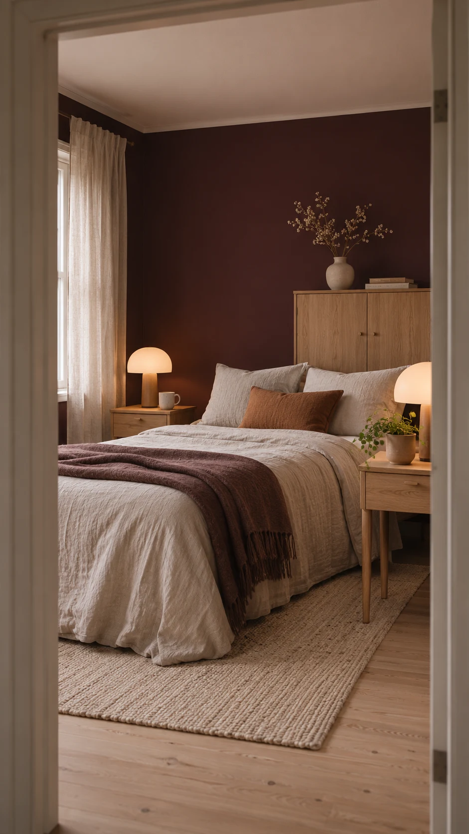
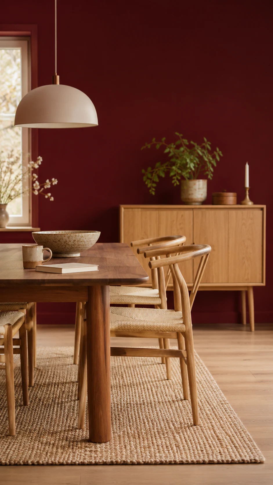
Moody paint colors aren’t going anywhere in paint color trends 2027, but they’ve gotten smarter. Rather than plain black, deep shades now carry green, red, brown, or purple undertones, which gives them a richer, more lived-in look.
Benjamin Moore’s Caponata is a deep aubergine brown that suits primary bedrooms, libraries, and dining rooms. Bewitched is a deep oxblood wine, a rich red-brown that’s wonderful in a dining room, a study, or a powder room.
Sherwin-Williams’ Cordovan and Red Barn bring in the heritage reds.
Dunn-Edwards’ French Press Coffee is a rich espresso brown with smoky charcoal undertones (LRV 6), if you want moody without going purple.
Best for: evening rooms, cabinetry, and built-ins. Pair with: warm white trim, natural wood, and aged brass. Low LRV means these need good lighting, so sample them after dark too.
Shop These Paint Colors
Here are the moody shades. Check them after dark too, since deep colors change under lamplight.
- Caponata : AF-650 by Benjamin Moore || Sample
- Bewitched : CSP-450 by Benjamin Moore || Sample
- Cordovan : SW 6027 by Sherwin-Williams || Sample
- Red Barn : SW 7591 by Sherwin-Williams || Sample
- French Press Coffee : DEBN07 by Dunn-Edwards
Deep color is a small-dose game, so one wall or one cabinet run is plenty to start.
Sun-Faded Pastels, Straw Gold, and Soft Lilac
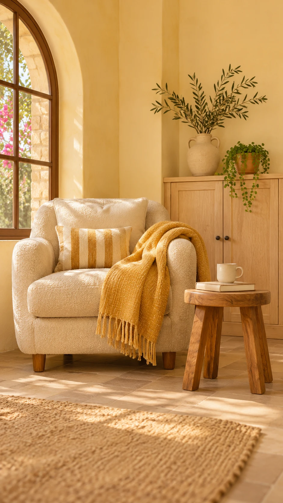
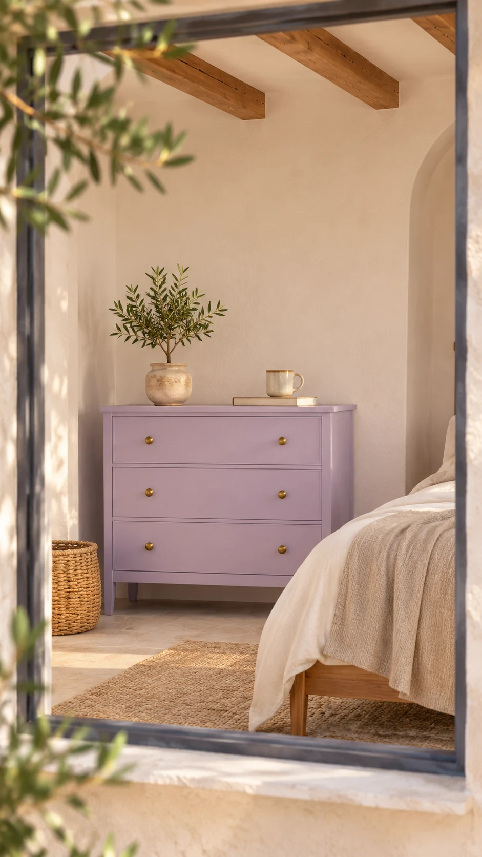
Not everything in paint color trends 2027 is deep. Faded, chalky colors feel fresher than perfectly saturated ones, and they’re ideal if you want a little joy without a lot of commitment. Think of your favorite linen shirt after a summer of washing.
Behr’s Frittata is a vibrant light yellow, and Hayloft is a soft straw gold. Sherwin-Williams’ Potentially Purple is a gentle lilac that echoes the muted mauves and soft purples showing up in 2027 forecasts. Celery counts here too.
These are lovely in small doses: a powder room, a reading nook, or a painted piece of furniture. The sun-faded pastels and warm mustards showing up in 2027 forecasts are a sweet way to test the waters.
Best for: powder rooms, reading nooks, and painted furniture. Pair with: warm white, light oak, and natural linen.
Shop These Paint Colors
Here are the sun-faded shades. They’re lovely in small doses, so a sample on a dresser or a nook wall is plenty.
- Frittata : M290-2 by Behr || Sample
- Hayloft : MQ2-22 by Behr || Sample
- Potentially Purple : SW 6821 by Sherwin-Williams || Sample
Not sure pastels are you? A dresser sample answers that in a day.
My Top Tip: Once your first room is done, try a three-can recipe for paint color trends 2027: one mid-tone (a green or a blue), one warm white for trim, and one deep accent like Caponata for a door or bookcase. For now, sample only the mid-tone.
Pick the mood you want from paint color trends 2027, then choose just one or two colors and call it done.
How to Use Paint Color Trends 2027 Room by Room
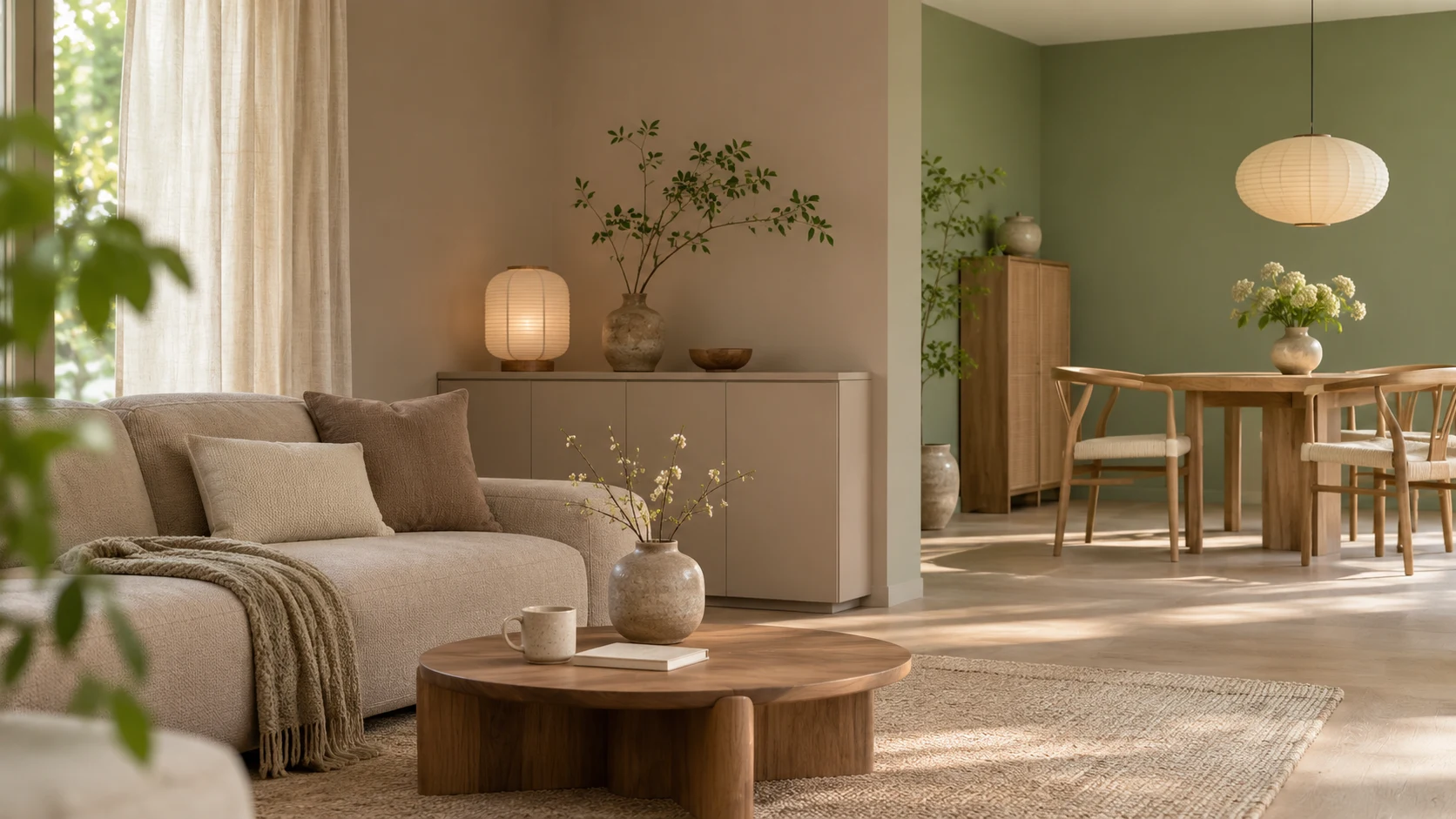
Match the palette to the room: soft greens and blues for bedrooms and baths, warm neutrals for living areas, and deeper colors for cabinets and small spaces. For more than paint, my interior design trends 2027 guide covers layouts, furniture, and materials.
Living Room and Bedroom Paint Color Trends 2027
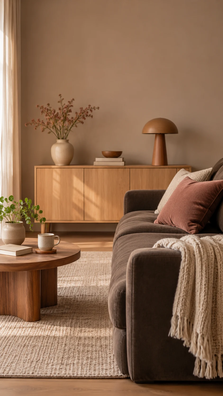
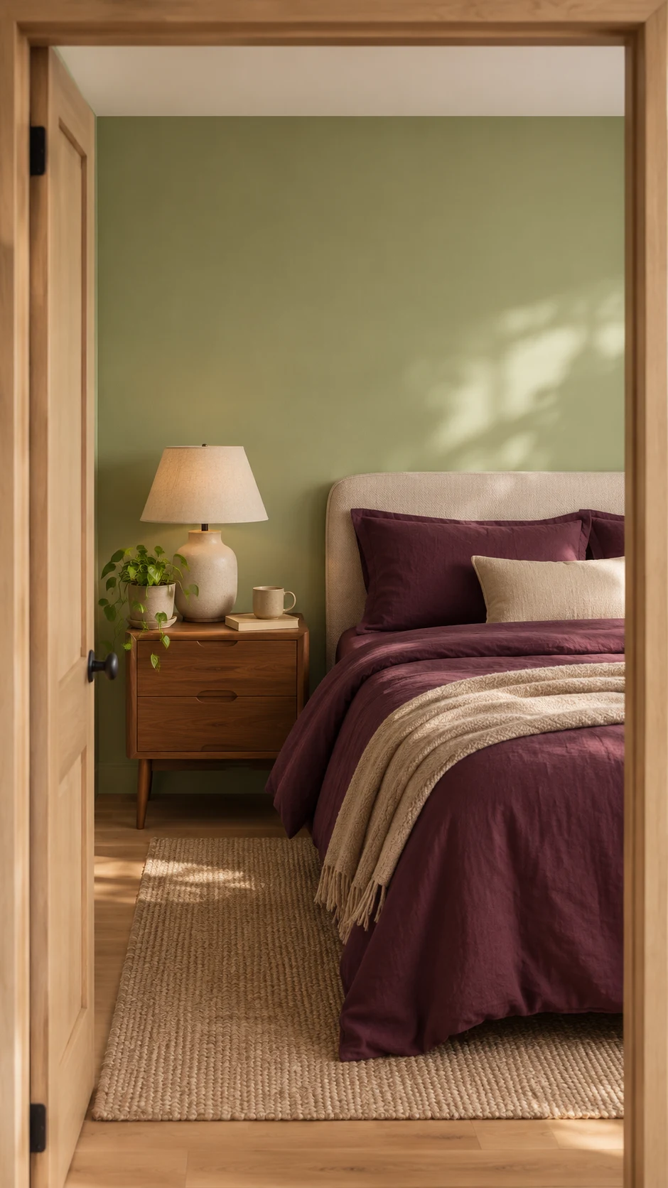
For living rooms, warm neutral paint colors like Elusive Morel and Backdrop, or a soft rosy shade like Rose Earth, create a calm backdrop. In bedrooms, Cottage Door and Celery feel restful, and Caponata gives a primary bedroom a cocooning, cozy mood.
Kitchen and Laundry Paint Color Trends 2027
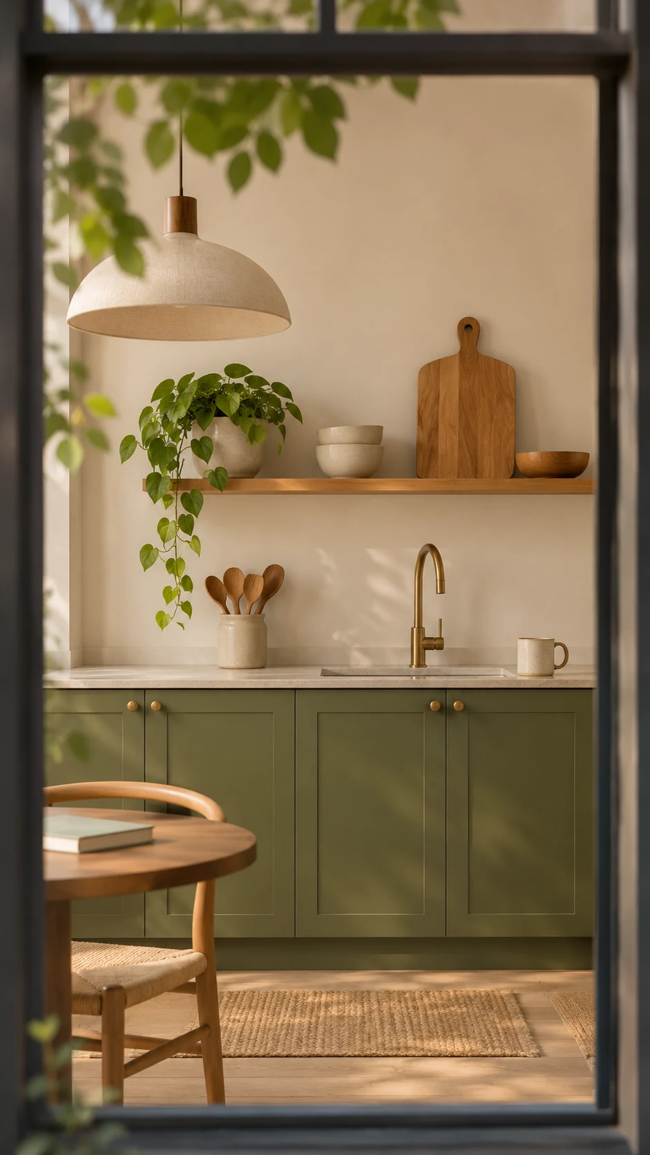
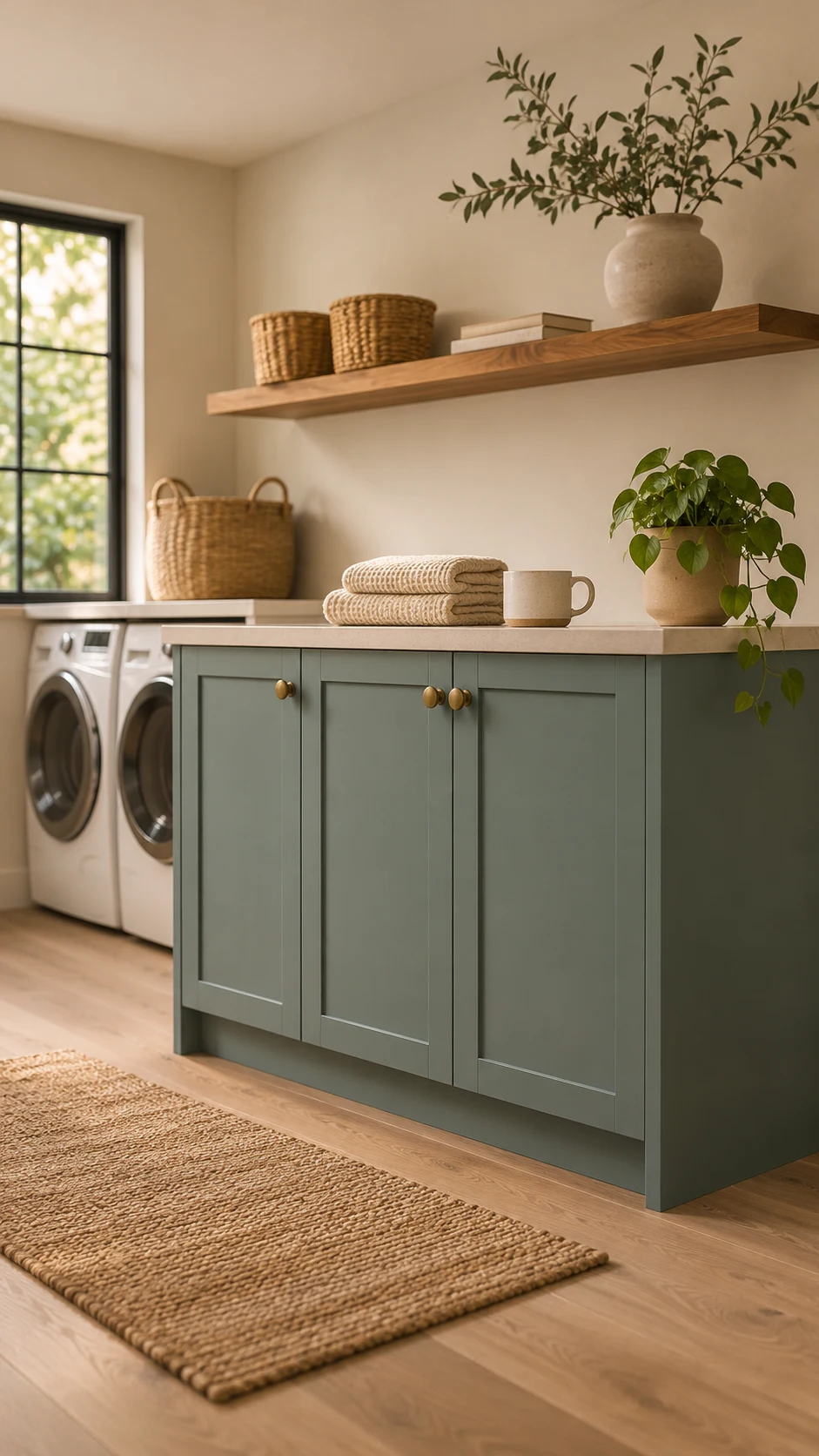
Kitchens are where color shows up on cabinetry, islands, and pantry doors. Olive green paint colors like Grounded and Vintage Vogue look great on cabinets, while Aegean Teal shines on an island or in a laundry room. Celery works on cabinets too, especially with warm white walls.
Bathroom and Powder Room Paint Color Trends 2027
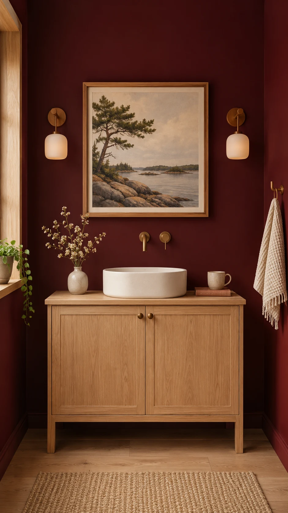
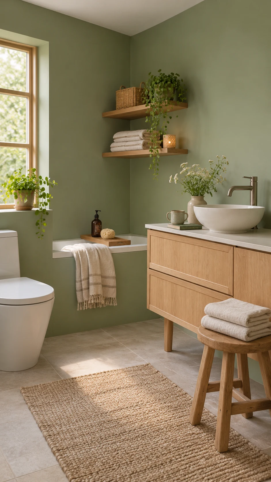
Celery, Cottage Door, and Aegean Teal are all spa-calm in a full bath. A powder room is your chance to go bolder. Bewitched, Deep Rooted, and Potentially Purple are all small-space showstoppers.
Entry, Mudroom, and Home Office Paint Color Trends 2027
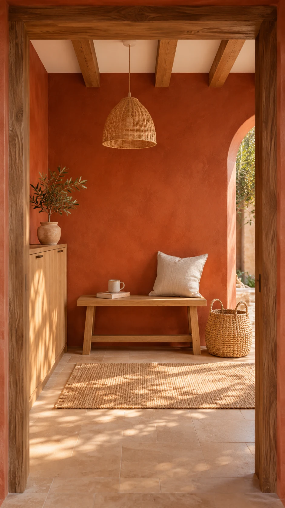
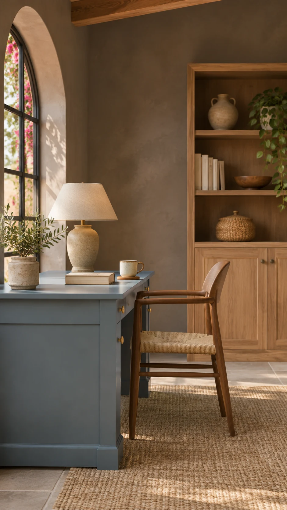
Cavern Clay and Aegean Teal are practical, friendly choices for a mudroom. For a home office, Backdrop, Caponata, and Cottage Door create a focused, calm setting.
If you like to see forecasts side by side, this video compares American and European 2027 paint predictions:
Bedrooms and living rooms like calm. Kitchens and mudrooms can take more color, and powder rooms are your playground. Not sure where to begin? Start with the room you walk through most.
Expert Tips for Using Paint Color Trends 2027 Without Regret
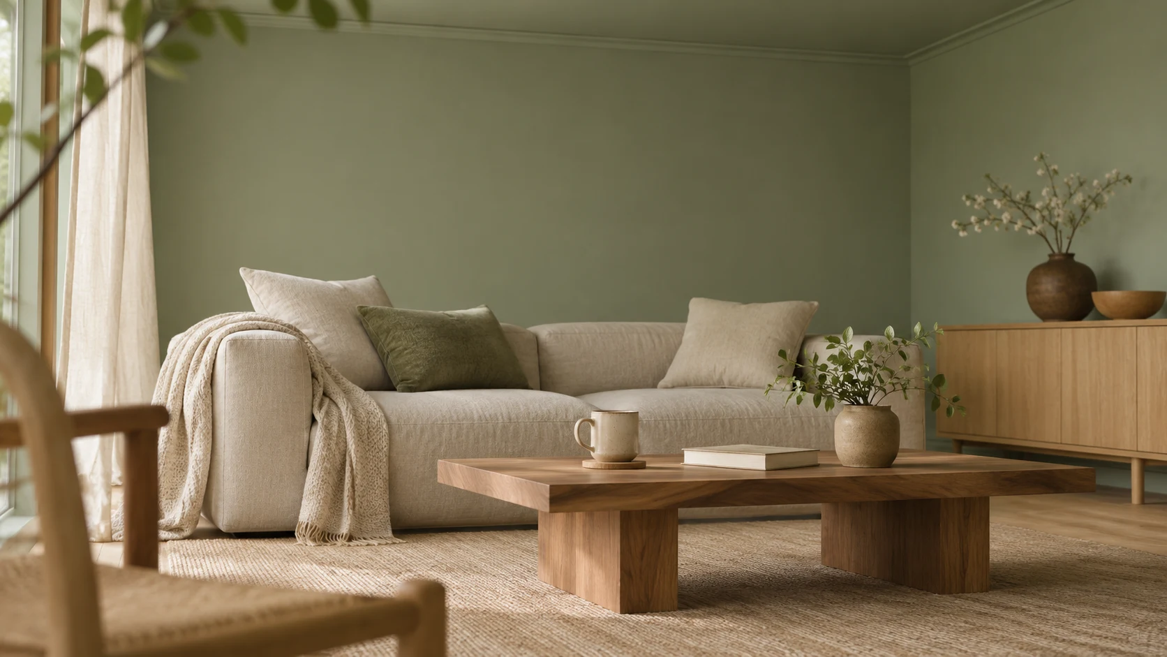
The safest way to try paint color trends 2027 is to sample in your own light, check the LRV, and save the deepest shades for small doses. These are the tips I’d follow before opening a single can of 2027 paint colors.
Try Color Drenching and Tonal Layering
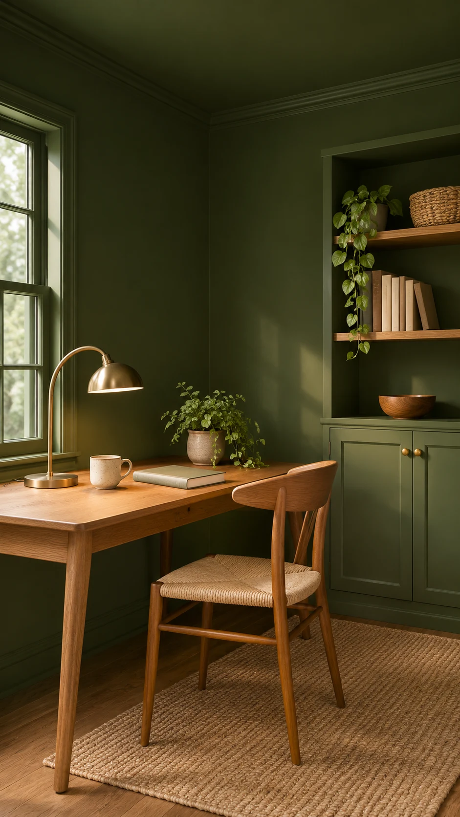
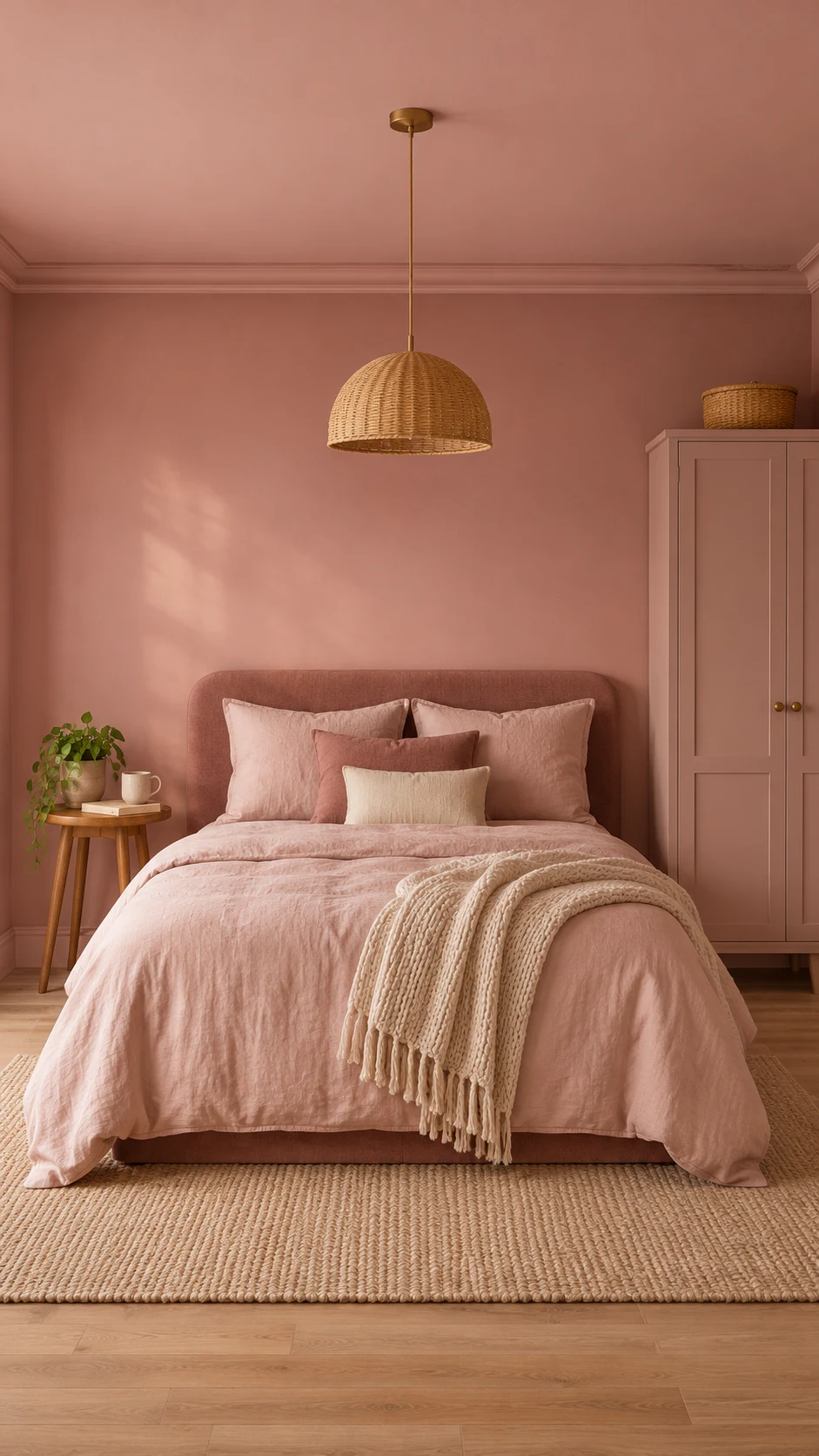
Color drenching means painting the walls, trim, and sometimes the ceiling in one color. A double drench uses two closely related shades, and tonal layering stacks a light, mid, and deep version of the same family.
It sounds dramatic, but color drenching in a small room like a powder room or an office is surprisingly calming. No wonder paint color trends 2027 can’t stop talking about it.
Designers are also mixing finishes within the same color family: eggshell (a soft sheen) on the walls, gloss (a shiny finish) on the trim, and flat (no shine) on the ceiling, so the room gets layers of depth.
A drenched room still needs a little contrast, so add a different finish or a slightly lighter shade somewhere.
Renting? Check your lease first, since many landlords want the original color back at move-out. Samples, a painted piece of furniture, or one small accent wall are low-risk ways to try the trend on a budget.
Think Beyond the Walls
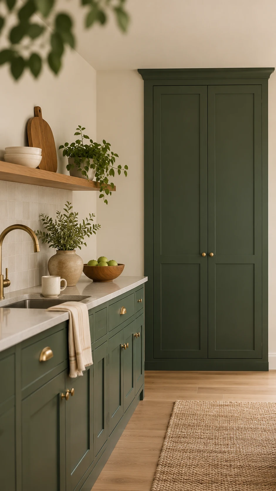
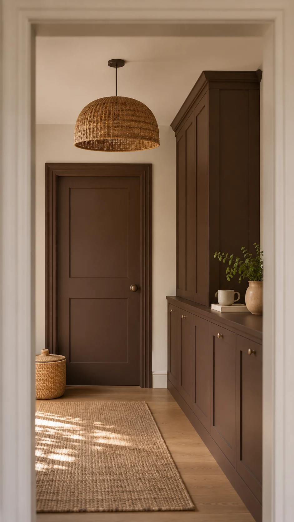
In paint color trends 2027, paint is moving onto cabinetry, built-ins, doors, and millwork (the trim and moldings). The ceiling is also being treated as a fifth wall. Matte, mineral, and plaster-like finishes are popular because they make deep colors look soft rather than shiny.
For cabinets and trim, ask for a cabinet-grade enamel (a tough, durable paint) in satin or semi-gloss, both with a soft-to-medium shine.
If your home was built before 1978, test for lead paint before you sand, and follow the EPA’s lead-safe guidance or hire a lead-safe certified renovator. Never dry-sand paint in a pre-1978 home.
Then follow your paint maker’s directions, usually in this order: degrease with a kitchen cleaner, lightly sand, wipe off the dust, then prime. Dark shades like Grounded show every flaw, so prep matters more than the color itself.
Colorful Trim, Built-Ins, and Ceilings
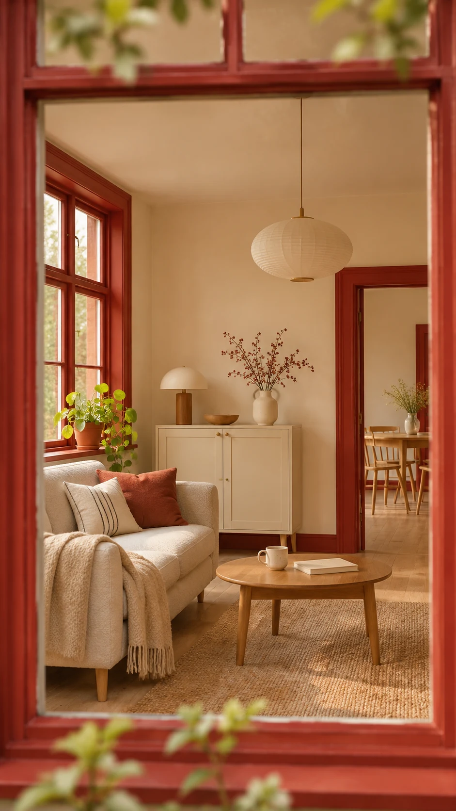
Trim doesn’t have to be white. Designers are pulling a bold color from the wallpaper, the sofa, or the art and putting it on window frames, door frames, and baseboards. It’s a small area, so trim is a low-commitment place to test paint color trends 2027 before you go bigger.
Built-ins and shelving can get their own color too, especially when you want to keep wood paneling in view. A soft yellow-green against dark wood is one combination I love.
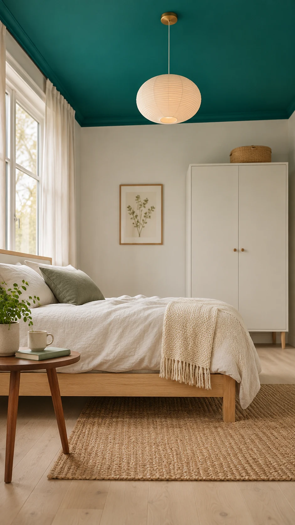
Then look up. A bold ceiling over lighter walls adds drama without overwhelming the room, and it’s a fun idea for a kid’s room. If you use gloss on dark walls, keep the ceiling white so your eye has a place to rest.
Check the LRV Before You Commit to Paint Color Trends 2027
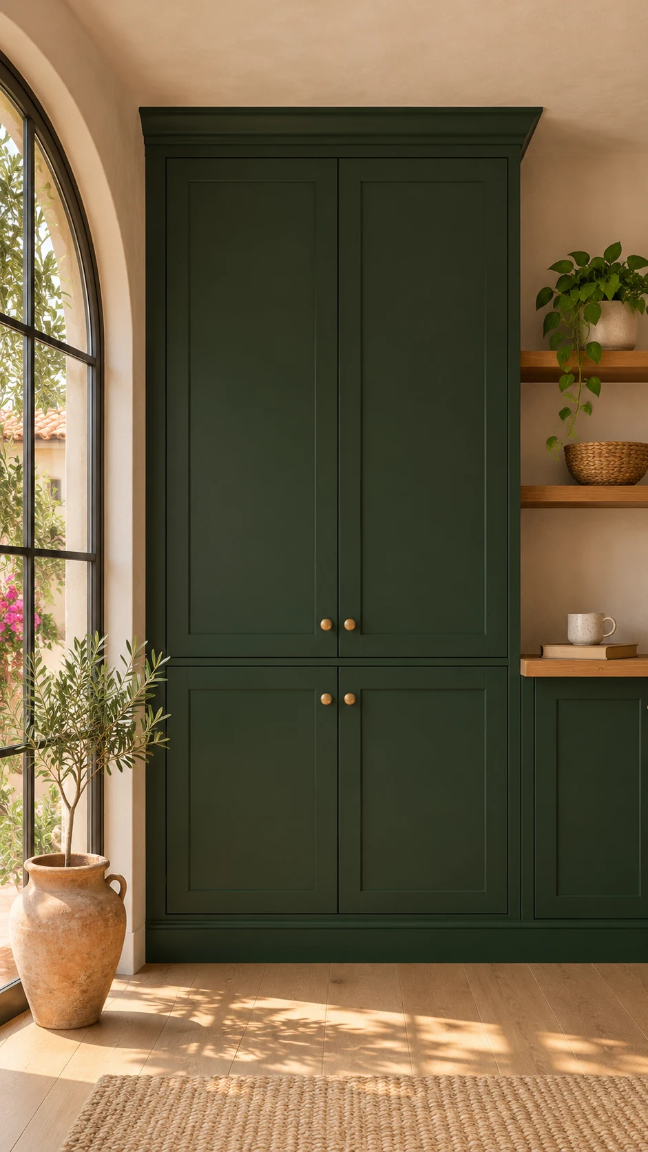
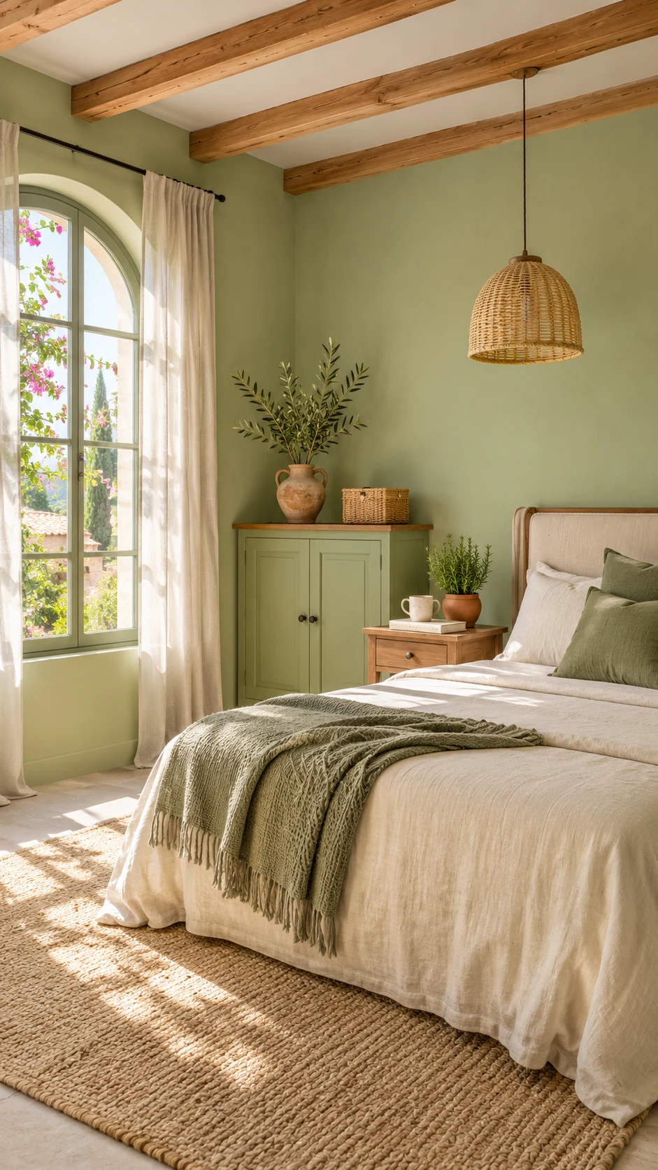
LRV stands for light reflectance value, a score from 0 to 100 for how much light a color bounces back. The higher the number, the lighter the color feels. It’s the reason a swatch can look lovely online and much darker on your wall. Here’s how six of the 2027 shades compare:
- Celery (Sherwin-Williams): LRV 71, an airy herbal green.
- Elusive Morel (Dunn-Edwards): LRV 35, a mid-tone mushroom brown.
- Cottage Door (Valspar): LRV 26, a mid-tone blue that reads deeper.
- Webster Green (Benjamin Moore): LRV 20, a classic mid-dark green.
- Deep Rooted (Dutch Boy): LRV 17, a rich terracotta orange.
- Grounded (Behr): LRV 9, a deep, mossy olive.
Lower numbers aren’t bad. They just need good light, or a plan to use them on cabinets and accents instead of every wall, and that goes for plenty of the shades in paint color trends 2027.
Paint codes and LRVs here come from brand color pages and sample shops where I could check them, so confirm any code on the brand’s page before you order.
Sample Like a Pro
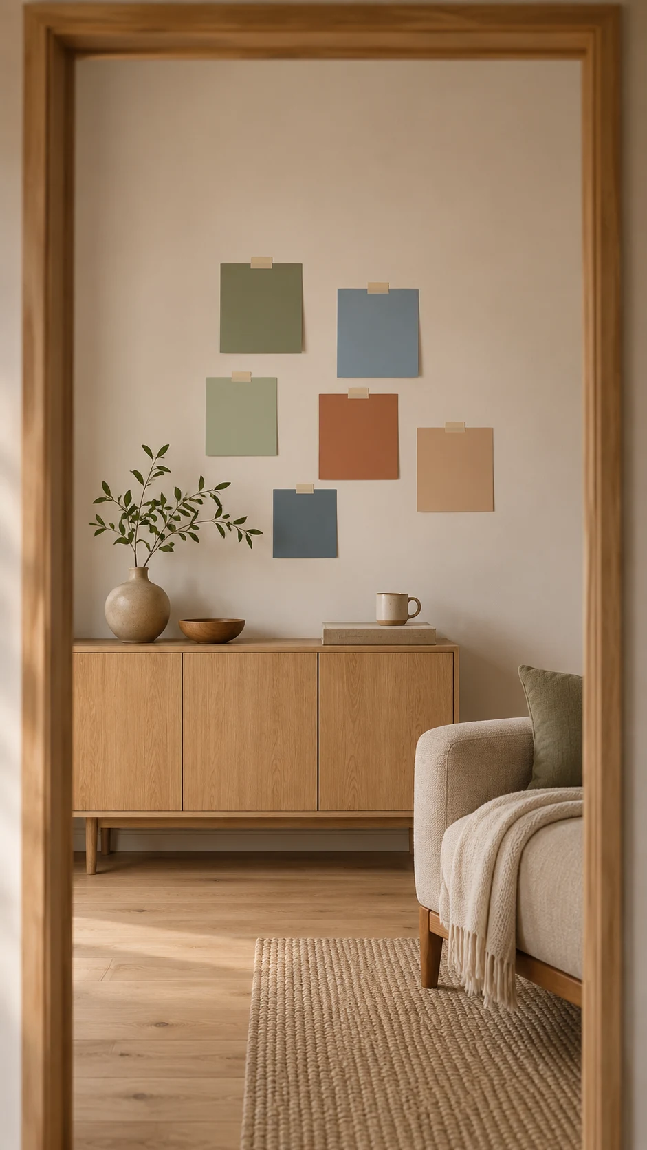
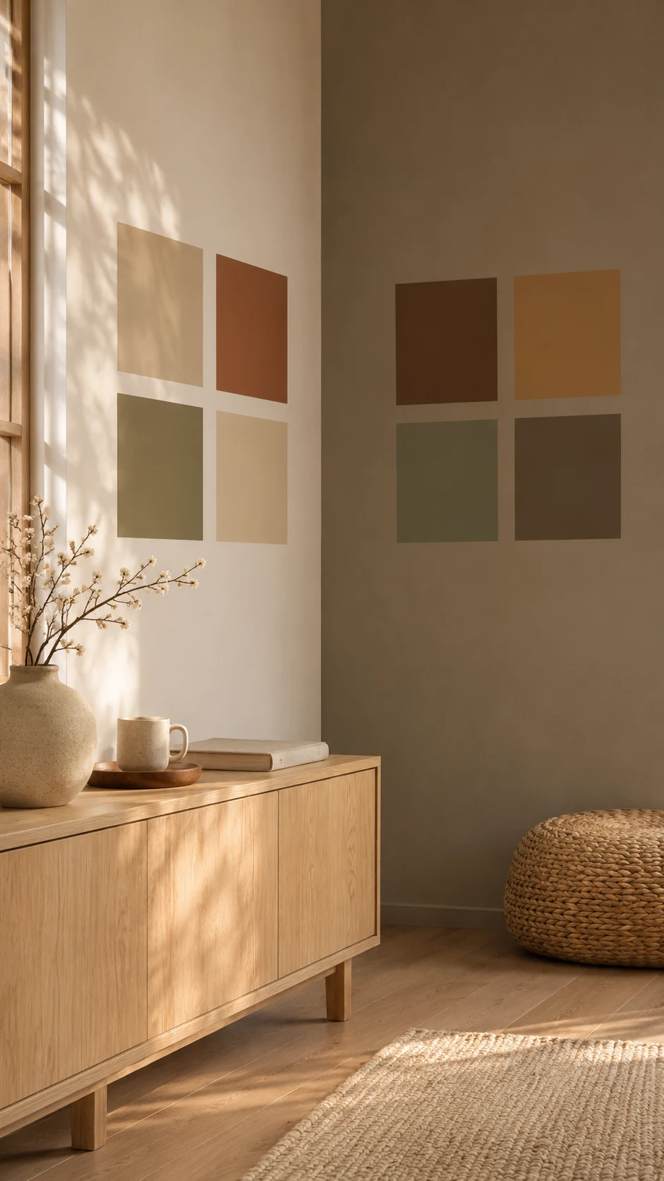
Order peel-and-stick samples and stick them on two walls, one that gets direct light and one in shadow. Look at them in the morning, in the afternoon, and under your evening lamps.
Undertones show up fast next to your real wood floors and sofa. Trying paint color trends 2027 this way costs you a sample, not a weekend.
Peel-and-stick samples start at $6.95 for a 9 x 15 inch sheet, so testing three colors costs about $21. That’s far cheaper than a gallon you end up repainting over. Prices can change, so check the product page.
My Top Tip: Live with a sample for a few days before you buy a gallon. In a house with three kids, the room looks very different at breakfast than it does at bedtime, so I’d judge a color at both.
Sample first, then go bold in small doses, and paint color trends 2027 stay fun instead of stressful.
What Paint Color Trends 2027 Are Leaving Behind
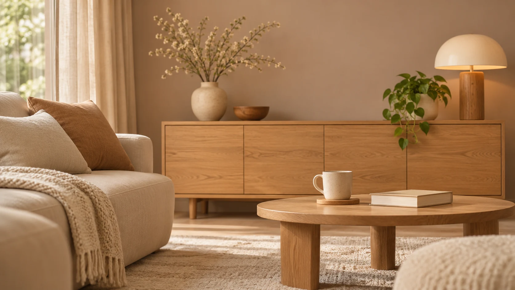
Paint color trends 2027 are retiring four habits: cool gray on every wall, stark white, perfectly matched rooms, and painting without a sample.
Cool Gray on Every Wall
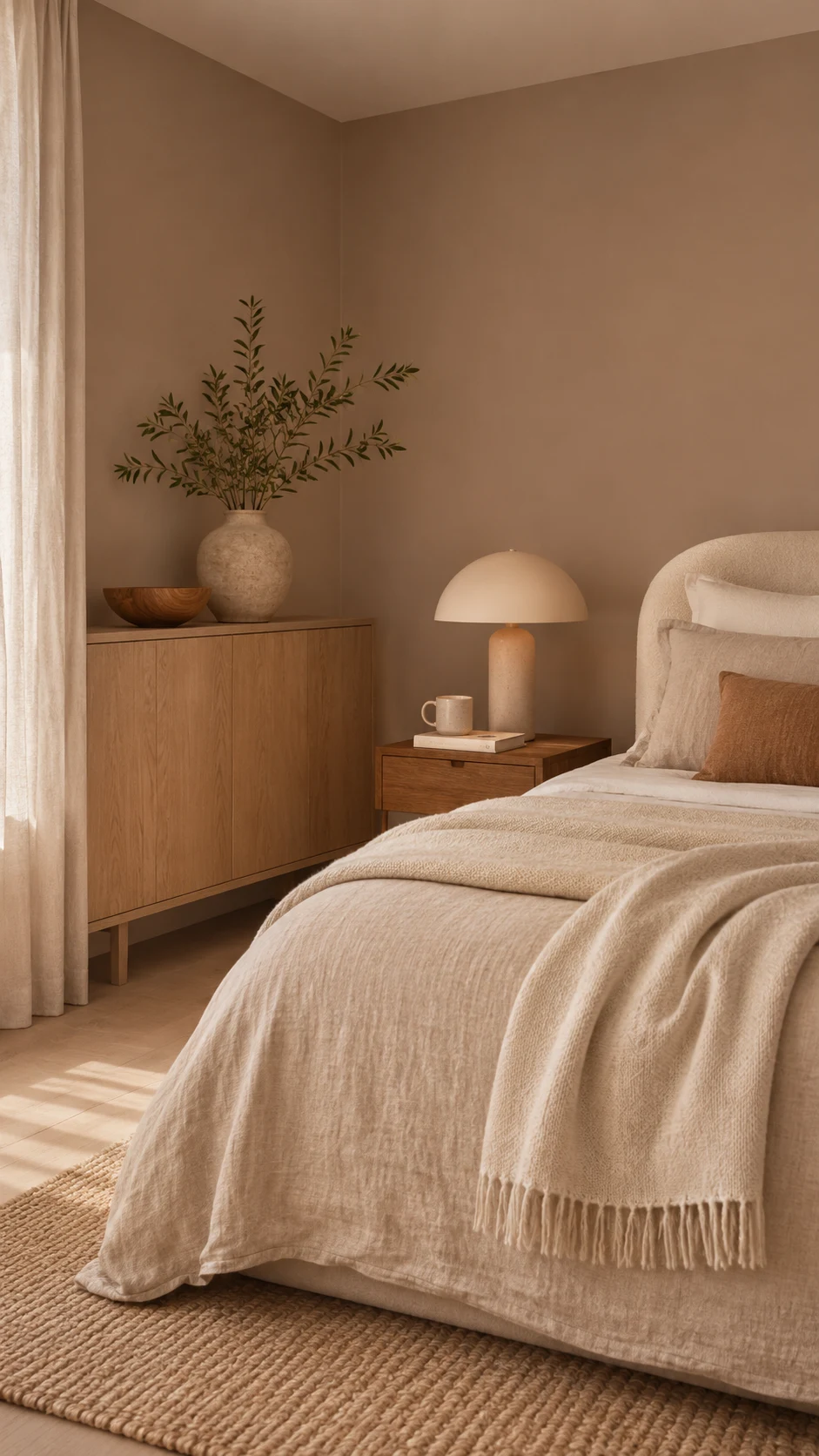
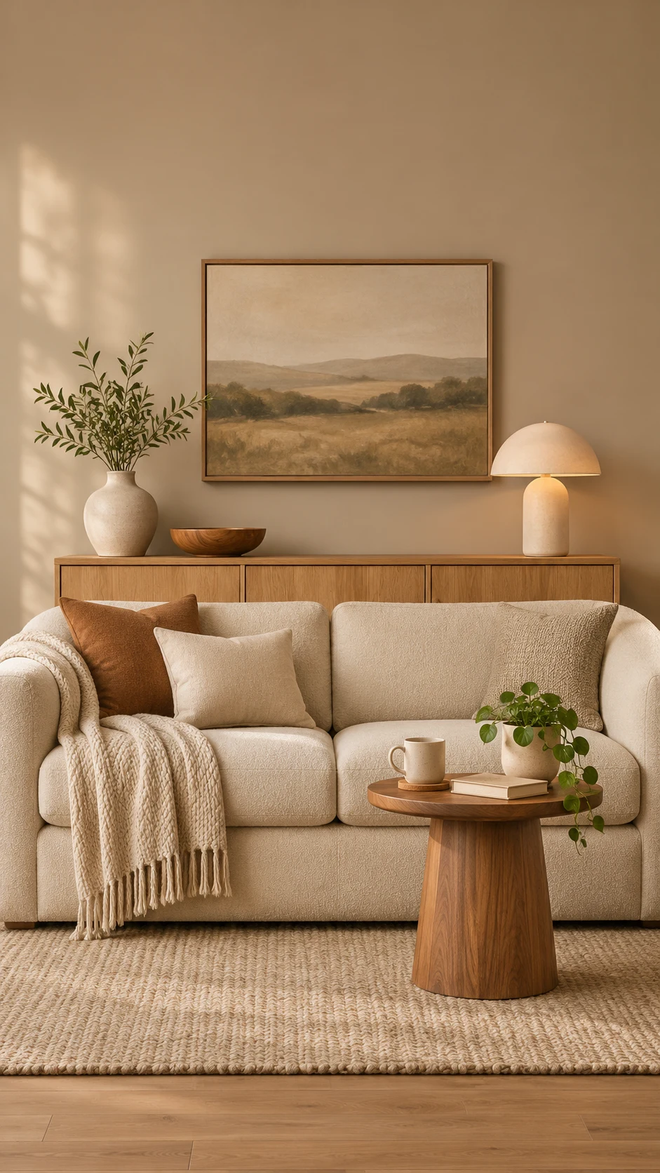
Paint color trends 2027 are moving away from cool grays and stark contrast. You don’t need to repaint a gray room tomorrow, but if you’re choosing something new, try a warm neutral like Backdrop or Elusive Morel instead.
Stark, Sterile White
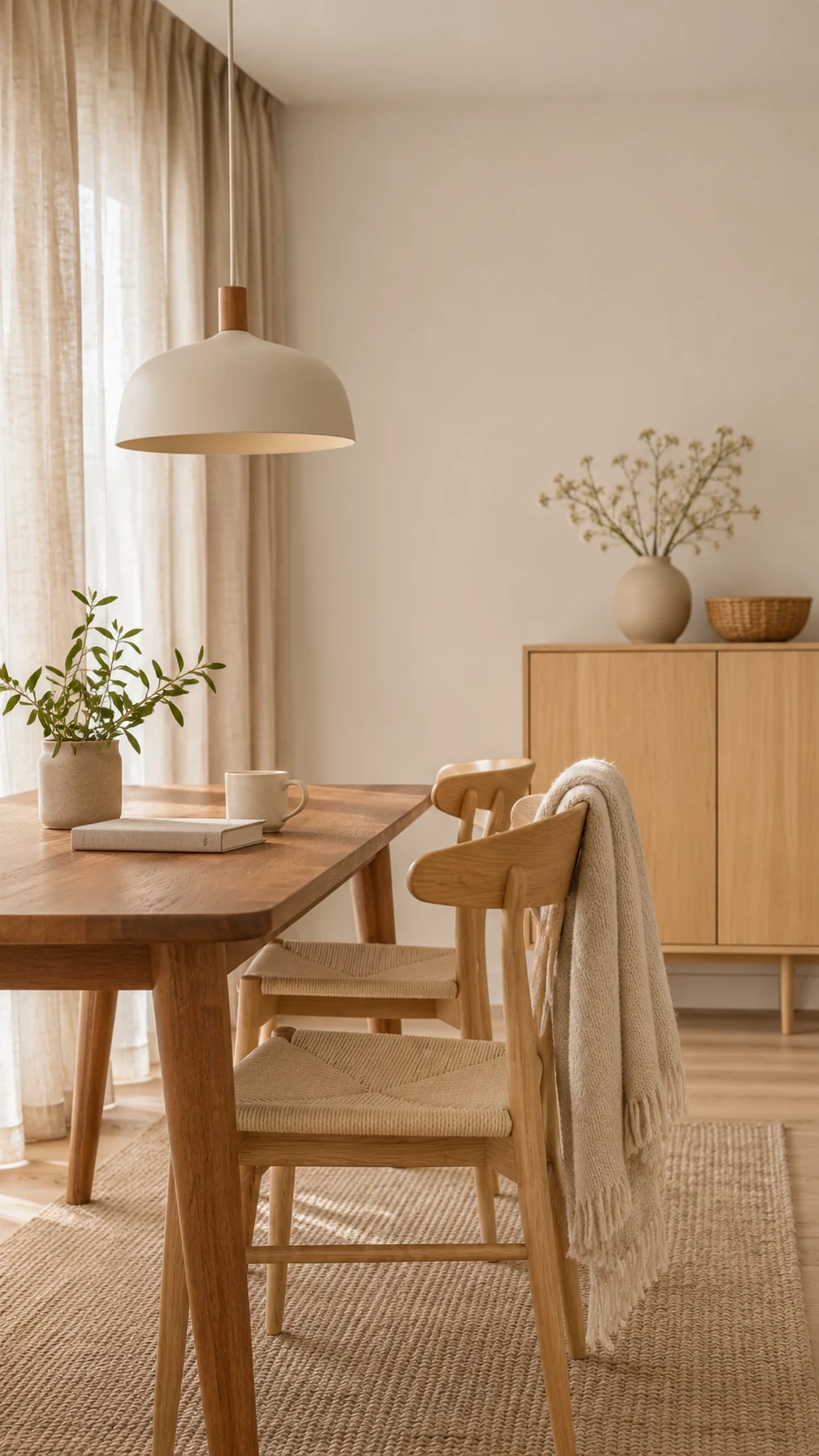
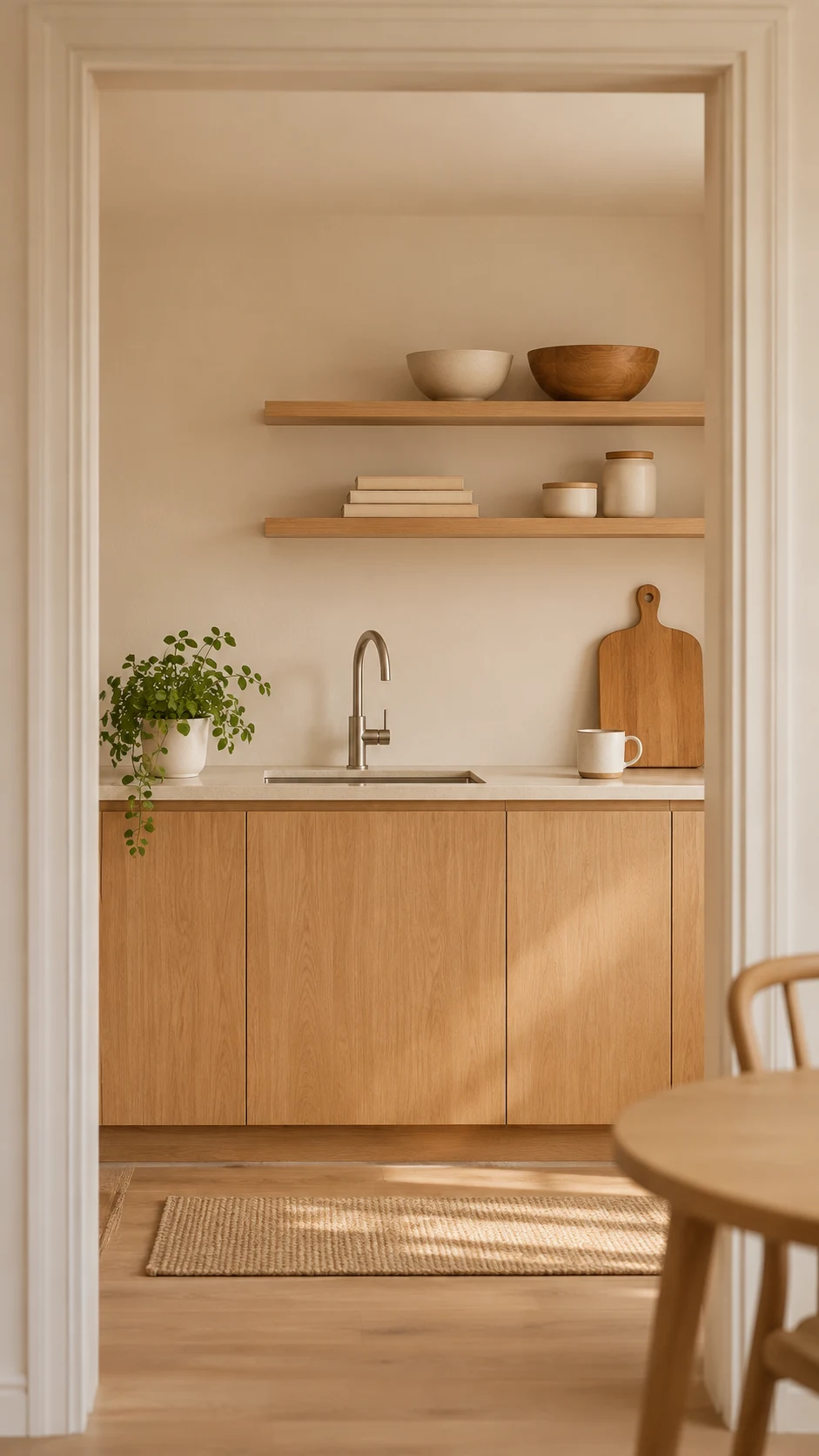
In paint color trends 2027, bright, clinical white is giving way to creamier, softer whites. A warm white like White Dove or White Duck still keeps rooms fresh while feeling far more welcoming.
The Perfectly Matched Room
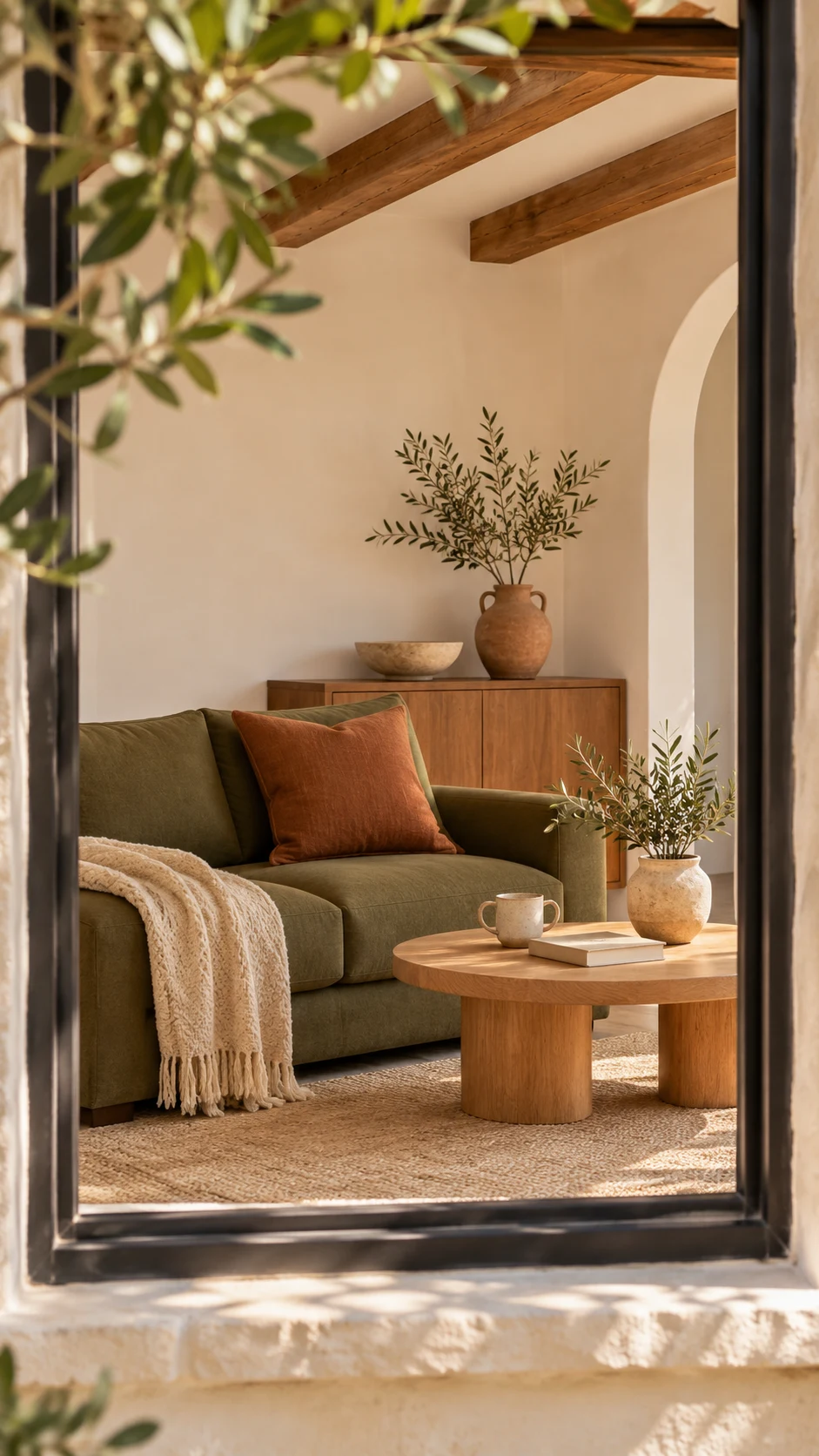
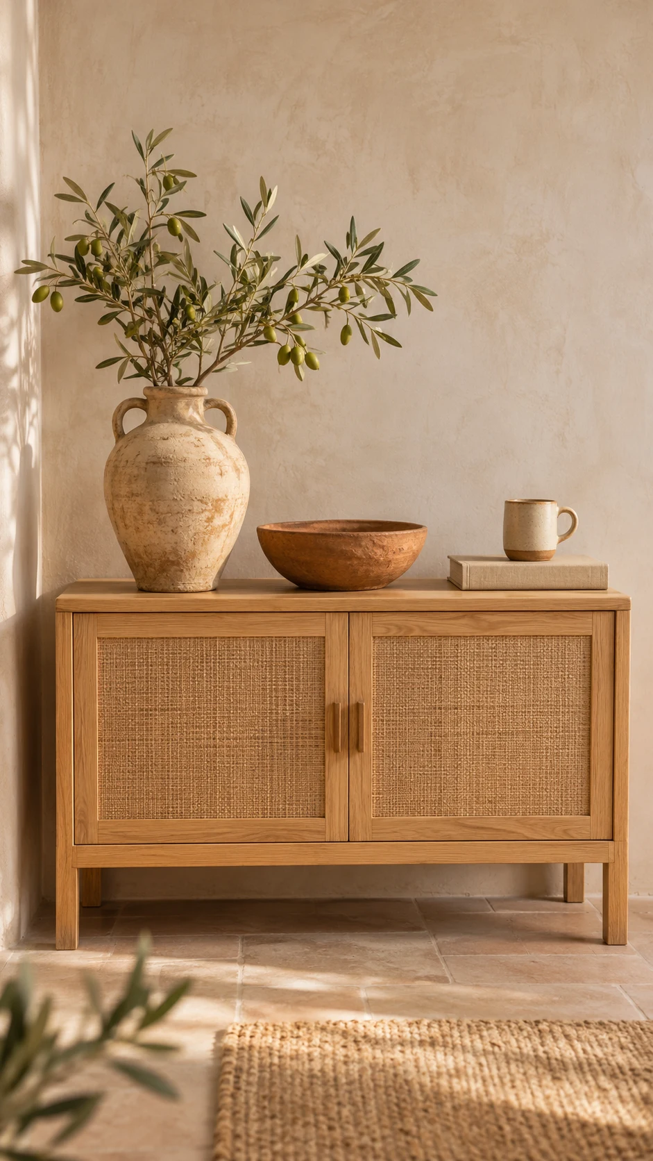
Designers keep saying spaces should feel less formulaic and more personal. When the paint, sofa, and rug all match to the shade, a room can feel flat. Layer close cousins instead, like olive with clay and warm white.
Painting Without Sampling
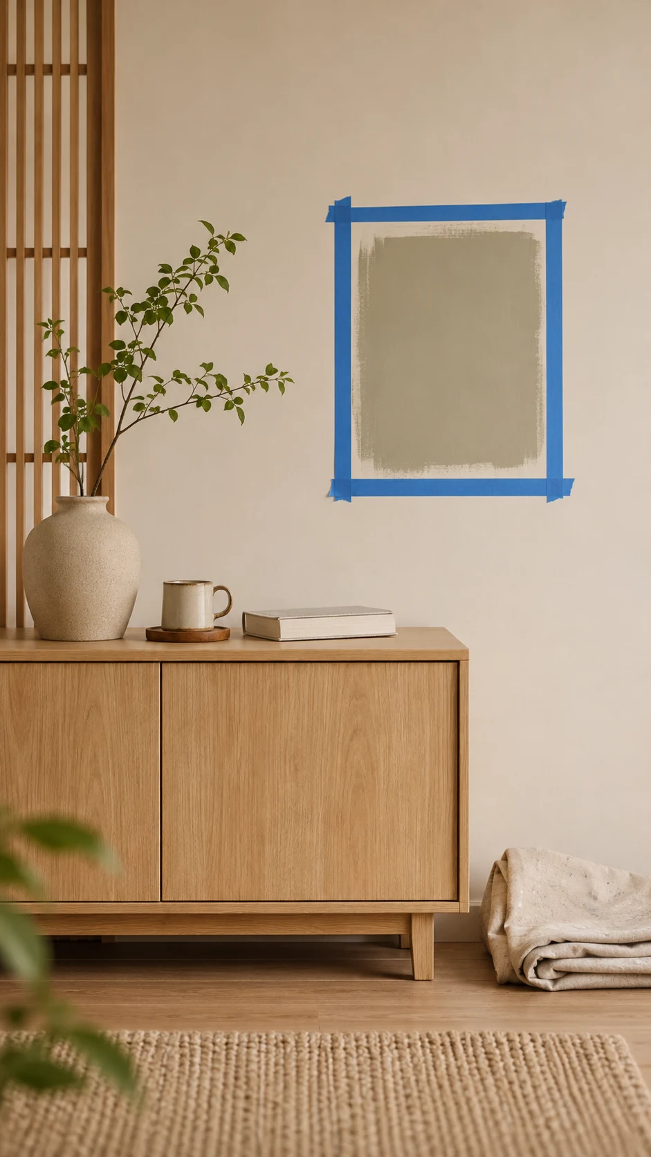
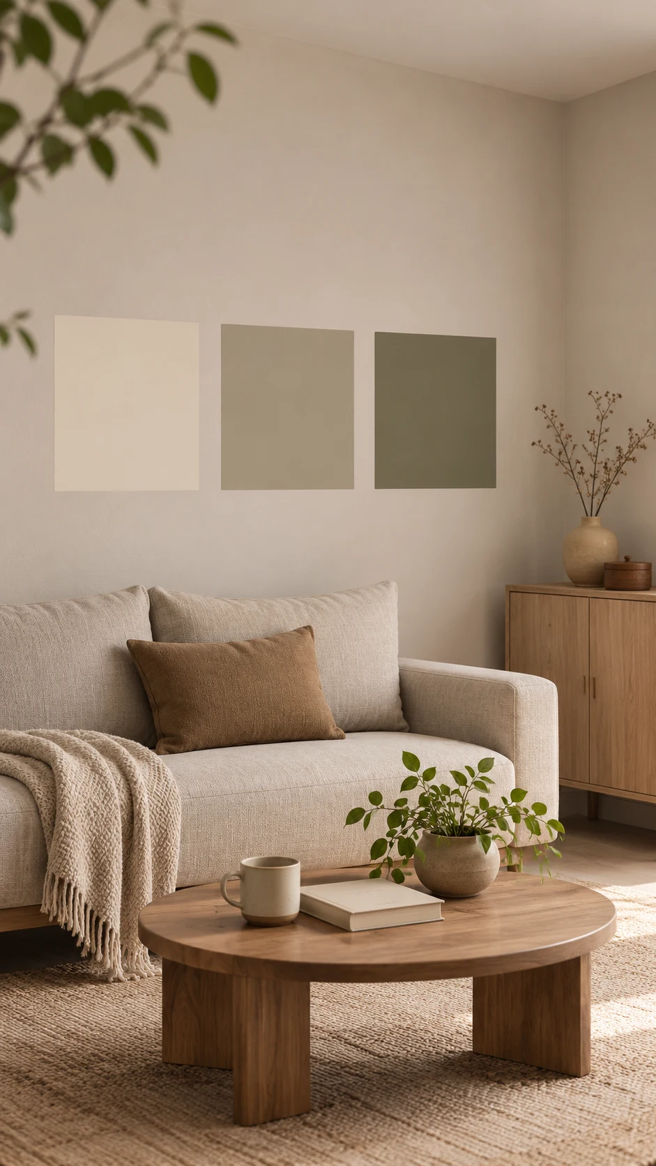
Even the most gorgeous Color of the Year can surprise you. Skipping the sample is the easiest way to end up repainting, and no trend is worth a second weekend of taping baseboards.
No repainting required. Just pick warmer shades the next time you reach for a brush.
My Favorite Shops
Discover your favorite paint colors for your next project at these premier online shops!
My Handpicked Selections
Here’s where I’d shop if I were sampling paint color trends 2027 this weekend. Remember, one room and one sample first, so pick just one of these to begin.
Samplize: honestly the easiest way to try a trend without a commitment. Start with the Celery (6421) peel-and-stick sample for a soft herbal green in your own light, or the Grounded (T27-01) sample to see just how deep that olive really is.
Once your first color wins, add the White Dove (OC-17) sample to test a warm white beside it.
Lowe’s: the go-to for Valspar’s Color of the Year. The Cottage Door (8004-38E) color page lists it as a Lowe’s color, and you can order paint chips or pick up samples at the Paint Desk.
Ace Hardware: a smart stop for Benjamin Moore shades. Try Caponata (AF-650) for a moody bedroom and Bewitched (CSP-450) for a dining room or powder room.
FAQ
These ten answers cover the most common questions about paint color trends 2027, from picking your first color to testing it at home without repainting.
What are the biggest color trends for 2027?
Paint color trends 2027 are all about warm, nature-inspired shades: earthy greens, faded blues, mushroom neutrals, clay and rosy earth, deep aubergine and heritage reds, and sun-faded pastels. The common thread is softness, since almost every color has a little brown, gray, or yellow in it.
I’m overwhelmed by all the colors. Where do I start?
Start with one room and one color. Pick a green or a blue and order one peel-and-stick sample. Live with it for a few days before you buy paint, and add a warm white for trim later. That’s the simplest way into paint color trends 2027.
What are the 2027 Colors of the Year?
So far, the 2027 color of the year picks are these: Sherwin-Williams picked Celery, Behr chose Grounded, Benjamin Moore named Webster Green, and Valspar went with Cottage Door.
Dutch Boy named Deep Rooted, Dunn-Edwards chose French Press Coffee, Pittsburgh Paints picked Artifact, and Graham & Brown chose Rose Earth.
Pantone hasn’t announced yet, and I’ll add it here when it does.
What is Benjamin Moore’s color of the year 2027, and when is Pantone’s?
Benjamin Moore named Webster Green (HC-130) its 2027 Color of the Year on October 14. Pantone usually announces between late November and early December and hasn’t yet, so I’ll update this guide to paint color trends 2027 as soon as it’s official.
Is gray completely out in 2027?
Cool, stark gray is fading, but you don’t need to panic-repaint. Paint color trends 2027 favor warm grays with brown undertones, like mushroom shades. They pair beautifully with the new greens and blues.
Which color in paint color trends 2027 is best for a small room?
Lighter shades reflect more light, so Celery, with an LRV of 71, is a natural fit for a small bedroom or bathroom. Deep colors like Grounded (LRV 9) can work in a small room too, but they’re best when you commit with color drenching and good lighting.
Are moody paint colors still in style?
Yes, with more nuance. In paint color trends 2027, deep shades carry green, red, brown, or purple undertones rather than pure black. Caponata, Bewitched, and Grounded are great examples for cabinetry, a library, or a dining room.
What is color drenching, and should I try it?
Color drenching means painting the walls, trim, and sometimes the ceiling in one color. A powder room or a small office is the easiest place to try it, and a peel-and-stick sample will tell you quickly whether you love the look.
How do I test a 2027 paint color without repainting?
Order peel-and-stick samples and place them on two walls, one in bright light and one in shadow. Check them in the morning, in the afternoon, and under evening lamps. Leave them up for a few days before you decide on any of the 2027 paint colors you’re considering.
Will these colors work with wood floors and warm metals?
Yes, that’s their sweet spot. Most colors in paint color trends 2027 have warm undertones, so they suit oak, walnut, aged brass, and linen. Materials matter as much as paint this year, so hold each sample right next to your real floors.
The Bottom Line
The heart of paint color trends 2027 is simple: choose colors that make your home feel like yours. Whether you’re drawn to airy Celery, moody Caponata, or the quiet blue of Cottage Door, the goal is a space that feels warm, grounded, and lived in.
Not sure where to start? Pick one room and order one sample, Celery for a bright bedroom or Grounded for cabinets.
Add a warm white like White Dove later, once that first color wins. You’ll know in a few days, and trying paint color trends 2027 this way costs far less than a repaint.
I’d love to see how these colors look in your home! Share your photos and tag me on Instagram or Pinterest. It truly makes my day to see your beautiful spaces come to life.



ABOUT the AUTHOR
TOKI; INTERIOR DESIGN & lifestyle CONTENT CREATOR.
Hey there! I’m Toki—the design-obsessed brain behind Dwell Studio 24. I’m a content creator passionate about interior design, photography, and creativity, living in a 77-year-old house with my husband and our awesome three kids. I write about interior design, furniture, home topics, and my lifestyle, including travel, recipes, skincare, and daily routines. I hope to inspire your next project and lifestyle!
ABOUT the AUTHOR
TOKI; INTERIOR DESIGN & lifestyle CONTENT CREATOR.
Hey there! I’m Toki—the design-obsessed brain behind Dwell Studio 24. I’m a content creator passionate about interior design, photography, and creativity, living in a 77-year-old house with my husband and our awesome three kids. I write about interior design, furniture, home topics, and my lifestyle, including travel, recipes, skincare, and daily routines. I hope to inspire your next project and lifestyle!
ABOUT the AUTHOR
TOKI; INTERIOR DESIGN & lifestyle CONTENT CREATOR.
Hey there! I’m Toki—the design-obsessed brain behind Dwell Studio 24. I write about interior design, furniture, home topics, and my lifestyle, including travel, recipes, skincare, and daily routines. I hope to inspire your next project and lifestyle!