Kitchen Color Trends 2026 : Brilliant Warm Neutral Hues to Refresh Your Home
Welcome to Kitchen Color Trends 2026! If you’re planning a remodel or just dreaming about giving your home’s heart a facelift, you’ve come to the right place, because the Kitchen Color Trends 2026 are shaking up the design world. Forget everything you thought you knew about modern kitchens; the era of “all-white austerity” is officially over.
For nearly a decade, the “sterile Instagram perfect white box” dominated design. But now, homeowners are craving something deeper, warmer, and more reflective of their actual lives. We’re moving into a time where your kitchen isn’t just for cooking; it’s the “emotional center of modern living,” a true sanctuary designed for connection, wellness, and self-expression.
This isn’t just about picking pretty colors; it’s about making choices that nurture your soul and feel authentically and timelessly yours. We’ve gathered the top palettes, the essential pro tips, and the outdated trends you absolutely need to ditch before spending a dime!
Key Takeaways
Before we dive into the details, here’s the snapshot of what you need to know about the Kitchen Color Trends 2026:
- Warmth Over Cool: Stark, clinical whites are out, replaced by creamy, inviting off-whites and deep, sophisticated earthy tones.
- Texture is Key: The aesthetic shift demands texture. Think honed stone, visible wood grain, and rough marbles over smooth, polished surfaces.
- Strategic Color: Bold colors like navy and charcoal aren’t covering every cabinet; they’re being used strategically on the island or lower cabinets to create drama without the “high commitment” risk.
- Functionality Wins: Kitchen elements that interrupt visual flow (like visible microwaves and dual-tiered islands) are out, replaced by integrated solutions and optimized storage.
The New Design Philosophy: Why Warmth and Authenticity Win
The current shift in kitchen design is the biggest one in over a decade. Designers are actively rejecting the cold, clinical feel that dominated the late 2010s and early 2020s.
The Decline of Stark White and the Rise of Warm Neutrals

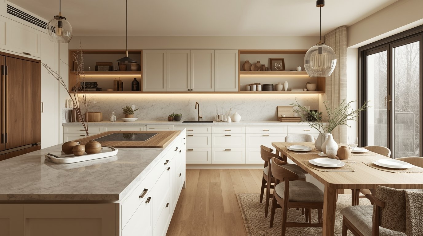
If you’ve been planning an all-white kitchen, you need to hear this: White cabinets have actually dropped from the number one most popular finish to the number three. Why? Homeowners realized the “bright clinical whites” can feel sterile and unwelcoming.
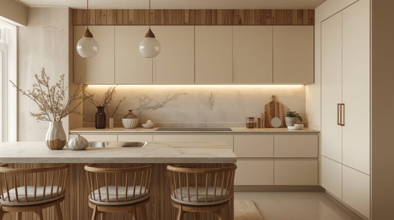
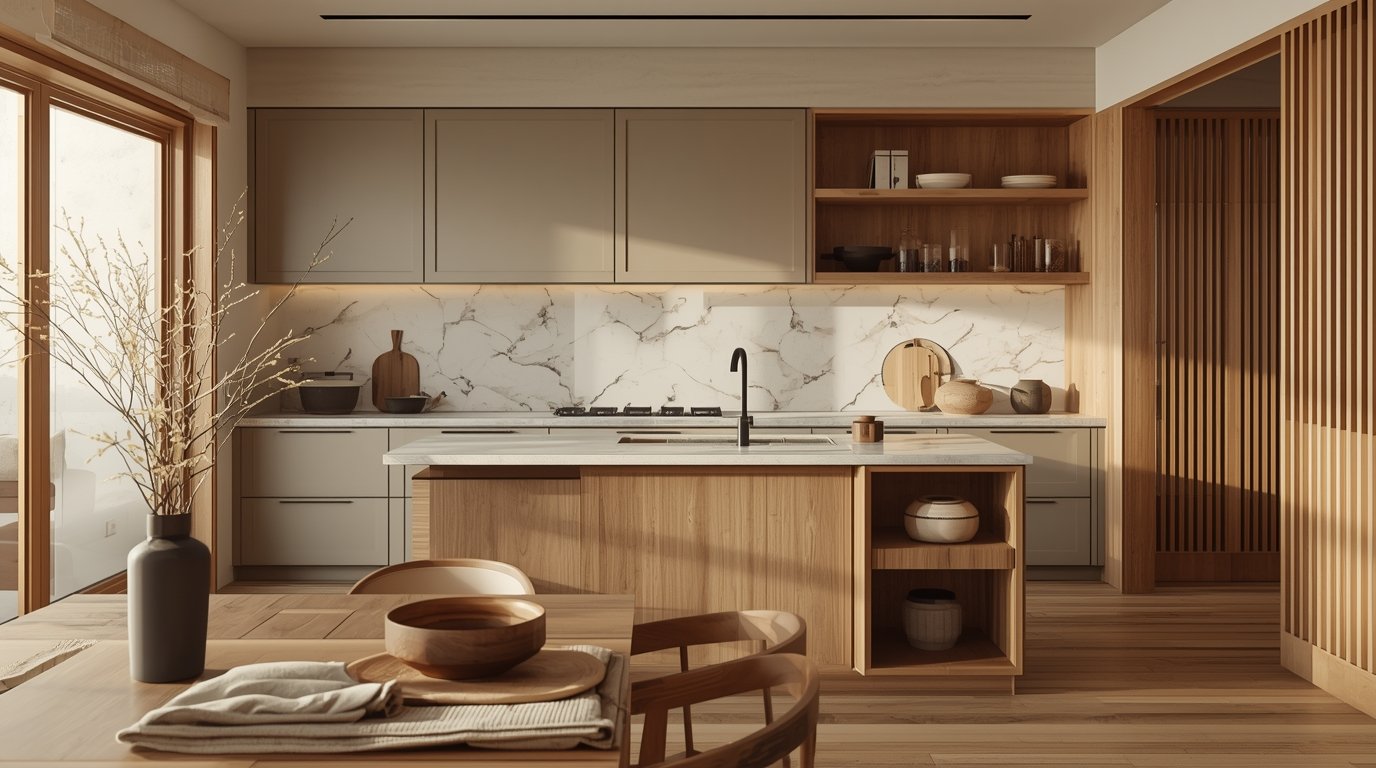
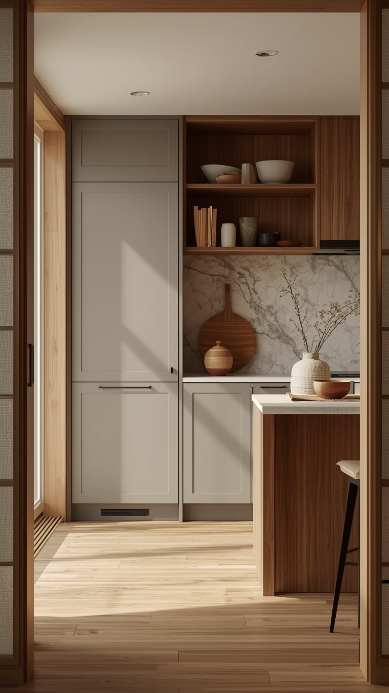
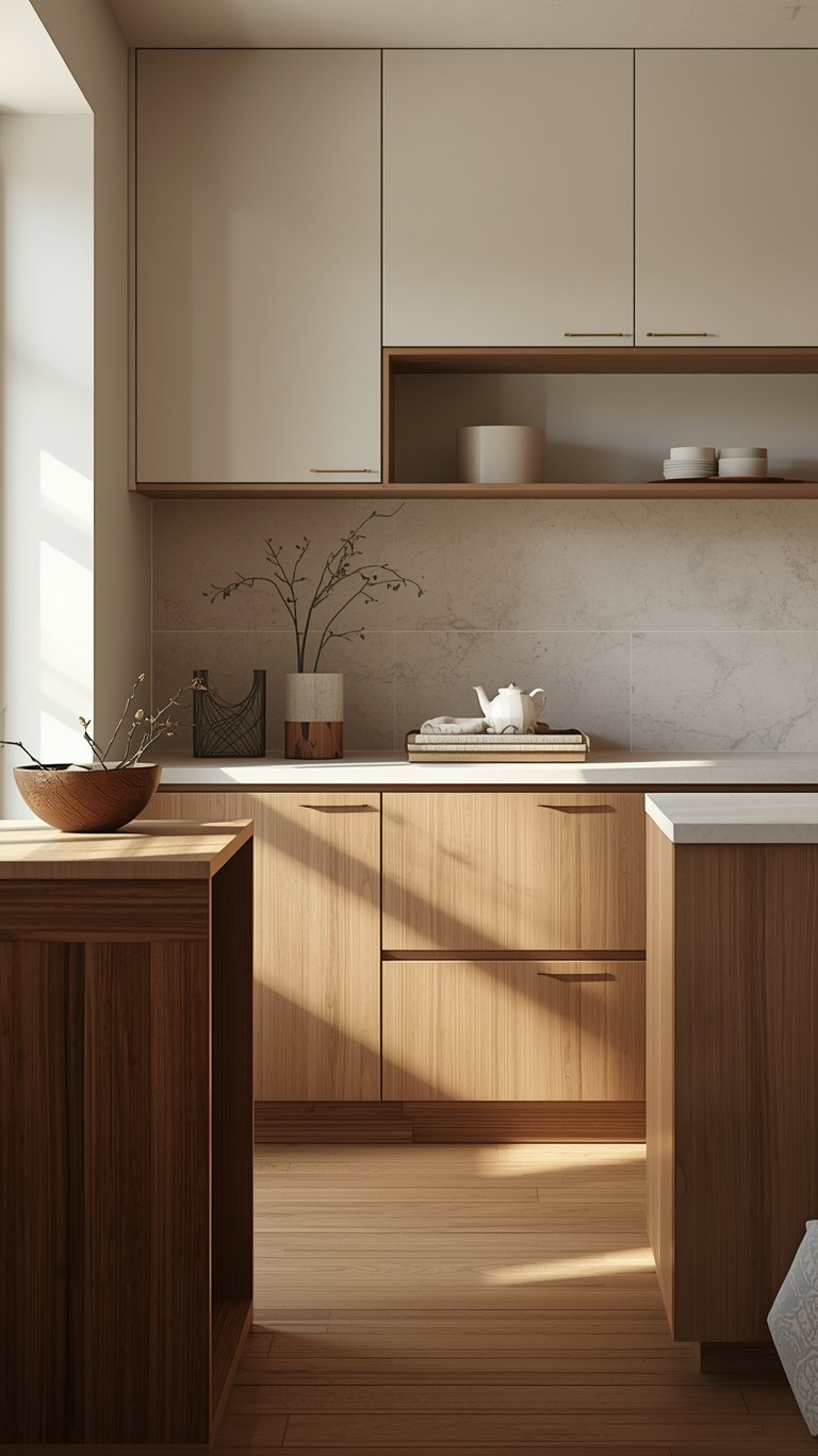
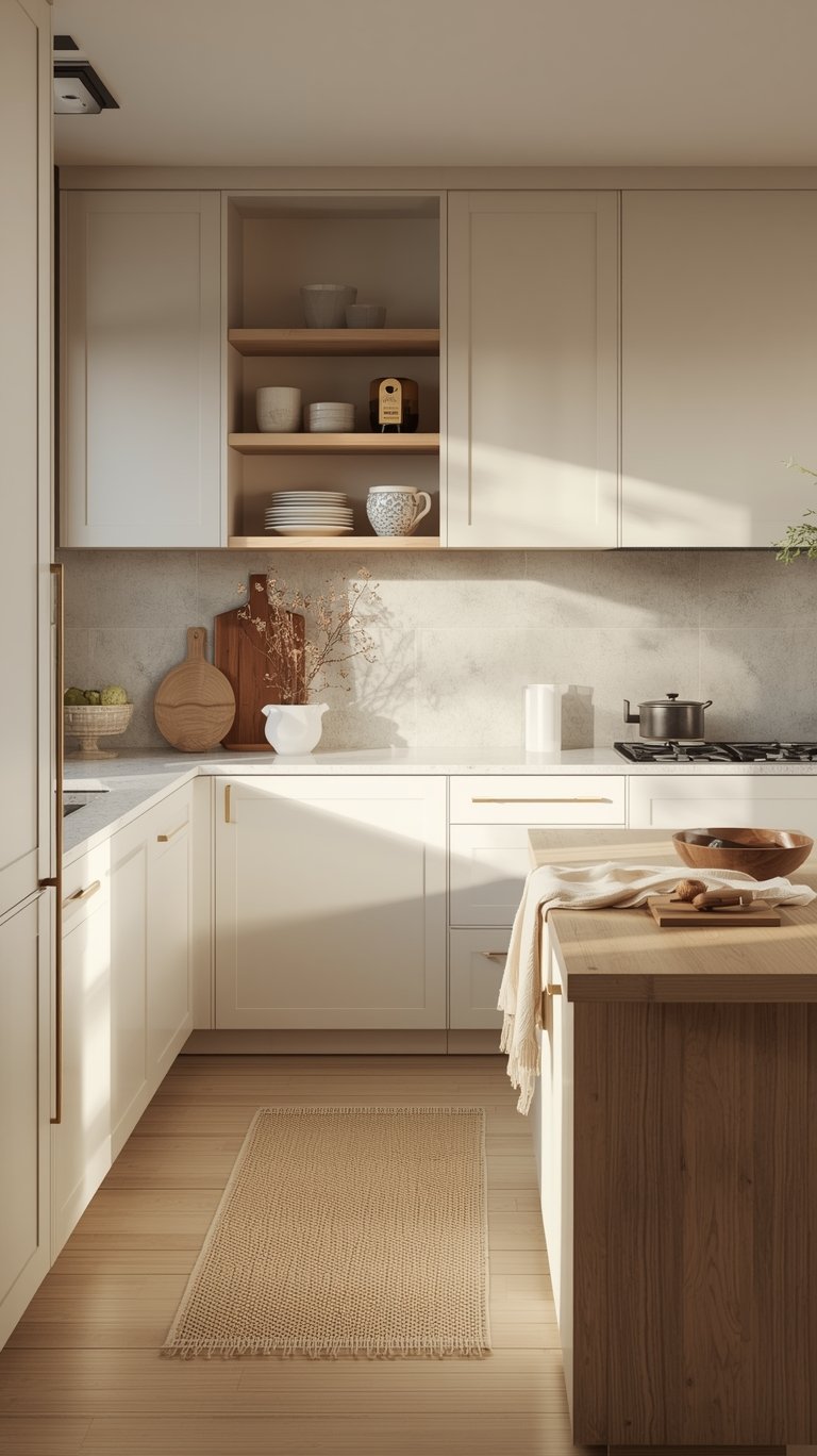
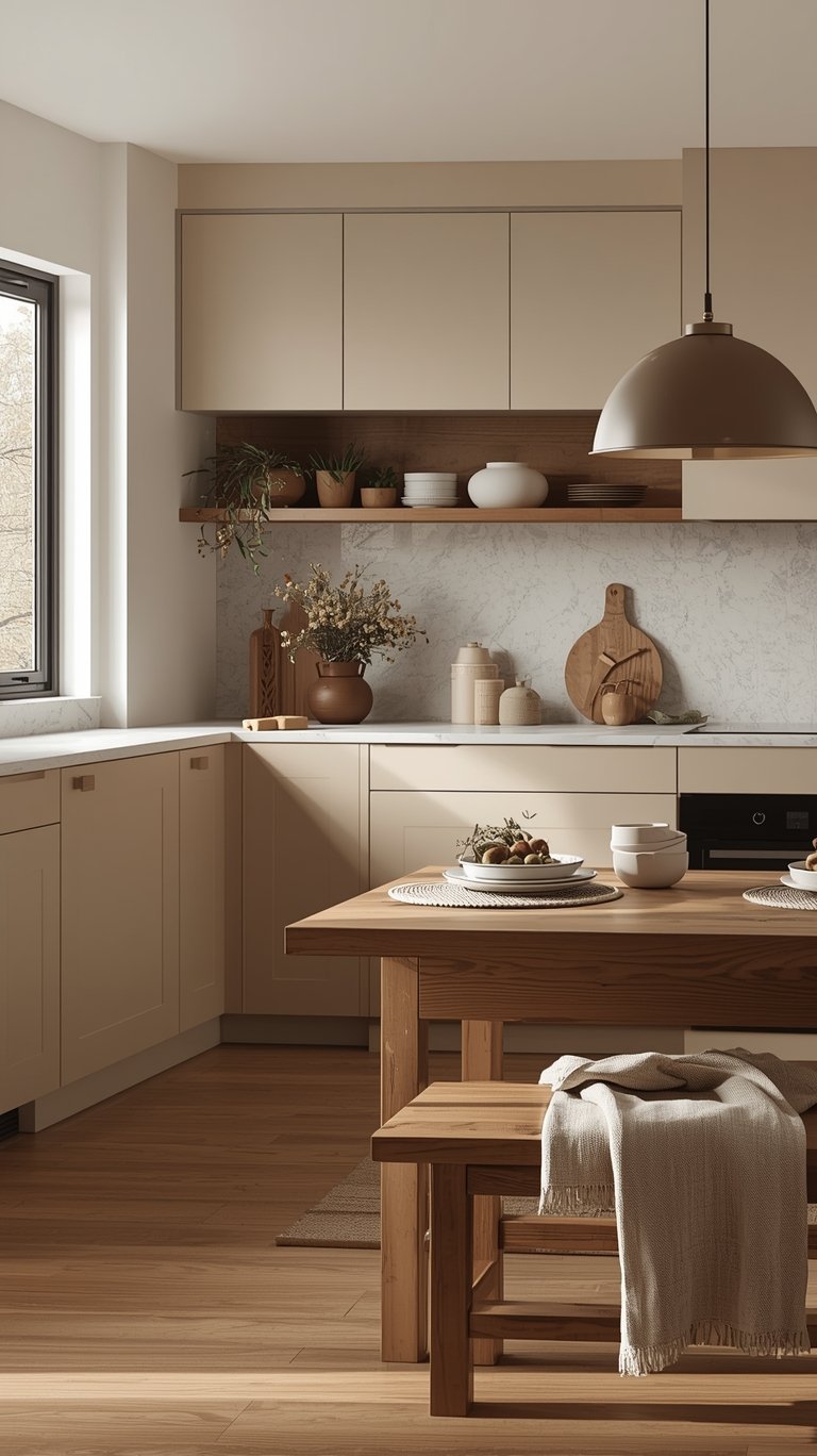
- The New White: Designers are now opting for creamier, warmer white tones that have subtle undertones of beige, gray, or even a hint of yellow or pink. Shades like antique white, ivory cream, and warm dove gray are making spaces feel sophisticated yet approachable, serving as the “antidote” to that harsh, bluish builder-grade tone.
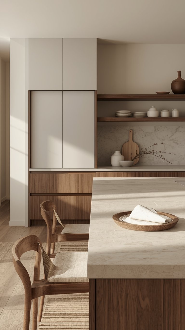
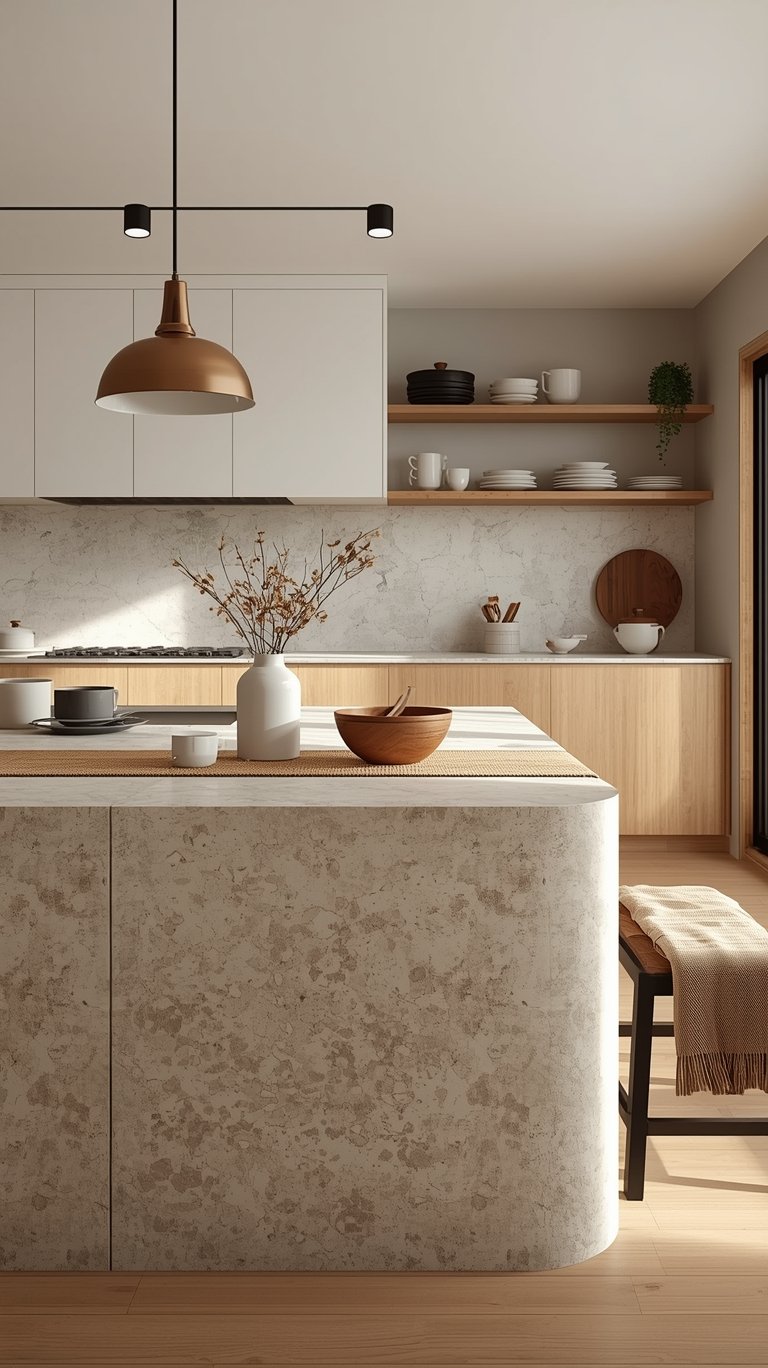
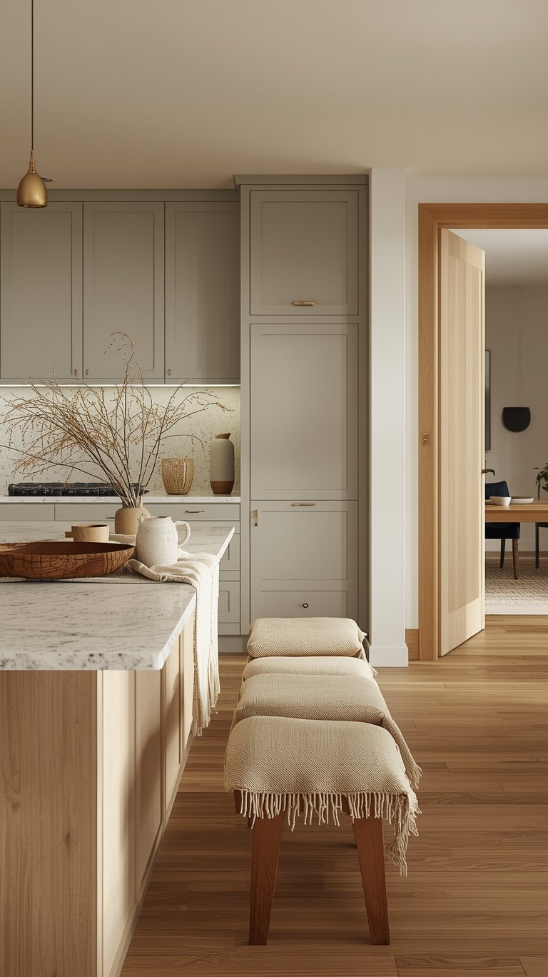
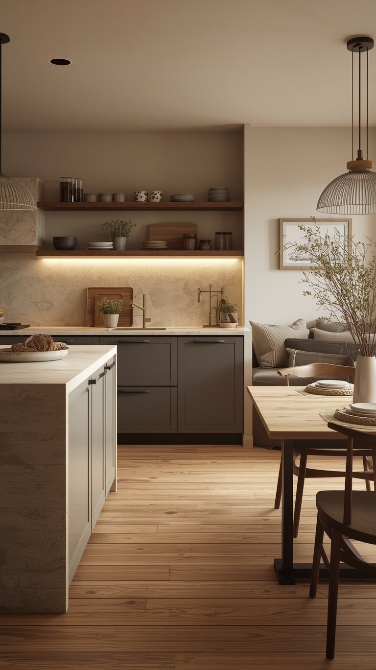
- Mushroom and Taupe Tones: These hues are perfect for those who want a neutral base but need more personality than standard gray. Mushroom grays and soft taupes provide the coziness people crave while maintaining a sophisticated neutral backdrop. They have a “chameleon-like quality,” appearing more gray in cool light and more brown in warm light, making them incredibly versatile.
Texture First, Color Second
One of the key elements missing from the old all-white minimalist look was sensory appeal. Now, people are “craving materials you can actually feel”. This shift demands that you think about texture before you even finalize your cabinet color.
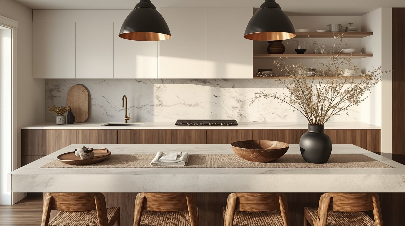
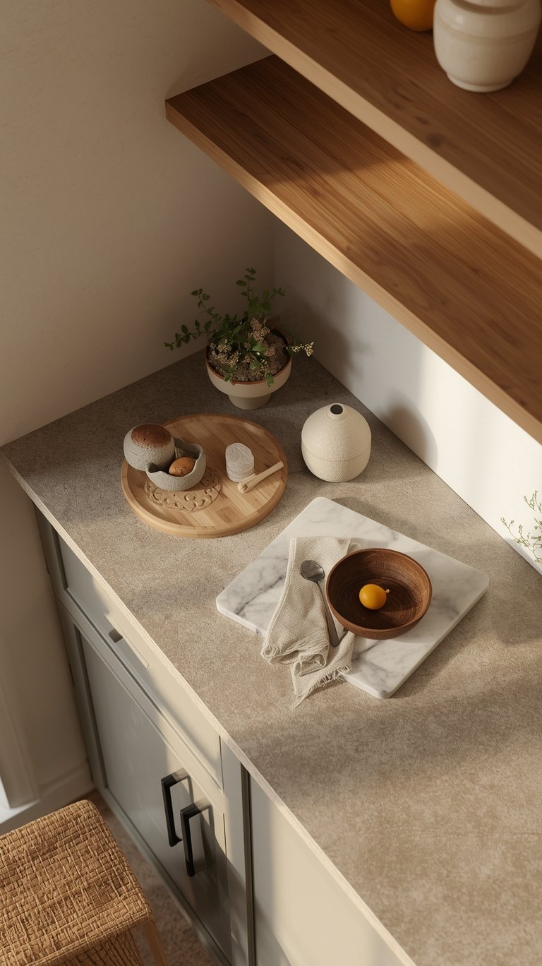
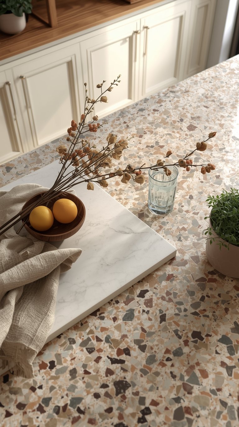
- Stone Finishes: We’re moving past highly polished, shiny surfaces. Instead, look for honed and leathered stones (like granite or quartzite) instead of polished finishes. Chunky travertine and rough marbles, and terrazzo are also replacing perfect, smooth slabs.
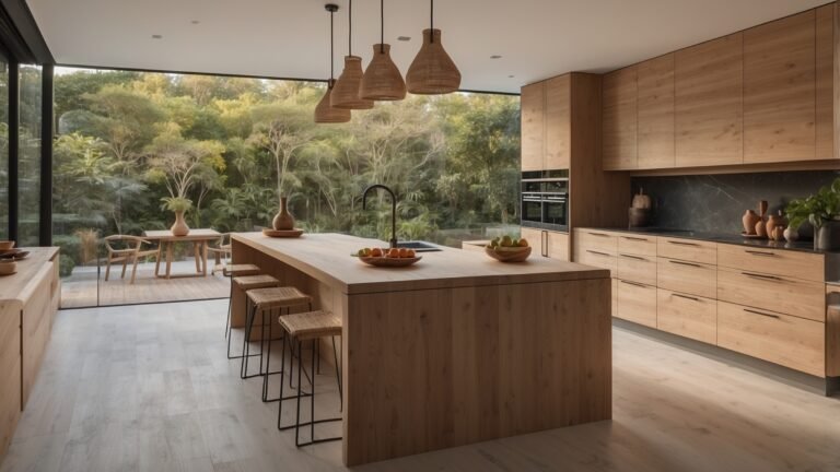
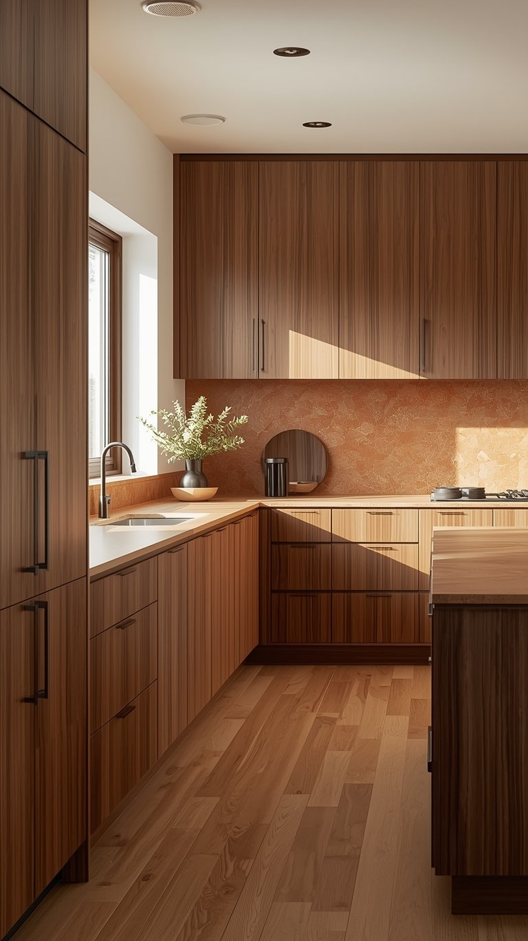
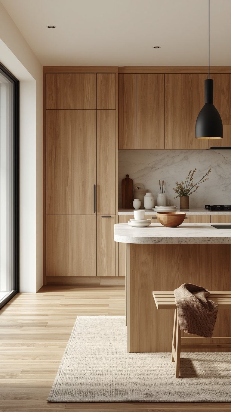
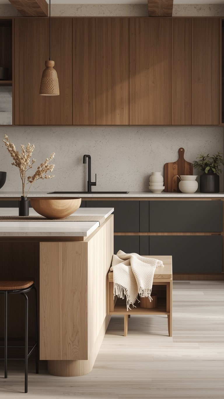
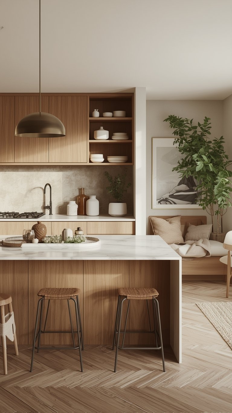
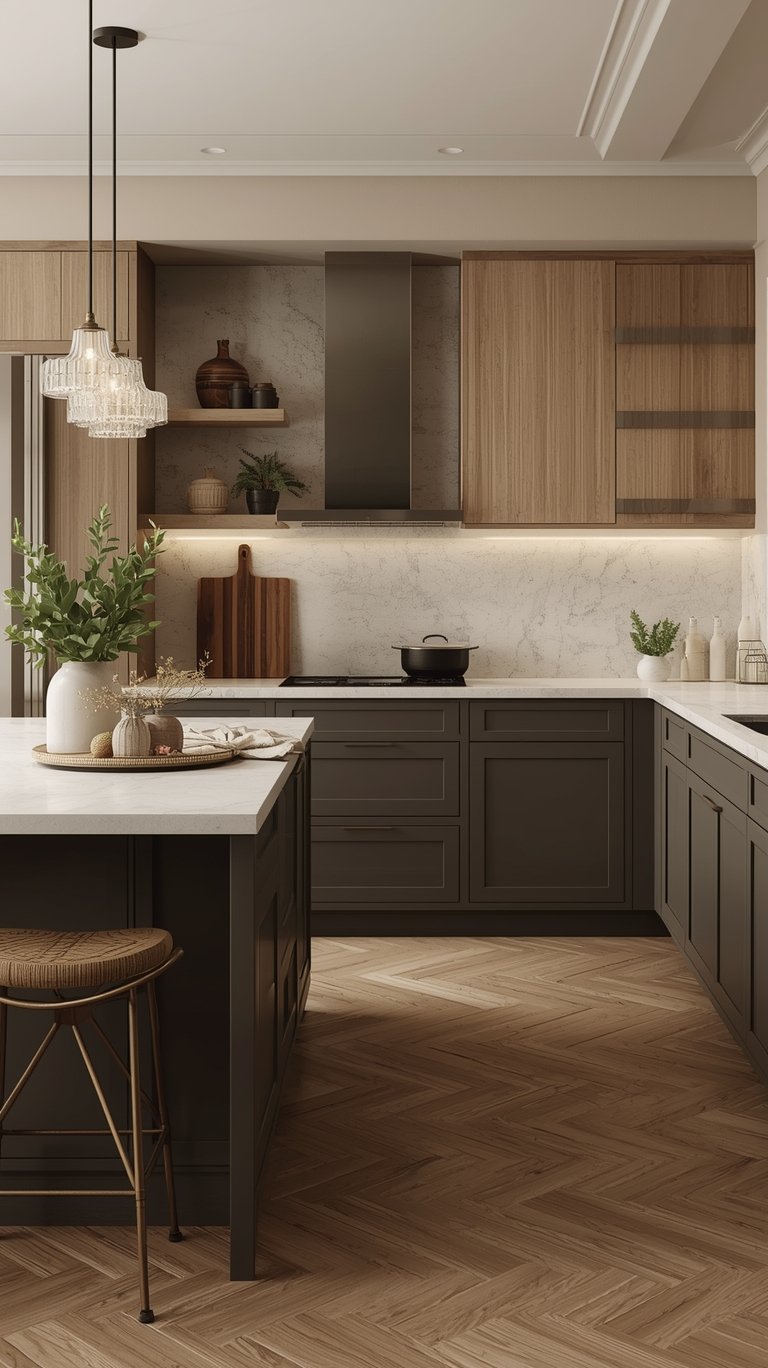
- Wood Grain Revival: Designers are embracing natural woods with visible grain (like white oak or maple) instead of painted cabinets everywhere. The idea is to combine the look of stone and wood as you would see them in nature.
- Practical Budget Hack: If you’re keeping existing sterile white cabinets, you can instantly warm them up and add texture by simply swapping the hardware for something textured like hammered brass or raw iron and integrating a wood butcher block somewhere in the space.
The 5 Dominant Color Palettes for 2026
These palettes define the new aesthetic, moving us into a rich, personal, and comfortable environment.
Earth-Inspired and Botanical Hues
This trend is all about bringing the outdoors inside to create a sense of grounded tranquility.
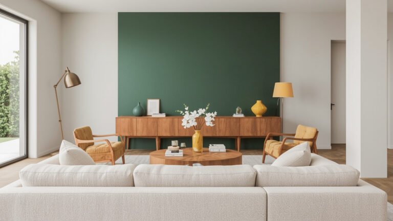
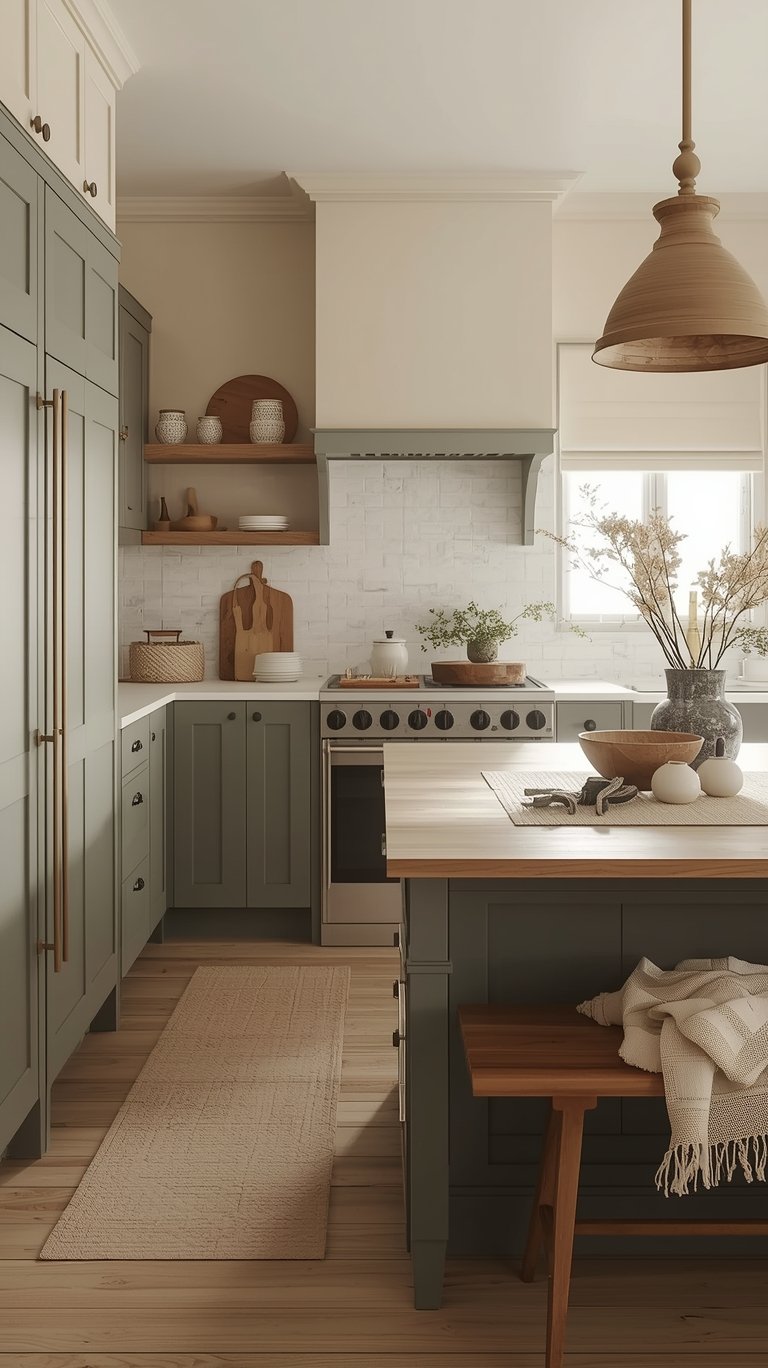
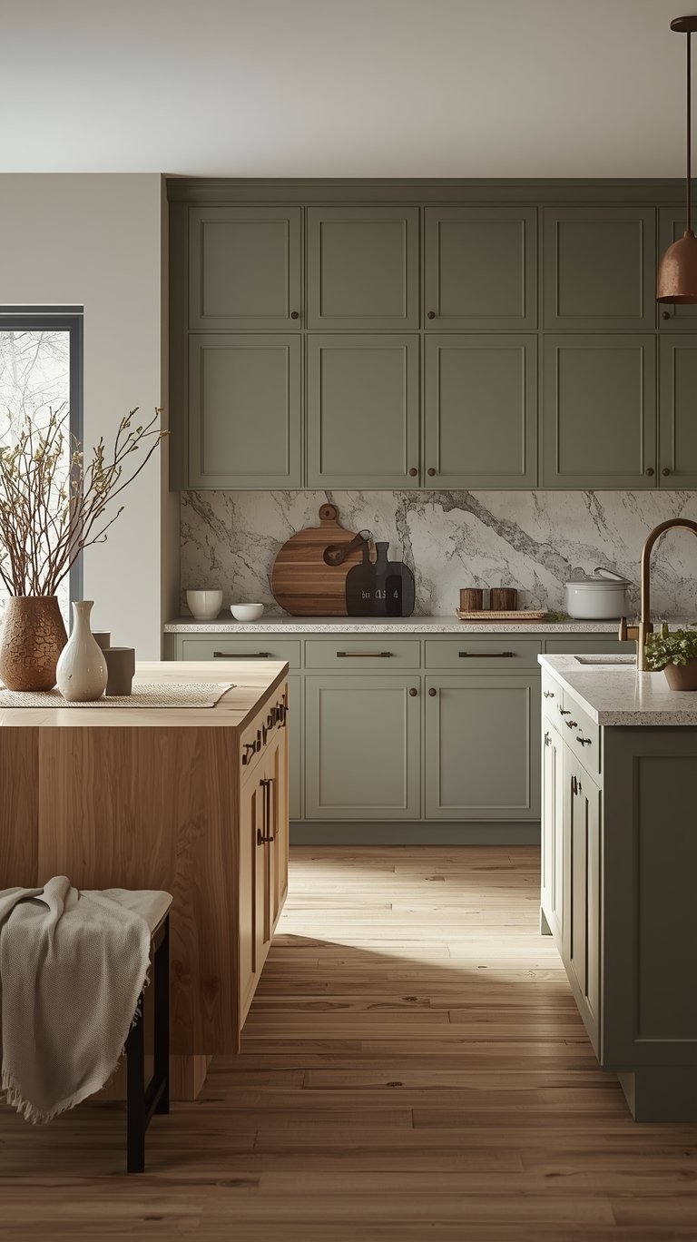
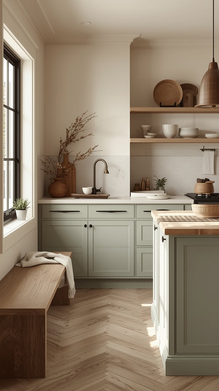
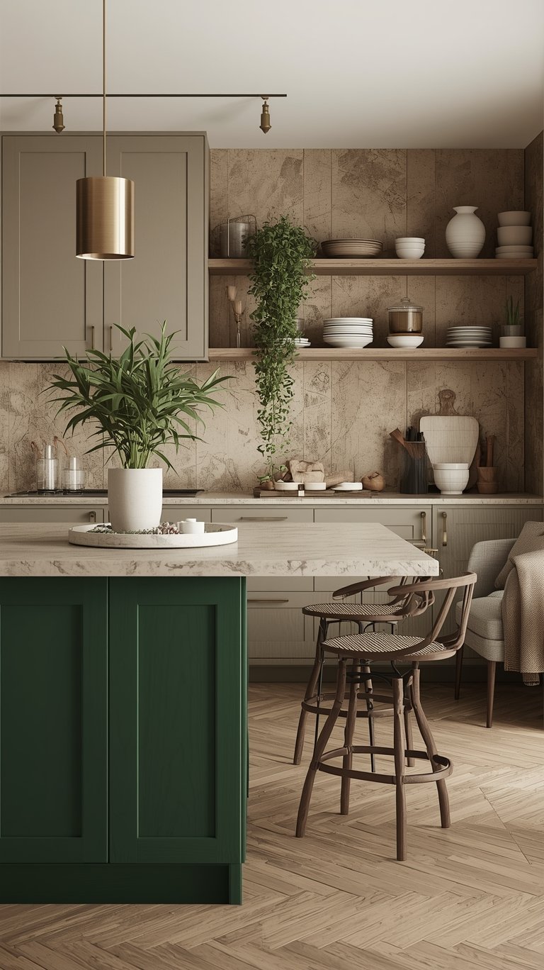
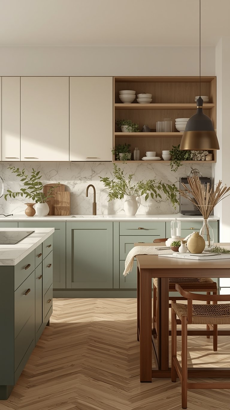
- Sage Green, Olive, and Moss: These hues are leading the movement. Sage, in particular, is a “muted grey tone” that achieves a perfect balance of sophistication and tranquility, promoting a sense of calm and well-being.
- Warm Eucalyptus: Valspar’s 2026 color of the year, Warm Eucalyptus, is a “restorative gray-green” that instantly brings calm and serenity, fitting perfectly with the trend toward mindful living and creating true sanctuaries.
- Spelt Sage: This shade acts like a neutral but offers more personality than a standard gray.
My Top Tip: To make these colors “really sing,” pair them with light woods, natural textures, handcrafted ceramics, and brass accents. They look organic and fresh when paired with warm white uppers in a two-toned scheme.
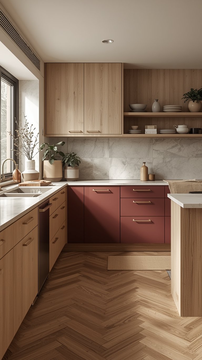
Warm Terracotta and Sunbaked Clay Tones
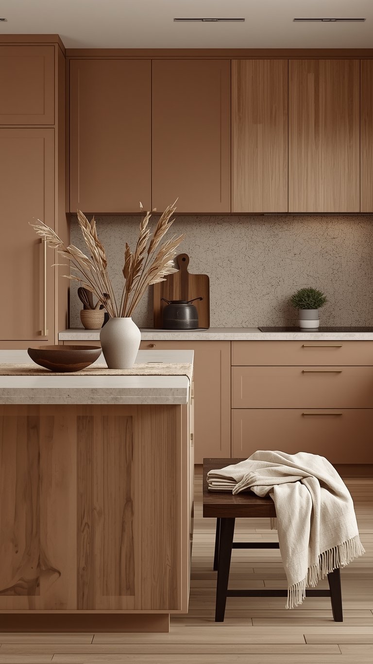
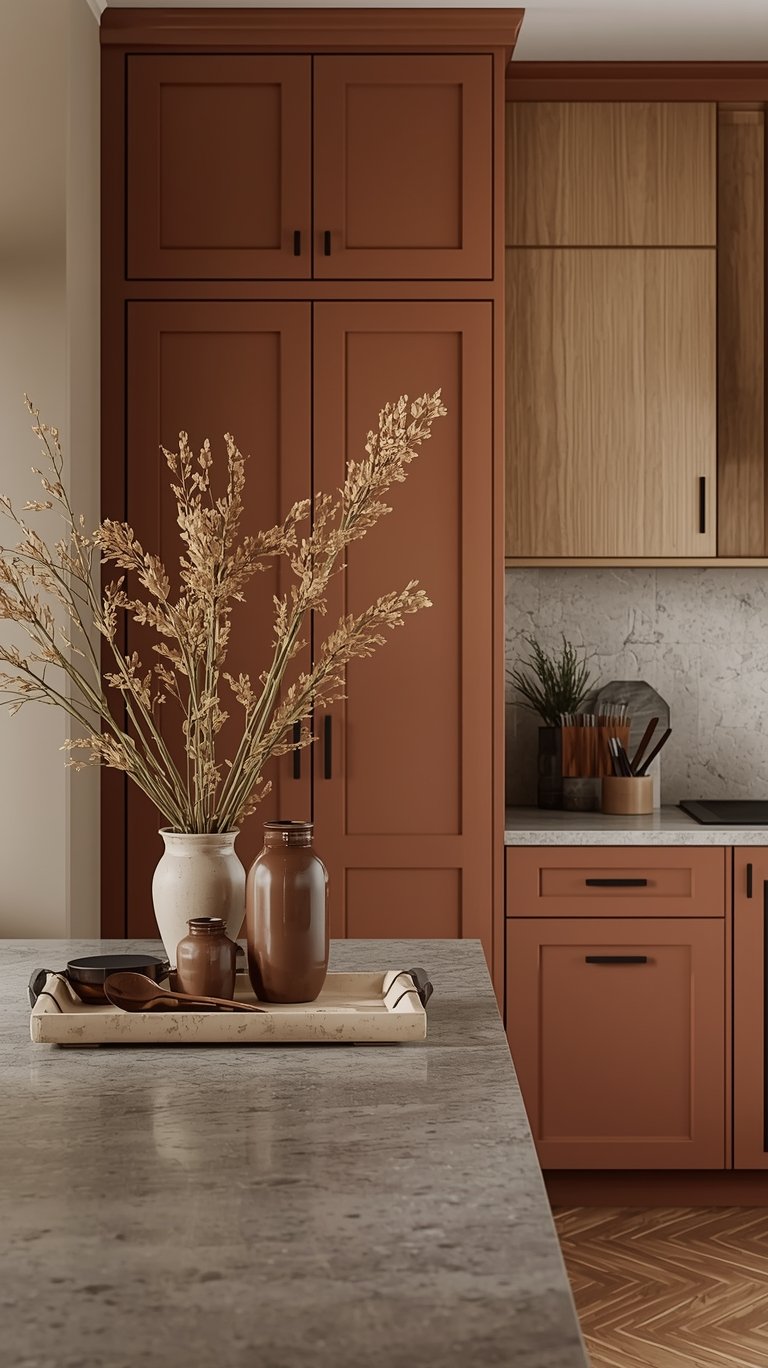
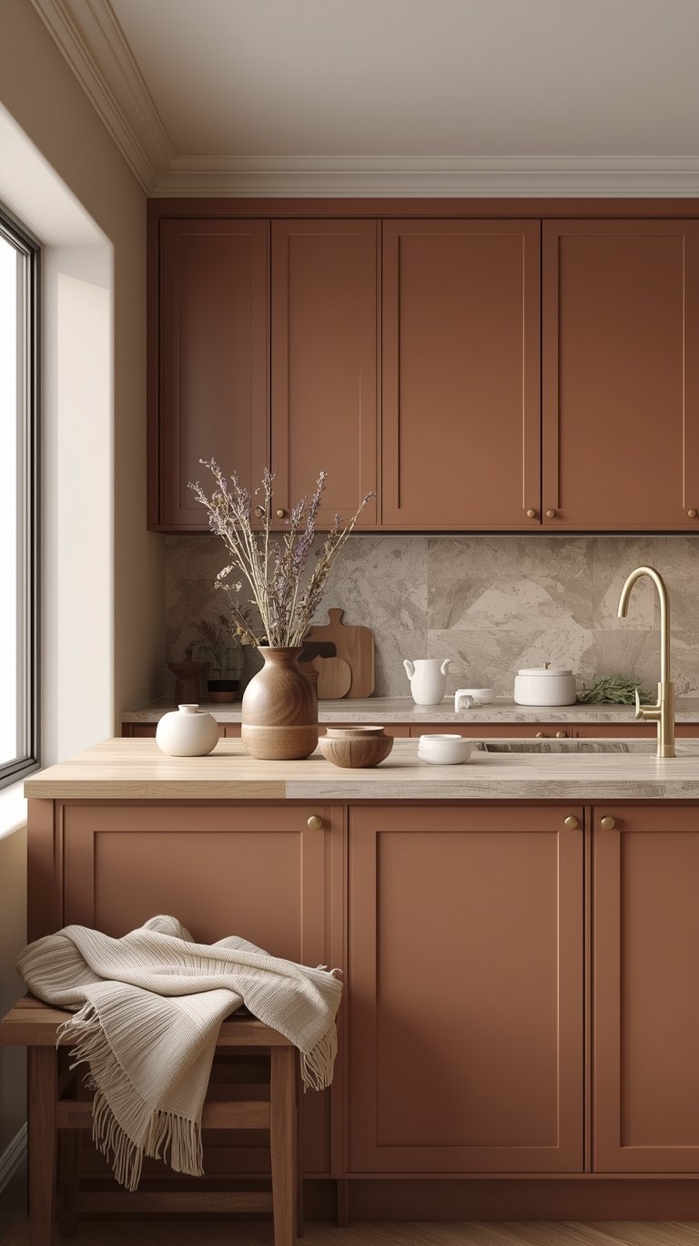
Do you dream of a kitchen that feels like a “warm embrace”? Terracotta is your answer.
- Earthy Oranges: These aren’t the bright, overwhelming oranges of the past, but sophisticated, muted, earthy clay colors that remind us of Mediterranean sunsets.
- Sunbaked Hues: Sherwin Williams’ forecast highlights Pennywise (a warm terracotta) and Drift of Mist (a light clay tone). These tones are excellent for mid-century modern, southwestern, or Mediterranean styles.
- Application: Terracotta works beautifully with natural materials like wood and stone. Picture soft burnt orange cabinets complemented by warm brass hardware, making the space feel like a Tuscan villa. They are perfect for an accent wall or island.
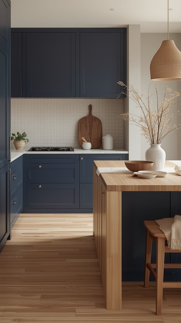
Sophisticated Dark Dramatics
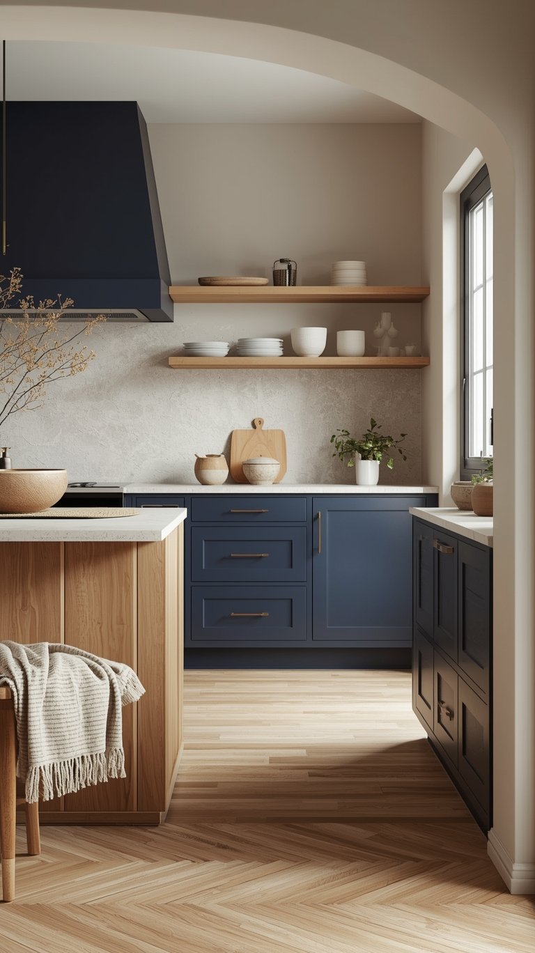
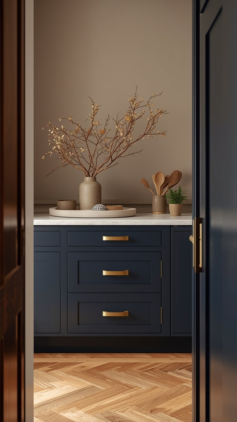
For those who crave high impact and drama, deep colors are making a sophisticated comeback, but with a twist—they’re designed for coziness.
- Deep Navy and Midnight Blues: Navy blue offers the perfect marriage of boldness and elegance. It creates stunning contrast when paired with crisp white or creamy accents and warm brass hardware.
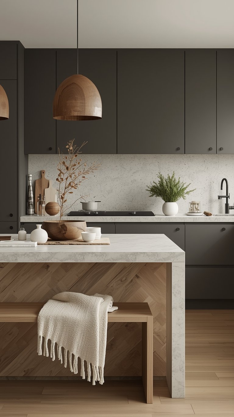
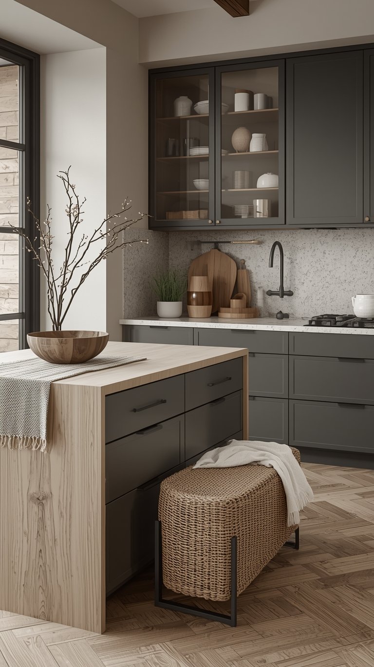
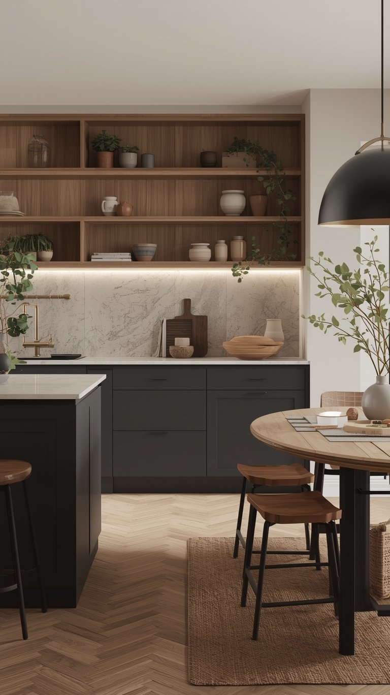
- Charcoal Gray and Dark Neutrals: Charcoal gray provides a versatile, sophisticated neutral backdrop that creates stunning visual impact. It also has the practical advantage of hiding fingerprints and daily wear better than lighter colors, making it an excellent choice for busy families.
- The Cocooning Effect (SK: cocooning effect): Why go dark? Designers are using rich dark colors (charcoals, near blacks, inky blues) to create a “surprisingly cozy atmosphere”. This “cocooning effect” makes the space feel more intimate and enveloping, “like a warm hug”.
Pro Tip: When using these dark shades, balance is key. They require ample natural light and high-contrast elements, like white marble countertops and metallic hardware, to prevent them from feeling too heavy.
The New Neutrals: Mushroom and Taupe
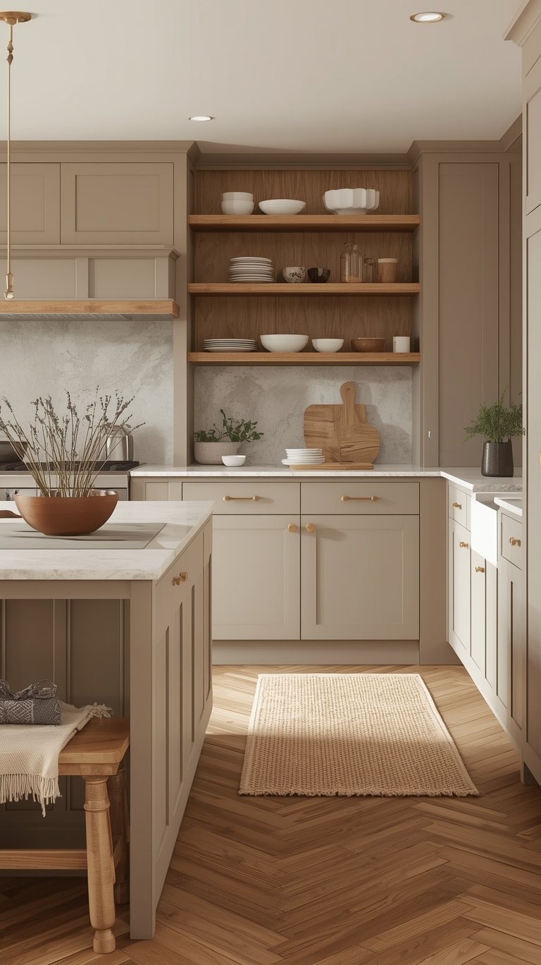
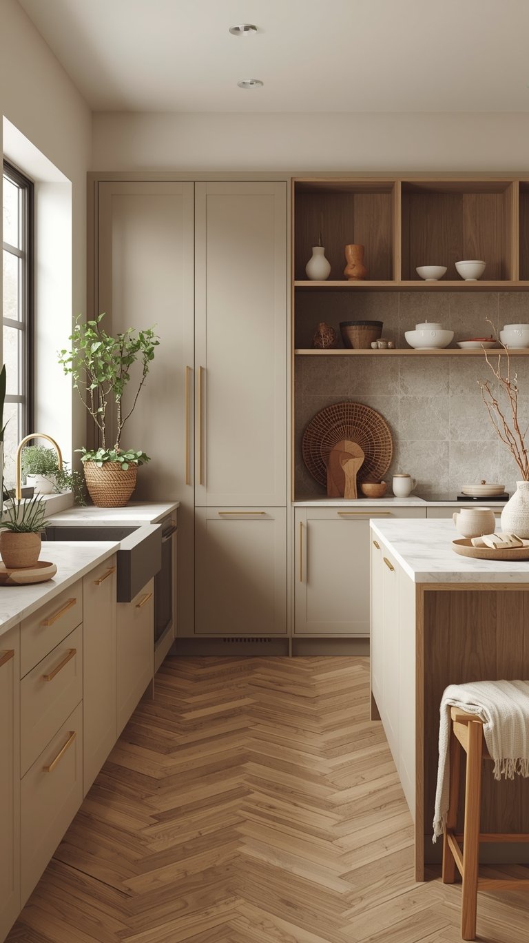
These colors are the perfect middle ground, offering the warmth and sophistication we crave without the commitment of a bold shade.
- Versatility: Mushroom and taupe tones work with virtually any design style or color palette. They can appear more gray in cool light and more brown in warm light, making them interesting and incredibly versatile.
- Grounded Feel: These tones ground a space and feel timeless. They are excellent choices for full cabinet sets or as accent colors because they maintain sophistication while allowing other design elements (like hardware and stone) to shine.
- Greige (SK: warm neutrals): The combination of warm beige and gray is hugely popular (known as “greige”) because it offers the warmth of beige with the contemporary sophistication of gray.
Unexpected Accent Colors
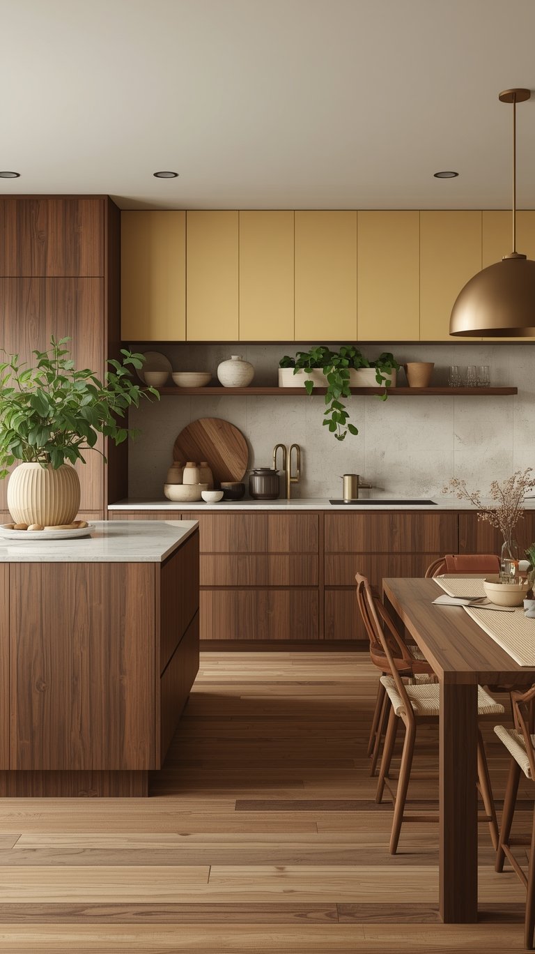
If you want a pop of unique personality without committing to a full color overhaul, look to these unconventional shades:
- Deep Reds and Burgundies: Burgundy, in particular, is trending and feels luxurious and unexpected. It makes a kitchen feel “designed rather than just decorated”. This deep, earthy red often has burnt umber undertones and looks fantastic with natural wood floors and green accents for high contrast.
- Soft, Butter Yellows: For a sunnier, brighter space, soft butter yellow reads “cheerful and fresh”. Because yellow reflects light brilliantly, it’s a great choice for brightening up a darker kitchen. Warning: Experts caution against pairing rich yellow with high-contrast black, as it can create a slightly “bee-like look”.
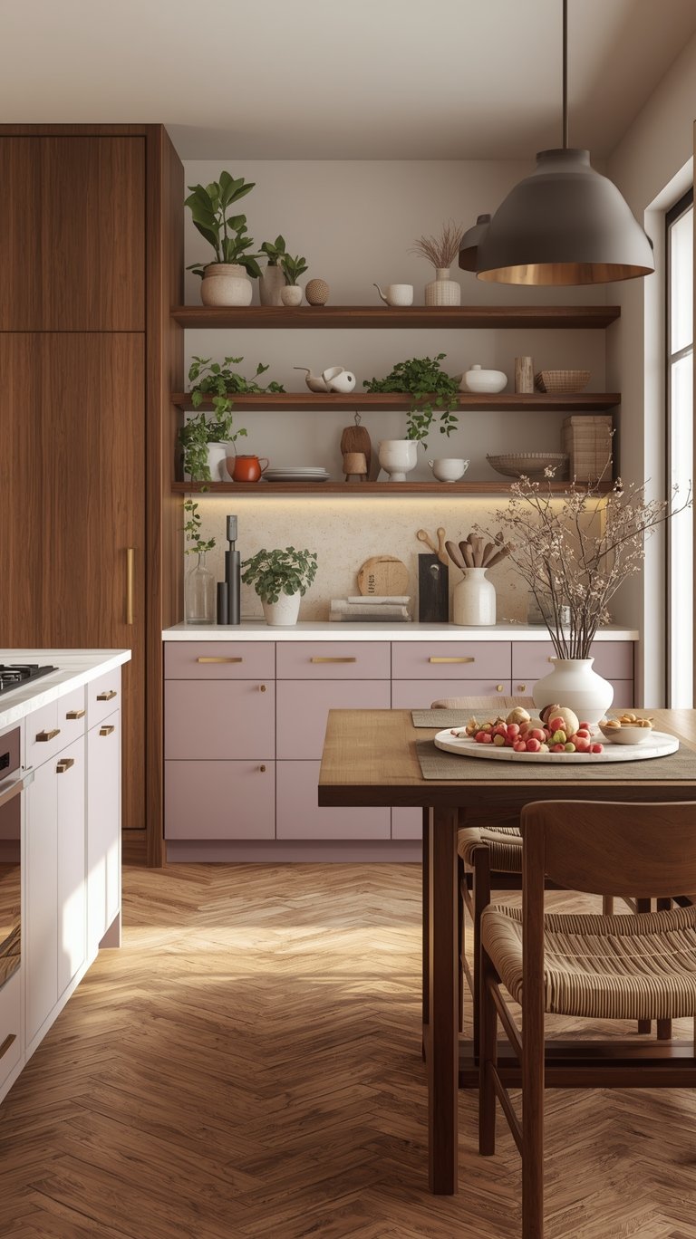
- Soft Lavender and Muted Purple: These aren’t overwhelming purples, but sophisticated tones with significant gray undertones. They add personality and uniqueness while remaining calm and distinctive, pairing beautifully with warm whites and soft blush.
Expert Implementation Strategies (How to Use Color)
It’s one thing to know the colors; it’s another to know how to install them like a pro. These tips focus on making smart, low-commitment, and timeless choices.
Strategic Application: The Two-Toned Look
The high-impact trend is fine, but high commitment is fading. The two-toned look is the solution, adding dimension without overwhelming the space.
- Island Focus: If you absolutely love a bold color (like Navy Blue, Forest Green, or Deep Red), use it just on the island cabinetry. This makes it a stunning focal point without the color being “up in your face all the time” or causing you to get “sick of it”.
- Lower Cabinets First: Another popular combination is using the bold shade on the lower cabinets and a warm neutral or white on the uppers. This grounds the space but still feels light and timeless.
Material Pairing for Longevity
The secret to a successful design in 2026 is ensuring your color choices harmonize with their surrounding finishes.
- Warmth is Non-Negotiable: Lean into the natural warmth of your chosen cabinet colors. Pair creamy whites and warm neutrals with brass hardware, oak, or walnut.
- Avoid the Clash: A major mistake is pairing warm colors (like Melodius Ivory) with cool gray countertops or walls—they will clash and mute the warmth you’re trying to achieve. Similarly, soft powder blues should avoid very dark countertops, as the high-contrast look can feel dated. Instead, opt for light marble or neutral countertops for a fresh, clean look.
- Accenting the Greens: To anchor botanical hues, pair them with natural elements, light woods, and sophisticated brass accents.
Budget-Friendly Hacks
You don’t have to gut the entire space to achieve the 2026 aesthetic.
- The Hardware Hack: For the cheapest and easiest fix, replace matte black hardware with something warmer or more classic. Aged brass, polished nickel, or a classic timeless look are all great options to instantly make a kitchen feel warmer and more expensive.
- Adding Wood Elements: You can transform sterile cabinets or countertops by adding natural wood elements like floating shelves or a wood butcher block somewhere in the space. This introduces the crucial texture and warmth that modern kitchens demand.
- Painting is Powerful: If you have dated naughty pine, honey oak, or orangey oak cabinets, remember you can always paint them. This can be a very inexpensive fix to align your kitchen with the more muted, natural-looking wood tones trending today.
Future-Proofing Your Design: 15 Trends to Ditch Now
Readers interested in the Kitchen Color Trends 2026 are also keen to know what they should avoid so they “don’t waste your hard-earned money” on elements that will quickly look dated. Here’s a detailed look at the kitchen trends that are actively on the way out in 2025.
Outdated Hardware and Finishes
Some details that used to scream “modern” now scream “builder basic.”
- Matte Black Hardware (SK: matte black hardware): This used to feel bold and fresh, but now it’s everywhere—even builders use it by default. It’s being replaced by the warmth of aged brass, polished nickel, or shiny silver.
- Faux Distressed Cabinetry: We’re talking about uneven wear, hand-scraped paint, and glazing. This look “says ‘I sanded this with a chainsaw'”. Kitchens are moving toward much cleaner, simpler finishes. What to do instead: Opt for a very smooth matte finish—avoiding glossy paint, which is also going out of style.
- Orangey Oak and Honey Pine: The golden, visible knots, and rings of naughty pine or honey oak cabinetry look straight out of the 70s or 80s. What to do instead: Embrace lighter, more neutral, muted wood tones like white oak or maple, or simply paint your existing cabinets.
Functional Elements That Interrupt Flow
Kitchens must prioritize unobstructed, clean, straight lines. These elements actively work against that goal:
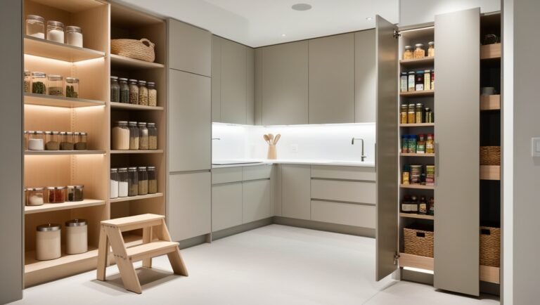
- Visible Microwaves: Having a microwave above the range has been common for space-saving, but it has functionality issues (poor venting) and breaks up the visual flow. It can also “just scream builder basic”. What to do instead (SK: appliance garage): Hide the microwave inside a pantry cabinet with an electrical outlet, use a microwave drawer in the island (though these can be expensive and require reaching down), or put it in an appliance garage—a countertop cabinet with an appropriate electrical connection.
- Dual-Tiered Islands/Peninsulas: These split-level designs, with a bar-height top tier and a counter-height lower tier, “break up your work zone” and limit usable prep space. What to do instead: Opt for a single-level island or peninsula that’s all at counter height. This is often an easy fix, involving just replacing the countertop without replacing all the cabinetry.
- Built-in Kitchen Desks: These “homemaker’s desks” shoved into a corner often become a cluttered, messy “dumping ground for junk,” not a useful workstation. What to do instead: Put traditional cabinetry in that spot for extra storage, or convert it into a popular, dedicated coffee bar or coffee station.
Overly Fussy Aesthetics
Modern design favors clean lines and simplicity over complex or thematic décor.
- Ornate Tiled Backsplashes: Tiny tiles, busy geometric patterns, and mosaic backsplashes instantly make a kitchen look dated and “overly done”. What to do instead: Choose a simple pattern or a solid color for your backsplash. Many people are using the countertop material to go up into the backsplash for a seamless look, or using a simple solid subway tile in an interesting pattern.
- Overly Themed Kitchens: This means a complete Tuscan theme, a farmhouse theme with wagon wheels and “eat” signs, or a beach theme where the house is nowhere near the ocean. When every element reflects the theme, it looks like a “TV show set”. What to do instead: Embrace a vibe through texture and color (e.g., using sandy tones or linen textures for coastal) rather than using themed décor items everywhere.
- Fluted Paneling Near the Cook Zone: Fluted or slatted paneling near the range hood is a hot trend right now, but experts agree it’s a terrible idea. I just imagine all the grease, hair, and dust getting stuck in those grooves!. They are nearly impossible to clean, requiring a toothbrush and extreme effort. What to do instead: If you love fluting, incorporate it into a non-built-in furniture piece (like a pantry cabinet or buffet) that can be easily swapped out when the trend fades.
- Ornate, Traditional Custom Range Hoods: Those custom range hoods with scrollwork and corbels that look like they belong in a palace or on the hills of Tuscany feel “way too fussy” for today’s clean-lined kitchens. What to do instead: Choose clean lines, simple boxy shapes, integrated range hoods that are hidden inside cabinetry, or plaster range hoods.
Advanced Functionality and Tech: Designing for Real Life
The shift in Kitchen Color Trends 2026 is about creating spaces that support how we actually live, cook, and gather. This requires smarter decisions about lighting and technology.
Integrated Lighting for Drama
Lighting plays a critical role, especially when embracing moody colors like charcoal or navy (the “cocooning effect”).
- Avoid Oversized Pendants: Gigantic pendant lights over the island can overwhelm a space, block sight lines, and make the room feel unbalanced, particularly if you have average-height ceilings (like 8ft). What to do instead: Opt for appropriately sized lighting, perhaps something with fluted or ruffled glass that complements the kitchen without competing with it.
- Layering is Essential: Dark cabinets absolutely require excellent lighting to make them work and prevent the space from feeling cave-like. Use layered lighting to ensure functionality and to highlight the texture of your materials (honed stone or wood grain).
The Smart Kitchen Reset (SK: smart upgrades)
Many smart kitchen appliances—like Wi-Fi-enabled refrigerators, screens on fridges, and touch or voice-controlled faucets—are falling out of favor because the technology can get “glitchy,” requires frequent battery packs, or quickly looks dated.
- Choose Functional Upgrades: Instead of gadgets, invest in smart, functional upgrades that genuinely make life easier. These include:
- Soft-Closed Doors and Drawers: A functional upgrade that prevents slamming.
- Motion-Activated Lighting: LED light strips under toe kicks or inside cabinets add ambiance and functionality.
- Induction Cooktops: These are becoming more popular, offer smooth, clean lines, and are a high-tech way to cook safely and efficiently.
- Avoid the Tech Trap: The technology on smart appliances can easily stop working after a few years, making them expensive and frustrating mistakes.
FAQ
Are all dark colors trending?
Yes, but specifically deep, sophisticated, and moody colors that offer a “cocooning effect”. Charcoal gray, deep navy, midnight blue, and deep emerald or forest green are trending because they offer drama and intimacy. The key is to ensure they are balanced with high contrast elements like warm whites and brass hardware.
Why are people moving away from stark white kitchens?
After nearly a decade of dominance, homeowners are tired of the “sterile Instagram perfect white box” and are craving something more personal, comfortable, and cozy. Stark whites can feel clinical and unwelcoming. The design shift is driven by a desire to make the kitchen feel like a “sanctuary” rather than a showroom.
What is the biggest color trend replacing white?
The biggest shifts are toward warm creamy whites (off-white tones with beige or yellow undertones) and earth-inspired hues like sage green and warm terracotta/clay tones. These colors make the space feel grounded, inviting, and connected to nature.
Should I worry about committing to a bold color like red or navy?
A full kitchen of a bold color is a high commitment and people are already getting “sick of them”. The expert advice is to use bold colors strategically on low-commitment areas like the kitchen island or the lower cabinets. This allows you to embrace the color without overwhelming the space.
What is replacing polished granite and shiny surfaces?
Texture is paramount. Polished surfaces are being replaced by materials you can feel, such as honed and leathered stones (which have a matte, textured finish). The use of natural woods with visible grain (like oak or walnut) also adds essential texture.
What is the number one thing I should remove from my kitchen immediately?
Designers agree that two of the most dated elements are visible microwaves (especially those above the range) and dual-tiered or split-level islands. Both break up the visual flow and reduce usable, functional space.
What are the best hardware choices for 2026?
Move away from matte black. Focus on aged brass, polished nickel (a shiny silver), and classic, timeless looks. Hardware should add contrast and complement the material textures.
What if I have a small kitchen? Can I still use dark colors?
Yes, but be strategic. Deep navy blue works well in smaller kitchens because it adds depth and richness when balanced with adequate lighting and lighter accents. However, if you want to make a small kitchen feel bigger and more open, designers recommend airy shades like a soft powder blue (like Gentle Gray) paired with creamy white cabinetry.
The Bottom Line
The most important aspect of the Kitchen Color Trends 2026 is that they encourage you to choose colors that resonate with your personal style and lifestyle needs. Whether you’re drawn to the sophisticated embrace of charcoal gray, the calming nature of sage green, or the warm hug of terracotta, the goal is the same: to create a space that feels grounding, inviting, and brings a sense of comfort that calms your senses.
The best kitchen colors aren’t just the ones that look beautiful in photos or impress visitors; they’re the ones that make you smile every time you walk in, feeling truly inspired to cook, gather, and create memories with the people you love. It’s time to stop designing for the trends and start designing for your soul.
ABOUT the AUTHOR
TOKI; INTERIOR DESIGN & lifestyle CONTENT CREATOR.
Hey there! I’m Toki—the design-obsessed brain behind Dwell Studio 24. I’m a content creator passionate about interior design, photography, and creativity, living in a 77-year-old house with my husband and our awesome three kids. I write about interior design, furniture, home topics, and my lifestyle, including travel, recipes, skincare, and daily routines. I hope to inspire your next project and lifestyle!
ABOUT the AUTHOR
TOKI; INTERIOR DESIGN & lifestyle CONTENT CREATOR.
Hey there! I’m Toki—the design-obsessed brain behind Dwell Studio 24. I write about interior design, furniture, home topics, and my lifestyle, including travel, recipes, skincare, and daily routines. I hope to inspire your next project and lifestyle!