The Ultimate Japandi Color Palette Guide: Create a Serene Home with Scandi-Japanese Style
Finding the perfect Japandi Color Palette is like giving your house a long, deep breath out after a busy day. It’s the very first step in turning a cluttered, loud living space into a sanctuary that feels both grounded and incredibly light. If you’ve been scrolling through social media and falling in love with those rooms that look like a mix between a fancy spa and a cozy cabin, you’ve found Japandi Interior Design. This style isn’t just a fleeting trend; it’s a lifestyle choice that blends the best of two worlds: the cozy contentment of Scandinavian hygge and the rustic, imperfect beauty of Japanese wabi-sabi.
When we talk about a Japandi Color Scheme, we’re talking about more than just picking paint. We’re setting the emotional rhythm of your home. It’s a language of subtlety where light, shadow, and texture do the talking. Let’s be honest, choosing the right white paint can feel like a high-stakes game of “Spot the Difference” where the prize is a nap-worthy living room. But don’t worry! I’m here to walk you through how to use a Japandi Palette to make your home feel like a warm hug and a quiet meditation session all at once.
Key Takeaways for Your Japandi Home
- Balance is Everything: Mix the “cool” minimalism of Japan with the “warm” coziness of Scandinavia.
- Nature is the Best Designer: Use a Japandi House Color Palette inspired by stone, sand, wood, and mist.
- Texture Adds Depth: Since the colors are muted, use tactile materials like linen, jute, and wood slats to keep things interesting.
- Quality Over Quantity: The Japandi Style encourages choosing “fewer, better things” to reduce visual clutter.
- Mindful Cohesion: Use the 60/30/10 rule to balance your Japandi Colors effectively.
The Heart of Japandi: Why These Two Styles Fit So Well
To really understand why a Japandi Colour Palette works, we have to look at the philosophies behind it. On one side, we have Scandinavia. Think of Japandi Living through the lens of hygge. This Danish concept is all about creating a warm atmosphere and enjoying the good things in life with good people. It’s the chunky knit blanket, the soft glow of a candle, and the feeling of safety.
On the other side, we have Japan and the philosophy of wabi-sabi. This is the art of finding beauty in imperfection and transience. It’s the crack in a ceramic bowl, the weathered grain of an old wooden stool, and the appreciation for things that are aged and grounded. When you bring these together in a Japandi Home, you get a space that is functional but not cold, and minimal but not empty.
In Japandi Interiors, color isn’t used to impress guests or make a loud statement. Instead, it’s used to restore. It’s about creating a “visual language of calm” that helps your brain relax. By using a Japandi Style Color Palette, you’re actually reducing the “cognitive load” on your mind. This means your brain doesn’t have to process a million bright colors or messy patterns, leading to lower stress and better focus. It’s basically meditation you can live in!
Building Your Japandi Color Palette: The Essential Tones
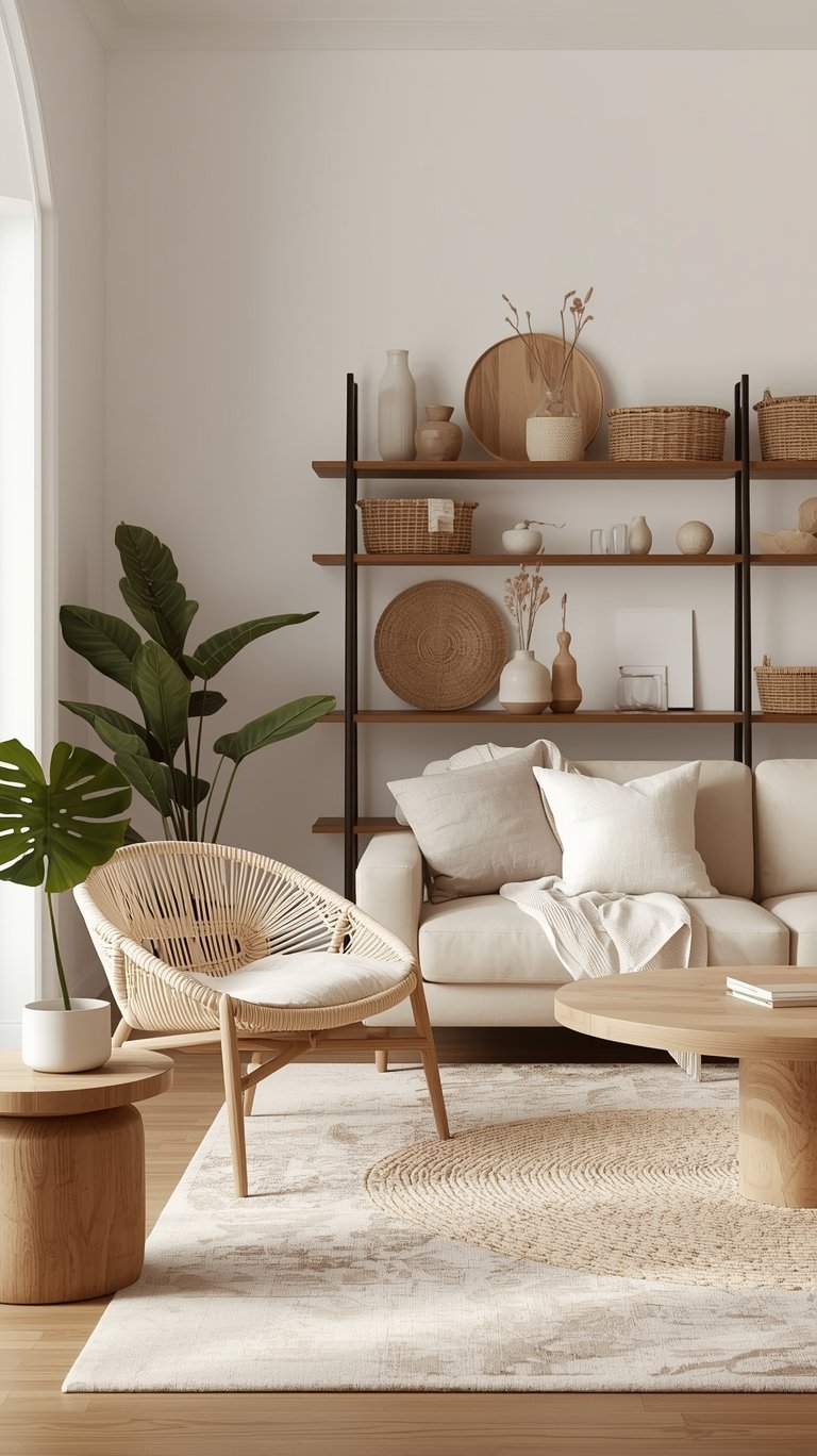
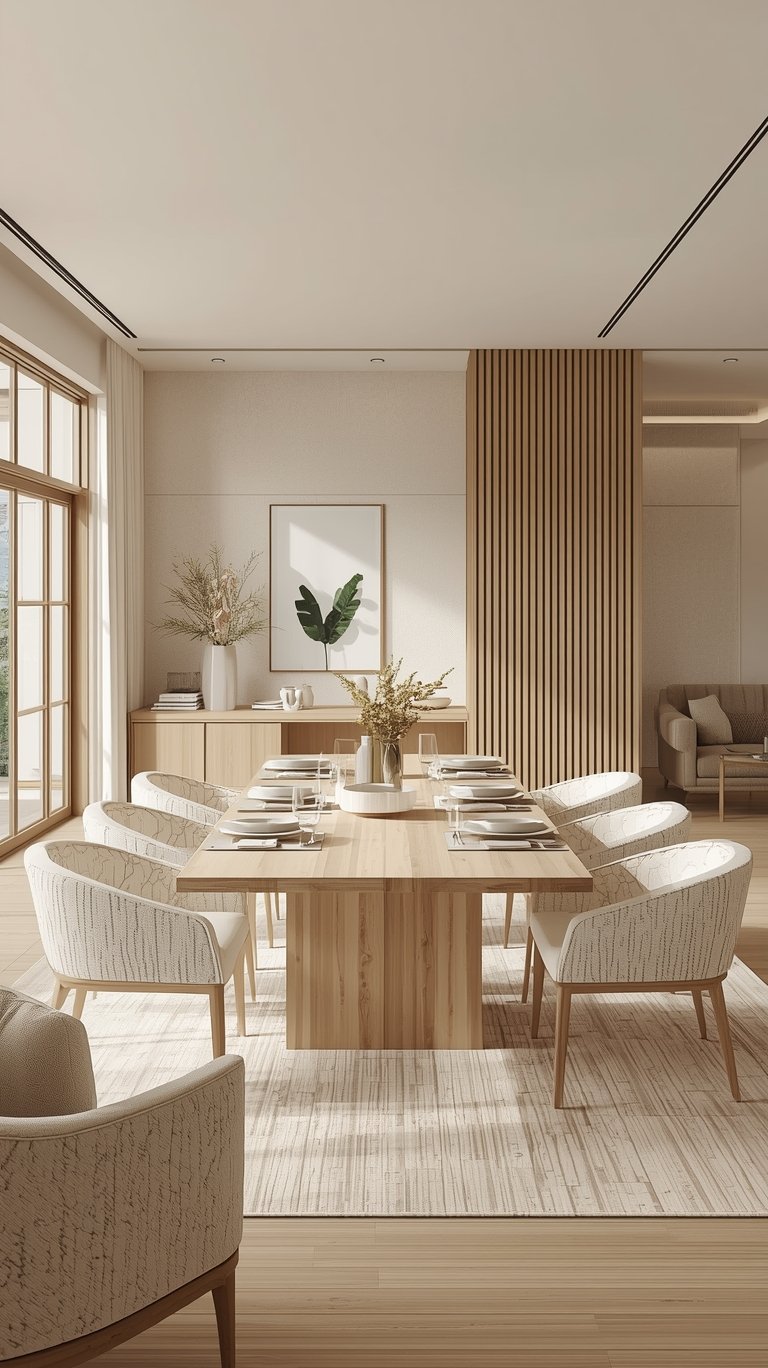
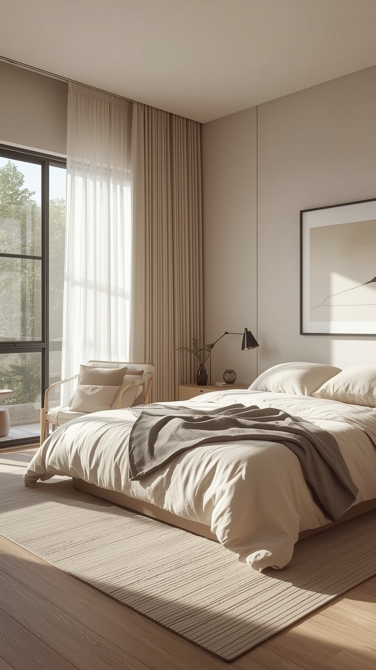
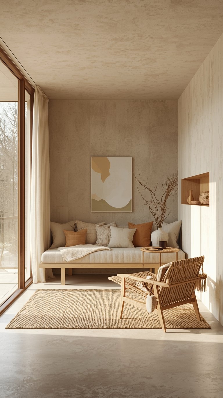
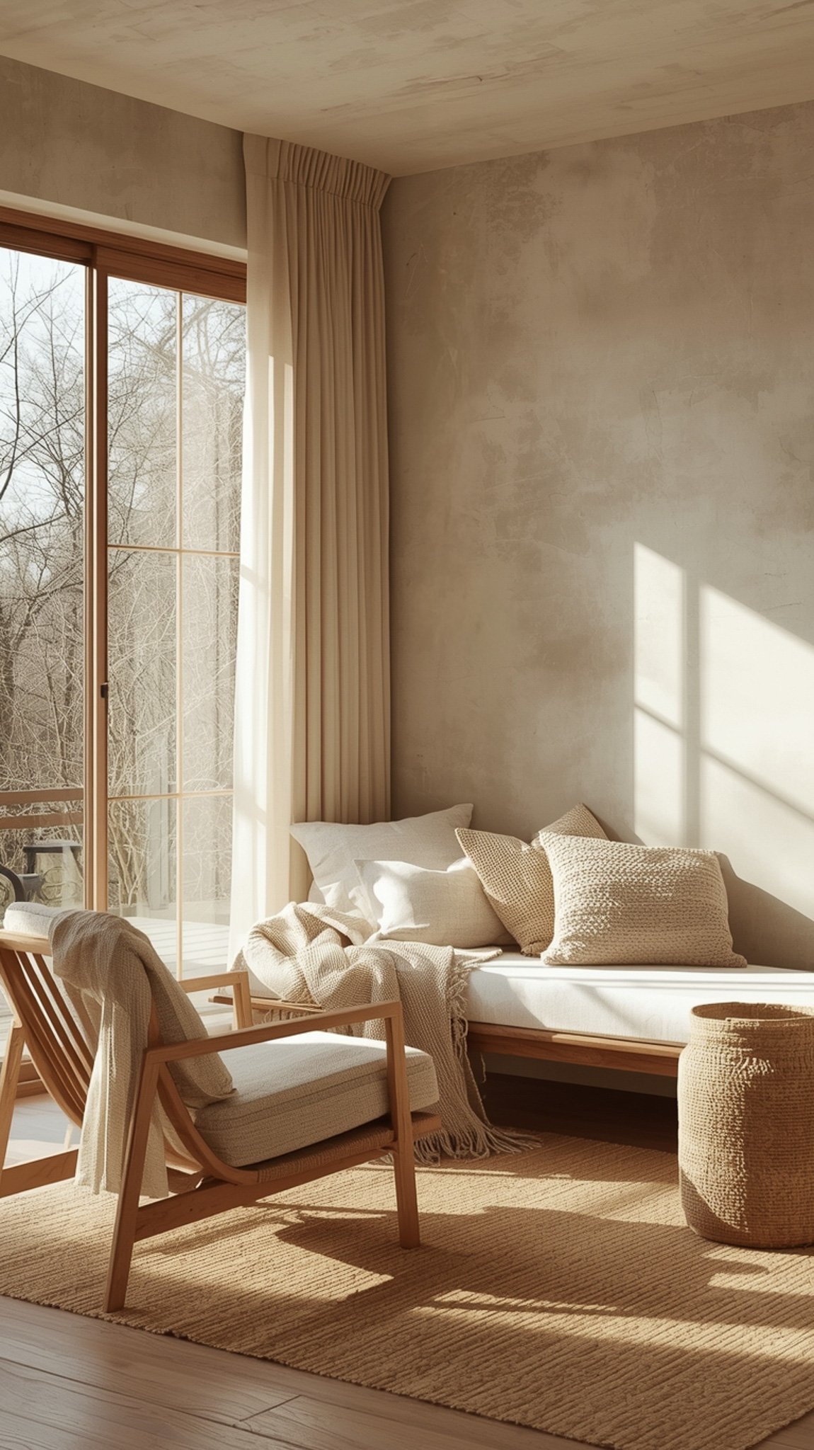
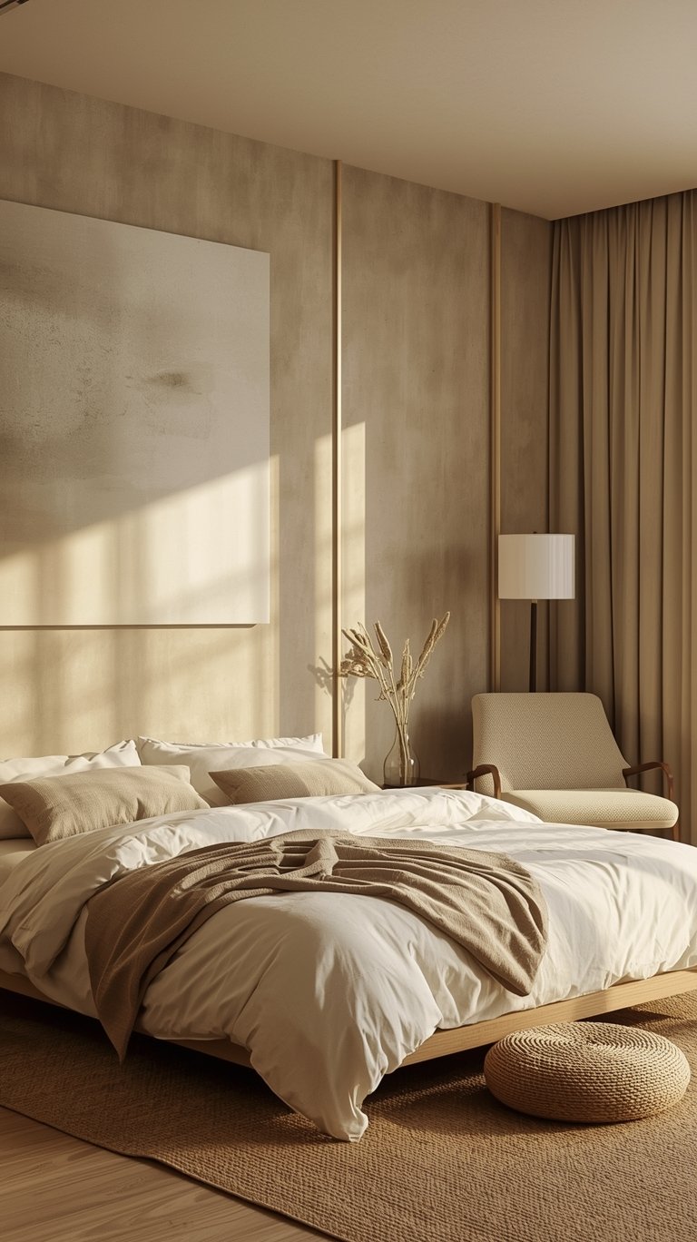
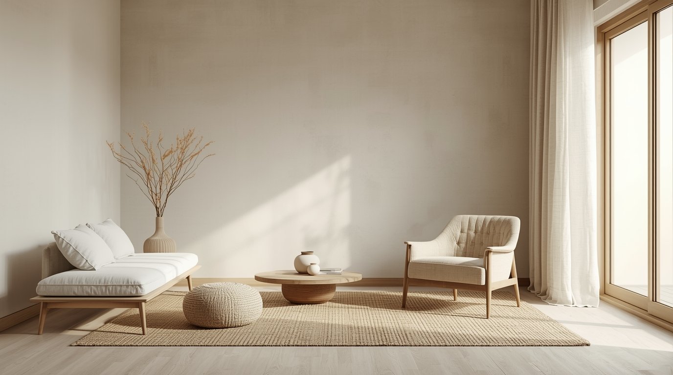
The foundation of any Japandi Interiors Color plan is a restrained, nature-inspired spectrum. You want to imagine the colors you’d see during a quiet walk in the woods or on a misty beach. A successful Japandi Palette Color story usually involves a mix of whites, beiges, grays, and deep earthy accents.
The Foundation of Warm Neutrals
Warm neutrals are the “hygge” heart of the home. They make a room feel intimate and human. When you’re looking for a Japandi Wall Color Palette, start with these:
- Creams and Ivories: These offer a soft, nurturing light. A great suggestion from the pros is Swiss Coffee by Benjamin Moore. It glows in natural light without feeling too yellow.
- Sandy Beiges: These feel effortless. Slipper Satin by Farrow & Ball is a classic choice for a Japandi Living Room because it feels like a warm beach on a cloudy day.
- Greige: This is the ultimate bridge between warm and cool. It’s a mix of gray and beige that looks sophisticated in any light. Thunder by Benjamin Moore is a fantastic greige that adds depth to a white kitchen.
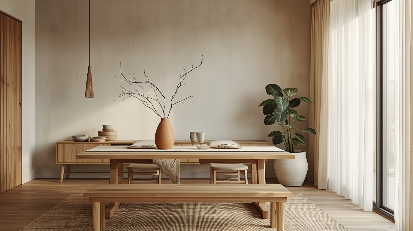
Light Wood Tones: Think natural oak, birch, and ash. These light woods are essential for bringing warmth and texture to the space.
The Clarity of Cool Neutrals
Cool neutrals bring the “Zen” side of the Japandi Interior Design to life. They mirror the stillness of water and stone.
- Stone Grays: These provide visual rest. A wash of cool gray, like Set in Stone by Clare, can make wood features really pop.
- Muted Sage and Blue-Gray: These are “whispers of nature.” They add a hint of freshness without being overwhelming. Try Softened Green by Sherwin-Williams on a ceiling or an accent wall.
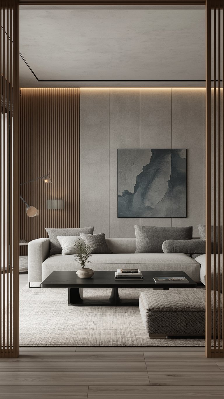
- Soft Black and Charcoal: These provide the “clarity and structure” every room needs. Without a little bit of dark contrast, a neutral room can feel like it’s floating away. Railings by Farrow & Ball is a moody, soft black with blue undertones that looks stunning on window frames or a bathroom vanity.
The 60/30/10 Rule for a Balanced Japandi Color Scheme
If you’re wondering how to actually put these Japandi Colours together without it looking like a beige explosion, the 60/30/10 rule is your best friend. This is a classic design trick that works perfectly for Japandi Interior Design.
60% Dominant Light Neutral
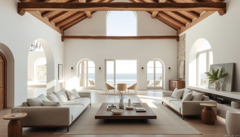
This is your “canvas.” It’s usually your Japandi Wall Colors. You want a light, airy tone like a warm off-white or a very pale gray. This color should cover about 60% of the room—think walls, large area rugs, or a big sectional sofa. This creates that sense of “openness and lightness” that Scandi design loves.
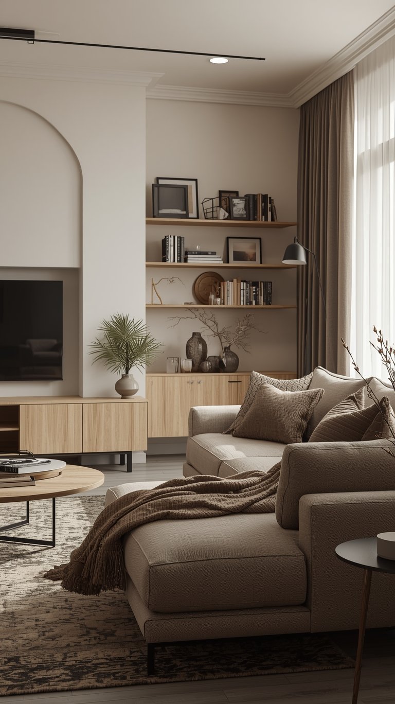
30% Secondary Tone
This is where you bring in the “grounding” elements. This should be about 30% of your space and usually includes your wood tones or a medium-toned gray. In a Japandi Living, this might be your oak coffee table, your walnut bookshelves, or a set of tan leather chairs. These colors provide warmth and prevent the room from feeling too “clinical.”
10% Dark Accent
This is the “punctuation mark” of your Japandi Palette. Use a dark charcoal, deep cocoa brown, or a soft black for the final 10%. This could be your lamp bases, picture frames, or even a single black ceramic vase. This small amount of dark color gives the eye a place to land and adds a sense of “structure” to the peacefulness.
The heart of Japandi lies in its calming neutral base. These colors create a sense of spaciousness and serenity:
Soft White: A warm, inviting white that reflects light and creates a sense of airiness. Avoid stark, clinical whites.
Warm Gray: A gentle gray with subtle warm undertones, providing a grounding and sophisticated feel.
Beige & Greige: These versatile neutrals offer a bridge between gray and brown, adding warmth and depth to the palette.
Light Wood Tones: Think natural oak, birch, and ash. These light woods are essential for bringing warmth and texture to the space.
My Top Tip: Don’t be afraid to mix your whites! A slightly off-white wall with crisp white trim can look amazing. Just make sure they have similar undertones (warm or cool) so they don’t clash.
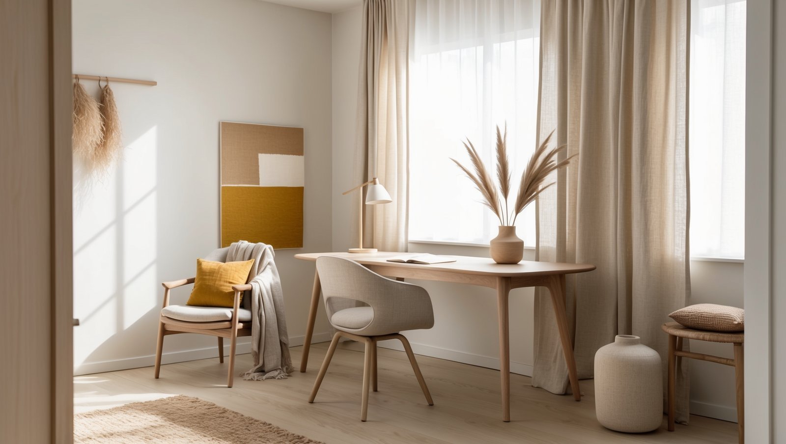
Subtle Pops of Color: Adding Personality
Japandi design celebrates the natural world, and 2026 sees an increased emphasis on earthy accent colors:
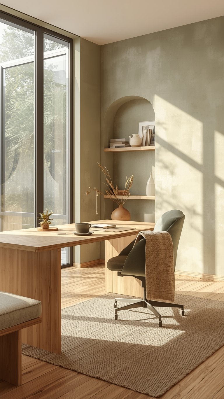
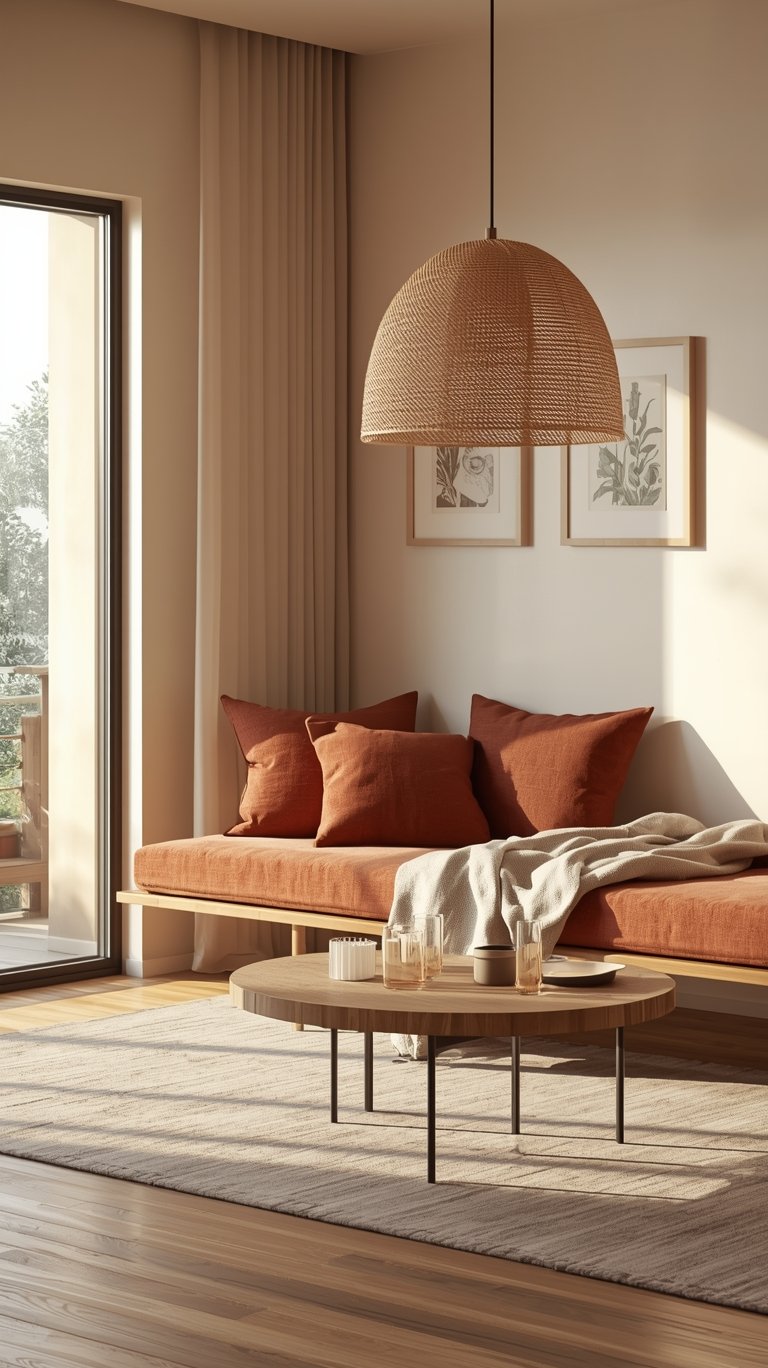
Sage Green: A muted, calming green that evokes a sense of tranquility and connection to nature.
Terracotta: A warm, earthy red that adds a touch of rustic charm and grounding energy.
Charcoal Gray: A deep, sophisticated gray that provides contrast and adds a touch of drama.
Greige: Its understated elegance adds sophistication while maintaining a cozy, inviting atmosphere. Perfect for contemporary aesthetics!
Add Personality to Your Room with Earthy Accent Colors:
Dusty Rose / Mauve: A muted, sophisticated pink that adds a touch of warmth and femininity.
Ochre Yellow: A warm, earthy yellow that adds a touch of sunshine and optimism.
Muted Siena: A warm, earthy reddish‑brown that brings rustic elegance and cozy depth to interiors.
My Top Tip: Don’t go overboard with the pops of color! Think of them like jewelry – a few well-chosen pieces can elevate the whole outfit, but too much can be overwhelming.
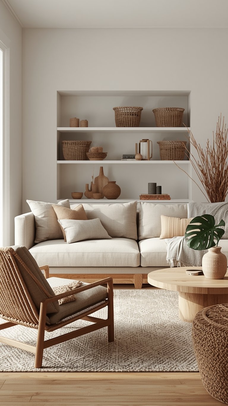
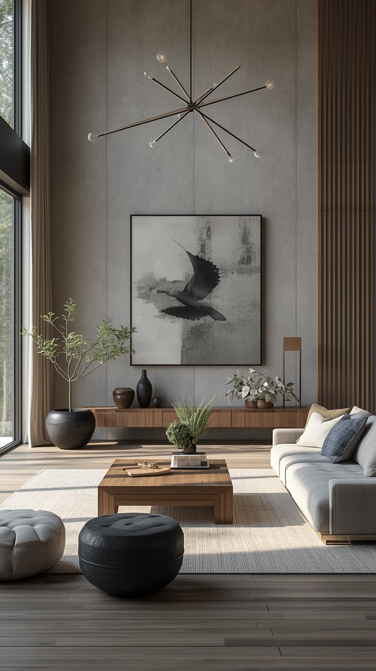
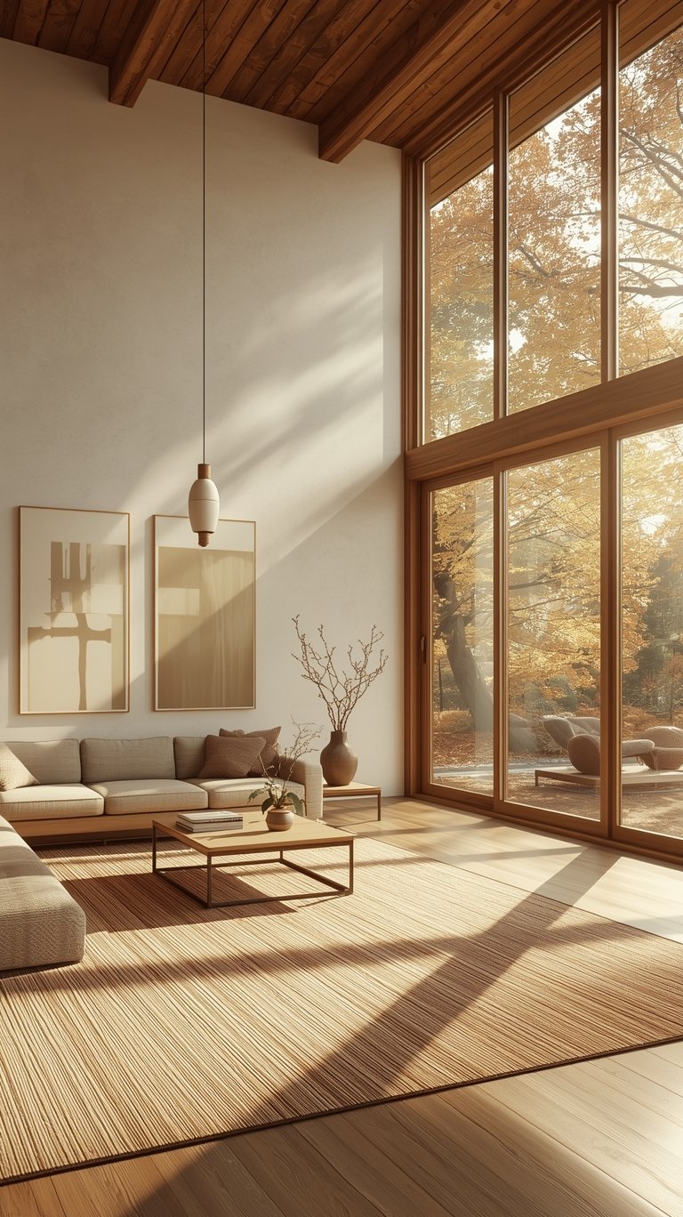
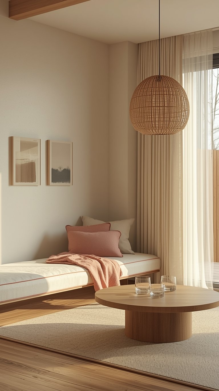
Texture is the Main Protagonist in Japandi Living
Here’s a secret: in a Japandi Color Palette, texture actually acts like a color. Because the colors are so quiet, the feel of the materials has to do the heavy lifting to keep the room from looking flat. This is where Japandi Interiors really come to life.
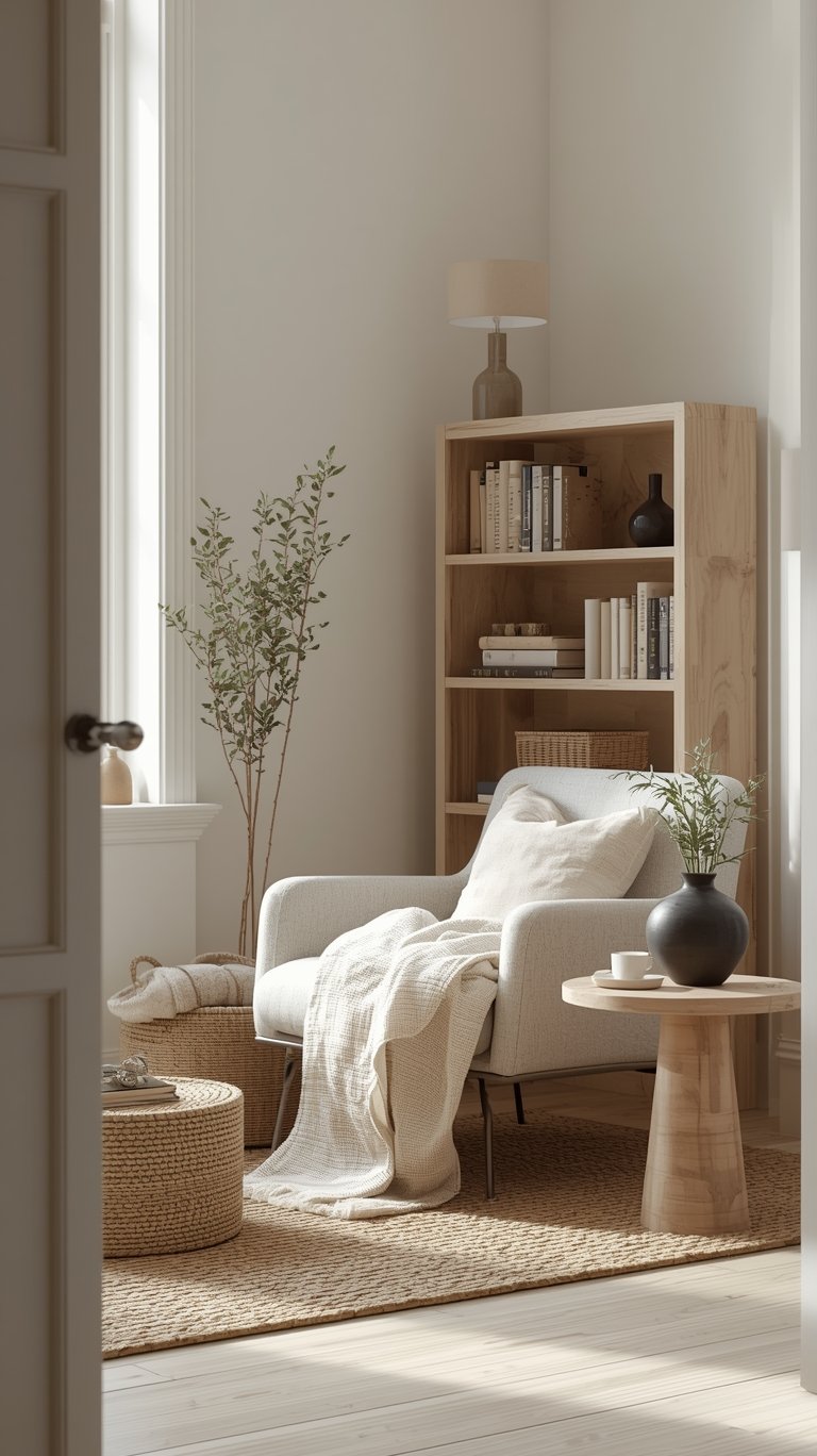
Layering Natural Materials
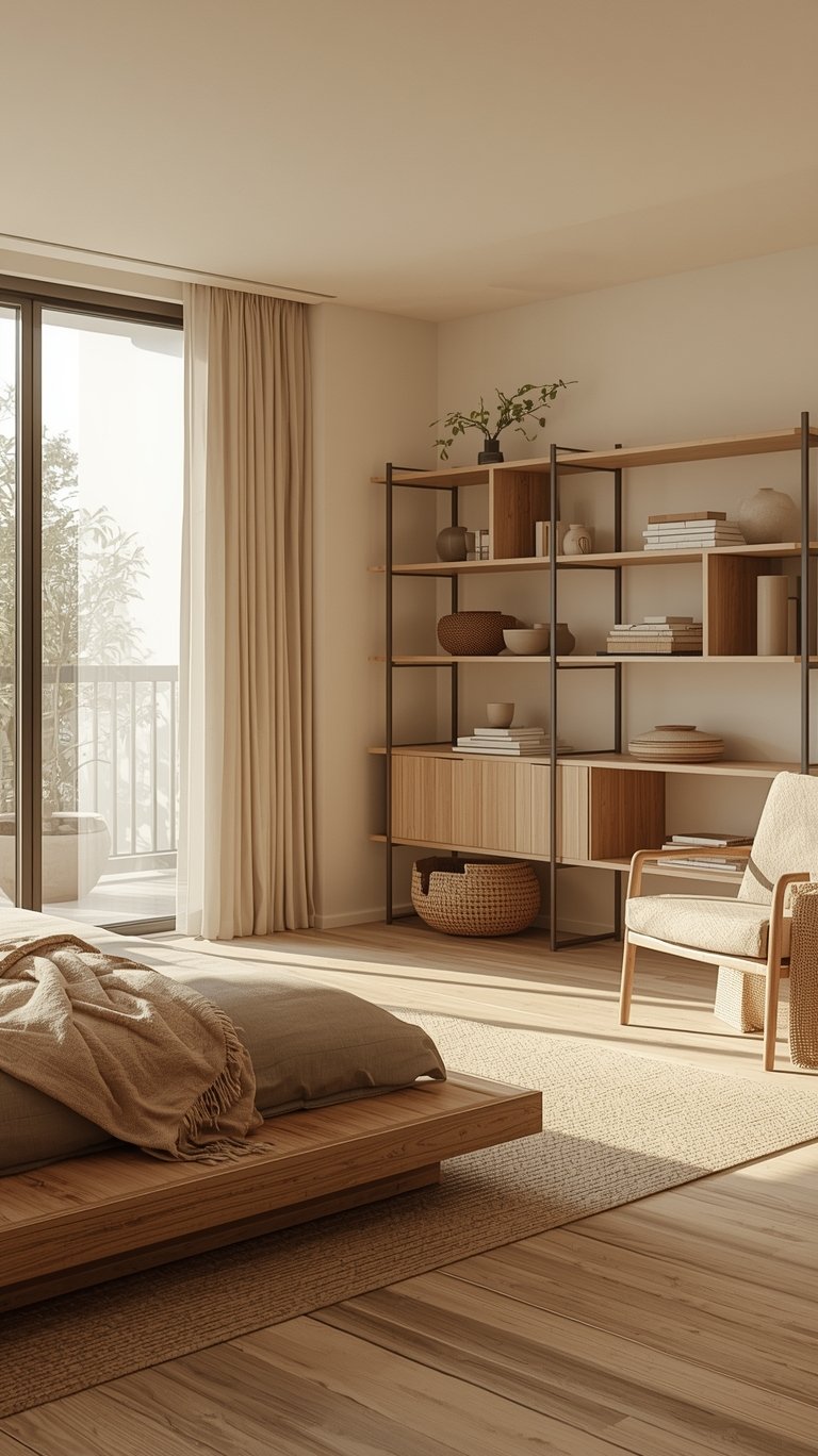
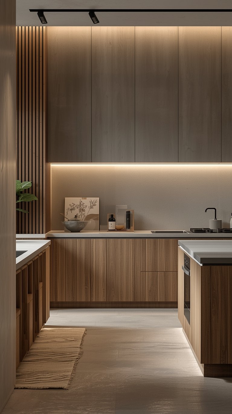
A Japandi Home Color Palette isn’t complete without wood. Light woods like oak reflect light and make spaces feel larger. Darker woods like walnut convey a sense of calm and elegance. But don’t stop there!
- Linen: Use linen curtains to filter sunlight. It creates a soft, hazy glow that feels like a dream.
- Jute and Sisal: A jute rug adds an “organic warmth” underfoot and introduces a beautiful tan color that fits perfectly into the Japandi Style.
- Bouclé and Wool: A textured bouclé chair in an oatmeal shade adds massive amounts of “hygge” to a corner.
Wall Finishes with Depth
Instead of flat, boring paint, consider a Japandi Wall Color Palette that includes texture. Limewash finishes are a huge trend for 2026. They create a soft, cloud-like mottling effect on the walls that looks like aged stone. Another great option is a wood slat wall. Using vertical wooden slats—maybe in a light oak or even a black-stained wood—adds a “rhythmic” element that is very common in Japanese architecture. It provides a graphic contrast that feels both modern and timeless.
Applying the Japandi Style Color Palette Room by Room
Every room in your Japandi House has a slightly different job to do, so your Japandi Color Scheme should adapt to match.
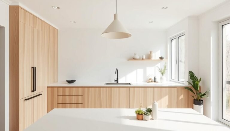
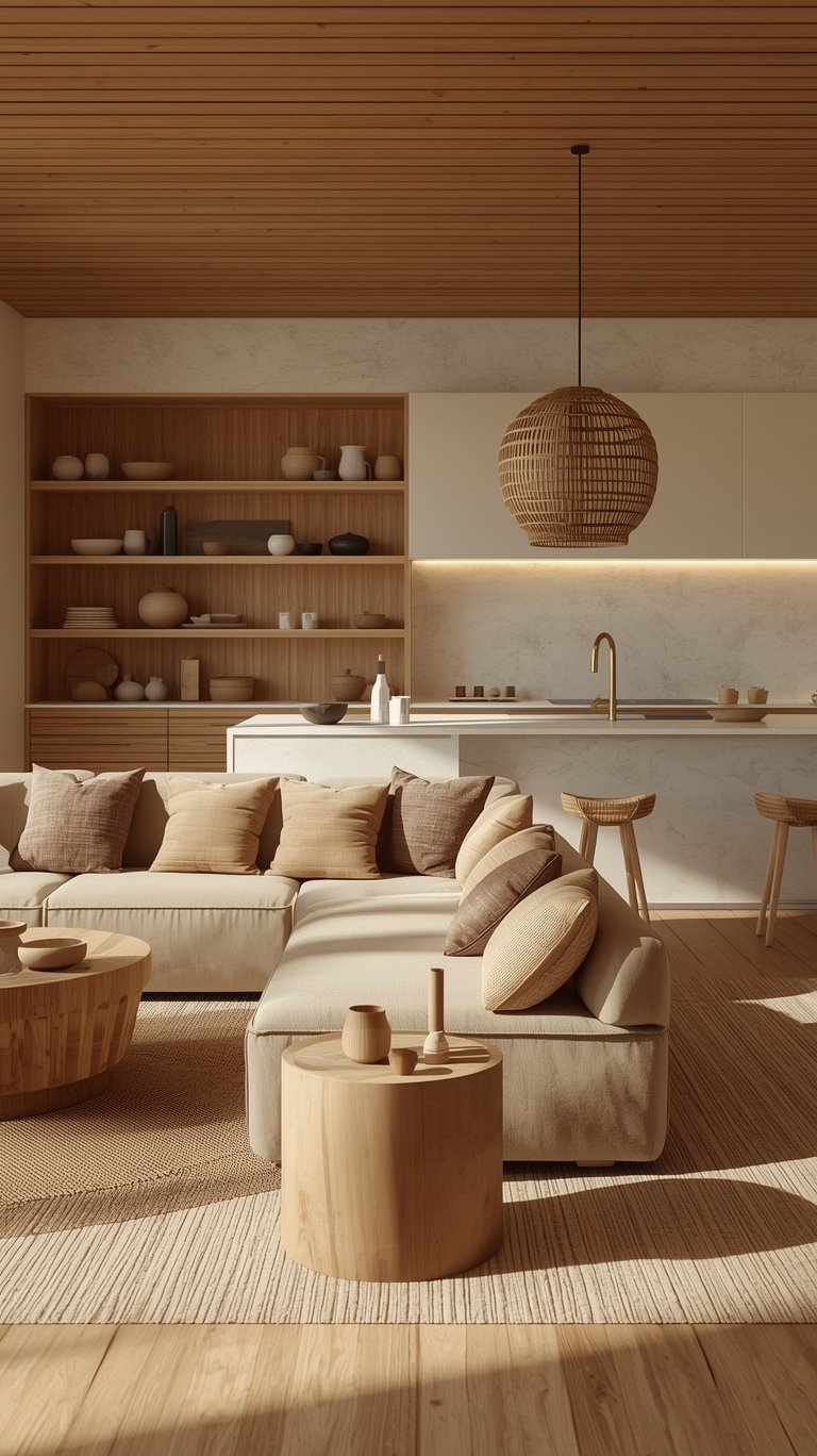
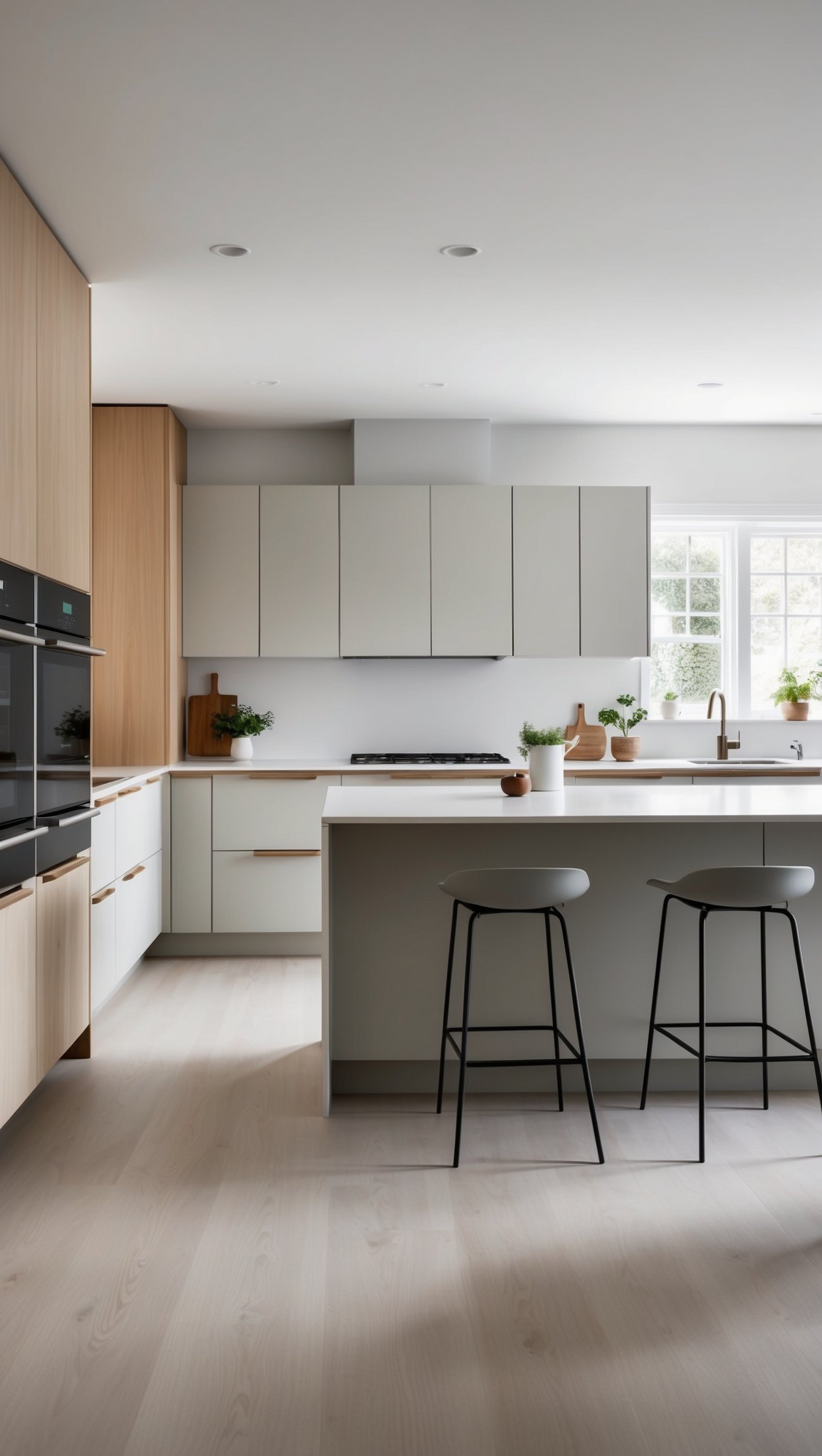
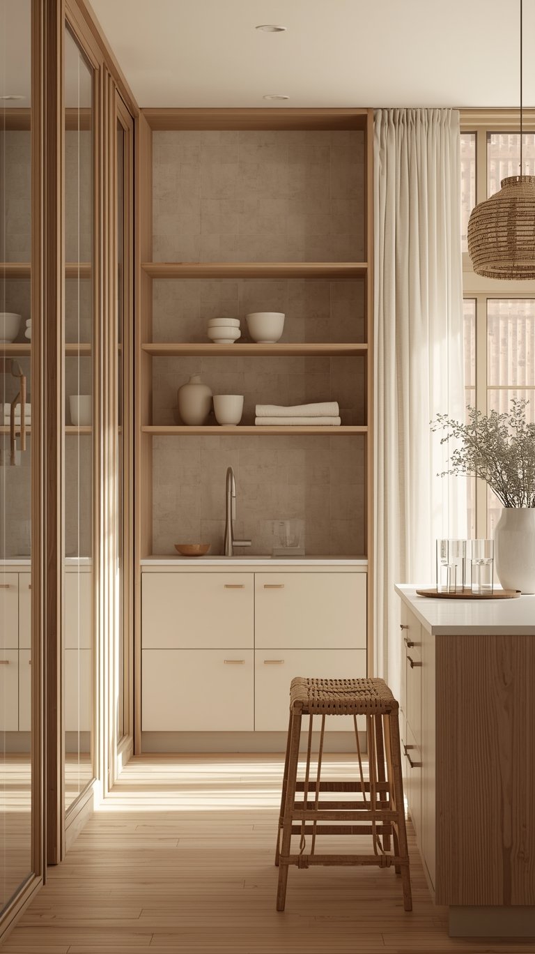
The Zen Kitchen: Seamless and Functional
The kitchen is often the heart of Japandi Interior Design. You want a “seamless transition” between your cooking and living areas.
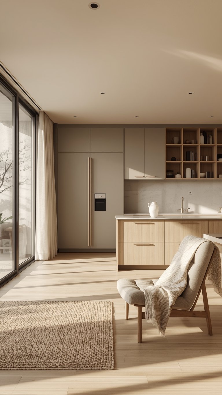
- Cabinetry: Try a mix of colors. Maybe light-colored wall cabinets (like sand gray) with warm, earthy accents on the base cabinets (like sepia brown).
- The Details: Use wide drawer fronts. This reduces the number of visible joints, which makes the space look “calm and cohesive.”
- Sustainability: Brands like Schüller are now creating kitchen fronts using materials made from 78% recycled components. Choosing a Japandi Home Color Palette that is also eco-friendly is a win for you and the planet!
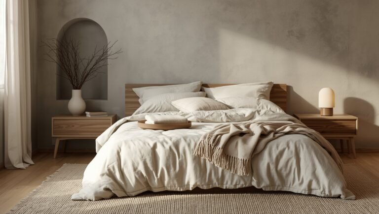
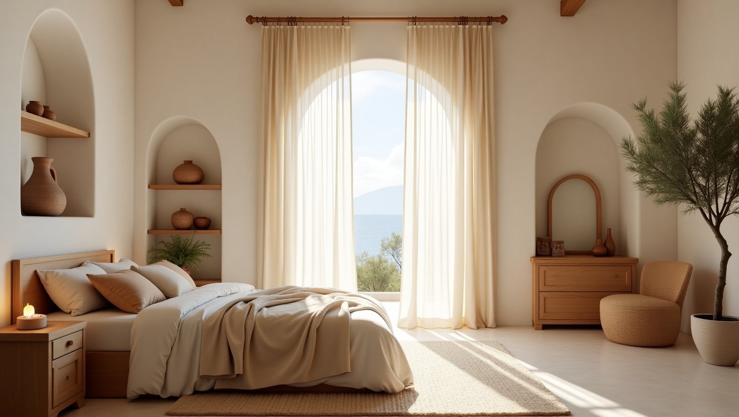
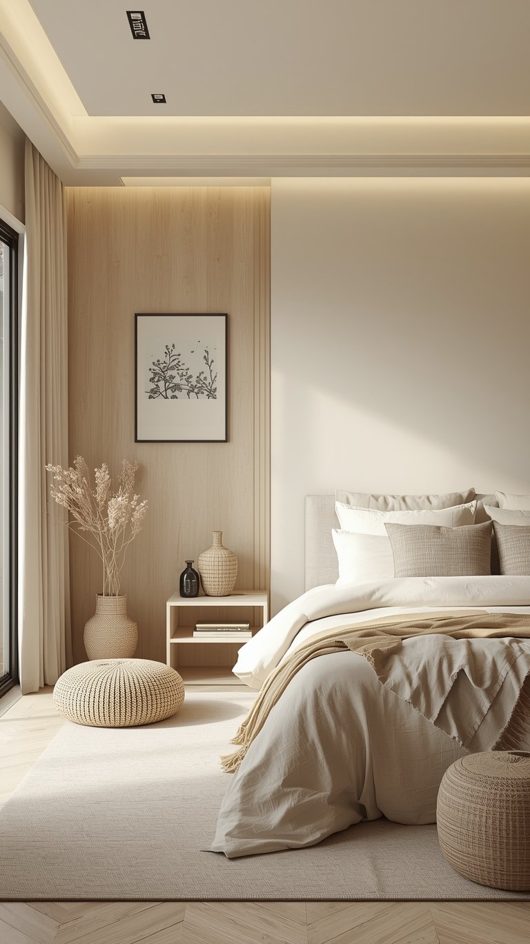
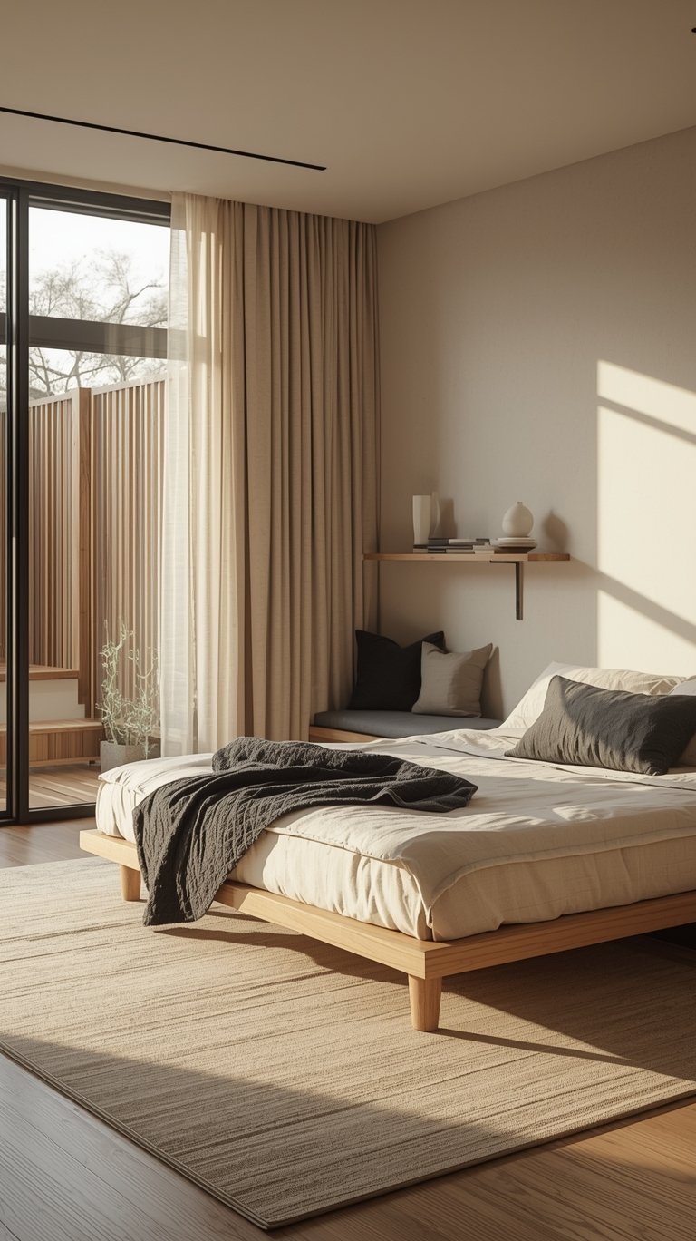
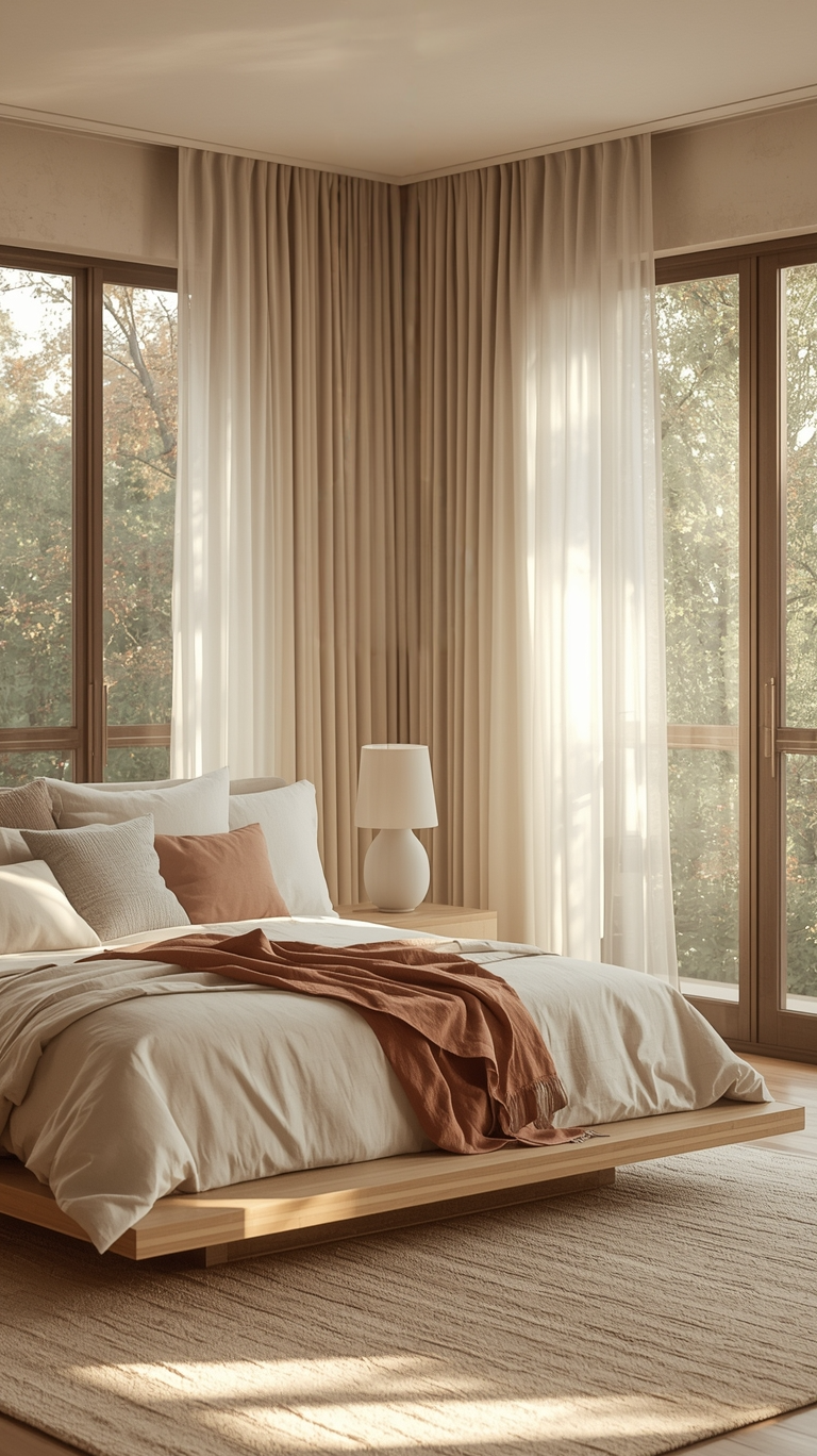
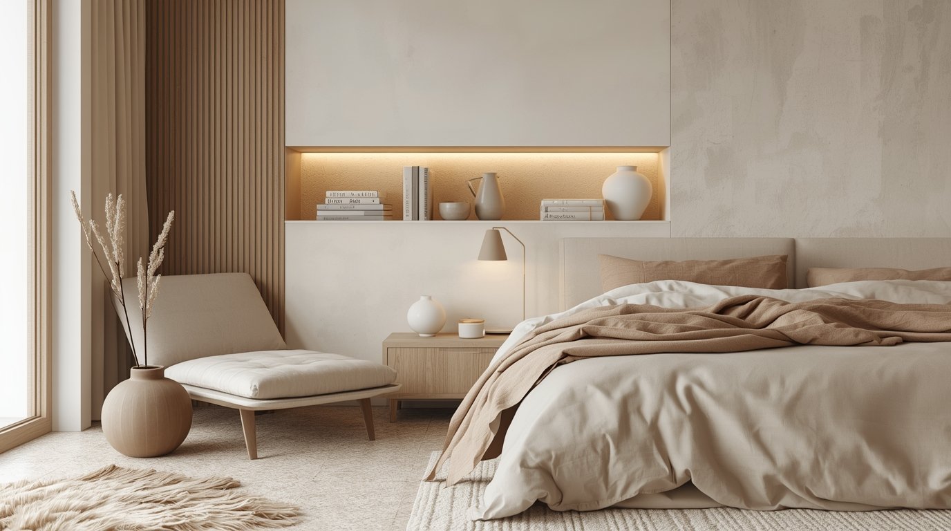
The Restorative Bedroom: A Space for Real Rest
Your bedroom should be a sanctuary. This is where you want to lean heavily into the Japandi Palette for “mental clarity.”
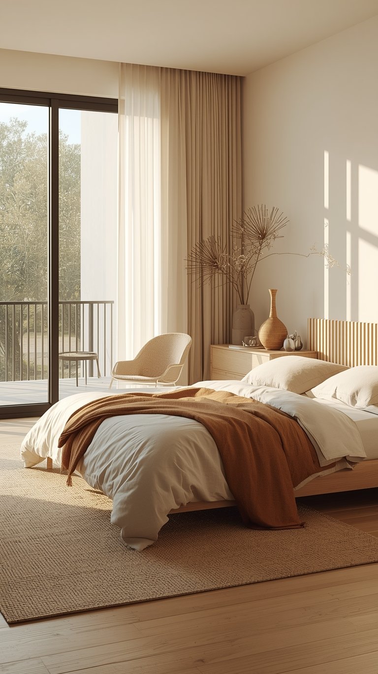
- Colors: Go for ultra-pale grays or warm creams like Dove White by Benjamin Moore.
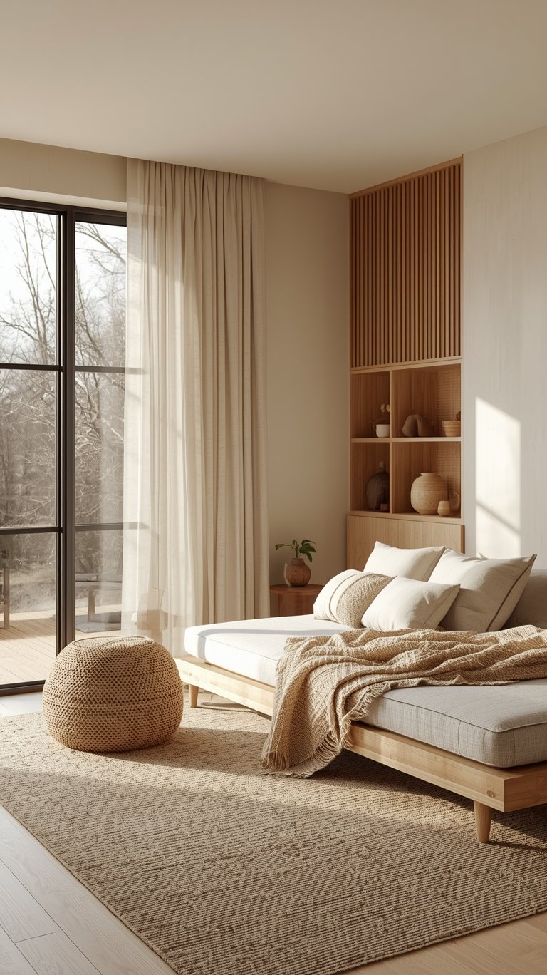
- Furniture: Use “low-profile” furniture. A bed that sits closer to the floor encourages a feeling of being grounded and connected to the earth.
- Accents: Keep it simple. A single wooden dresser and some neutral bedding in shades of oatmeal and cocoa are all you need.
The Serene Bathroom: Upscale Spa Vibes
You can turn a basic bathroom into a Japandi Style retreat with just a few color shifts.
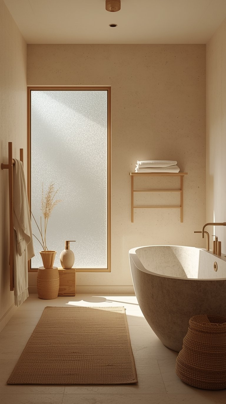
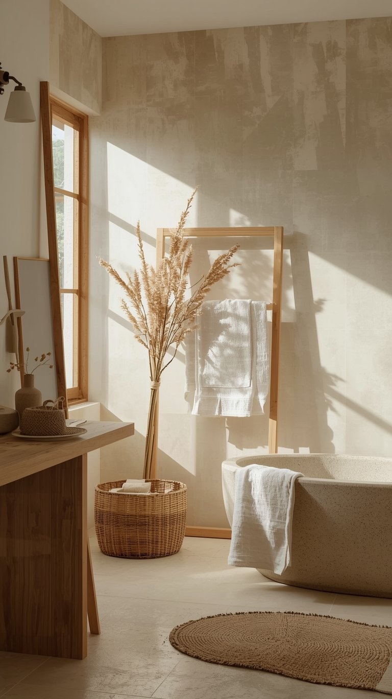
- The “Wow” Factor: Introduce a Japanese shoji screen. It’s a classic element that provides privacy while letting in a soft, filtered light.
- Walls: Pearl gray or stone gray walls feel clean but warm.
- Textures: Pair these with a natural wood vanity and a stone tub.
The Concept of “Ma”: The Beauty of Emptiness
One of the most important parts of Japandi Interior Design isn’t something you can buy at a store. It’s a Japanese concept called Ma. This refers to the space between things—the “negative space.”
In a Japandi Living Room, Ma is just as important as the furniture. It’s about not feeling the need to fill every corner with “stuff.” When you use a Japandi Color Palette, the empty spaces on your walls or the open floor around a coffee table become part of the design. This “emptiness” isn’t boring; it’s intentional. It gives your eyes and your mind a place to rest. As the saying goes in Ikebana (the art of flower arrangement), the space around the flowers is what makes the arrangement beautiful. The same goes for your Japandi Home.
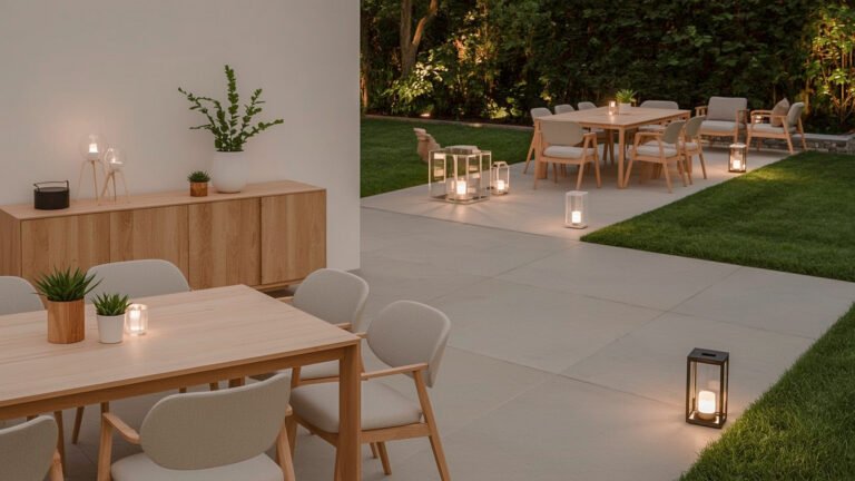
Lighting: Casting a Soft, Warm Glow
You could have the most perfect Japandi Palette Color on your walls, but if you have harsh, blue-toned overhead lights, the whole vibe will be ruined. Japandi Lighting is all about “sculptural” warmth.
The Power of Paper
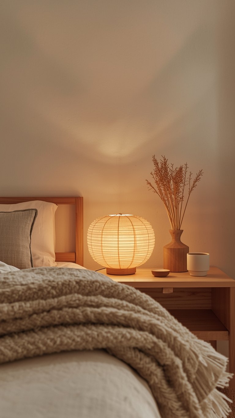
Think of the classic Akari light sculptures. These are lamps with delicate paper shades that turn a lightbulb’s harsh glare into a soft, warm glow. This “filtered sunlight” effect is essential for a Japandi Style home.
Highlighting with Light
Use targeted lighting to showcase your favorite things. A glass display unit with subtle warm LED strips can make a few simple ceramic vases look like museum pieces. In a Japandi Living, you want several small “pools” of light rather than one big, bright light in the center of the ceiling. This creates layers of light and shadow that make the room feel dynamic and cozy.
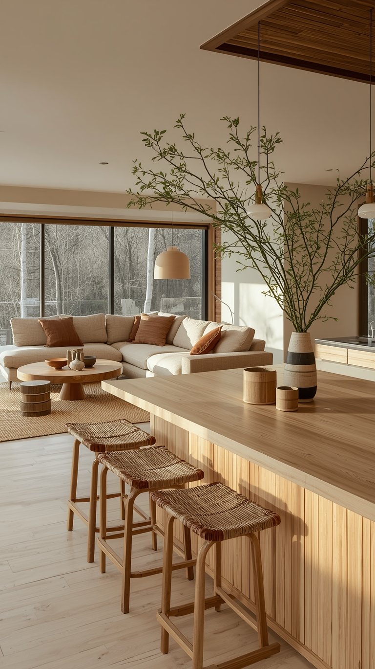
Bringing Nature Indoors: Living Elements in Japandi
A Japandi Color Palette is naturally tied to the outdoors, so it only makes sense to bring “living elements” into your space. This is often called biophilic design.
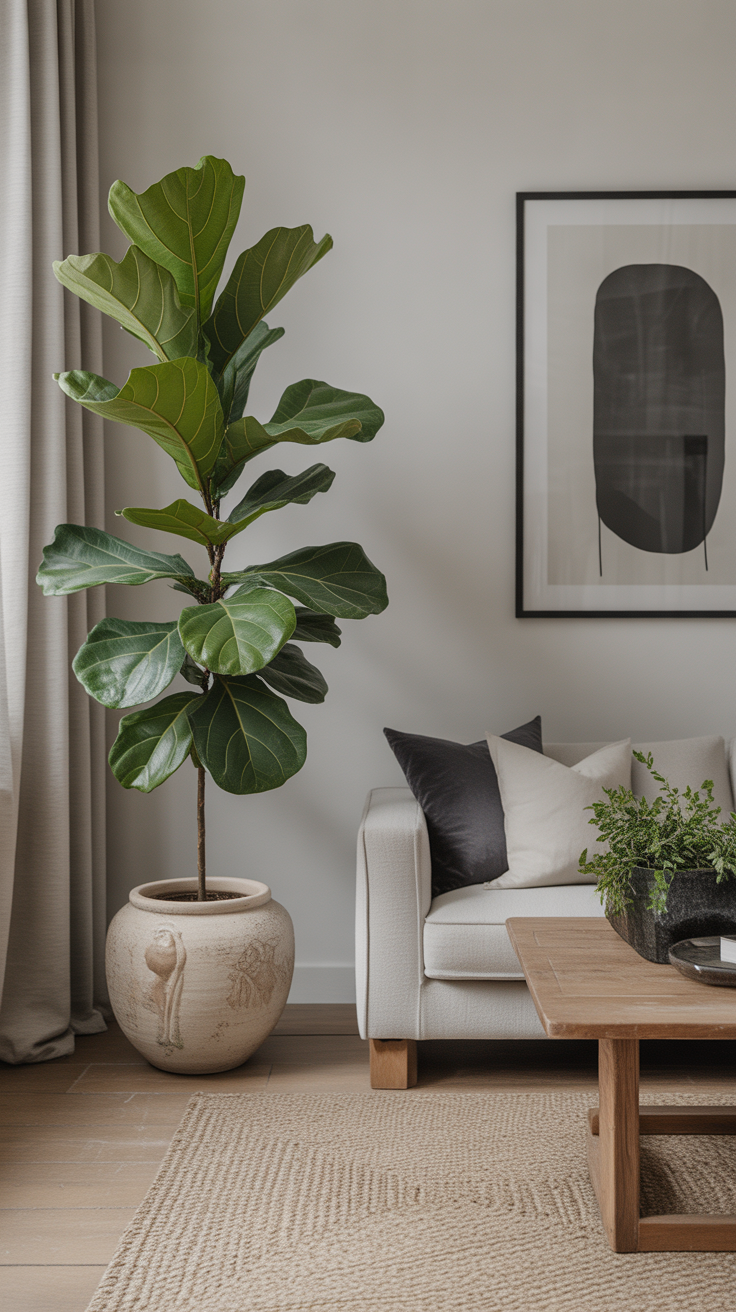
- Greenery: A large fiddle-leaf fig or a simple snake plant introduces a vibrant green that acts as a natural accent color.
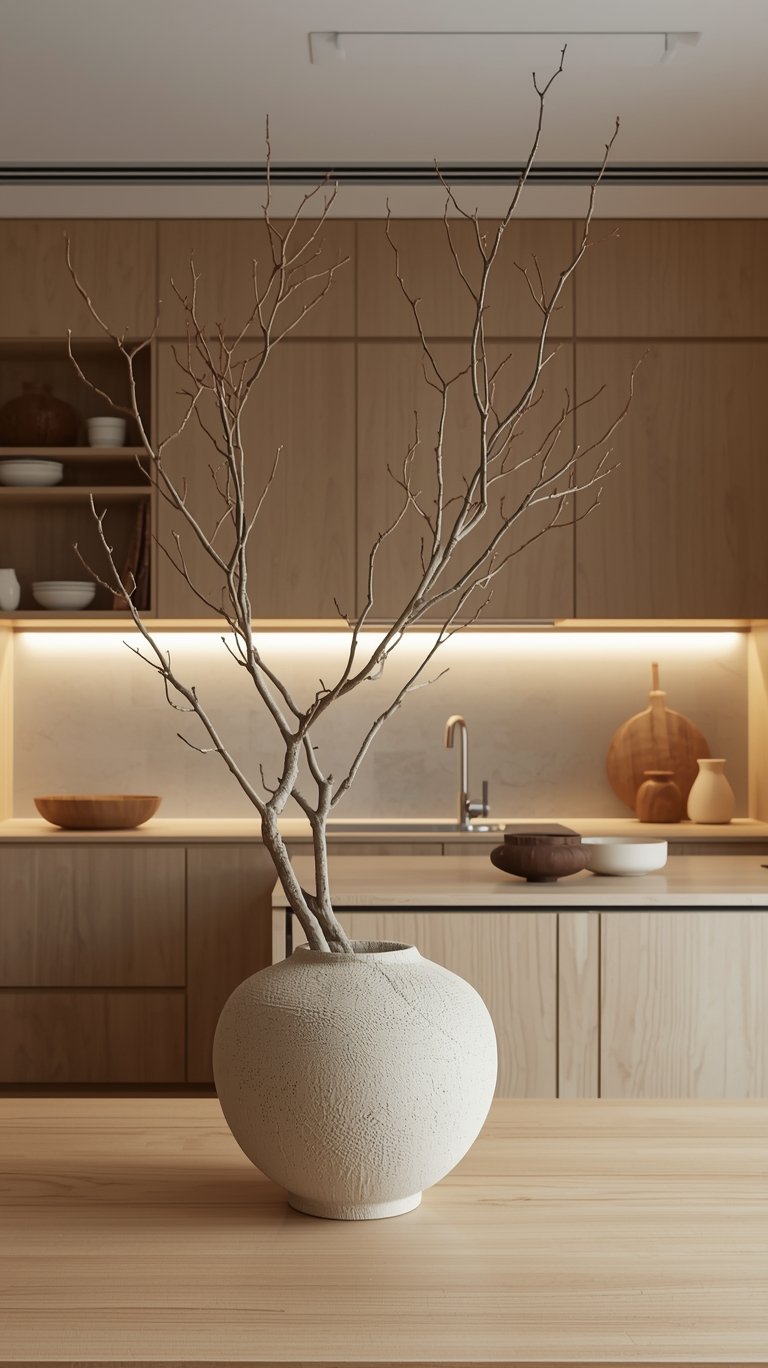
- Branches: If you don’t have a green thumb, don’t worry! A single dried branch in a tall wabi-sabi ceramic vase is a direct nod to Japanese tradition. It adds a sculptural element that changes with the light throughout the day.
- Natural Light: This is your best “color.” Sheer curtains allow natural light to reveal the different tonal shifts in your Japandi Wall Colors from morning to evening.
Creating Harmony: Tips for Success
Start with a Neutral Base: Begin by painting your walls in a soft white, warm gray, or beige.
Layer in Earthy Accents: Add pops of sage green, terracotta, or charcoal gray through furniture, textiles, and accessories.
Use Natural Materials: Incorporate natural materials like wood, linen, and rattan to add warmth and texture.
Embrace Minimalism: Avoid clutter and keep your space clean and organized.
Focus on Functionality: Choose furniture and accessories that are both beautiful and functional.
My Top Tip: When in doubt, edit! Japandi is all about simplicity, so if you’re not sure if something fits, take it out. You can always add it back later if you miss it.
Japandi With Color: Can You Use Bolder Hues?
A common question is: “Do I have to live in a beige box?” The answer is no! Japandi With Color is definitely possible, as long as the colors are “muted” and “earthy.”
The Scandinavian side of Japandi often uses “bolder” accents like muted reds, blues, or mustards. The trick is to make sure they are “earth-toned” versions. Instead of a bright fire-engine red, go for a soft terracotta or a “faded terracotta” like the one from Farrow & Ball. Instead of a bright navy, go for a smoky blue-gray. These colors still provide a pop of interest, but they don’t “scream” at you. They stay within the “visual language of calm” that defines the Japandi Color Palette.
FQA

What is the best white paint for a Japandi look?
It depends on your light! For a warm, cozy feel, Swiss Coffee by Benjamin Moore is a huge favorite. If you want something a bit cleaner and more modern, Dove White by Benjamin Moore has a slight grayish cast that looks great with light wood.
Can I do Japandi on a budget?
Absolutely. The Japandi Style is about “less is more,” which is great for your wallet! Focus on a fresh coat of paint in a Japandi House Color Palette and some affordable natural textiles like a jute rug or linen pillows from places like Target or West Elm.
How do I stop a neutral room from looking boring?
Texture! Mix your materials. Put a rough jute rug next to a smooth leather chair. Use a linen throw on a bouclé sofa. Also, don’t forget your 10% dark accent—that little bit of black or charcoal provides the contrast needed to make the neutrals look “expensive.”
Is Japandi good for small apartments?
It’s actually perfect for them! The “light and airy” colors make small rooms feel much larger. Using “low-profile” furniture also creates more visual space, making low ceilings feel higher.
What woods work best for Japandi?
Light oak is the most common for that “Scandi” look, but don’t be afraid of dark walnut. Mixing the two—light floors with a dark walnut coffee table—is a classic way to achieve that “balanced” Japandi Interior Design.
Do I have to be a minimalist to have a Japandi home?
You don’t have to get rid of everything you own! It’s more about being “intentional.” Start by clearing off your surfaces and only putting back the things that are either beautiful or useful. Japandi Living is about quality over quantity.
The Bottom Line: Finding Your Harmony
At the end of the day, the Japandi Color Palette is about more than just matching your pillows to your rug. It’s a commitment to a more mindful way of living. By choosing a Japandi Palette, you are creating a space that supports your mental health and gives you a place to truly recharge.
Whether you are painting your whole house in Japandi Wall Colors or just adding a few Japandi Colours through textiles, remember that the goal is balance. Balance between light and dark, smooth and rough, and “doing” and “being.” Your home should be a reflection of the peace you want to feel inside. So, grab a warm mug of tea (in a wabi-sabi ceramic cup, of course!), light a candle, and start composing your own personal sanctuary. You’ve got this!

ABOUT the AUTHOR
TOKI; INTERIOR DESIGN & lifestyle CONTENT CREATOR.
Hey there! I’m Toki—the design-obsessed brain behind Dwell Studio 24. I’m a content creator passionate about interior design, photography, and creativity, living in a 77-year-old house with my husband and our awesome three kids. I write about interior design, furniture, home topics, and my lifestyle, including travel, recipes, skincare, and daily routines. I hope to inspire your next project and lifestyle!
ABOUT the AUTHOR
TOKI; INTERIOR DESIGN & lifestyle CONTENT CREATOR.
Hey there! I’m Toki—the design-obsessed brain behind Dwell Studio 24. I write about interior design, furniture, home topics, and my lifestyle, including travel, recipes, skincare, and daily routines. I hope to inspire your next project and lifestyle!